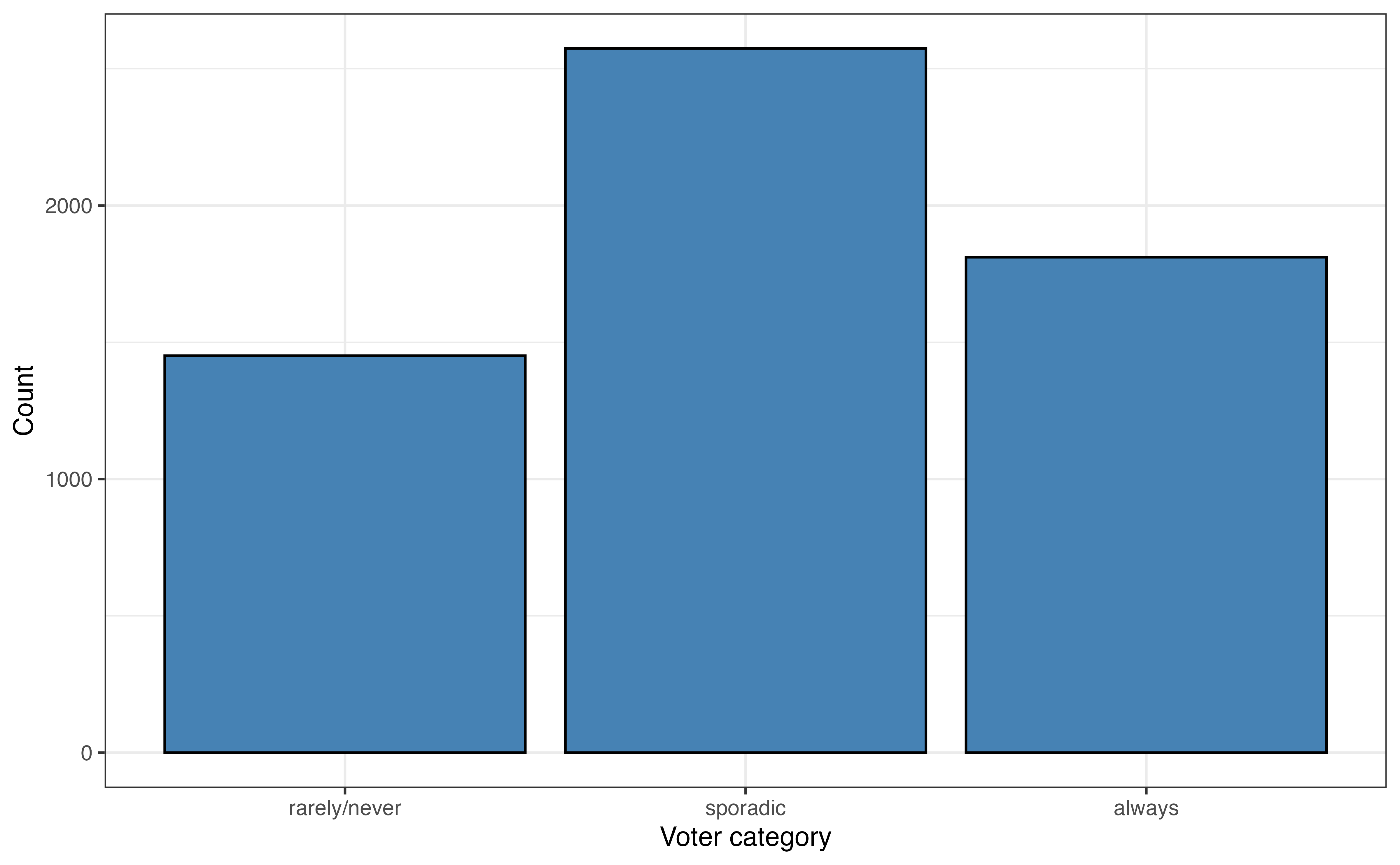
voter_category
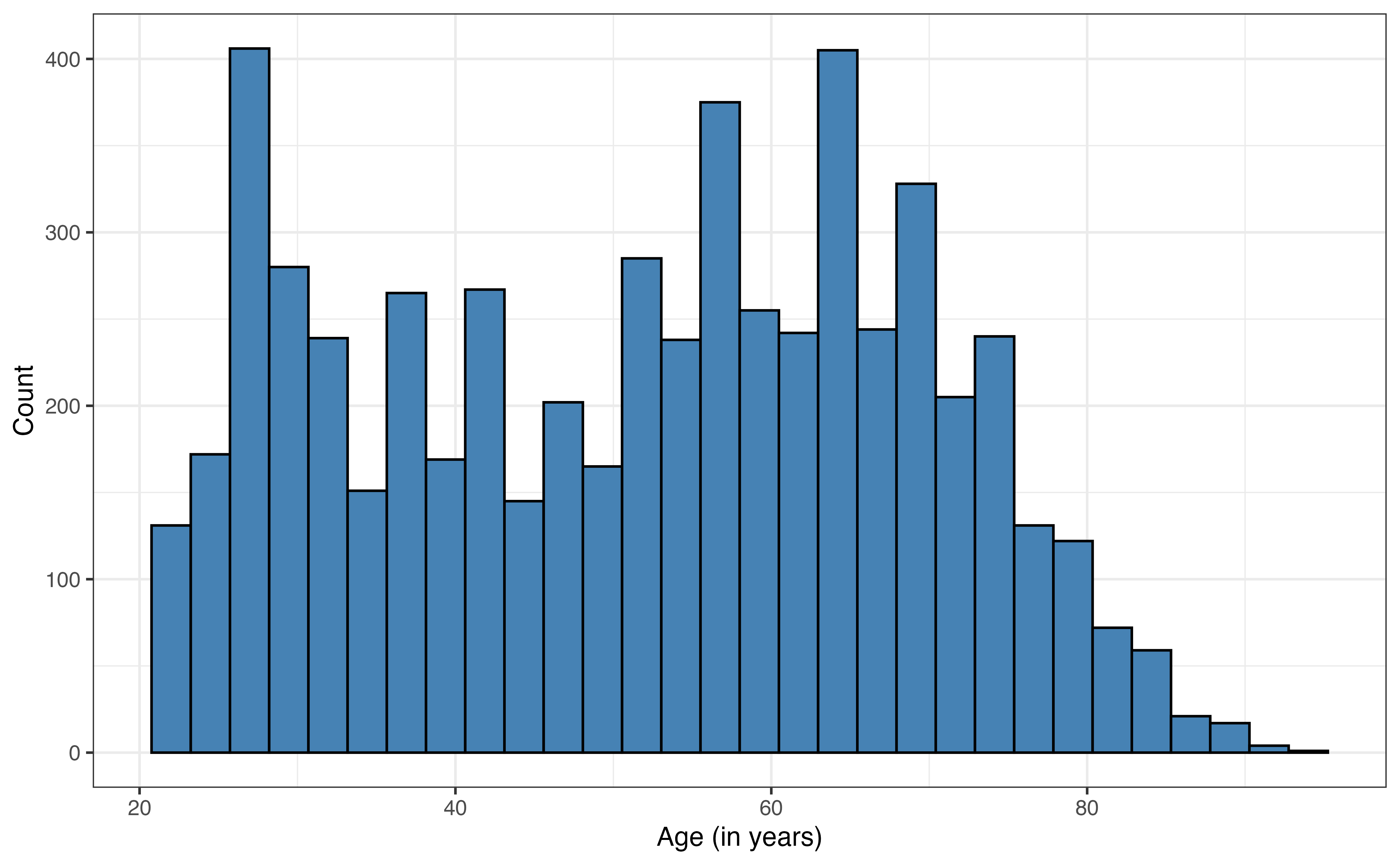
age
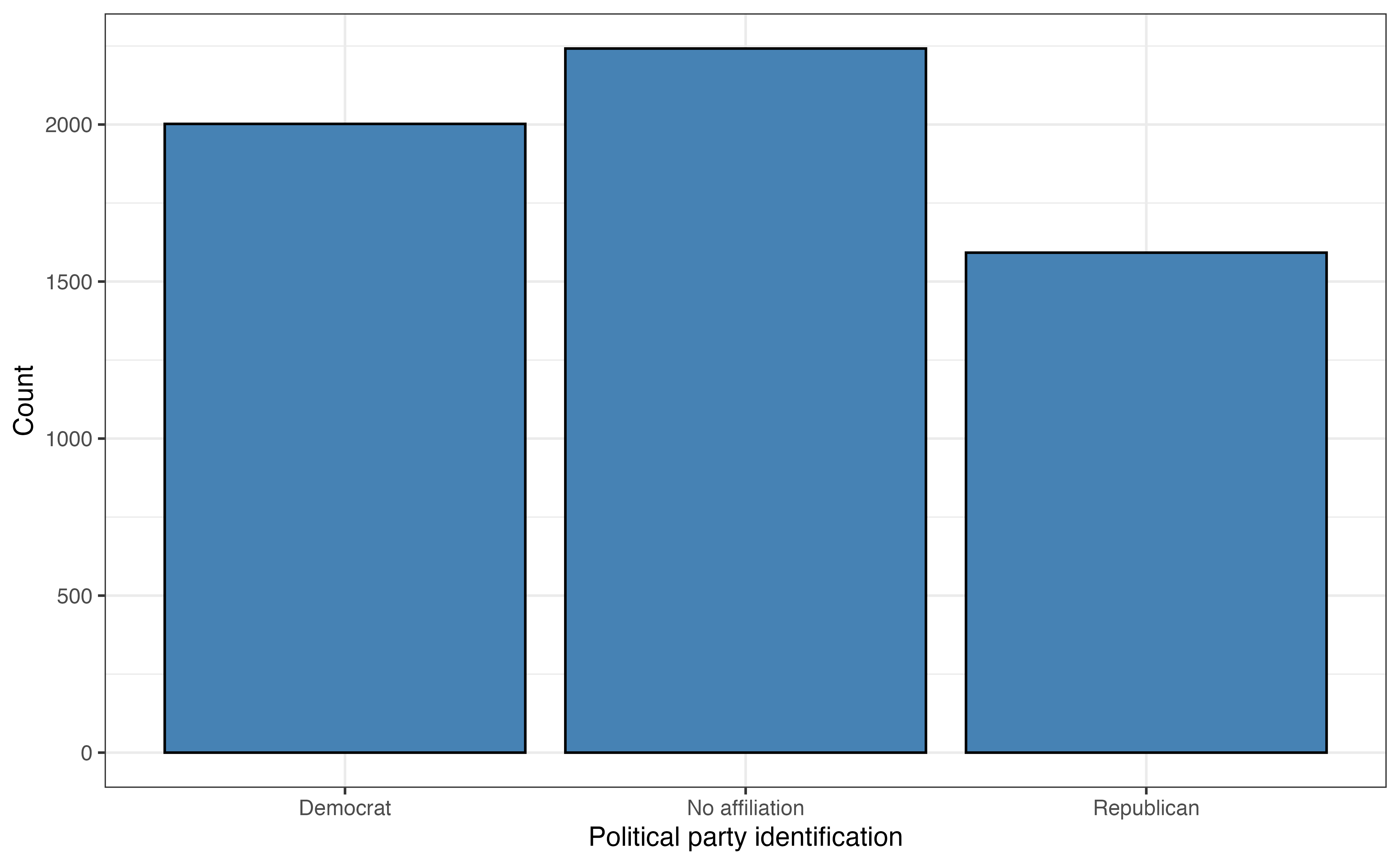
party_id
This chapter introduces readers to a collection to models that are extensions of linear and logistic regression. The goal is to provide an introduction to the topic along with resources for those interested in learning more. The following topics are introduced:
In Chapter 11, we introduced logistic regression models for binary response variables. In this section, we introduce multinomial logistic regression, models for categorical response variables with three or more levels.
In the 2020 article “Why Many Americans Don’t Vote” (Thomson-DeVeaux, Mithani, and Bronner 2020) on the now defunct data journalism website FiveThirtyEight, journalists explored the voting behavior of eligible voters in the United States. As indicated by the article’s title, their primary objective was to understand why many eligible voters choose not to vote at all or only vote sporadically. They considered numerous factors in their analysis, but we will focus on a few, age and political affiliation, for this analysis.
The data were obtained from the FiveThirtyEight data website (https://data.fivethirtyeight.com) and is available in fivethirtyeight-voters-data.csv. It contains survey responses from 5836 respondents. All survey participants had been eligible to vote in at least four prior elections. The variables used in this analysis are below. The definitions are adapted from the data documentation (https://github.com/fivethirtyeight/data/tree/master/non-voters)
voter_category: An respondent’s past voting behavior, categorized as
always: respondent voted in all or all-but-one of the elections they were eligible in
sporadic: respondent voted in at least two, but fewer than all-but-one of the elections they were eligible in
rarely/never: respondent voted in 0 or 1 of the elections they were eligible in
age: Respondent’s age in years (called ppage in original data set)
party_id: Respondent’s political affiliation categorized as Democrat, Republican , No affiliation. This variable was derived from the variable Q30 in the original data set, defined as the following:
Response to the question “Generally speaking, do you think of yourself as a…”
1:Republican
2: Democrat
3: Independent
4: Another party, please specify
5: No preference
-1: No response
Responses 3, 4, 5,-1 are classified as “No affiliation” in this analysis.
income_cat: Respondent’s annual income (Less than $40k, $40-75k, $75-125k, $125k or more)
The goal of this analysis is to use age and party_id to predict voting_id and describe factors associated with variability in voting behavior. The univariate exploratory data analysis is in Figure 13.1 and Table 13.1.
voter_category
age
party_id
age
| Variable | Mean | SD | Min | Q1 | Median (Q2) | Q3 | Max | Missing |
|---|---|---|---|---|---|---|---|---|
| age | 51.7 | 17.1 | 22 | 36 | 54 | 65 | 94 | 0 |
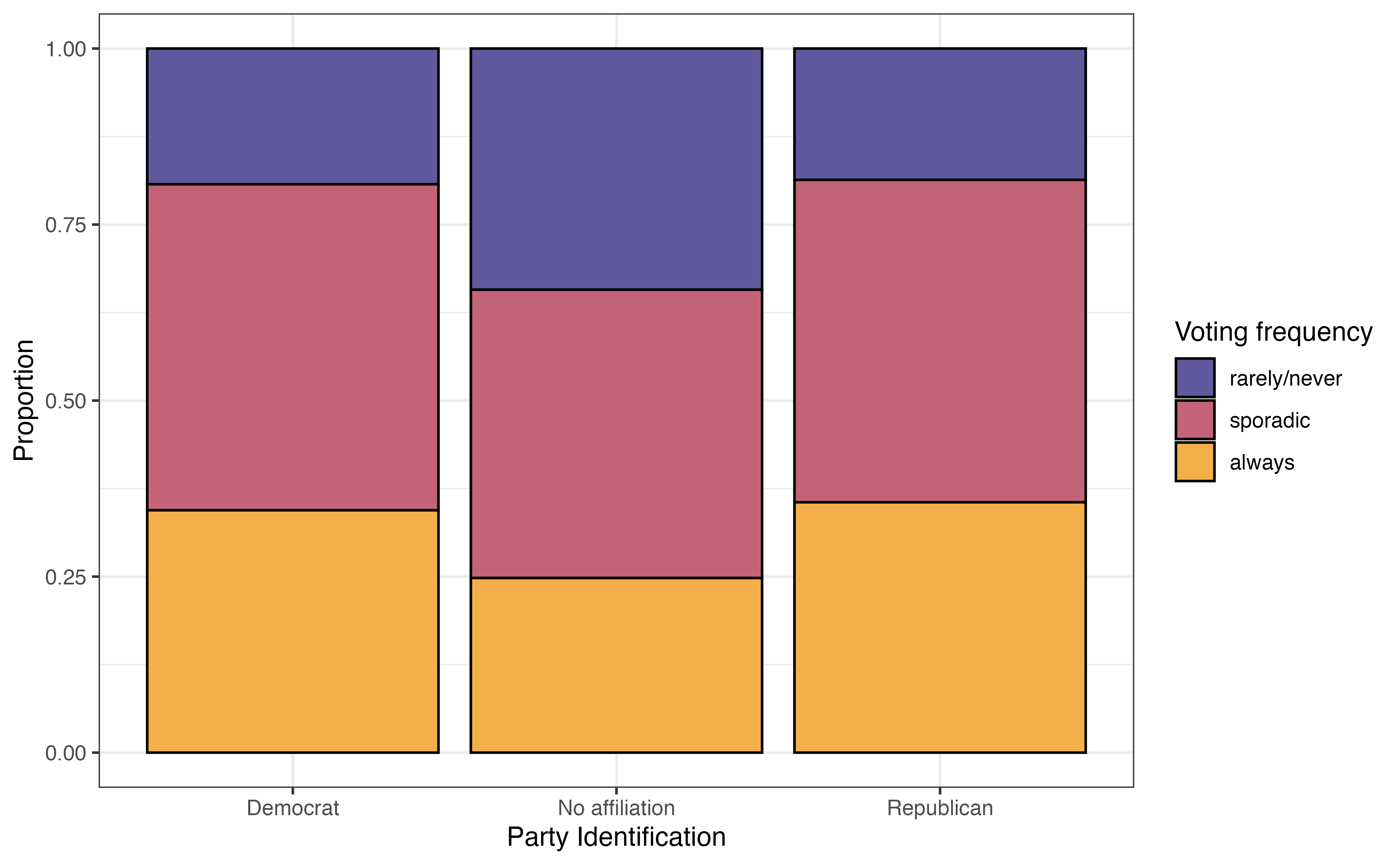
The most common voting frequency among respondents in sporadic, with 44.1% of the voters being in this category. About 24.9% of the respondents vote rarely or never, and 31% of the respondents voted always. The distribution of age is bimodal and skewed right. The median age in the data set is 54 years old, and the IQR is 29 years. The most common political party identification is “No affiliation” with about 38.4% of the respondents. About 34.3% of the respondents identified as “Democrat” and about 27.3% as “Republican”.
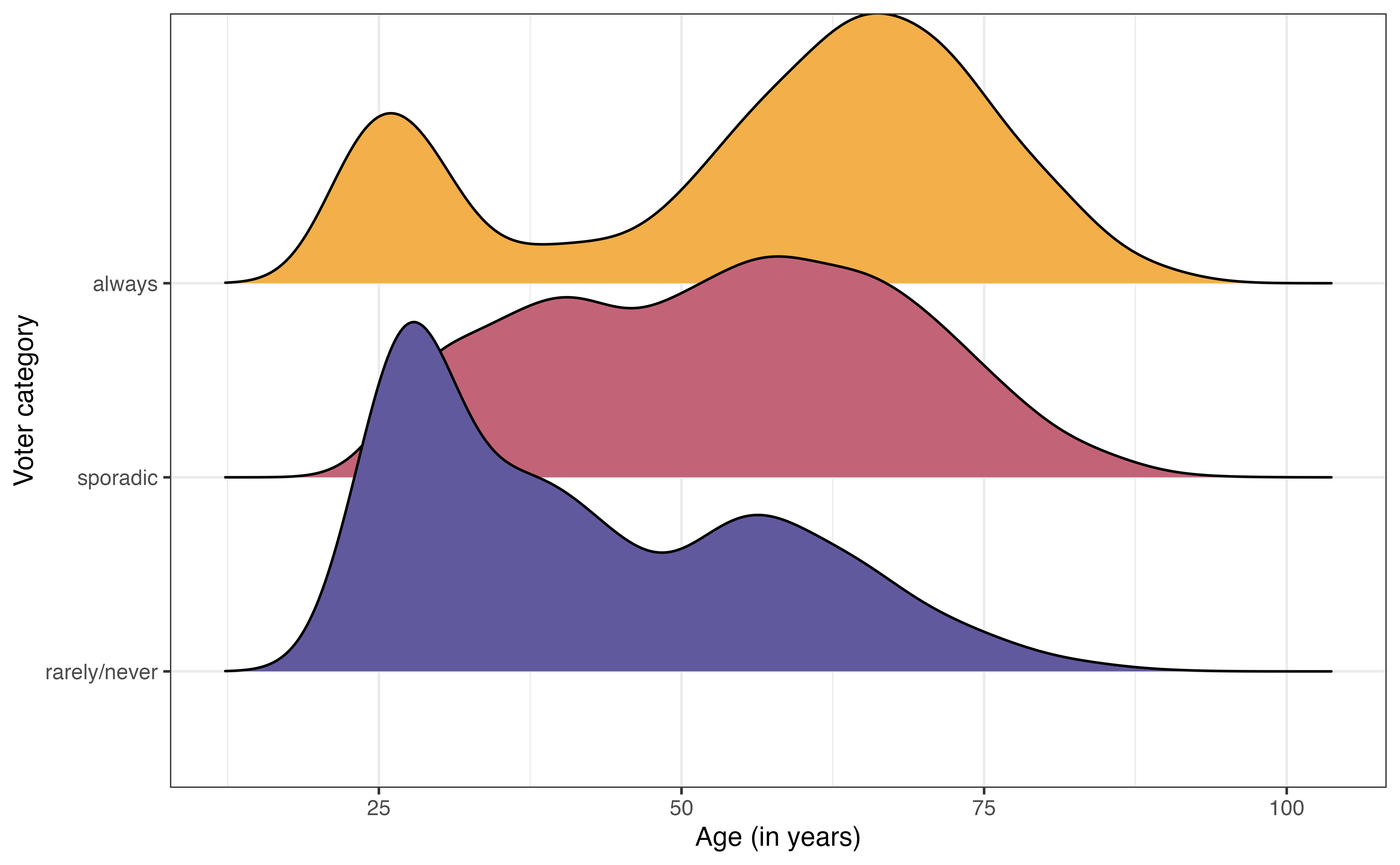
voter_category versus age
voter_category versus party_id
The bivariate exploratory data analysis is in Figure 13.2. From Figure 13.2 (a), the distribution of age among voters categorized as “always” is bimodal with a peak around 25 years old and another around 60 years old. In contrast, the distribution of age among voters categorized as “rarely/never” is unimodal and skewed towards younger voters. This suggest there may be a relationship between age and voting frequency.
From Figure 13.2 (b), the voters who have no political party affiliation are the most likely to vote “rarely/never” and the least likely to vote “always”. The distribution of voting frequency appears to be similar between Democrats and Republicans. This indicates there may be some relationship between political party identification (or even whether or not someone identifies with a political party) and voting frequency.
We have some initial insights from the data about overall voting frequency and potential relationships with age and political party affiliation, so we want to fit a model to summarize the relationship between these variables that we can use to draw robust conclusions and make predictions.
The response variable in this analysis has three levels, so we will use an extension of the logistic regression model. Multinomial logistic regression is part of the wider class of models called generalized linear models. It is a model for data with a categorical response variable that has three or more levels. Such response variables follow a multinomial distribution.
Multinomial distribution
Let \(Y\) be a categorical random variable with \(K > 2\) levels. Then,
\[P(Y = 1) = \pi_1, P(Y = 2) = \pi_2, \ldots, P(Y = K) = \pi_K\] such that \(\sum_{k=1}^K \pi_K = 1\)
Let’s look at the general form of the multinomial logistic regression model, then apply it to model voting frequency. Suppose we have a categorical response variable that takes values \(A\), \(B\), and \(C\). Let \(A\) be the baseline level. Then, the general form of the multinomial logistic regression model is
\[\begin{aligned} \log\Big(\frac{\pi_B}{\pi_A}\Big) = \beta_{0 B} + \beta_{1B}X_1 +\beta_{2B}X_2 + \dots + \beta_{pB}X_p \\ \log\Big(\frac{\pi_C}{\pi_A}\Big) = \beta_{0C} + \beta_{1C}X_1 +\beta_{2C}X_2 + \dots + \beta_{pC}X_p \end{aligned} \tag{13.1}\]
From Equation 13.1, we see a few features of the multinomial logistic model. We start by choosing a baseline level for the response variable. Each equation in the fitted model quantifies the log odds of being at another level of the response variable versus the baseline1. WE saw this implicitly in logistic regression, where the response variable, \(\log(\frac{\pi}{1-\pi})\), is the “log odds of \(Y = 1\) versus \(Y = 0\).”
The next feature of multinomial logistic regression is the multiple equations that comprise the model. More specifically, if the response variable has \(K\) levels, then there will be \(K - 1\) equations in the model. We will ultimately use the model to compute the predicted probabilities an observation takes each level of the response variable, so we need all \(K-1\) equations in order to compute the predicted probabilities for every level of the response variable.
The last feature is that each of the \(K -1\) equations have the same form but different values of the coefficients. This is shown in Equation 13.1 as the \(\beta's\) have unique indices in each equation. As with logistic regression, the coefficients for multinomial logistic regression are estimated using maximum likelihood estimation (see 11.4).
Table 13.2 is the multinomial logistic regression model using age and party_id to predict voter_category.
voter_category versus age and party_id with 95% confidence intervals for the coefficients
| y.level | term | estimate | std.error | statistic | p.value | conf.low | conf.high |
|---|---|---|---|---|---|---|---|
| sporadic | (Intercept) | -1.046 | 0.116 | -9.031 | 0.000 | -1.273 | -0.819 |
| sporadic | age | 0.041 | 0.002 | 18.834 | 0.000 | 0.036 | 0.045 |
| sporadic | party_idNo affiliation | -0.677 | 0.081 | -8.389 | 0.000 | -0.836 | -0.519 |
| sporadic | party_idRepublican | -0.106 | 0.095 | -1.118 | 0.264 | -0.292 | 0.080 |
| always | (Intercept) | -1.983 | 0.131 | -15.157 | 0.000 | -2.240 | -1.727 |
| always | age | 0.052 | 0.002 | 22.144 | 0.000 | 0.048 | 0.057 |
| always | party_idNo affiliation | -0.872 | 0.089 | -9.824 | 0.000 | -1.046 | -0.698 |
| always | party_idRepublican | -0.091 | 0.101 | -0.901 | 0.368 | -0.288 | 0.106 |
The column y.level indicates the corresponding level for the given equation. The level of the response variable that is not listed is the baseline. In this case, the baseline level is rarely/never. Therefore, this model produces the log odds of being in the other categories versus rarely/ never.
We can write the model in Table 13.2 as the following:
\[ \begin{aligned} \log\Big(\frac{\pi_{sporadic}}{\pi_{rarely/never}}\Big) = -1.046 + 0.041 \times \text{age} -0.677 \times \text{No affiliation} -0.106 \times \text{Republican} \\ \log\Big(\frac{\pi_{always}}{\pi_{rarely/never}}\Big) = -1.983 + 0.052 \times \text{age} -0.872 \times \text{No affiliation} -0.091 \times \text{Republican} \end{aligned} \]
The interpretation for the coefficients of the multinomial logistic model are very similar to the interpretations for the logistic model in Section 11.4. Like logistic regression, the model coefficients represent the change in the log odds, but in practice want to write interpretations in terms of the odds. The primary difference in the interpretation is the explicit statement of the baseline level of the response variable.
Let’s interpret the coefficients in terms of having the voter frequency of sporadic versus rarely/never. The interpretation of age in terms of the log odds is as follows:
For each additional year older, the log odds of an individual voting sporadically versus rarely/never are expected to increase by 0.041, holding political affiliation constant.
The interpretation in terms of the odds is the following:
For each additional year older, the odds of an individual voting sporadically versus rarely/never are expected to multiply by 1.042 \((e^{0.041})\), holding political affiliation constant.
Next, we interpret the effect of political affiliation on the voting frequency. As with other models, we write the interpretation in reference to the baseline level of the categorical predictor. The interpretation of the coefficients for party_id in terms of the log odds are the following:
The log odds an individual who has no political affiliation votes sporadically versus rarely/never are 0.677 less than the log odds of an individual whose party affiliation is Democrat, holding age constant.
The log odds an individual whose political affiliation is Republican votes sporadically versus rarely/never are 0.106 less than the log odds of an individual whose party affiliation is Democrat, holding age constant.
The interpretations in terms of the odds are as follows:
The odds an individual who has no political affiliation votes sporadically versus rarely/never are 0.508 \((e^{-0.872})\) times the odds of an individual whose party affiliation is Democrat, holding age constant.
The odds an individual whose political affiliation is Republican votes sporadically versus rarely/never are 0.899 \((e^{-0.106})\) times the odds of an individual whose party affiliation is Democrat, holding age constant.
Along with the coefficients in Table 13.2 are 95% confidence intervals for the population coefficients. These confidence intervals are estimated in a similar way as those for logistic regression in Section 11.5. As with previous models, we look to see whether the confidence interval contains 0 to determine whether it is a useful predictor in explaining variability in voting frequency after adjusting for the other predictors. In both equations in Table 13.2, none of the confidence intervals for age and party_idNoaffiliation include 0. Thus, both of these indicators are helpful in understanding voting frequency. In contrast, the confidence intervals for party_idRepublican do contain 0, so the voting behavior for Republicans does not differ significantly from Democrats, after adjusting for age. This is consistent with the observations from Figure 13.2 (b).
In Table 13.2, the inferential conclusions for each predictor are the same for both equations in the multinomial logistic model. This is not a requirement for multinomial logistic regression and is not always the case. It could be possible for a predictor to be useful in differentiating always versus rarely/never, but not useful in differentiating sporadic versus rarely/never.
We often want to use multinomial logistic regression models for prediction, and more specifically classifying observations into the groups defined by the response variable. We can use the log odds produced by the multinomial logistic model to compute probabilities, then use those probabilities for classification.
Let’s go back to the general form of the model in Equation 13.1. The predicted probability an observation is in category \(B\) is computed as
\[ \hat{\pi}_B = \frac{e^{\beta_{0B} + \beta_{1B}X_1 + \beta_{2B}X_2 + \dots + \beta_{pB}X_p}}{1 + \sum_{k \in (B,C)}e^{\beta_{0k} + \beta_{1k}X_1 + \beta_{2k}X_2 + \dots + \beta_{pk}X_p}} \tag{13.2}\]
The numerator of Equation 13.2 are the odds of an observation being in category \(B\) versus the baseline \(A\). The denominator is the sum of the odds for every possible level. In this example, it is the sum of the odds an observation is in category \(A\) versus \(A\) (that’s the “1” in the denominator), the odds an observation is in category \(B\) versus \(A\), and the odds an observation is in category \(C\) versus \(A\). A similar formula is used to compute \(\hat{p}_c\), the predicted probability of being in category \(C\). The difference is the numerator, which would be the odds of being in category \(C\) versus \(A\).
The predicted probability an observation is in the baseline category \(A\) is computed as
\[ \hat{\pi}_A = 1 - (\hat{\pi}_B + \hat{\pi}_C) \tag{13.3}\]
Equation 13.3 utilizes the fact that the sum of the probabilities across all possible categories equals 1. This is is also why we need all \(K - 1\) equations as part of the multinomial logistic when there are \(K\) categories of the response variable.
Table 13.3 shows the predicted probabilities based on Table 13.2 for ten observations in the data.
| voter_category | rarely/never | sporadic | always | pred_class |
|---|---|---|---|---|
| always | 0.071 | 0.484 | 0.446 | sporadic |
| always | 0.069 | 0.483 | 0.447 | sporadic |
| sporadic | 0.160 | 0.486 | 0.354 | sporadic |
| sporadic | 0.132 | 0.490 | 0.379 | sporadic |
| always | 0.055 | 0.466 | 0.479 | always |
| rarely/never | 0.220 | 0.470 | 0.310 | sporadic |
| always | 0.057 | 0.468 | 0.475 | always |
| always | 0.087 | 0.488 | 0.424 | sporadic |
| always | 0.088 | 0.479 | 0.433 | sporadic |
| always | 0.093 | 0.489 | 0.417 | sporadic |
The predicted probabilities are then used to classify the observations based on the model. For each observation, the predicted class is the one with the highest predicted probability. For example, for the first observation in Table 13.3, \(\hat{\pi}_{rarely/never} = 0.071\), \(\hat{\pi}_{sporadic} = 0.484\), and \(\hat{\pi}_{always} = 0.446\). Therefore, the predicted class for this observation is “sporadic”.
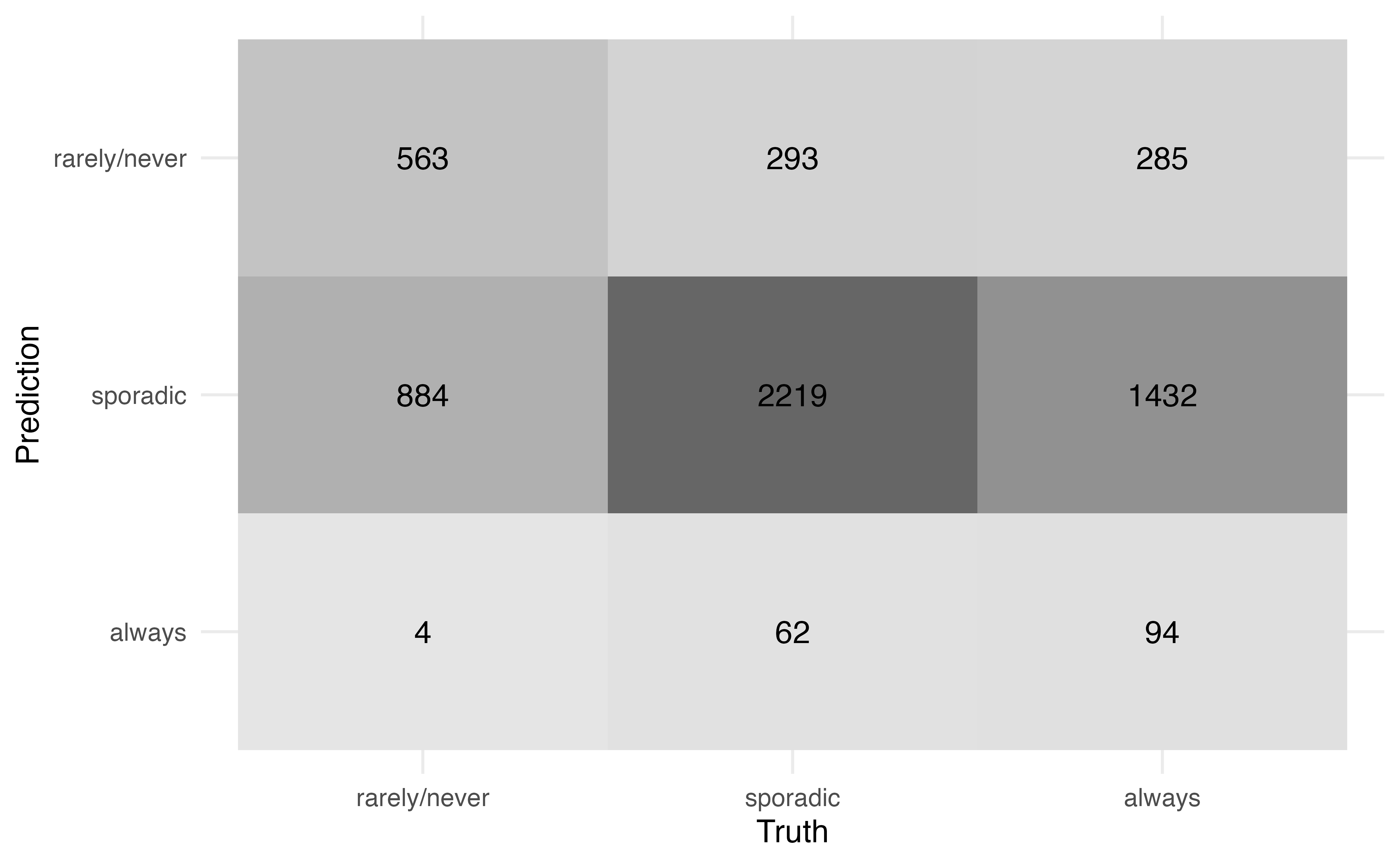
From Table 13.3, we see the predicted class is not always equal to the observed class. Therefore, we want to quantify the model performance, specifically how well the model classifies observations and how well it distinguishes observations from a specific class. A confusion matrix, introduced in Section 12.3.2, is used to compare the observed versus predicted classes. Figure 13.3 is the confusion matrix for the model in Table 13.2. Because the predicted class is always the category with the highest predicted probability, we do not need to specify a threshold as in logistic regression.
Use Figure 13.3 to compute
the accuracy.
the misclassification rate2
There are 5836 observations in the data.
Figure 13.3 can also be used to compute more specific statistics about how well the model identifies observations from a particular class. For example, among those who are actually classified voting rarely/never, the model correctly identified 38.801 % of them.
Conversely, among those who were classified by the model as rarely/never, 49.343% of them actually vote rarely/never.
Receiver Operating Characteristic (ROC) curves, introduced in Section 12.4, can be used to evaluate how well the model distinguishes observations from a particular category. To do so, we create multiclass ROC curves using a “one versus all” approach that evaluates how well the model distinguishes one category versus all the others. For example, one curve represents how well the model distinguishes “always” voters versus all the others (“rarely/never” and “sporadic”). Essentially, we compute a logistic regression ROC curve for each possible class of the response.
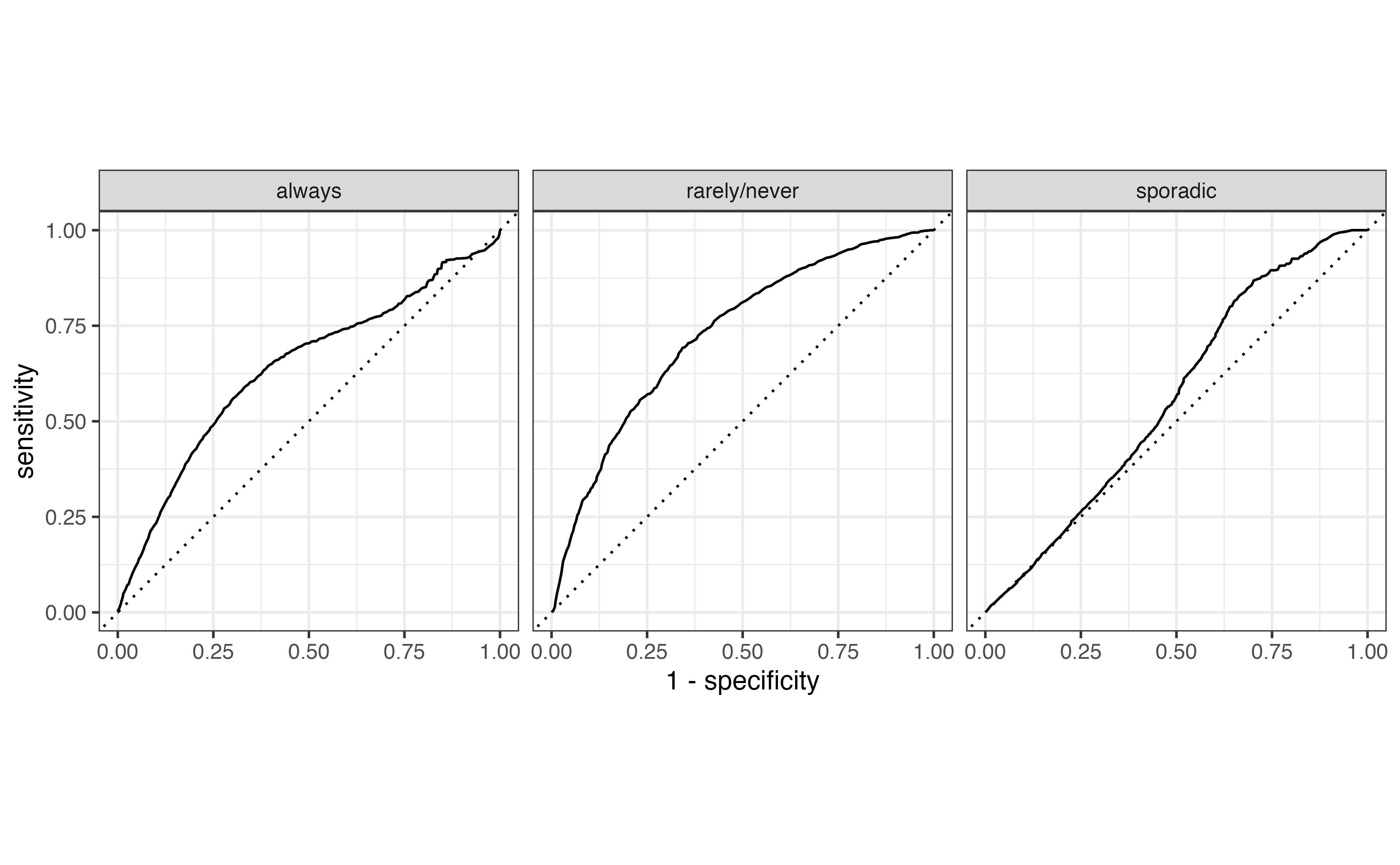
Figure 13.4 shows the multiclass ROC curve for the model in Table 13.2. We interpret this curve similarly to the ROC curve for logistic regression. Curves close to the upper-left portion of the graph indicate good model distinguishing, but curves close to the diagonal line indicate poor model distinguishing. Based on this, the model performs best in identifying “rarely/never” voters versus the others and does the worst in identifying sporadic voters.
The overall model performance is quantified using the average area under the curve (AUC). The average AUC is computed in two ways. The first by computing the AUC for each class, then taking the average across all values of AUC. The average AUC for Figure 13.4 is 0.656 . The second approach is to weight the AUC by the number of observations actually in each class. Therefore, larger classes have more influence on the measure of model performance. Using this approach, the average AUC for Figure 13.4 is 0.627.
Multinomial logistic models are fit using multinom() from the nnet R package (Venables and Ripley 2002).
# library(nnet)

voter_fit <- multinom(voter_category ~ age + party_id,
                      data = voters)
# weights: 15 (8 variable)
initial value 6411.501317
iter 10 value 5881.210811
final value 5858.219129
convergedThe model output can be tidied and neatly displayed using tidy() from the broom package (Robinson, Hayes, and Couch 2023) and kable() from the knitR package (Xie 2024).
tidy(voter_fit) |>
kable(digits = 3)| y.level | term | estimate | std.error | statistic | p.value |
|---|---|---|---|---|---|
| sporadic | (Intercept) | -1.046 | 0.116 | -9.031 | 0.000 |
| sporadic | age | 0.041 | 0.002 | 18.834 | 0.000 |
| sporadic | party_idNo affiliation | -0.677 | 0.081 | -8.389 | 0.000 |
| sporadic | party_idRepublican | -0.106 | 0.095 | -1.118 | 0.264 |
| always | (Intercept) | -1.983 | 0.131 | -15.157 | 0.000 |
| always | age | 0.052 | 0.002 | 22.144 | 0.000 |
| always | party_idNo affiliation | -0.872 | 0.089 | -9.824 | 0.000 |
| always | party_idRepublican | -0.091 | 0.101 | -0.901 | 0.368 |
Suppress model fit messages
The coefficients are estimated using numerical approximation methods to find the values that maximize the likelihood function. The mulitnom function will produce a message summarizing the optimization iterations. This information is generally not necessary in practice, so include the code chunk option #| results: hide in Quarto documents to suppress the message.
Predictions from the multinomial model are computed using the predict() function. The argument type = "probs" produces a matrix of the predicted probabilities and type = "class" produces a vector of the predicted classes.
We add these to the original tibble for additional analysis.
# compute predicted probabilities
voter_pred_prob <- predict(voter_fit, type = "probs")

# compute predicted class
voter_pred_class <- predict(voter_fit, type = "class")

# add predictions to original tibble
voters <- voters |>
  bind_cols(voter_pred_prob) |>
  mutate(pred_class = voter_pred_class)
The syntax for the confusion matrix, ROC curves, and AUC are similar to logistic regression in Section 12.6.
The confusion matrix is produced using conf_mat() from the yardstick R package (Kuhn, Vaughan, and Hvitfeldt 2025). We use autoplot() to format the confusion matrix such that the cells are shaded by the number of observations.
voters |>
  conf_mat(voter_category, pred_class) |>
  autoplot(type = "heatmap")
The multiclass ROC curves are produced using roc_curve() in the yardstick R package (Kuhn, Vaughan, and Hvitfeldt 2025). The argument truth = specifies the columns with the observed classes, and the next line of code indicates the columns that contain the predicted probabilities. The roc_curve() function produces the data underlying the curves, and autoplot() produces the curves.
voters |>
  roc_curve(
    truth = voter_category,
    `rarely/never`:always
  ) |>
  autoplot()
Lastly, the AUC is computed using roc_auc() from the yardstick R package. The the weighted average AUC is computed using the argument estimator = "macro_weighted". The unweighted average AUC is computed by default.
# compute unweighted average AUC
voters |>
  roc_auc(
    truth = voter_category,
    `rarely/never`:always
  )
# A tibble: 1 × 3
.metric .estimator .estimate
<chr> <chr> <dbl>
1 roc_auc hand_till 0.656# compute weighted average AUC
voters |>
roc_auc(
truth = voter_category,
`rarely/never`:always,
estimator = "macro_weighted"
) # A tibble: 1 × 3
.metric .estimator .estimate
<chr> <chr> <dbl>
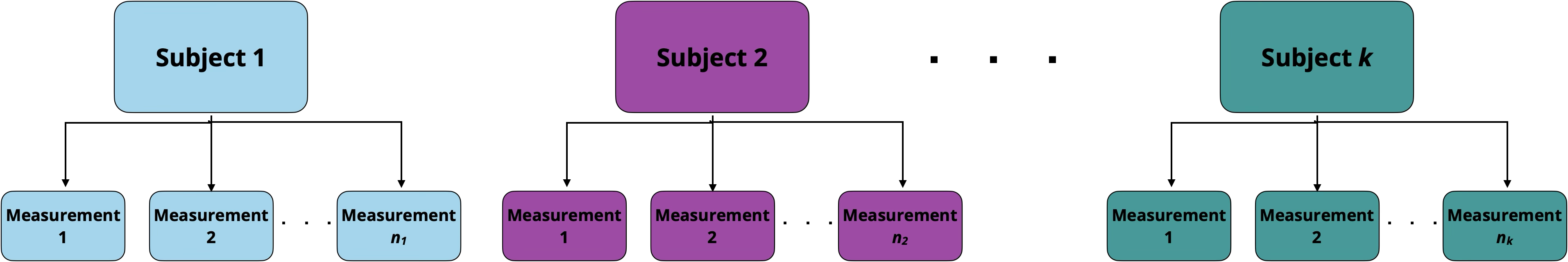
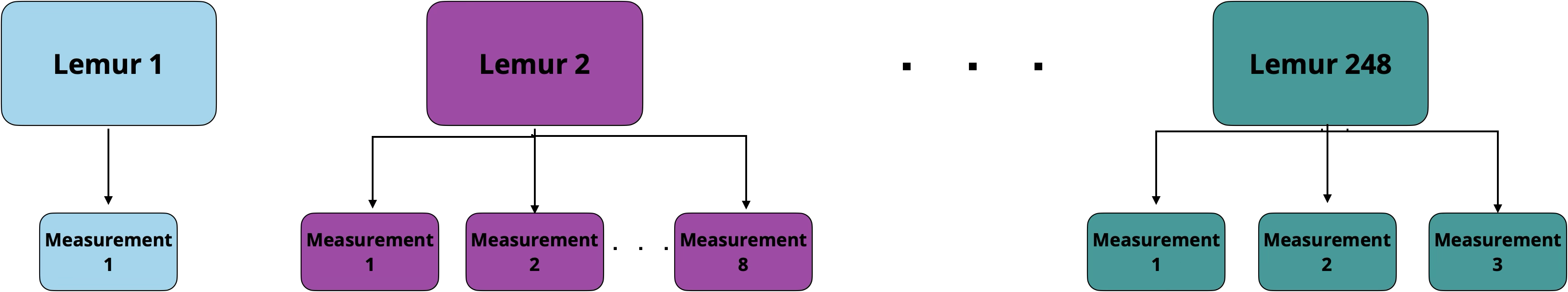
1 roc_auc macro_weighted 0.627One of the key assumptions we’ve made throughout this book is that the observations in the sample data are independent of each other. Often in practice, however, there is an underlying grouping structure in the data, and the observations are not completely independent of one another. For example, the data may contain multiple measurements from each individual (call repeated measures) as in Figure 13.5.
Another common grouping structure is having multiple observations from within a single group, such that we expect the observations within the group to be more similar than observations from different groups, as in Figure 13.6.
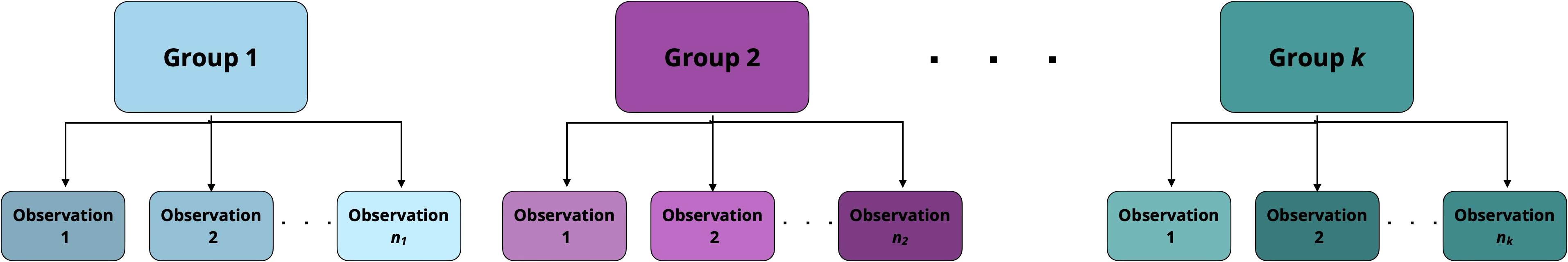
Data that contain a grouping structure are called multilevel data. The individual observations are at the first level of the data, and the groups are at the second level. We use generalized linear mixed models (GLMM), also called multilevel models or hierarchical models, to account for the grouping structure when we fit the model and conduct statistical inference. There are many types of generalized linear mixed models; in fact, there are often entire undergraduate-level courses dedicated to these models. In this section, we will introduce one of the most widely used GLMMs in practice, the random intercepts model.
In Chapter 7, we introduced a data set containing the weight, age, and other characteristics of lemurs living at the Duke Lemur Center. The data used in that chapter contained observations from a single weigh-in for each lemur between 0 and 24 months old. The lemurs were, in fact, weighed regularly, so the original data from Community (2024) includes multiple measures for each lemur. The data in this section includes all the measurements for each lemur when they were 1 to 24 months old.
The data are in lemurs-repeated-measures.csv. We will use the following variables:
weight: Weight of the lemur (in grams)taxon : Code made as a combination of the lemur’s genus and species. Note that the genus is a broader categorization that includes lemurs from multiple species. This analysis focuses on the following taxon:
ERUF: Eulemur rufus, commonly known as Red-fronted brown lemur
PCOQ: Propithecus coquereli, commonly known as Coquerel’s sifaka
VRUB: Varecia rubra, commonly known as Red ruffed lemur
sex : Sex of lemur (M: Male, F: Female)age: Age of lemur when weight was recorded (in months)litter_size: Total number of infants in the litter the lemur was born into (this includes the observed lemur)See Community (2024) for the full codebook.
The goal of the analysis is to understand a lemur’s growth rate (relationship between age and weight) after adjusting for other characteristics.
The lemurs data set is an example of repeated measures, where the data are grouped by lemur as shown in Figure 13.7. These data violate the independence assumption of linear regression models (Section 8.5) and logistic regression models (Section 11.6), because we expected observations from a single lemur to be correlated with one another. Some factors (e.g., taxon ) will remain constant for all observations from an individual lemur. Table 13.4 shows the data for an individual lemur.
| dlc_id | name | taxon | sex | litter_size | age | weight |
|---|---|---|---|---|---|---|
| 6492 | MIRFAK | VRUB | M | 2 | 1.32 | 590 |
| 6492 | MIRFAK | VRUB | M | 2 | 8.22 | 2560 |
| 6492 | MIRFAK | VRUB | M | 2 | 10.06 | 2610 |
| 6492 | MIRFAK | VRUB | M | 2 | 12.79 | 2800 |
| 6492 | MIRFAK | VRUB | M | 2 | 14.63 | 3160 |
| 6492 | MIRFAK | VRUB | M | 2 | 16.47 | 3020 |
| 6492 | MIRFAK | VRUB | M | 2 | 18.84 | 3340 |
In this data, the lemur’s dlc_id, name, sex, taxon, and litter_size remain the same for its observations. These variables are at level two of the data, i.e., they differ between lemurs but are the same for all observations from an individual lemur. The age and weight are different across observations. These are variables at level one, because they change each time data are collected.
The data set contains seven observations for the lemur Mirfak in Table 13.4 , but there are not necessarily seven observations for every lemur in the data. The number of observations for each lemur range from as few as 1 to as many as 120. The GLMMs can account for the different number of observations from each individual. When we fit the model, lemurs with more observations will be weighted more heavily when estimating the coefficients.
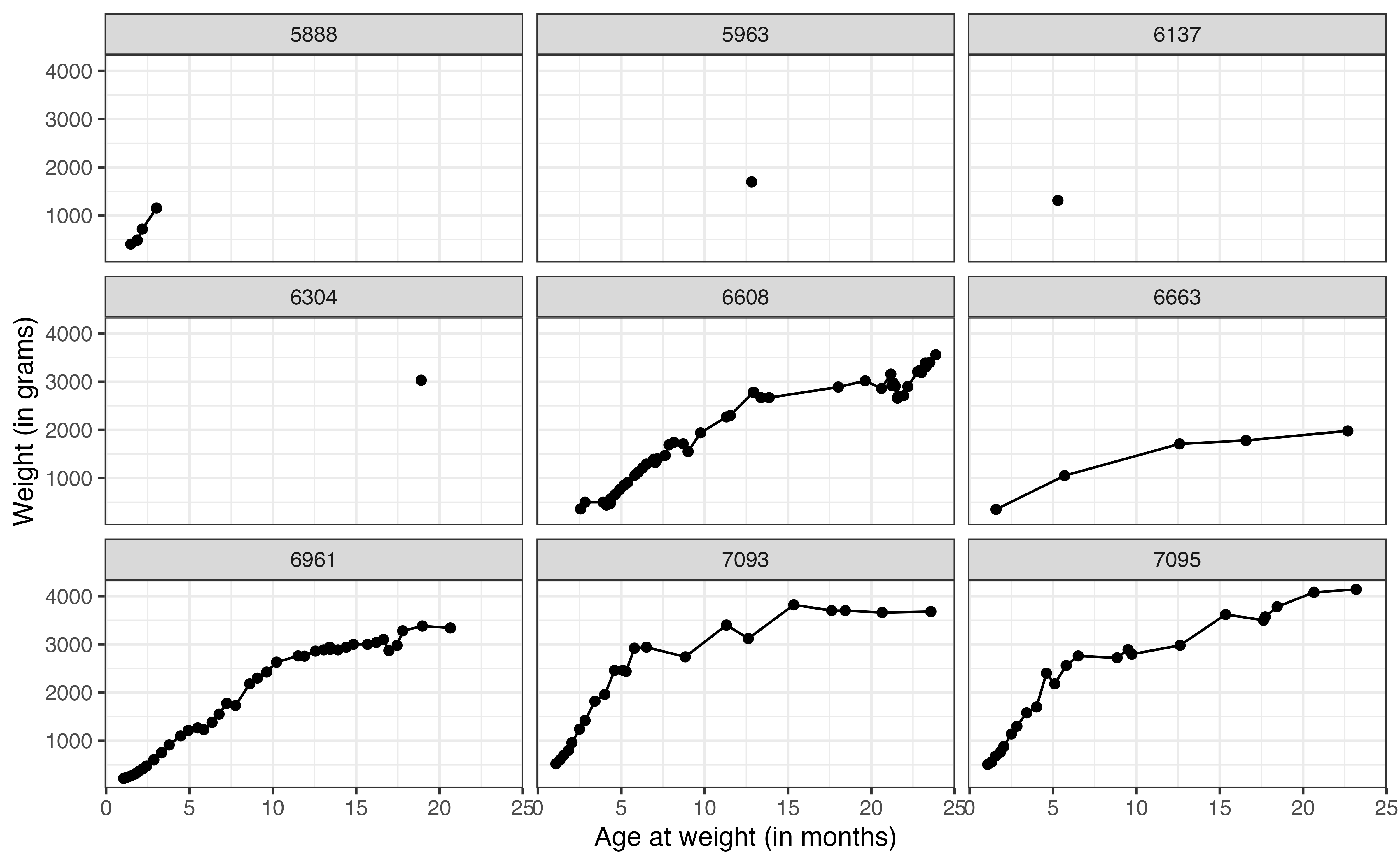
weight versus age for nine lemurs
Now let’s take a look at the relationship between weight and age for the lemurs in the data. Figure 13.8 shows the relationship between these variables for a sample of nine lemurs. The figure illustrates how the number of observations differ for each lemur. We can also begin to see how the weight changes with age for the lemurs. The visualizations of these 9 lemurs give us an idea of the variation in the data, but we would like to visualize the relationship for all the lemurs in the data. To do so, we use a spaghetti plot, shown in Figure 13.9.
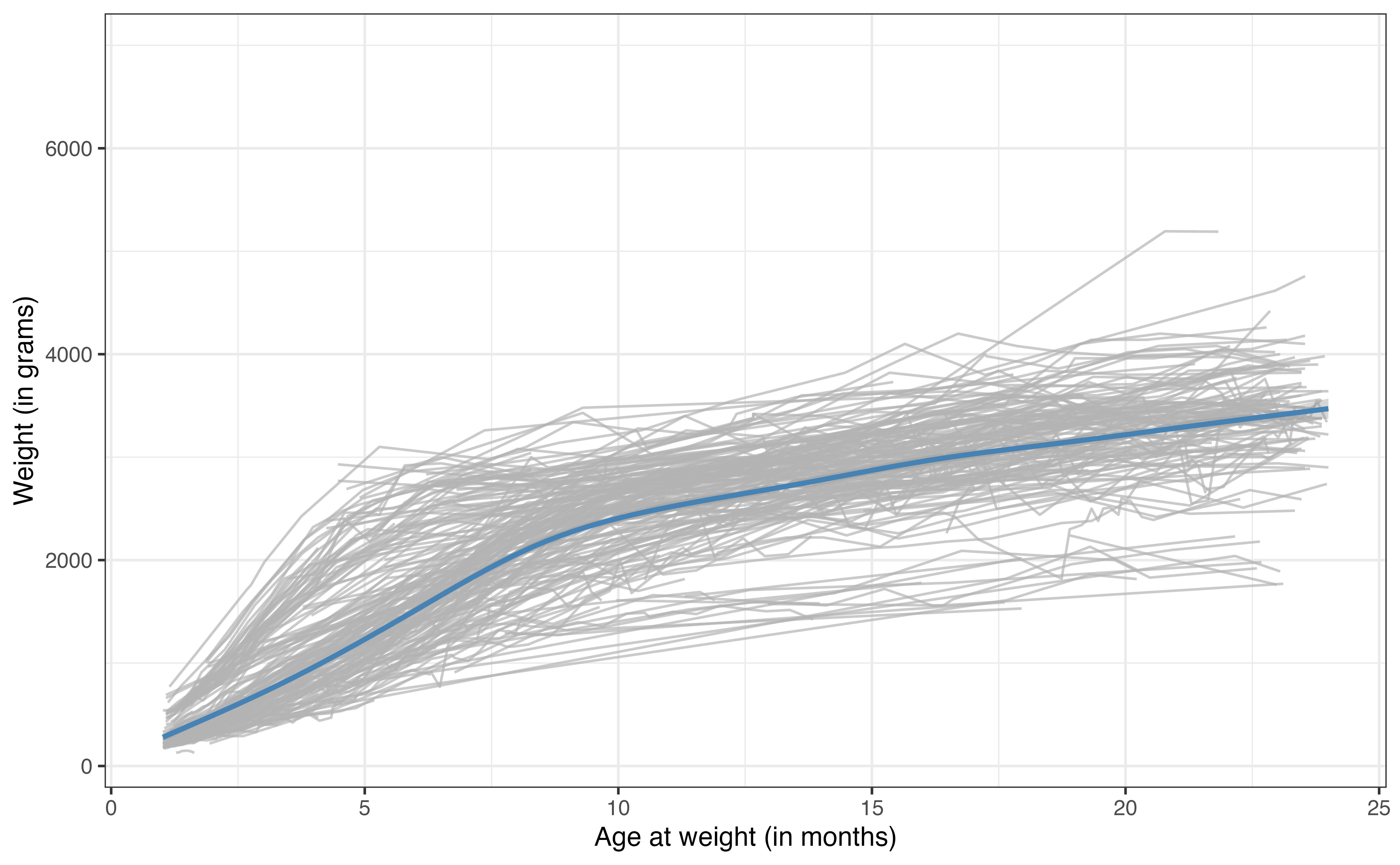
The gray lines in Figure 13.9 are the relationships between age and weight for each of the 248 lemurs in the data set. The blue line is the average trajectory across all the lemurs. From this plot, we more easily see the difference in the growth rate for the lemurs by the different slopes of the relationship between age and weight. We can also see the general differences in weight across the lemurs at each age.
The linear regression (and logistic regression) models we’ve seen thus have a single intercept for all observations. In other words, if we fit a model using age to predict weight, there would be a single intercept for the expected weight for new born lemurs. From Figure 13.9, we see that the lemurs are generally different weights (even lemurs with the same age and taxon), so a single intercept may not best represent the trend in the data We will use a random intercepts model to account for this additional variability.3
GLMMs differ from the GLMs we’ve studied thus far, because they include both fixed and random effects. The fixed effects are the variables we are interested in studying or explicitly adjusting for in the model. These are the variables for which we want to obtain an estimated coefficient. In the lemurs analysis, the fixed effects are age, taxon, sex, and litter_size. The random effects are those we don’t want to estimate explicitly but whose variability we want to understand. These are generally defined by the grouping variable in the data. In this analysis, the random effect is the individual lemur, captured by the variable dlc_id.
The random intercepts model includes fixed and random effects, such that the random effects account for random variability in the intercept. The general form of the model is
Let \(\text{weight}_{ij}\) be the weight in the \(j^{th}\) observation for lemur \(i\). Then, the random intercepts model for the lemurs analysis is
\[ \begin{aligned} \text{weight}_{ij} = \beta_0 &+ \beta_1 ~ \text{taxonPCOQ}_{i} + \beta_2 ~ \text{taxonVRUB}_i \\ & +\beta_3 ~ \text{sexM}_{i} + \beta_4 ~ \text{litter\_size}_{i} + \beta_5 ~ \text{age}_{ij}\\ & + u_i + \epsilon_{ij} \\ &u_i \sim N(0, \sigma^2_{u}) \hspace{5mm} \epsilon_{ij} \sim N(0, \sigma^2_{\epsilon}) \end{aligned} \tag{13.4}\]
Let’s break down the components of Equation 13.4. The subscript indicate whether the variable is at the first or second level of the data. The variable age is the only predictor in the second level that changes for each observation, so the subscript indicates that we plug in the age for lemur \(i\) at the \(j^{th}\) observation. The other predictors are measured at the second level of the data, so the subscript \(i\) indicates that we plug in the same value for lemur \(i\) across all its observations. The term \(\beta_0\) is the global intercept. It is the expected (mean) weight across all lemurs when all predictors are equal to 0.
The error term \(\epsilon_{ij}\) is like the error term previously introduced for linear models. It is the difference between the observed and expected value of the weight for the \(j^{th}\) observation from lemur \(i\). As in linear regression, these error terms follow a normal distribution with mean of 0 and variance of \(\sigma^2_{\epsilon}\). This \(\sigma^2_{\epsilon}\) is a measure of the variability in the weights (response variable) within an individual lemur (group).
The term \(u_{i}\) is the random effect that makes this the “random intercepts model”. We don’t estimate \(u_i\) directly, but its distribution tells us about the variability in the average weights between lemurs. The \(u_{i}\) are normally distributed with a mean of 0 and variance of \(\sigma^2_{u}\). This \(\sigma^2_{u}\) is the measure of between lemur variability. From this model, the intercept of an individual lemur \(i\) is \(\beta_0 + u_i\) where, \(u_i\) is drawn from \(N(0,\sigma^2_{u})\).
The coefficients \(\beta_0, \beta_1, \ldots, \beta_5\) and the variance components \(\sigma_u\) and \(\sigma_{\epsilon}\) are estimated using maximum likelihood estimation. The output for the lemurs random intercepts model is in Table 13.5.
| effect | group | term | estimate | std.error | statistic |
|---|---|---|---|---|---|
| fixed | (Intercept) | 16.0 | 79.07 | 0.202 | |
| fixed | taxonPCOQ | 449.9 | 67.12 | 6.703 | |
| fixed | taxonVRUB | 1021.4 | 94.48 | 10.811 | |
| fixed | sexM | -27.1 | 45.22 | -0.599 | |
| fixed | litter_size | -66.8 | 45.14 | -1.479 | |
| fixed | age | 147.7 | 0.97 | 152.338 | |
| ran_pars | dlc_id | sd__(Intercept) | 311.5 | ||
| ran_pars | Residual | sd__Observation | 356.3 |
The equation of the fitted model is
\[ \begin{aligned} \widehat{\text{weight}}_{ij} = 15.969 &+ 449.932 ~ \text{taxonPOQ} + 1021.387 ~ \text{taxonVRUB} \\ & -27.073 ~ \text{sexM} - 66.771 ~ \text{litter\_size} + 147.719 ~ \text{age} \\ &\hat{\sigma}_u = 311.504 \hspace{5mm} \hat{\sigma}_\epsilon = 356.275 \end{aligned} \]
Use the model in Table 13.5.
Interpret the coefficient of age in the context of the data.
Explain what \(\hat{\sigma}_u = 311.504\) means in the context of the data.4
Random intercepts models are fit using the lmer function in the lme4 R package (Bates et al. 2015). The syntax for the response and predictor variables is the same as in lm(). The grouping variable is specified using the syntax (1|grouping_var). This specifies that the random intercepts are based on grouping_var. The syntax for the model in Table 13.5 is below.
lemurs_fit <- lmer(weight ~ taxon + sex + litter_size + age +
                     (1|dlc_id),
                   data = lemurs)

lemurs_fit
Linear mixed model fit by REML ['lmerMod']
Formula: weight ~ taxon + sex + litter_size + age + (1 | dlc_id)
Data: lemurs
REML criterion at convergence: 54636
Random effects:
Groups Name Std.Dev.
dlc_id (Intercept) 312
Residual 356
Number of obs: 3715, groups: dlc_id, 248
Fixed Effects:
(Intercept) taxonPCOQ taxonVRUB sexM litter_size age
16.0 449.9 1021.4 -27.1 -66.8 147.7 The results can be displayed in a tidy format using tidy function in the broom.mixed R package (Bolker and Robinson 2024). The results below are neatly displayed using kable().
tidy(lemurs_fit) |>
kable()| effect | group | term | estimate | std.error | statistic |
|---|---|---|---|---|---|
| fixed | (Intercept) | 16.0 | 79.07 | 0.202 | |
| fixed | taxonPCOQ | 449.9 | 67.12 | 6.703 | |
| fixed | taxonVRUB | 1021.4 | 94.48 | 10.811 | |
| fixed | sexM | -27.1 | 45.22 | -0.599 | |
| fixed | litter_size | -66.8 | 45.14 | -1.479 | |
| fixed | age | 147.7 | 0.97 | 152.338 | |
| ran_pars | dlc_id | sd__(Intercept) | 311.5 | ||
| ran_pars | Residual | sd__Observation | 356.3 |
We have just scratched the surface in this section, but there are many resources for readers interested in learning more about random intercepts models and other types of GLMMs. See Beyond Multiple Linear Regression (Roback and Legler 2021) and Data Analysis Using Regression and Multilevel/Hierarchical Models (Gelman and Hill 2007) for an in-depth introduction to these topics.
The models presented in this book thus far have been parametric methods, in which we specify a form of the model then estimate the parameters of that model (Section 1.1.1). An alternative to this approach are tree-based models, a set of non-parametric methods that split the data based on a series of decision points. These methods are particularly useful if a precise interpretation of the relationship between the response and predictor variables is not needed, but rather a general understanding how to use the predictors to estimate the response is sufficient.
In the book Introduction to Statistical Learning 2nd edition, James et al. (2021) [pp. 339] lists advantages of tree-based models compared to GLMs.
- They are easier for others to understand;
- They are believed to better mirror the human decision-making process;
- They can more easily represented visually, making it easier for non-experts to understand them;
- They can use categorical predictors without creating indicator variables.
This list could be summarized as “The key advantage to tree-based models is that they are easy for others, especially non-experts, to understand.” Here we introduce two tree-based models: regression trees for quantitative response variables and classification trees for categorical response variables.
Regression trees are decision trees to model data with quantitative response variables, so they are often an alternative to linear regression. The general idea is to use the predictor variables to split the data into groups of similar observations. For each observation, the predicted value of the response is computed as the mean response among the observations in its group. To illustrate this, let’s go back to the total expenditure on basketball programs for Division I NCAA institutions introduced in Chapter 9. We will use a regression tree to predict expenditure_m (total expenditure in millions of dollars) using type (private or public institution), region (North Central, Northeast, South, West), and enrollment_th (total student enrollment in thousands).
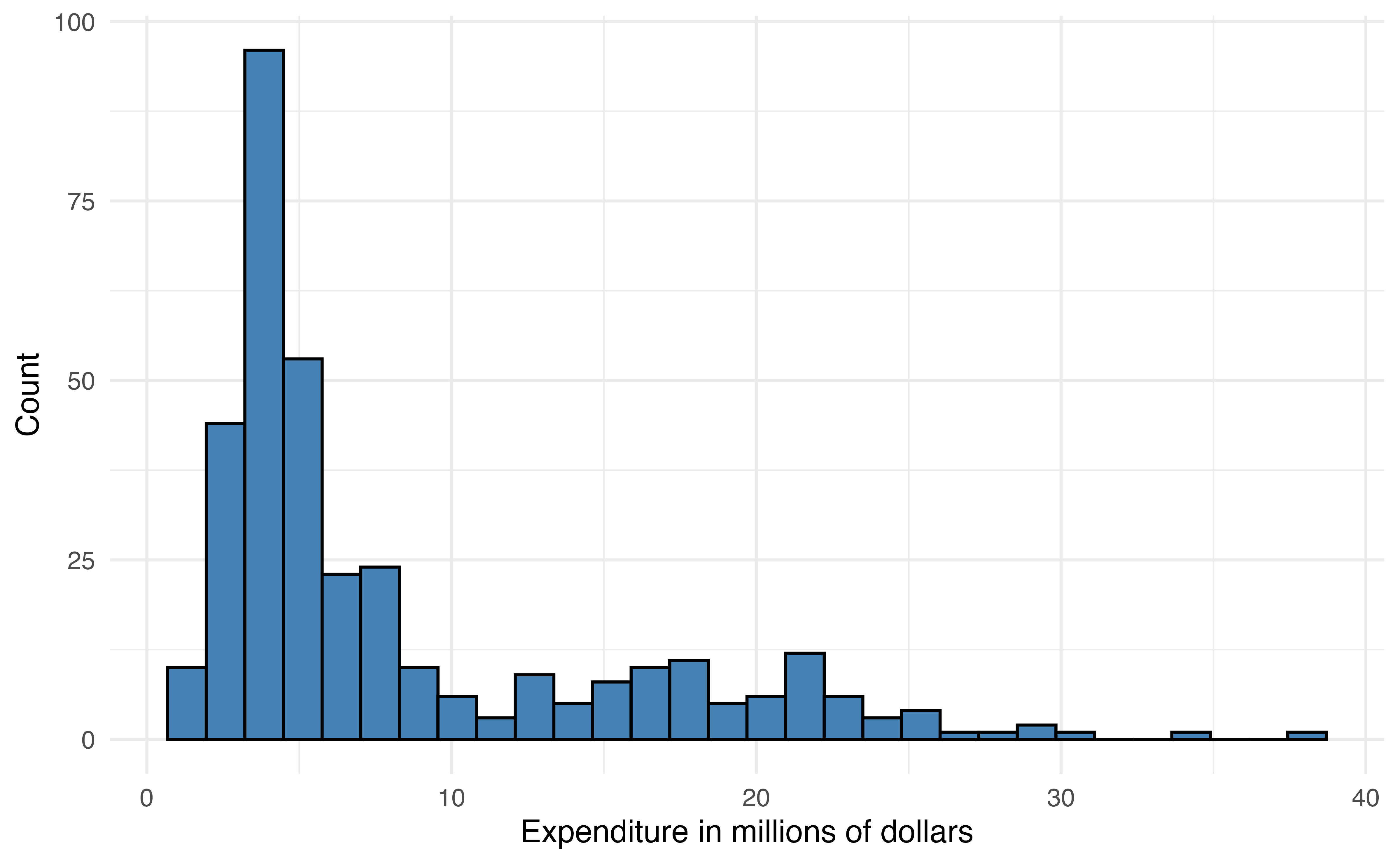
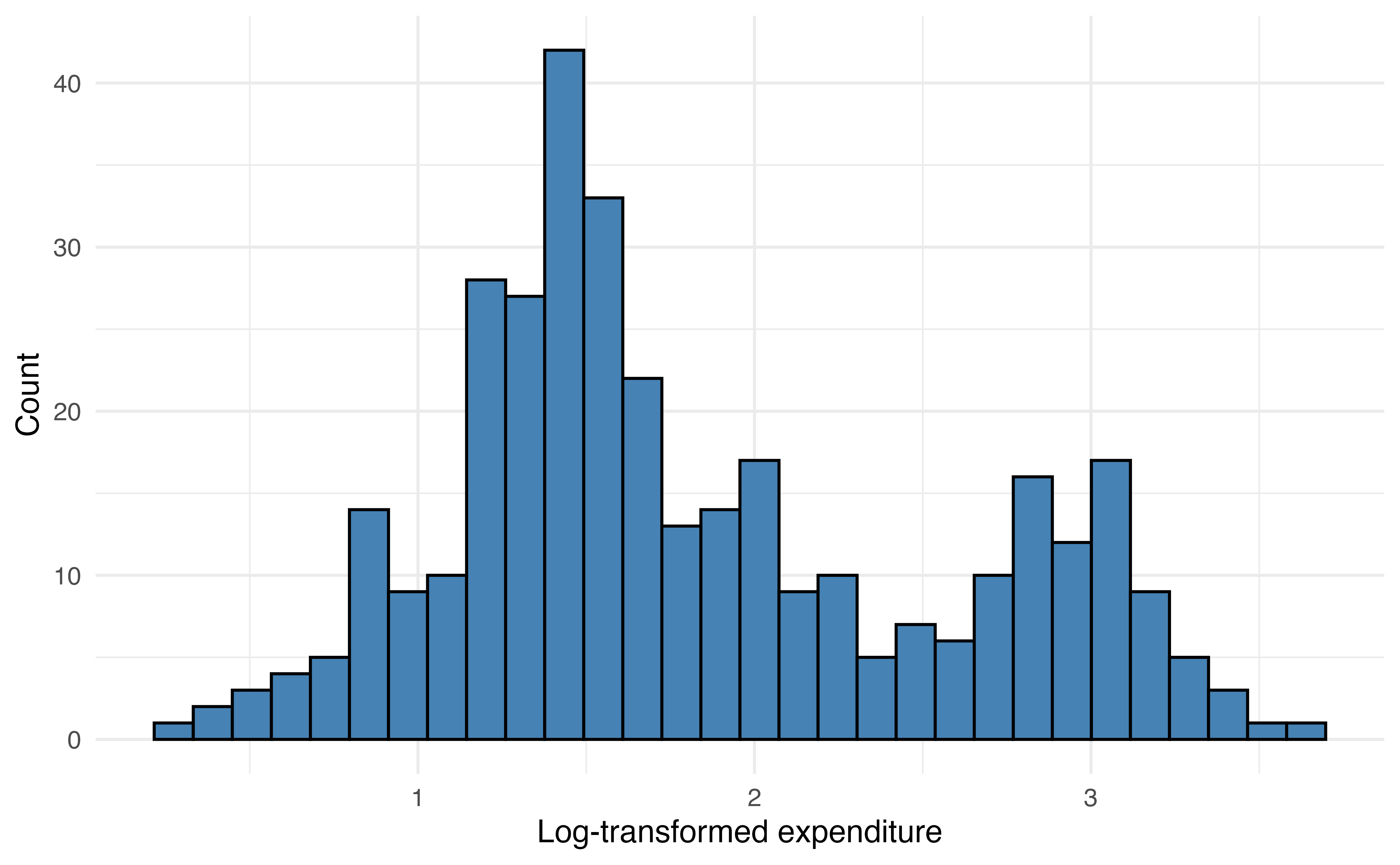
expenditure_m
expenditure_m
expenditure_m
The distribution of expenditure_m is heavily right-skewed Figure 13.10 (a), so we will use the log-transformed variable log(expenditure_m) in the model Figure 13.10 (b).
When the response variable is strongly skewed, it is good practice to use the transformed version in the regression tree. Though regression trees do not rely on the same assumptions as linear regression, their results can be strongly influenced by extreme observations when the distribution of the response variable is heavily skewed. Predictor variables do not need to be transformed for regression trees, because the tree does not depend on a linear relationship between the response and predictor variables.
A regression tree is made up of a series of nodes (also called leaves) and branches. The nodes are the decision-making points at each split (e.g., enrollment_th < 10?). The branches connect two nodes (e.g, enrollment_th < 10 = TRUE and enrollment_th < 10 = FALSE). The terminal nodes are the points at the end of the tree where the data are no longer split and the predictions are made. The prediction is the mean value of the response variable for the observations in that node.
At each step, the model searches to find the variable and associated cut point that minimizes the sum of squares residual (SSR) in Equation 13.5. This is the same SSR introduced in Section 4.7.2. Minimizing SSR maximizes the similarity of observations within a node. This process continues until making a new split no longer minimizes the SSR.
\[ SSR = \sum_{i = 1}^n(y_i - \hat{y}_i)^2 \tag{13.5}\]
Now let’s fit the regression tree to predict expenditure_m using enrollment_th, region, and type. Because the primary objective for the tree is prediction, we split the data into training (80%) and testing (20%) sets (Section 10.4). This will give us an assessment on how well the model performs on new data.
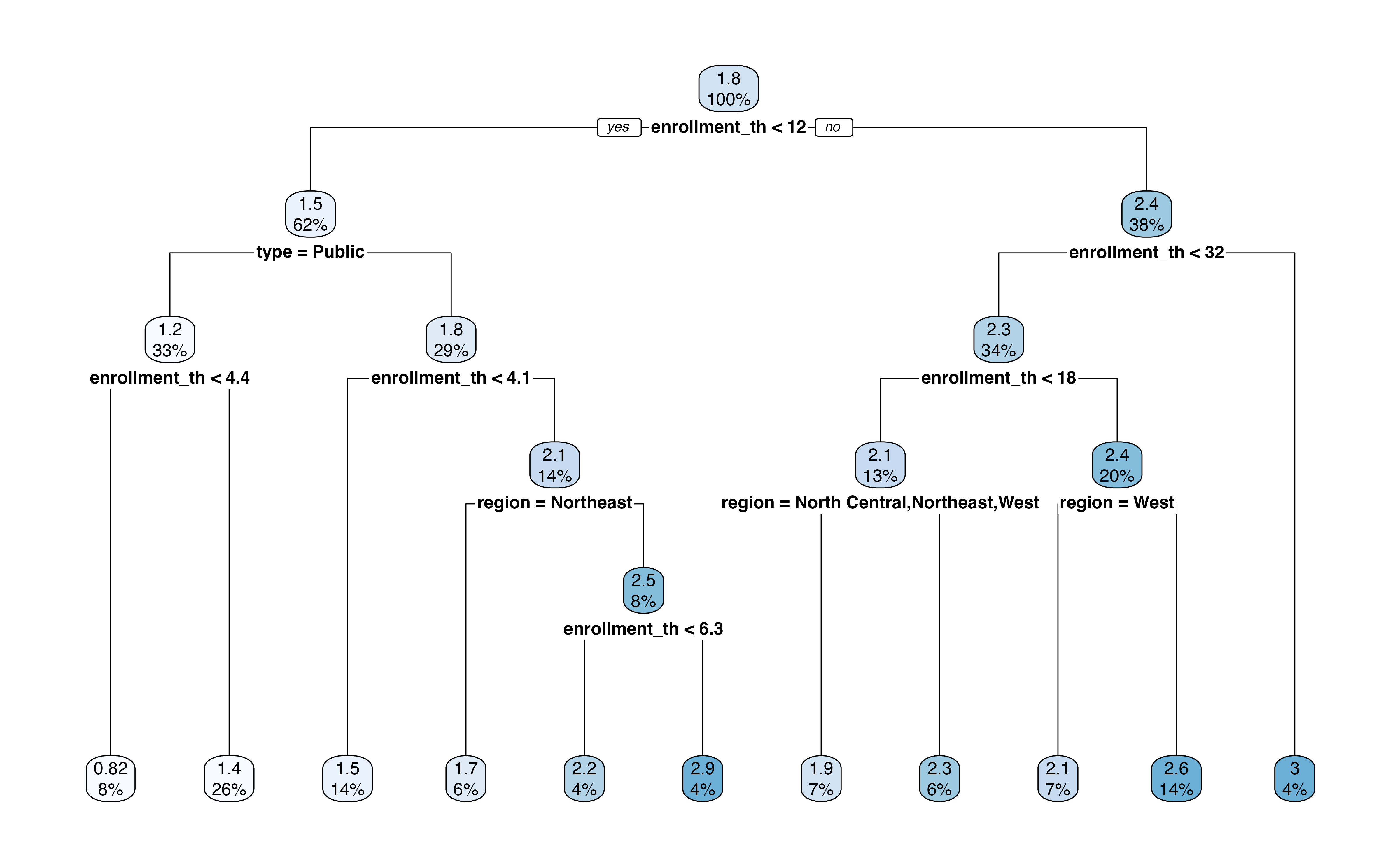
Figure 13.11 is the output of the regression tree. In this output, we see the variables and associated cutpoint used to make the split at each step, along with the percentage of observations in each subsequent node. This output also shows the predicted expenditure_m in each node.
For example, the first split is whether enrollment_th < 12. About 62% of the observations in the training data have enrollment_th < 12, and the mean log(expenditure) for those observations is 1.5 million. In contrast, about 38% of the observations have enrollment_th >= 12, and the mean log(expenditure) for those observations is about 2.4 million. If we were to stop there, then 1.5 million would be the predicted log(expenditure) for all observations with enrollment < 12 and 2.4 million would be the predicted log(expenditure) for all other observations.
Let’s use the tree to find the predicted expenditure for a private institution in the South region that has enrollment of 6,000 students. At the first step, we go down the “Yes” branch for enrollment_th < 12. Next, we go down the “No” branch for type = Public. Next, we go down the “No” branch for enrollment_th < 4.1. Next, we go down the branch, “No” for region = Northeast. Lastly, we go down the “Yes” branch for enrollment_th < 6.3. This branch leads to the terminal node of \(\widehat{\log(\text{expenditure\_m})} = 2.2\), which is equal to a predicted expenditure of 9.025 (\(e^{2.2}\)) million dollars.
What is the predicted expenditure for a public institution in the West region with enrollment of 20,000 students.5
We evaluate the model’s performance using the testing data. We compute the predicted expenditures for the observations in the testing data the root mean square error (RSME), introduced in Section 4.7, as a measure of the model performance.
The RMSE for the testing data is 0.506. This is the terms of the response variable, log(expenditure_m), so the error in terms of the original variable is 1.659. This means that the average difference between the observed expenditure and predicted is 1.659 million dollars.
Classification trees are decision trees for predicting categorical outcomes. We might use such a tree as an alternative to logistic regression Chapter 11 or multinomial logistic regression Section 13.1. They are very similar to regression trees with two primary differences. The first is that predictions in the terminal nodes are the predicted classes. The second is that the potential variables and associated cutoffs to define each split are evaluated using different criteria. The default in most software is the Gini Index shown in Equation 13.6
\[ \text{Gini index} = 1 - \sum_{k = 1}^K p_{mk}^2 \tag{13.6}\]
where \(p_{mk}\) is the proportion of observations in the \(m^{th}\) node that belong to class \(k\). Similar to RSS, the model selects the variable and cutoff that minimizes the Gini index at each step. Low values of the Gini index indicate a large proportion of observations in a given node are from the same class.
Let’s go back to the voter frequency data introduced in Section 13.1.1. We’ll use a classification tree to predict the voter_category (rarely/never, sporadic, always) using age, party_id, and an additional variable income_cat. We split the data into training (80%) and testing sets (20%), so we can evaluate the model’s performance on new data.
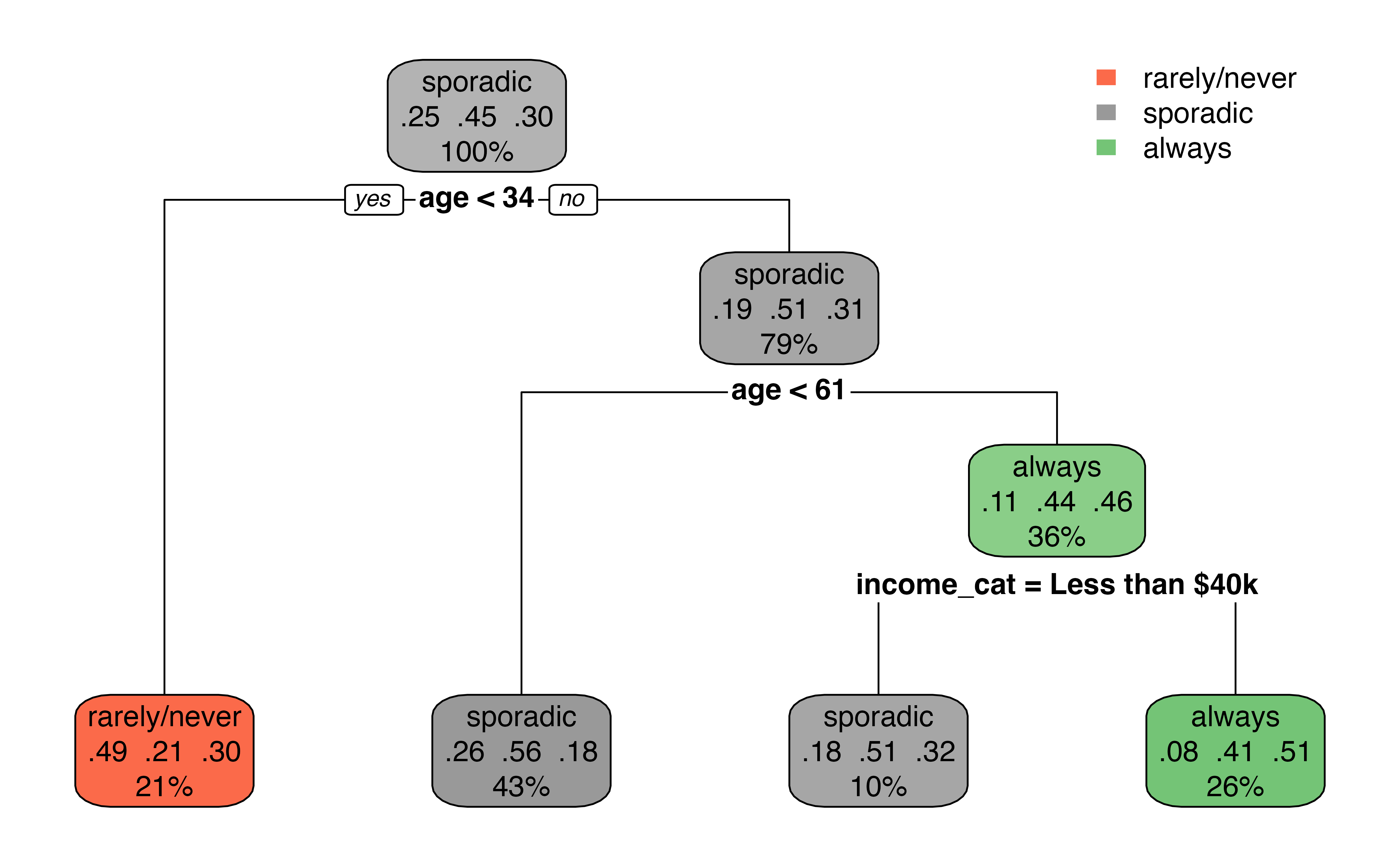
Figure 13.12 is the output from the classification tree. Something that may stand out is that the predictor party_id is not used in the tree. This means there was never a point where using party_id was more useful in classifying observations compared to the other predictors.
The first split in Figure 13.12 is at age < 34. About 21% of the observations have age < 34, and this group leads to a terminal node. Among those with age < 34, 34% of them are classified as rarely/never, 21% are classified as sporadic, and 30% are classified as always in the data. Therefore, if age < 34, the predicted class is rarely/never based on the classification tree. There is a bit more work among those with age >= 34. The next split is age < 61. If age < 61, then there is a terminal node with the predicted class sporadic. Otherwise, income_cat is taken into account, with a split at income_cat = Less than $40k. If yes, then the predicted class is sporadic; if no, the predicted class is always.
Based on Figure 13.12, what is the predicted voting frequency for an a 40 year old individual whose party affiliation is Democrat and annual income is $70,000?6
We fit decision trees using the rpart() function in the rpart R package (Therneau and Atkinson 2025). The argument method = is used to specify the type of decision tree.
Below is the code for the regression tree fit in Section 13.3.1. The argument method = "anova" specifies that we are fitting a regression tree. If we type the name of the tree, we see a summary of the nodes and branches
ncaa_tree <- rpart(log(expenditure_m) ~ enrollment_th +
                     type + region,
                   data = ncaa_train,
                   method = "anova")

ncaa_tree
n= 284
node), split, n, deviance, yval
* denotes terminal node
1) root 284 165.00 1.840
2) enrollment_th< 11.7 176 65.20 1.510
4) type=Public 95 15.90 1.240
8) enrollment_th< 4.35 22 2.32 0.821 *
9) enrollment_th>=4.35 73 8.64 1.360 *
5) type=Private 81 34.30 1.820
10) enrollment_th< 4.06 40 5.41 1.500 *
11) enrollment_th>=4.06 41 20.70 2.140
22) region=Northeast 18 5.53 1.650 *
23) region=North Central,South,West 23 7.60 2.520
46) enrollment_th< 6.32 12 2.62 2.180 *
47) enrollment_th>=6.32 11 2.13 2.880 *
3) enrollment_th>=11.7 108 49.30 2.370
6) enrollment_th< 31.5 96 42.70 2.290
12) enrollment_th< 18.1 38 15.10 2.080
24) region=North Central,Northeast,West 20 4.98 1.880 *
25) region=South 18 8.42 2.300 *
13) enrollment_th>=18.1 58 24.70 2.440
26) region=West 19 7.67 2.090 *
27) region=North Central,Northeast,South 39 13.60 2.610 *
7) enrollment_th>=31.5 12 1.09 3.010 *The code below is the classification tree from Section 13.3.2. We use the argument method = "class" to specify the classification tree. Similar to regression trees, we can type the name of the tree to see a summary of the nodes and branches.
voters_tree <- rpart(voter_category ~ age + party_id +
                       income_cat + educ,
                   data = voters_train,
                   method = "class")

voters_tree
n= 4668
node), split, n, loss, yval, (yprob)
* denotes terminal node
1) root 4668 2590 sporadic (0.2509 0.4460 0.3031)
2) age< 33.5 973 495 rarely/never (0.4913 0.2127 0.2960) *
3) age>=33.5 3695 1820 sporadic (0.1876 0.5074 0.3050)
6) age< 60.5 2017 879 sporadic (0.2558 0.5642 0.1800) *
7) age>=60.5 1678 914 always (0.1055 0.4392 0.4553)
14) income_cat=Less than $40k 452 223 sporadic (0.1770 0.5066 0.3164) *
15) income_cat=$125k or more,$40-75k,$75-125k 1226 605 always (0.0791 0.4144 0.5065) *The summaries produced by rpart() are challenging to read, so we use the rpart.plot() from the rpart.plot R package (Milborrow 2025) to create a visual representation of the tree. The code below produces the visualization of the regression tree for NCAA basketball expenditures.
rpart.plot(ncaa_tree)
Predictions are produced using predict(). This will produce a vector of predictions that can be added to the original data frame to evaluate model performance.
The code below produces the predictions for the testing data from the regression tree predicting NCAA basketball expenditures and saves the predictions as a column in the testing data. The same code is used to produce predictions from the classification tree.
ncaa_test <- ncaa_test |>
  mutate(predict_expend = predict(ncaa_tree, ncaa_test))
The predictions are in the same units as the response variable, so in this case, the predicted values are the predicted log(expenditure_m).
Overall, decision trees can be a nice alternative to linear and logistic regression. Their greatest advantage is that they can be easily represented visually and thus easier for non-experts to understand. The two greatest disadvantages to these models, however, are the inferior predictive accuracy compared to other modeling approaches and their sensitivity to small changes in the data (James et al. 2021, 340). In this section, we introduced decision trees, but there is extensive work in tuning (customizing) these models along with more advanced models that take into account multiple trees (e.g., random forest). We refer the reader to Chapter 8 James et al. (2021) for an in-depth discussion on the tree-based models.
Throughout this text, we have interpreted the coefficients of regression models to describe the association between the response and predictor variables and the “expected” change in the response variable based on the model. In other words, we have been bound by the common phrase in statistics “correlation does not equal causation.” There are many situations in practice, however, in which we want to make a stronger claim and conclude that “X causes Y.” For example, medical researchers developing a new treatment want to know if the treatment causes improved health outcomes. In social sciences, researchers may want to know if a particular social program improves outcomes for individuals living in poverty. Economists want to know the impact of changing economic measures, such as interest rates, on the economy overall. Each of these scenarios requires an analysis that can more thoroughly account for confounding variables, underlying variables that impact both the response and predictor variables, so that the impact of the medical treatment, social program, or economic measure can be quantified. We will refer to all of these as treatment or intervention throughout the rest of the section.
The ability to make causal claims start with the data. There are two types of data: experimental and observational data. Experimental data are data obtained from a randomized-control experiment in which individuals were randomly assigned to the treatment group that receives the intervention or control group that does not receive the intervention. Because individuals are randomly assigned groups, we can assume the only difference between the treatment and control groups is the intervention itself. Therefore, as we interpret the model coefficients associated with the treatment, we can interpret it in terms of how a change in the treatment causes in a change in the response.
The ideal randomized experiment is often not feasible in practice due to a variety of factors. For example, it may be unethical to assign individuals to a control group and withhold beneficial treatment, or it is not feasible to restrict the behavior of individuals to implement experimental conditions. Therefore, researchers often rely on observational data, even when they want to draw conclusions stronger than a “correlation” or “association” between some treatment or intervention (predictor) and an outcome (response). To make such causal claims, we use statistical methods to make the observational data “look” more like data from a randomized experiment. These methods make up the branch of statistics called causal inference.
In propensity score matching, we compute the probability (propensity) an observation is assigned to the treatment group based on a set of confounding variables that directly impact both the response and the likelihood an individual is in the treatment group. We then match individuals in the treatment and control groups who have the same or similar propensities to create a new data set in which the control and treatment groups have similar characteristics. The matched data set is used to estimate the effect of the treatment.
Let’s apply propensity score matching to evaluate the effect of an educational program, Project ACE: Action for Equity. Project ACE was a “five year interdisciplinary program aimed to get more underrepresented high school students from disadvantaged backgrounds to get interested in college degrees in engineering as well as biomedical and behavioral sciences” (Texas at El Paso College of Liberal Arts n.d.). We will analyze data from Evans, Perez, and Morera (2025) who use propensity score matching to analyze outcomes of high school students. The data are available in project-ace-data.csv. We will follow their analysis closely with some modifications, so we refer readers to their article for the full analysis.
We will use the variables below. The definitions are adapted from Evans, Perez, and Morera (2025).
Grade: Grade level (9, 10, 11, 12)Gender: Gender (F, M)Ethnicity: Ethnicity (Hispanic, Non-Hispanic)ELL: Whether student is an English language learner (N, Y)Sped: Whether student is in a special education program (N, Y)Homeless: Whether student is homeless (N, Y)Tracking.Pathway: Whether student was in Project ACE (Treatment) or not (Control)Current.GPA: Grade Point Average (GPA) ranging 0 to 5.0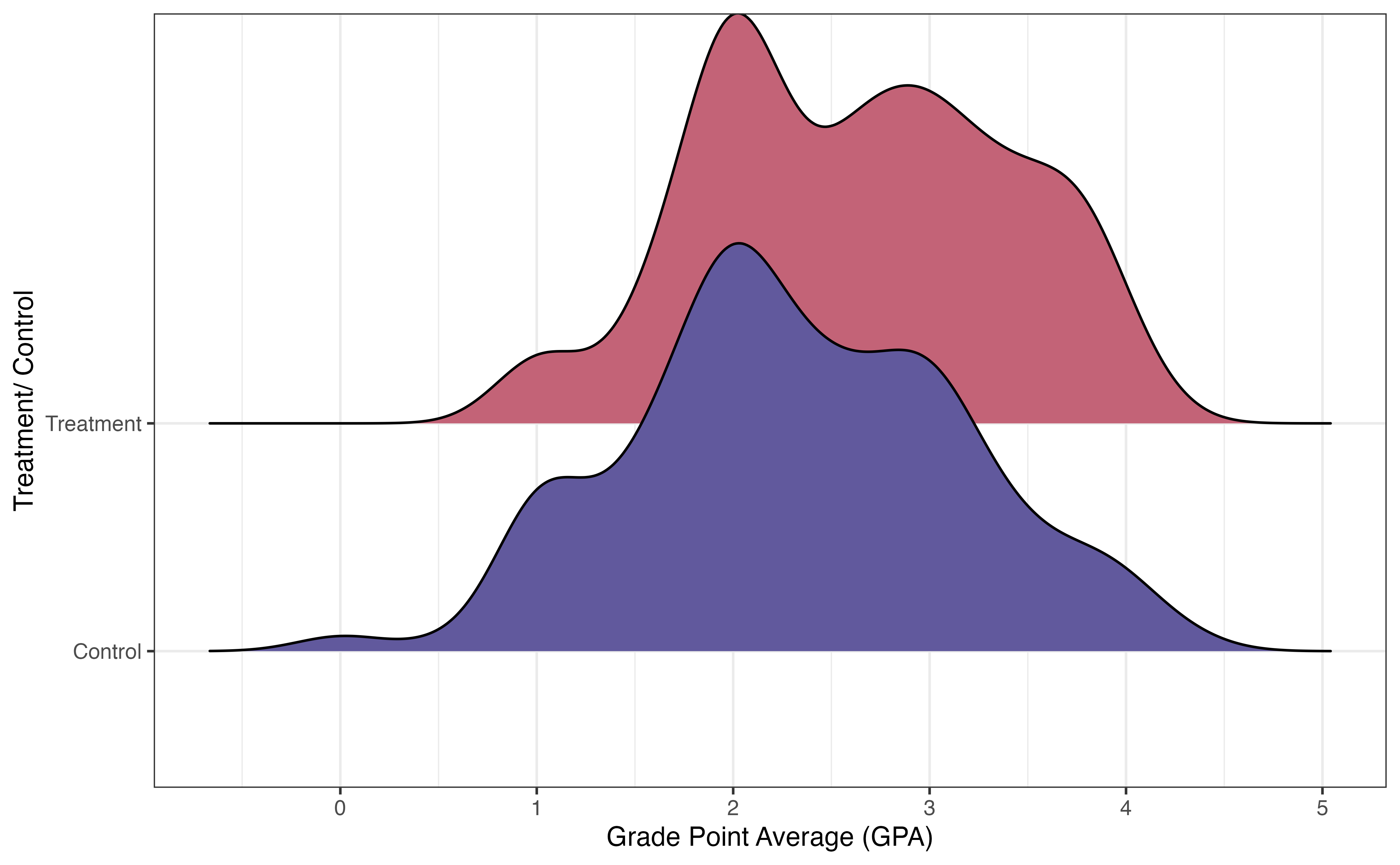
Figure 13.13 shows the distribution of the response variable Current.GPA for the treatment and control groups. There is a lot of overlap in the distributions, but there does appear to be a higher proportion of students in the treatment group who have higher GPAs. The goal of this analysis is to measure if there is a difference in the GPAs between students in Project ACE versus those not in the program, and if so, the effect of the Project ACE on GPA.
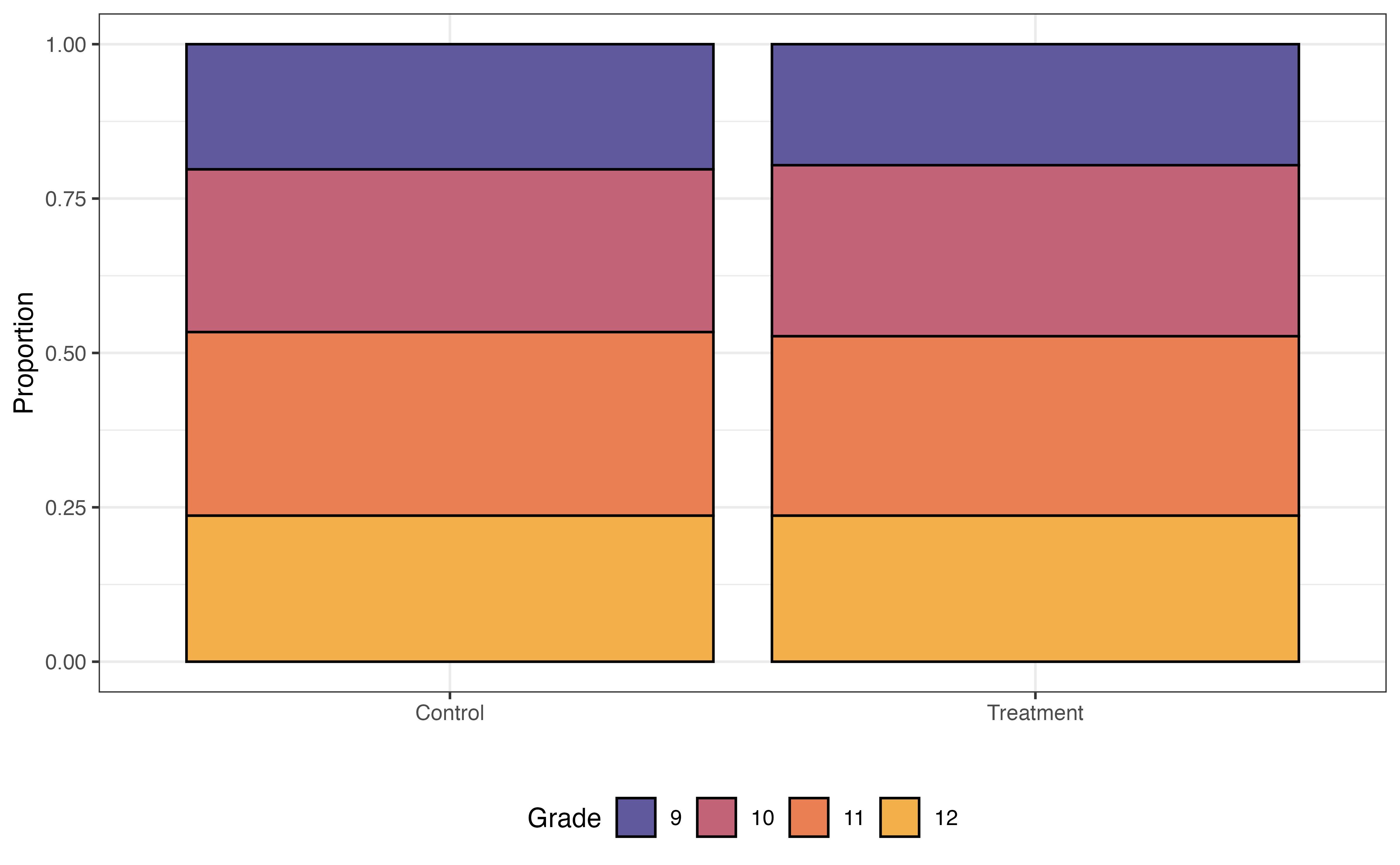
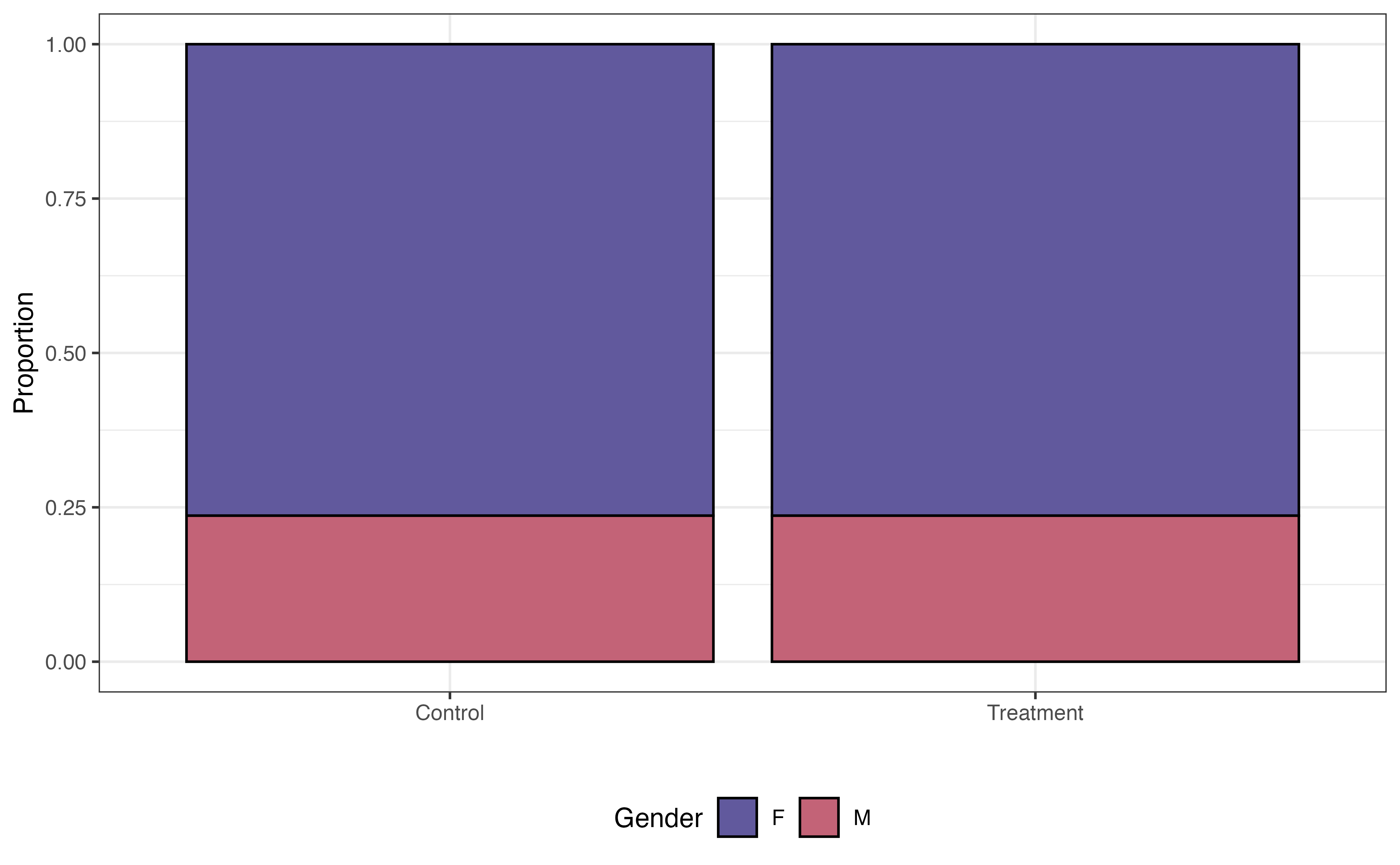
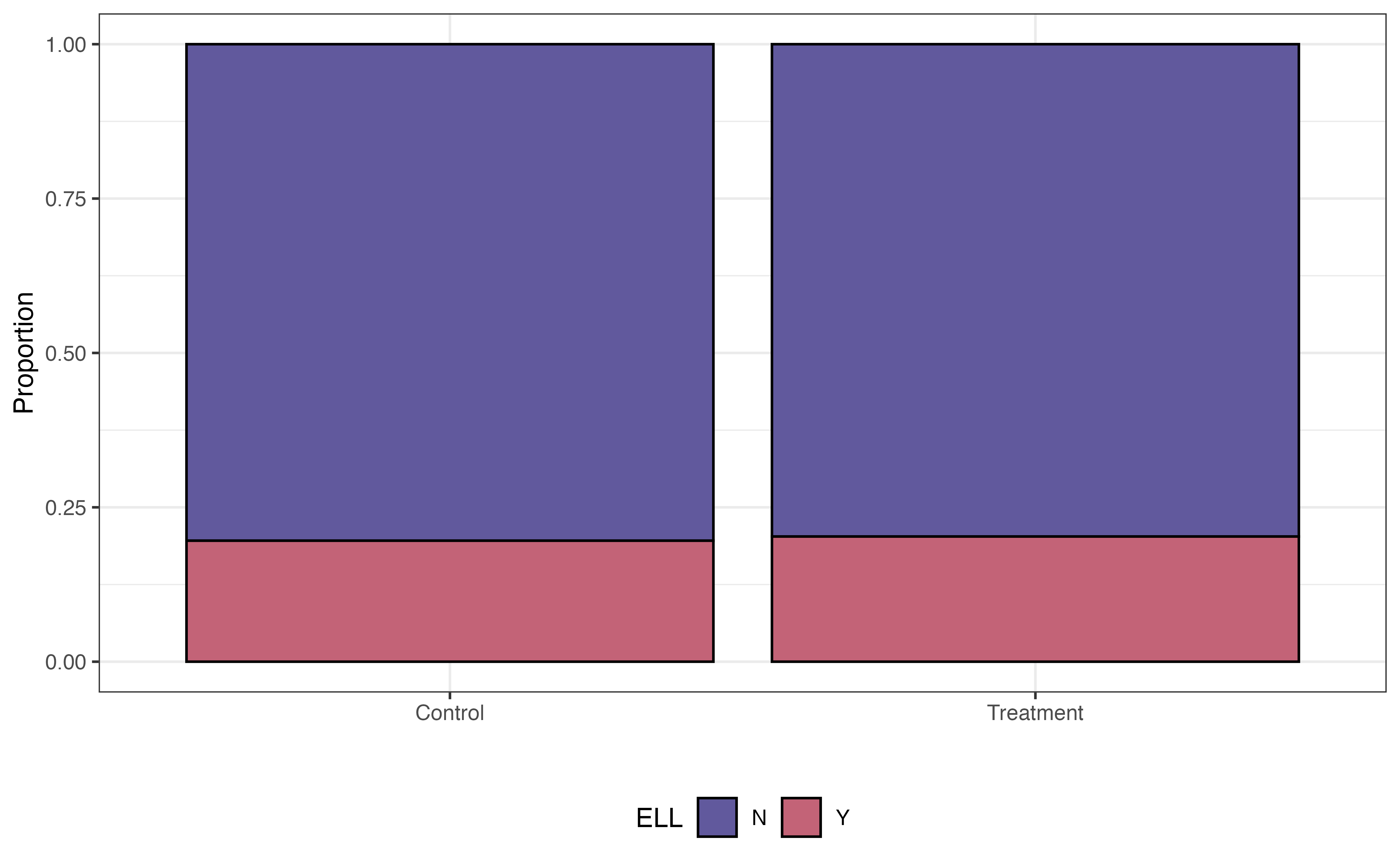
Some variables are associated with both the response and the chance to receiving the treatment. For example, research shows that demographic and socioeconomic variables are associated with academic performance (Evans, Perez, and Morera 2025). Because Project ACE is aimed at students who are “underrepresented” and from “disadvantaged backgrounds”, demographic and socioeconomic factors are also associated with the probability of being in the program. We see examples of this in Figure 13.14, where the distributions of three potential covariates differ between control and treatment groups.
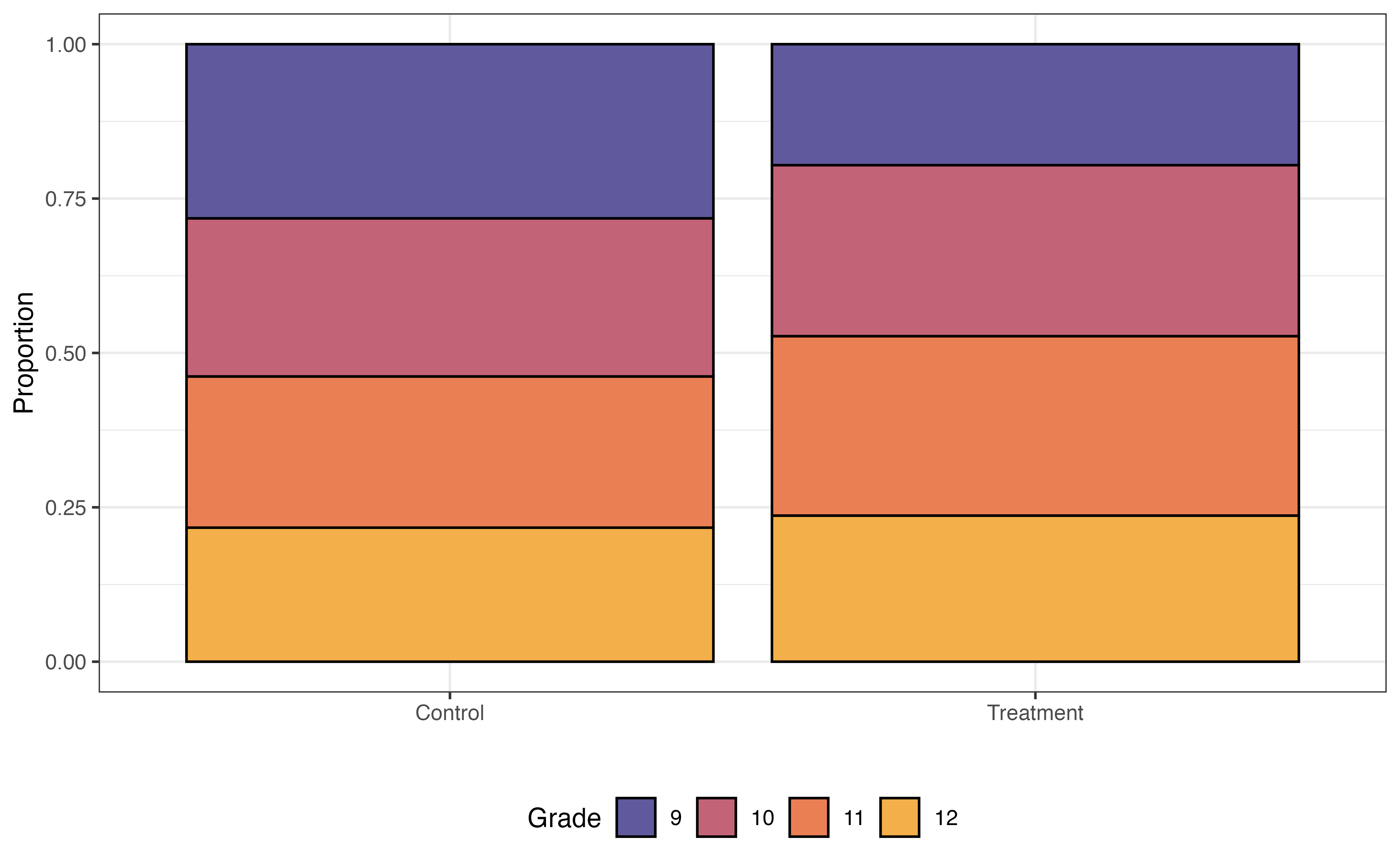
Grade
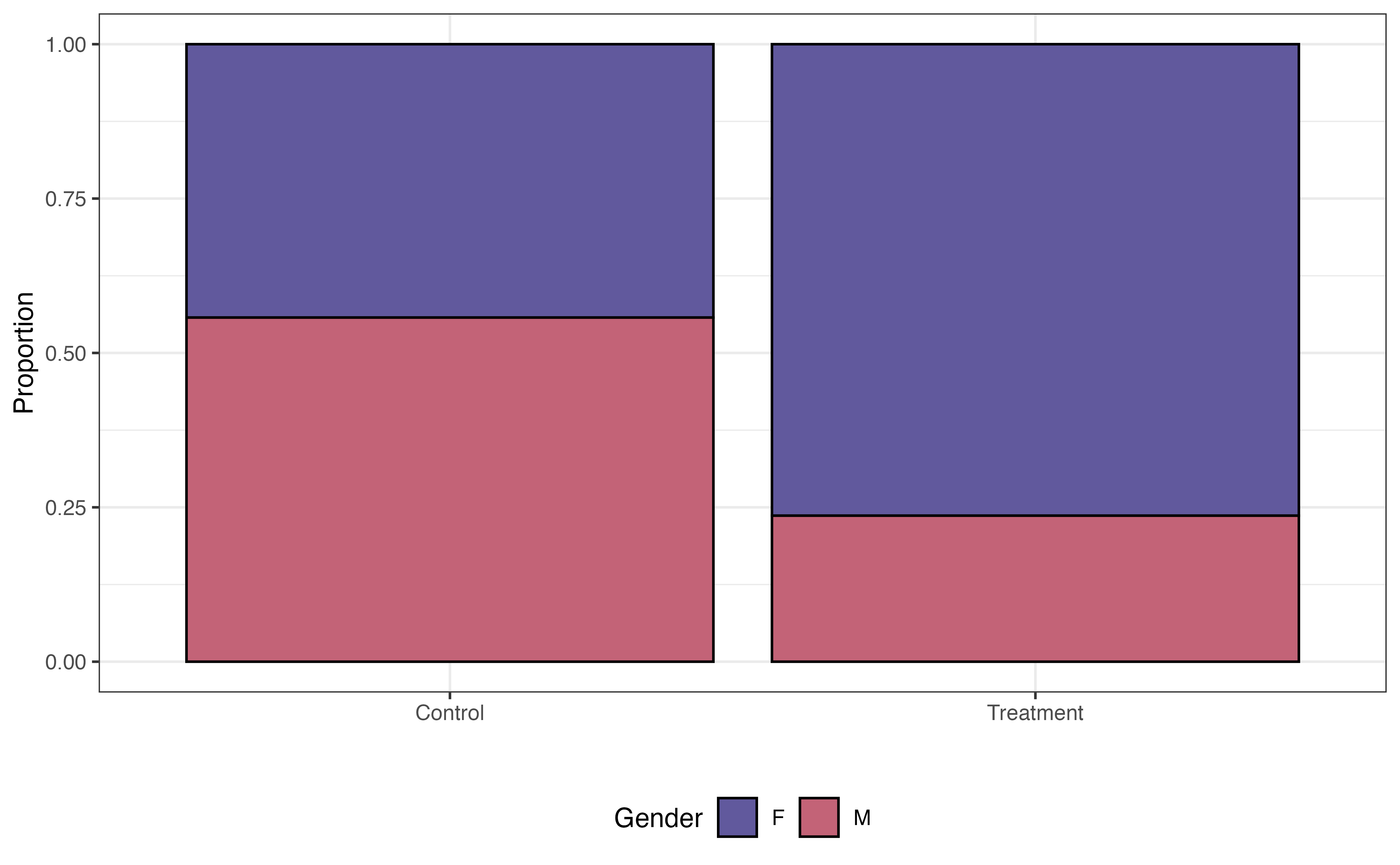
Gender
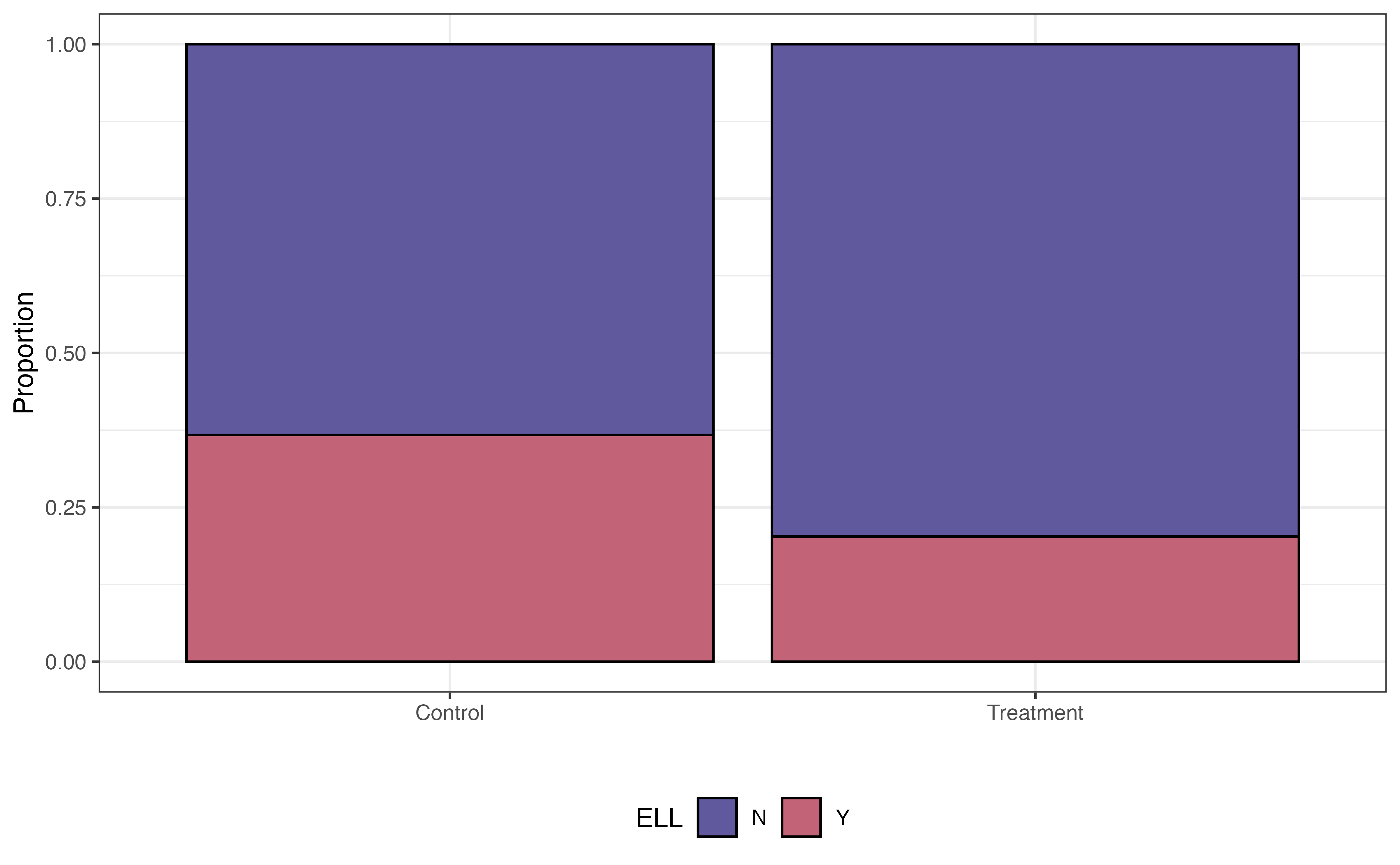
ELL
In a standard regression model, these variables and the other demographic and socioeconomic variables would be confounders that limit the strength of the claim we can make about the effect of the treatment, even if these variables are included as predictors in the model. Therefore, we will match the data in a way such that the distributions of these factors are similar between the treatment and control groups.
Choosing the variables to include in the propensity score model can be challenging. We often choose these variables based on previous research and collaboration with individuals who are domain experts. Deciding up front which variables are important helps strengthen the analysis conclusions, as there is less potential there are confounding variables impacting the model of the treatment effect.
The propensity score model is a logistic regression model where the response variable is the binary indicator for Treatment vs. Control. As shown in Equation 13.7, we use this model to compute the probability that an individual is in the treatment group. The form of the propensity score model for this analysis is as follows:
\[ \begin{aligned} \log\Big(\frac{\pi}{1-\pi}\Big) = \beta_0 &+ \beta_1 ~ \text{Grade10} + \beta_2 ~ \text{Grade11} + \beta_3 ~ \text{Grade12} \\ & + \beta_4 ~ \text{GenderM} + \beta_5 ~ \text{EthnicityNon-Hispanic} \\ &+ \beta_6 ~ \text{ELL} + \beta_7 ~ \text{Sped} + \beta_8 ~ \text{Homeless} \end{aligned} \tag{13.7}\] where \(\pi\) is the propensity, the probability of being in the treatment group (participating in Project ACE). Table 13.6 is the output of the fitted propensity score model.
| term | estimate | std.error | statistic | p.value |
|---|---|---|---|---|
| (Intercept) | -1.670 | 0.216 | -7.733 | 0.000 |
| Grade10 | 0.539 | 0.264 | 2.040 | 0.041 |
| Grade11 | 0.566 | 0.263 | 2.155 | 0.031 |
| Grade12 | 0.314 | 0.273 | 1.151 | 0.250 |
| GenderM | -1.390 | 0.206 | -6.731 | 0.000 |
| Ethnicity.Hispanic.Y.NNon Hispanic | -0.498 | 0.775 | -0.643 | 0.520 |
| ELLY | -0.792 | 0.222 | -3.562 | 0.000 |
| SpedY | 0.017 | 0.277 | 0.060 | 0.952 |
| HomelessY | 1.126 | 0.649 | 1.734 | 0.083 |
In general, we are not interested in interpreting the coefficients of the propensity score model but rather using it to compute the propensity for each observation. Before using the propensity scores to match, let’s take a look at the distribution of propensity scores for the treatment and control group in Figure 13.15.
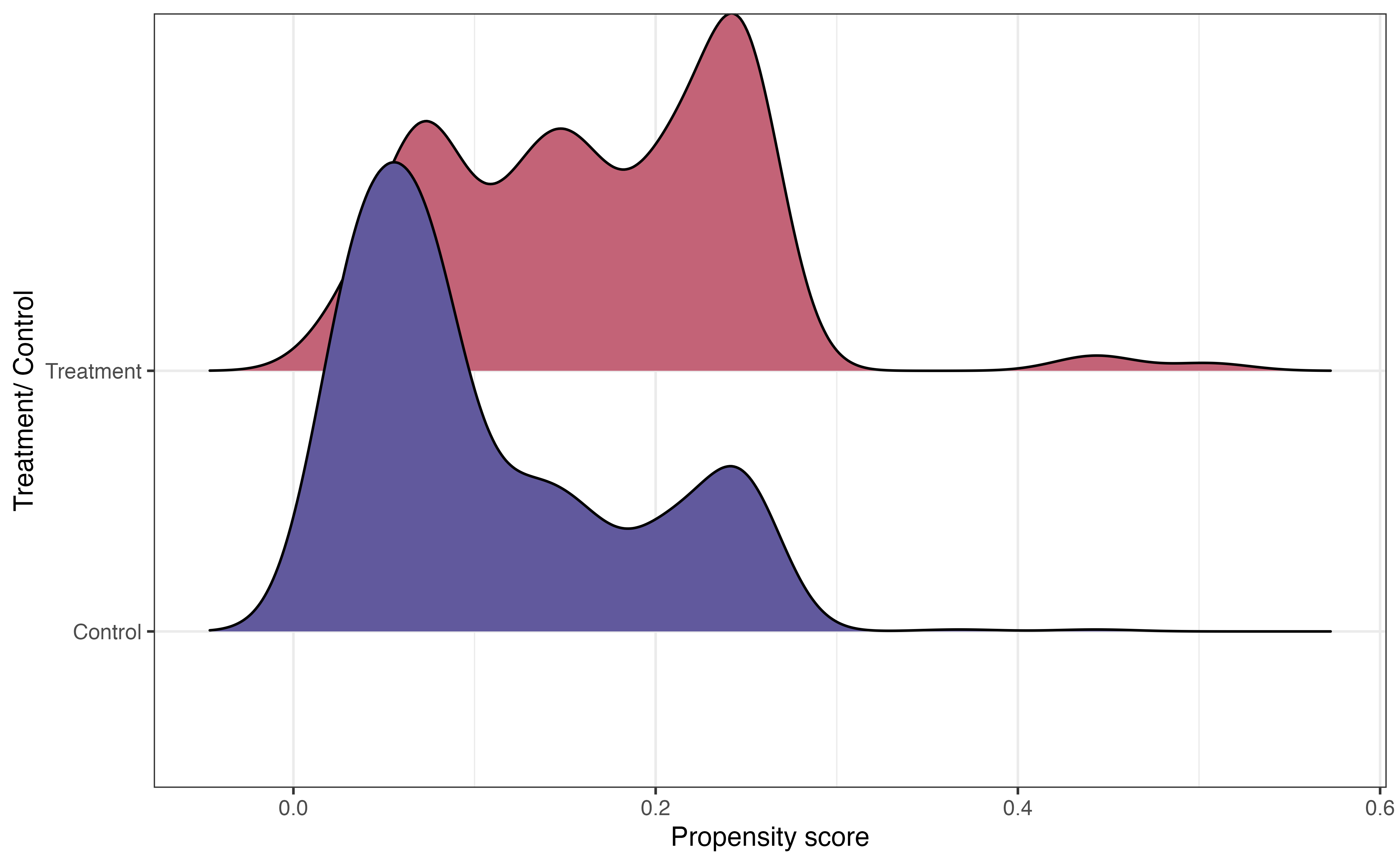
In Figure 13.15, we see that the center of the distribution of propensity scores for individuals in the treatment group is higher than the center for the control group. This is what we might expect, because the individuals in the treatment group are more likely to have the characteristics of eligibility to participate in Project ACE.
The other important feature from this graph is the large overlap between the two distributions. This indicates common support, in which individuals in both the treatment and control groups have a nonzero probability of receiving the treatment. In the context of this analysis, this means every student had a non-zero chance of participating in Project ACE. Practically speaking, we use the propensity scores to match observations in the treatment group with an observation in the control group, so there needs to be overlap in the distributions.
Now let’s use the propensity scores to match observations. The number of observations in the treatment group is often equal to or less than the number of observations in the control group. Therefore, the matching is done such that each observation in the treatment group is matched to an observation in the control group. Then, the observations in the control group that are not matched are discarded. In the Project ACE analysis, there are 148 observations in the treatment group and 1152 observations in the control group. Therefore, the final matched data set will contain 148 observations in the treatment group and 148 observations in the control group. The unmatched 1004 observations in the control group are discarded.
One of the most widely used matching approaches is nearest-neighbor matching, in which each observation in the treatment group is matched with an observation in the control group with the closest propensity score. Table 13.7 shows three treatment/control pairs in the matched data for the Project ACE analysis.
subclass identifies the matches.
| subclass | Tracking.Pathway | propensity_score |
|---|---|---|
| 14 | Control | 0.367 |
| 14 | Treatment | 0.443 |
| 50 | Control | 0.249 |
| 50 | Treatment | 0.249 |
| 118 | Control | 0.158 |
| 118 | Treatment | 0.158 |
Sometimes there are exact matches, where an observation in the treatment group is matched with an observation in the control group with an equal propensity score. Matches 50 and 118 in the table are examples of this. This generally indicates that the two observations are the same in terms of the characteristics included in the propensity score model Equation 13.7. In other cases, such as Match 14, the scores are close but not exact.
| Tracking.Pathway | Grade | Gender | Ethnicity.Hispanic.Y.N | ELL | Sped | Homeless | propensity_score |
|---|---|---|---|---|---|---|---|
| Treatment | 12 | F | Hispanic | N | N | Y | 0.443 |
| Control | 9 | F | Hispanic | N | N | Y | 0.367 |
From Table 13.8, we see that the two observations that make up the 14th match are the same in all characteristics except grade. The student in the treatment group is in grade 12, and the student in the control group is in grade 9.
Before fitting the model to estimate the effect of the treatment, let’s take a look at the distributions of the variables we examined in Figure 13.14, and see how the distributions compare between the treatment and control group for the 296 observations in the matched data.
Grade
Gender
ELL
In Figure 13.16, the distributions of these student characteristics are now the same for the treatment and control groups (compare to Figure 13.14). For brevity, we only show three variables here, but we could look at the distributions for all variables in the propensity score model Equation 13.7. Now the data look more like what we would expect in a randomized experiment. Therefore, we can be more confident that any differences in the GPA (response variable) are due to the treatment and not underlying confounding variables.
Once we have the matched data set, it’s time to evaluate the effect of the treatment. We do this by using a regression model with the treatment as a predictor.
\[ \text{GPA} = \beta_0 + \beta_1 ~\text{Treatment} + \epsilon \hspace{8mm} \epsilon \sim N(0, \sigma^2_{\epsilon}) \tag{13.8}\] For the Project ACE analysis, the response variable GPA is quantitative, so we use a linear regression model of the form in Equation 13.8. The fitted model is in Table 13.9.
| term | estimate | std.error | statistic | p.value | conf.low | conf.high |
|---|---|---|---|---|---|---|
| (Intercept) | 2.430 | 0.069 | 35 | 0.000 | 2.294 | 2.57 |
| Tracking.PathwayTreatment | 0.196 | 0.098 | 2 | 0.046 | 0.003 | 0.39 |
We interpret the model just as we interpret other linear regression models (see Chapter 4 and Chapter 7). In Table 13.9, the estimated effect of the treatment, participating in Project ACE is 0.196 and the 95% confidence interval is 0.003 to 0.39. This estimate 0.196 is the average treatment effect (ATE), the difference in the expected response between the treatment and control group. Therefore, based on this analysis, we can make a causal relationship between participating in Project ACE and higher GPA, on average. The 95% confidence interval gives a plausible range for the effect in the population.
Interpret the 95% confidence interval for the effect of participating in Project ACE in the context of the data.7
As we use these results to inform decision-making, one thing to keep in mind is that this is the average treatment effect in the matched population. Therefore, the results may not generalize to the entire population if the discarded individuals in the control group are significantly different from the individuals in the matched group. One way to mitigate this is to include more observations from the control group. Strategies for this are available in the resources at the end of this section.
Much of the code for causal inference is the code for linear lm() and logistic glm() models that we’ve seen in previous chapters. The primarily new code is for creating the matched data set using the propensity scores.
We compute the propensity scores “manually” by fitting a logistic regression model using glm().
propensity_score_model <- glm(Tracking.Pathway ~ Grade + Gender +
                                Ethnicity.Hispanic.Y.N + ELL +
                                Sped + Homeless,
                        data = ace,
                        family = "binomial")
The assigned matches are done using the matchit() function from the MatchIt R package (Ho et al. 2011). The code below shows the propensity score matching for the Project Ace data.
The argument method = "nearest" species to conduct nearest-neighbor matching (the default method), and distance = "logit" indicates to compute the propensity scores using a logistic regression model. The matchit() function will refit the model with propensity scores.
ace_psm <- matchit(Tracking.Pathway ~ Grade + Gender + Ethnicity.Hispanic.Y.N +
                          Race + ELL + Sped + Homeless,
                 data = ace,
                 method = "nearest",
                 distance = "logit")

ace_psm
A `matchit` object
- method: 1:1 nearest neighbor matching without replacement
- distance: Propensity score
- estimated with logistic regression
- number of obs.: 1300 (original), 296 (matched)
- target estimand: ATT
- covariates: Grade, Gender, Ethnicity.Hispanic.Y.N, Race, ELL, Sped, HomelessThis code creates a matchit object called ace_psm that contains information about the propensity score matching. We retrieve the matched data using the match.data() function as shown below.
ace_matched <- match.data(ace_psm)We use glimpse() to see what is in the new matched data set.
Rows: 296
Columns: 17
$ Student.ID                                        <dbl> 9478, 8268, 9846, 22…
$ Grade                                             <fct> 12, 12, 12, 12, 11, …
$ Gender                                            <chr> "M", "M", "F", "F", …
$ Race                                              <chr> "C", "C", "C", "C", …
$ Ethnicity.Hispanic.Y.N                            <chr> "Hispanic", "Hispani…
$ ELL                                               <chr> "N", "N", "N", "N", …
$ Sped                                              <chr> "N", "N", "N", "N", …
$ Homeless                                          <chr> "N", "N", "Y", "N", …
$ Free.Lunch                                        <chr> "Y", "Y", "Y", "Y", …
$ Migrant                                           <chr> "N", "N", "N", "N", …
$ Current.GPA                                       <dbl> 1.45, 2.96, 2.96, 3.…
$ Number.of.Classes.Enrolled.in.for.the.school.year <dbl> 7, 7, 7, 7, 7, 7, 7,…
$ Tracking.Pathway                                  <fct> Control, Treatment, …
$ propensity_score                                  <dbl> 0.0603, 0.0603, 0.44…
$ distance                                          <dbl> 0.0590, 0.0590, 0.45…
$ weights                                           <dbl> 1, 1, 1, 1, 1, 1, 1,…
$ subclass                                          <fct> 1, 1, 42, 3, 2, 2, 4…
There are some new columns in addition to the columns in the original ace tibble. The column distance contains the propensity scores. The column sub.class identifies the matches. The column weights contains sample weights. All observations are equally weighted using the methods introduced in this section. See the resources in Section 13.4.3 to learn about propensity score matching that incorporates weighting.
The lm function is used to fit the linear regression model for the treatment effect.
treatment_effect <- lm(Current.GPA ~ Tracking.Pathway, data = ace_matched)Given the plethora of data available today, it is no surprise that causal inference is a rich and growing field in statistics and data science. We refer interested readers to The effect: An introduction to research design and causality (Huntington-Klein 2021) and Causal Inference: The Mixtape (Cunningham 2021) for an introduction to causal inference on observational data and Design and Analysis of Experiments (Montgomery 2017) for an introduction to experimental design.
In this chapter, we introduced models that are extensions of linear and logistic regression. Specifically, we introduced the multinomial logistic regression model for categorical response variables with at least three levels, the random intercepts model for data with correlated observations, decision trees for prediction, and propensity scores models for causal inference. The goal of this book is to introduce readers to regression analysis, so this chapter is a springboard for readers interested in learning more about modeling. All the resources mentioned throughout the chapter are a nice followup to this text for readers interested in a deeper dive into the special topics introduced here and much more.
Similar to how categorical predictors are interpreted as one level versus the baseline (see 7.4.2).↩︎
The accuracy is the 0.493 \((563 + 2219 + 94)/5836)\). The misclassification rate is 0.507 \((1 - 0.407)\).↩︎
We can also specify the GLMMs to account for the different slopes of age across the lemurs. That is beyond the scope of this text, but we provide resources at the end of the section for readers interested in learning more.↩︎
age: As a lemur gets one month older, its weight is expected to increase by 147.719 grams, on average, after adjusting for taxon, sex, and litter size.
\(\hat{\sigma}_u = 311.504\): The variability in the average weights between lemurs is 311.504. On average, the mean weight of an individual lemur is 311.504 grams away from the overall mean weight of all lemurs.
↩︎
The predicted expenditure is 2.1 million. Note that the fact that it was a public institution was not used based on its path in the decision tree.↩︎
The predicted voting frequency is sporadic.↩︎
We are 95% confident that improvement in GPA from participating in Project ACE is between 0.003 and 0.39 points.↩︎