install.packages("tidyverse")2 Data analysis in R
Learning goals
- Wrangle and manipulate data using dplyr
- Create visualizations using ggplot2
- Customize ggplot2 visualizations
- Create reproducible documents using Quarto
2.1 Data: Palmer penguins
In this chapter, explore data about penguins collected at the Palmer Station in Antarctica. The data were collected 2007 - 2009 by Dr. Kristen Gorman with the Palmer Station Long Term Ecological Research Program. The data are in the penguins data frame in the palmerpenguins R package (Horst, Hill, and Gorman 2020).
We will use the following variables:
species: Penguins species (Adelie, Chinstrap, Gentoo)island:Island in Palmer Archipelago (Biscoe, Dream, Torgersen)bill_length_mm: Bill length in millimetersflipper_length_mm: Flipper length in millimeterssex: Penguins sex (female, male)year: Study year (2007, 2008, 2009)
See the (Horst, Hill, and Gorman 2020) for the full code book.
2.2 Installation
2.2.1 Installing R and RStudio
We will use the statistical analysis software R. Go to https://cran.rstudio.com to download and install R. R version 4.5.0 was used for the computing in this book. We use R through an integrated user environment (IDE). The IDE is a user-friendly interface with additional features that make it easier to use the underlying software. Ismay and Kim (2019) describes it this way, “R is like a car’s engine while [the IDE] is like a car’s dashboard.”
There are two widely used IDEs for R offered by the open-source data science company Posit: RStudio and Positron. At this point, RStudio is the most commonly used environment for R (Posit Software, PBC 2025) and is widely used by R programmers in classes, academic research, and industry. Go to https://posit.co/download/rstudio-desktop to download RStudio on a laptop or desktop computer. A cloud-based version is also available on Posit Cloud (https://posit.cloud/). Positron is a new IDE designed specifically for a data science workflow. It has more advanced data exploration and AI-assistance capabilities compared to RStudio. Go to https://positron.posit.co to download Positron1.
Overall, the content in this chapter is the same when using RStudio and Positron, with the exception of a minor difference mentioned in Section 2.7.
2.2.2 Installing R packages
Coding in R is primarily done by calling functions that perform specific tasks. These functions are located in packages. There is a collection of “base R” functions that are automatically loaded in R. A list of packages for the most recent version of R is available at R Core Team (2025).
Even with a lot of functionality built into R, we may want to utilize advanced or specialized functions that are available through R packages. There are two primary ways to install packages: from the Comprehensive R Archive Network (CRAN) or from GitHub repositories.
CRAN is the official network for hosting R packages and documentation, and packages must undergo R a rigorous review and testing process to be hosted on CRAN. We use the code install.packages("Package Name") to install packages from CRAN. For example, the code to install the tidyverse package is
Packages that are not available on CRAN are typically available through a GitHub repository created by the package developer. This is often the cases for new packages or in-development versions of existing packages. We use the code remotes::install_github("Package repo") to install packages from GitHub. The code remotes:: calls the remotes package (Csárdi et al. 2024) that contains the install_github function.2
Packages only need to be installed once on a given computer or virtual machine; however, we can periodically update them as new versions are released. Once the package is installed, we use the library() function to load it into R. Though we only install packages once, we need to load packages each time we have a new instance of R.
Installing versus loading packages has been compared to the lights in the room. The light bulbs are installed once, but we still need to flip a switch to turn on the light each time we enter a room.
2.3 Tidyverse
The tidyverse (Wickham et al. 2019) is an “an opinionated collection of R packages designed for data science” (tidyverse Development Team 2025). Packages in the tidyverse have a common structure and syntax, making it more streamlined to utilize functions from multiple packages in a data analysis. As shown in the previous section, tidyverse is available on CRAN. We load tidyverse using the code below. From the output, we see the nine core packages that load as part of tidyverse.
library(tidyverse)This chapter focuses on dplyr (Wickham et al. 2023), the package for data manipulation, and ggplot2 (Wickham 2016), the package data visualization. We will introduce other packages, as needed, in subsequent chapters. See https://tidyverse.org for a full description of all the core tidyverse packages.
2.3.1 Tidy data
A central component of the tidyverse is the notion of “tidy” data. Wickham (2014) defines tidy data as data sets that have the following characteristics:
- Each variable forms a column.
- Each observation forms a row.
- Each type of observational unit forms a table.
Let’s take a look at the penguins data frame from the palmerpenguins package that was introduced in Section 2.1.
library(palmerpenguins)
data(penguins)
The first ten rows of penguins is shown in Table 2.1.
penguins data
# A tibble: 10 × 8
  species island    bill_length_mm bill_depth_mm flipper_length_mm body_mass_g
  <fct>   <fct>              <dbl>         <dbl>             <int>       <int>
1 Adelie  Torgersen           39.1          18.7               181        3750
2 Adelie  Torgersen           39.5          17.4               186        3800
3 Adelie  Torgersen           40.3          18                 195        3250
4 Adelie  Torgersen           NA            NA                  NA          NA
5 Adelie  Torgersen           36.7          19.3               193        3450
6 Adelie  Torgersen           39.3          20.6               190        3650
# ℹ 4 more rows
# ℹ 2 more variables: sex <fct>, year <int>
Let’s use the criteria above to evaluate whether this is a tidy data frame.
- Each variable forms a column.
- Yes, the variables are stored in individual columns. There are no instances of multiple variables stored in a single column or a single variable stored across multiple columns.
- Each observation forms a row.
- Yes, the information for one penguin (observation) is across a single row. There are no instances of multiple penguins represented on a single row or a single penguin represented across multiple rows.
- Each type of observational unit forms a table.
- Yes, the observational unit is the set of penguins included in the study. The data from these penguins makes up the data frame.
All the criteria are met, so penguins is a tidy data frame.
All the data sets used in the book are tidy, so we can focus on regression analysis concepts and methods. In practice, we may need to “tidy” data before doing any analysis. Wickham (2014) has recommendations for handling different issues that make data untidy.
The data sets in the tidyverse are stored as tibbles. Tibbles are like data frames in R with some differences in the underlying features. As Wickham, Çetinkaya-Rundel, and Grolemund (2023) puts it, a tibble is a data frame that modifies “some older behaviours to make life a little easier”. One nice feature of tibbles is that they show summary information about the data set overall and for each variable. For example, in Table 2.1 we see there are 344 rows (observations) and 8 columns (variables). We also see the format of each column, e.g. species is stored as a <fct> (factor). We talk more about data formats in Section 3.3.
2.3.2 The pipe
One benefit of the tidyverse syntax is its readability. Though it can be more verbose than other coding styles, its naming convention and structure makes it easy to read and understand. A key part of the readability is due to the pipe. The pipe, coded as |>, is used to pass data from one function to the next. If we think of reading code aloud in English, we say “and then” when we see a pipe (Çetinkaya-Rundel et al. 2021).
For example, let’s suppose we write code to describe the steps to make a ham and cheese sandwich.
bread_slice |>
  add_layer(ingredient = "ham") |>
  add_layer(ingredient = "cheese") |>
  add_bread_slice()
We would read this aloud in English as the following:
Start with a bread slice,
and then add a layer of ham
and then add a layer of cheese,
and then add another bread slice.
A series of functions joined by pipes, like the sandwich example above, is called a pipeline. We will see pipelines throughout the next section as we introduce data manipulation with dplyr.
2.4 Data manipulation with dplyr
The dplyr package is tidyverse’s primary package for data wrangling and manipulation. We often use functions from dplyr for analysis steps such as data exploration (Chapter 3), evaluating model conditions (Chapter 6), and applying variable transformations (Chapter 9).
The functions in dplyr perform one of the following tasks: manipulate the data by row, manipulate the data by column, or manipulate groups of rows. We will show key functions in each of these categories that are used frequently in the text. The full list of dplyr functions is available at the dplyr reference site https://dplyr.tidyverse.org.
2.4.1 Data manipulation by row
filter()
The filter function is used to choose rows based on a set of criteria defined by the columns in the data. For example, we may use filter() to narrow the data to a specific subgroup of observations. The filtering criteria can be based on one variable or multiple variables. For example, let’s filter the data such that we choose the rows for penguins in the Adelie species.
penguins |>
  filter(species == "Adelie")
# A tibble: 152 × 8
species island bill_length_mm bill_depth_mm flipper_length_mm body_mass_g
<fct> <fct> <dbl> <dbl> <int> <int>
1 Adelie Torgersen 39.1 18.7 181 3750
2 Adelie Torgersen 39.5 17.4 186 3800
3 Adelie Torgersen 40.3 18 195 3250
4 Adelie Torgersen NA NA NA NA
5 Adelie Torgersen 36.7 19.3 193 3450
6 Adelie Torgersen 39.3 20.6 190 3650
# ℹ 146 more rows
# ℹ 2 more variables: sex <fct>, year <int>How many penguins are in the Adelie species?3
We can filter based on multiple variables by specifying “and” or “or” criteria. For example, let’s filter the data so that we choose rows for penguins in the Adelie species and from Dream island.
penguins |>
  filter(species == "Adelie" & island == "Dream")
# A tibble: 56 × 8
species island bill_length_mm bill_depth_mm flipper_length_mm body_mass_g
<fct> <fct> <dbl> <dbl> <int> <int>
1 Adelie Dream 39.5 16.7 178 3250
2 Adelie Dream 37.2 18.1 178 3900
3 Adelie Dream 39.5 17.8 188 3300
4 Adelie Dream 40.9 18.9 184 3900
5 Adelie Dream 36.4 17 195 3325
6 Adelie Dream 39.2 21.1 196 4150
# ℹ 50 more rows
# ℹ 2 more variables: sex <fct>, year <int>There are 56 penguins from the Adelie species and Dream island. This is a smaller subset than in the previous example, because observations have to satisfy both criteria to be included in the resulting tibble.
Alternatively, let’s suppose we wish to filter the data such that we choose penguins who are from the Adelie species or from Dream island.
penguins |>
  filter(species == "Adelie" | island == "Dream")
# A tibble: 220 × 8
species island bill_length_mm bill_depth_mm flipper_length_mm body_mass_g
<fct> <fct> <dbl> <dbl> <int> <int>
1 Adelie Torgersen 39.1 18.7 181 3750
2 Adelie Torgersen 39.5 17.4 186 3800
3 Adelie Torgersen 40.3 18 195 3250
4 Adelie Torgersen NA NA NA NA
5 Adelie Torgersen 36.7 19.3 193 3450
6 Adelie Torgersen 39.3 20.6 190 3650
# ℹ 214 more rows
# ℹ 2 more variables: sex <fct>, year <int>There are 220 penguins in the resulting tibble. There are more penguins in this tibble than in the previous two, because penguins can meet one or both of the criteria to be included in the resulting tibble.
Lastly, we use ! to define criteria in terms of excluding observations that take a certain value. For example, let’s select the penguins in the Adelie species and are not on Dream island.
penguins |>
  filter(species == "Adelie" & island != "Dream")
# A tibble: 96 × 8
species island bill_length_mm bill_depth_mm flipper_length_mm body_mass_g
<fct> <fct> <dbl> <dbl> <int> <int>
1 Adelie Torgersen 39.1 18.7 181 3750
2 Adelie Torgersen 39.5 17.4 186 3800
3 Adelie Torgersen 40.3 18 195 3250
4 Adelie Torgersen NA NA NA NA
5 Adelie Torgersen 36.7 19.3 193 3450
6 Adelie Torgersen 39.3 20.6 190 3650
# ℹ 90 more rows
# ℹ 2 more variables: sex <fct>, year <int>arrange()
The arrange function is used to sort the data based on the values in one or more columns. This can be useful as we explore the data to identify outlying observations with unusually high or unusually low values. In the code below, the observations are sorted in ascending order (smallest to largest) based on values of bill_length_mm .
penguins |>
  arrange(bill_length_mm)
# A tibble: 344 × 8
species island bill_length_mm bill_depth_mm flipper_length_mm body_mass_g
<fct> <fct> <dbl> <dbl> <int> <int>
1 Adelie Dream 32.1 15.5 188 3050
2 Adelie Dream 33.1 16.1 178 2900
3 Adelie Torgersen 33.5 19 190 3600
4 Adelie Dream 34 17.1 185 3400
5 Adelie Torgersen 34.1 18.1 193 3475
6 Adelie Torgersen 34.4 18.4 184 3325
# ℹ 338 more rows
# ℹ 2 more variables: sex <fct>, year <int>From the first few observations, we see the values of bill_length_mm increase as we move down the list of observations. Now we can more easily see the smallest bill_length_mm in the data, 32.1 mm. Including the desc argument in the arrange function sorts the data in descending order (largest to smallest). The code below sorts the observations in descending order by bill_length_mm.
penguins |>
  arrange(desc(bill_length_mm))
# A tibble: 344 × 8
species island bill_length_mm bill_depth_mm flipper_length_mm body_mass_g
<fct> <fct> <dbl> <dbl> <int> <int>
1 Gentoo Biscoe 59.6 17 230 6050
2 Chinstrap Dream 58 17.8 181 3700
3 Gentoo Biscoe 55.9 17 228 5600
4 Chinstrap Dream 55.8 19.8 207 4000
5 Gentoo Biscoe 55.1 16 230 5850
6 Gentoo Biscoe 54.3 15.7 231 5650
# ℹ 338 more rows
# ℹ 2 more variables: sex <fct>, year <int>The largest bill length in the data set is 59.6 mm.
These examples illustrate a feature of tidyverse pipelines. Pipeline always start with a tibble (penguins in these examples) and produce a tibble by default. We can extract a vector of values using pull() at the end of pipeline.
For example, the code below extracts a vector of bill lengths sorted in ascending order.4
penguins |>
  arrange(bill_length_mm) |>
  pull(bill_length_mm)
[1] 32.1 33.1 33.5 34.0 34.1 34.4 34.5 34.6 34.6 35.02.5 Data manipulation by column
select()
The select function narrows the data by choosing specific columns. We use this function when we want to retain or display only certain columns. For example, let’s create a new tibble that only contains the columns bill_length_mm and flipper_length_mm.
penguins |>
  select(bill_length_mm, flipper_length_mm)
# A tibble: 344 × 2
bill_length_mm flipper_length_mm
<dbl> <int>
1 39.1 181
2 39.5 186
3 40.3 195
4 NA NA
5 36.7 193
6 39.3 190
# ℹ 338 more rowsNote that the number of rows remains unchanged from the original data.
We may also exclude columns by using - in front of the column name. For example, in the code below we create a new tibble that excludes the column species.
penguins |>
  select(-species)
# A tibble: 344 × 7
island bill_length_mm bill_depth_mm flipper_length_mm body_mass_g sex year
<fct> <dbl> <dbl> <int> <int> <fct> <int>
1 Torger… 39.1 18.7 181 3750 male 2007
2 Torger… 39.5 17.4 186 3800 fema… 2007
3 Torger… 40.3 18 195 3250 fema… 2007
4 Torger… NA NA NA NA <NA> 2007
5 Torger… 36.7 19.3 193 3450 fema… 2007
6 Torger… 39.3 20.6 190 3650 male 2007
# ℹ 338 more rowsmutate()
The mutate function is used to create new columns or change the values in an existing column. We often use this in the analysis to create new variables from existing ones or to impute values for missing data.
For example, let’s create a new variable called dream that takes value 1 if the penguin is from the Dream island and the value 0 otherwise (called an indicator variable).
penguins |>
  mutate(dream = if_else(island == "Dream", 1, 0))
# A tibble: 344 × 9
species island bill_length_mm bill_depth_mm flipper_length_mm body_mass_g
<fct> <fct> <dbl> <dbl> <int> <int>
1 Adelie Torgersen 39.1 18.7 181 3750
2 Adelie Torgersen 39.5 17.4 186 3800
3 Adelie Torgersen 40.3 18 195 3250
4 Adelie Torgersen NA NA NA NA
5 Adelie Torgersen 36.7 19.3 193 3450
6 Adelie Torgersen 39.3 20.6 190 3650
# ℹ 338 more rows
# ℹ 3 more variables: sex <fct>, year <int>, dream <dbl>At the top of the tibble, we see the number of observations hasn’t changed, but we now have an additional column in the data set. Below are the values of island and dream for ten randomly selected observations.
# A tibble: 10 × 2
  island dream
  <fct>  <dbl>
1 Dream      1
2 Biscoe     0
3 Biscoe     0
4 Biscoe     0
5 Biscoe     0
6 Dream      1
# ℹ 4 more rows
This code uses the if_else() function, a useful function for applying “if/else” statements. The structure of the function is if_else([Criteria], [Result if true], [Result if false]).
The mutate function is also used to change the values in existing columns. Using the name of an existing column will overwrite the data in that column based on the output from mutate(). For example, there are 11 penguins in the data with missing values for sex. Therefore, we would like to input the value Missing if the data are missing and otherwise keep the original value of sex. The values of sex for ten randomly selected penguins are below.
penguins |>
  mutate(sex = if_else(is.na(sex), "Missing", sex))
# A tibble: 10 × 1
sex
<chr>
1 Missing
2 male
3 female
4 male
5 male
6 female
# ℹ 4 more rowsThe code above uses is.na(), a logical function that returns TRUE if the value is missing and FALSE otherwise.
Create a tibble that only includes penguins from Biscoe island. Arrange the rows in descending order of bill_length_mm. Display the columns species and bill_length_mm. What is the species and bill length for the first observation?5
2.5.1 Data manipulation by group
count()
The count function is used to compute the number of observations that take each unique value in a column or combination of columns. We often use this in data analysis to produce frequency tables for categorical variables.
For example, the code below produces the number of observations from each island.
penguins |>
  count(island)
# A tibble: 3 × 2
island n
<fct> <int>
1 Biscoe 168
2 Dream 124
3 Torgersen 52We may also compute the number of observations that take each combination of values for two or more variables. The code below produces the number of observations that take each combination of island and species.
penguins |>
  count(island, species)
# A tibble: 5 × 3
island species n
<fct> <fct> <int>
1 Biscoe Adelie 44
2 Biscoe Gentoo 124
3 Dream Adelie 56
4 Dream Chinstrap 68
5 Torgersen Adelie 52Some combinations of island and species are missing from the output. This means there are no observations in the data with that combination of values. For example, there are no penguins in the data who are from Biscoe island and the Chinstrap species. Include the argument .drop = FALSE to see all possible combinations of values, including those with zero observations in the data.
penguins |>
  count(island, species, .drop = FALSE)
# A tibble: 9 × 3
island species n
<fct> <fct> <int>
1 Biscoe Adelie 44
2 Biscoe Chinstrap 0
3 Biscoe Gentoo 124
4 Dream Adelie 56
5 Dream Chinstrap 68
6 Dream Gentoo 0
# ℹ 3 more rowssummarize()
The summarize6 function computes summary statistics for columns in the data. See the summarize() reference page at https://dplyr.tidyverse.org for a list of commonly used summary statistics.
For example, we want to compute the mean and standard deviation of bill_length_mm.
penguins |>
  summarize(mean_bill_length = mean(bill_length_mm),
            sd_bill_length = sd(bill_length_mm))
# A tibble: 1 × 2
mean_bill_length sd_bill_length
<dbl> <dbl>
1 NA NAThis code did not return values but instead produced NA. By default, the functions for computing specific summary statistics, e.g., mean(), do not remove missing values (NA) from the computation. Thus, they are unable to compute summary statistics if there any values are missing in the column. We use the argument na.rm = TRUE to ignore missing values when computing summary statistics.
penguins |>
  summarize(mean_bill_length = mean(bill_length_mm, na.rm = TRUE),
            sd_bill_length = sd(bill_length_mm, na.rm = TRUE))
# A tibble: 1 × 2
mean_bill_length sd_bill_length
<dbl> <dbl>
1 43.9 5.46Note, this now means we have the mean and standard deviation of bill_length_mm among the rows that do not have missing observations, not all observations. Missing data is discussed in more detail in Chapter 3.
group_by()
The last dplyr function we introduce here is group_by(). This function is used to perform calculations separately for subgroups of the data. This is often useful when we want to compare results between groups. For example, let’s look at the mean and standard deviation of bill_length_mm by species.
penguins |>
  group_by(species) |>
  summarize(mean_bill_length = mean(bill_length_mm, na.rm = TRUE),
            sd_bill_length = sd(bill_length_mm, na.rm = TRUE))
# A tibble: 3 × 3
species mean_bill_length sd_bill_length
<fct> <dbl> <dbl>
1 Adelie 38.8 2.66
2 Chinstrap 48.8 3.34
3 Gentoo 47.5 3.08All functions following group_by() in the pipeline will be performed separately for each subgroup. The ungroupfunction removes the grouping structure, so any functions following ungroup() are applied to all observations.
Use median() to compute the median bill length separately for each combination of island and species. What is the median bill length for Adelie penguins on Dream island? 7
This section provided a short overview of the dplyr functions that are used frequently in this book. See Chapter 3 in R for Data Science (Wickham, Çetinkaya-Rundel, and Grolemund 2023) for more on data manipulation and Chapter 5 for more on tidy data.
2.6 Data visualizations using ggplot2
ggplot2 is the primary package for data visualizations in tidyverse. The code in ggplot2 is designed to produce plots in layers, with each layer separated by +. This section is an overview of the package that largely follows the structure of Chapter 1 in R for Data Science (Wickham, Çetinkaya-Rundel, and Grolemund 2023). We point readers there for a more detailed introduction to the package.
The general structure of code to create a visualization is as follows
ggplot(data = [data set], aes(x = [x-var], y = [y-var])) +
  geom_xx() +
  other options
The first part of the code establishes the base layer by specifying the tibble that will be used to make the visualization.
ggplot(data = penguins)
The next part of the code is used to set the aesthetics that indicate how the variables are mapped onto features of the plot. It is defined in the mapping = argument inside the aes() function. Often times, we do not see the argument name mapping = in the code, but it is the second argument of ggplot().
Let’s map the aesthetics such bill_length_mm is on the x-axis and flipper_length_mm is on the y-axis.
ggplot(data = penguins, aes(x = bill_length_mm, y = flipper_length_mm))
Now that we have the foundation, the next layer of the code defines the type of plot to make. The plot types are defined using functions with the prefix geom_. Here we use geom_point() to make a scatterplot.
ggplot(data = penguins, aes(x = bill_length_mm, y = flipper_length_mm)) +
  geom_point()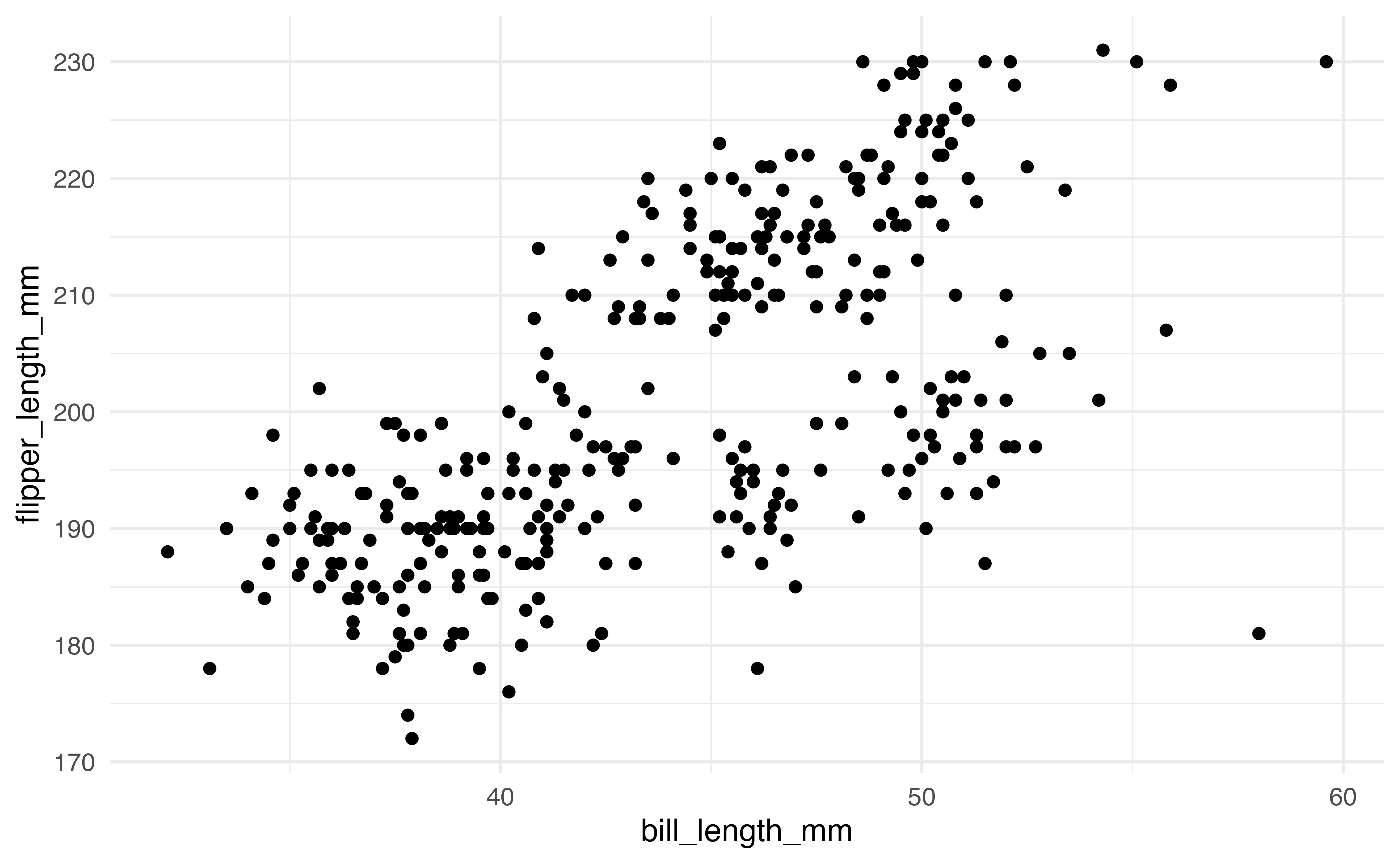
geom (plot type) for ggplot2 visualization
2.6.1 Geoms
We will focus on the scatterplot for the majority of this section, but there are many other geoms available in ggplot2. Below are some of the geoms that will be used frequently throughout the book.
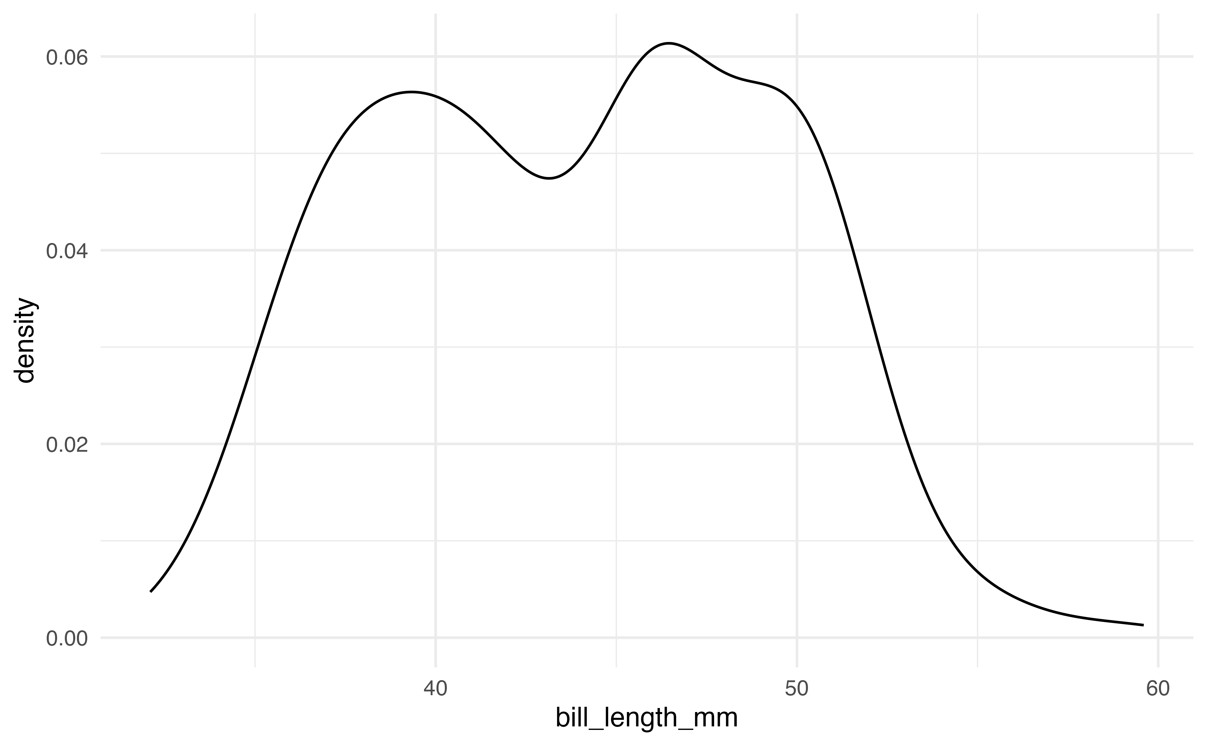
The first plots are a histogram and a density plot. Both are used to visualize the distribution of a single quantitative variable. The code and output produce the histogram and density plot for bill_length_mm.
# histogram
ggplot(data = penguins, aes(x = bill_length_mm)) +
  geom_histogram()

# density plot
ggplot(data = penguins, aes(x = bill_length_mm)) +
  geom_density()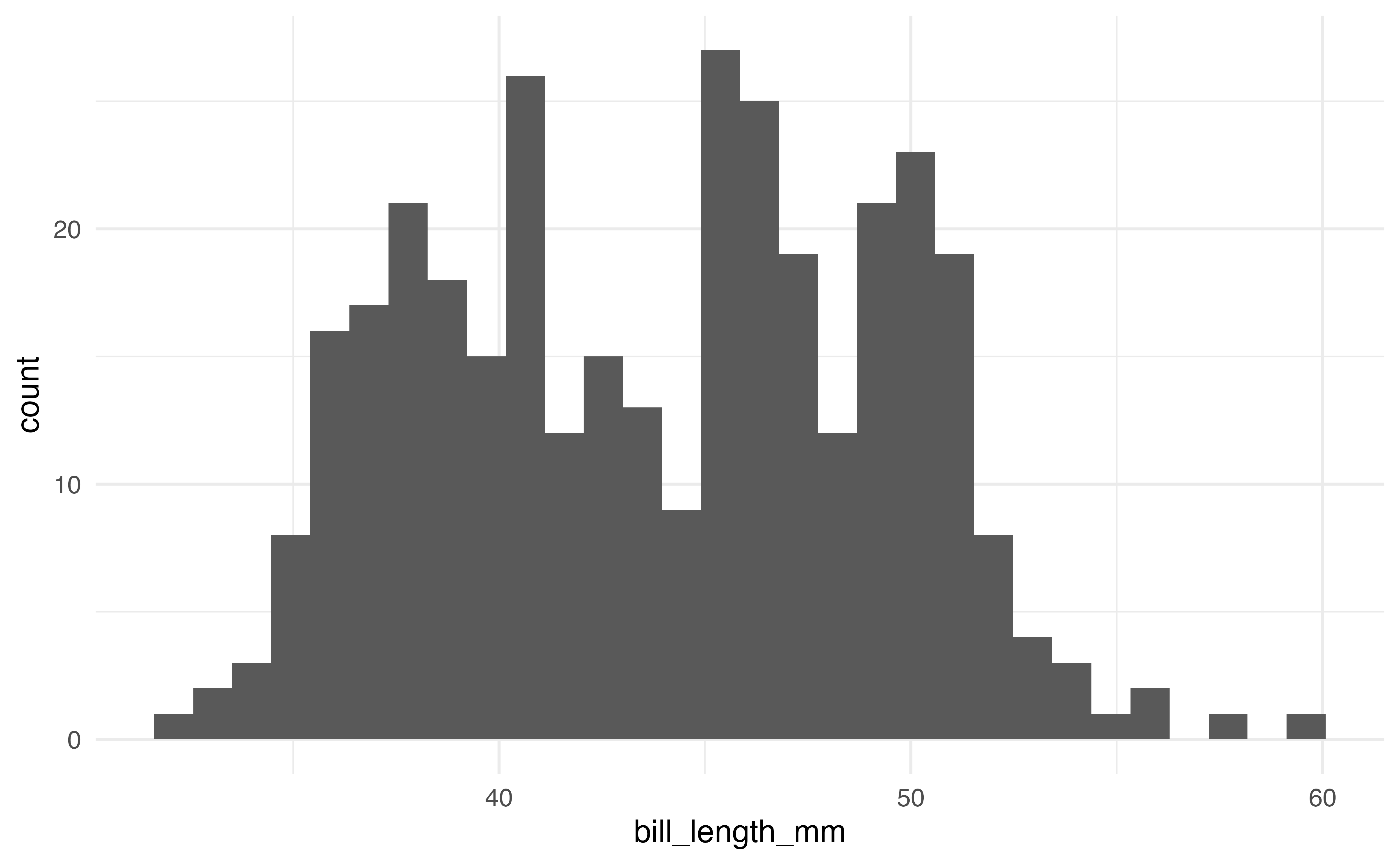
A common plot for the distribution of a single categorical variable is a bar graph. Below are the code and output of a bar graph of the distribution of island.
ggplot(data = penguins, aes(x = island)) +
  geom_bar()
Side-by-side boxplots are used to visualize the relationship between a quantitative variable and a categorical variable. The code and output for a side-by-side boxplot of bill_length_mm versus species is below.
ggplot(data = penguins, aes(x = species, y = bill_length_mm)) +
  geom_boxplot()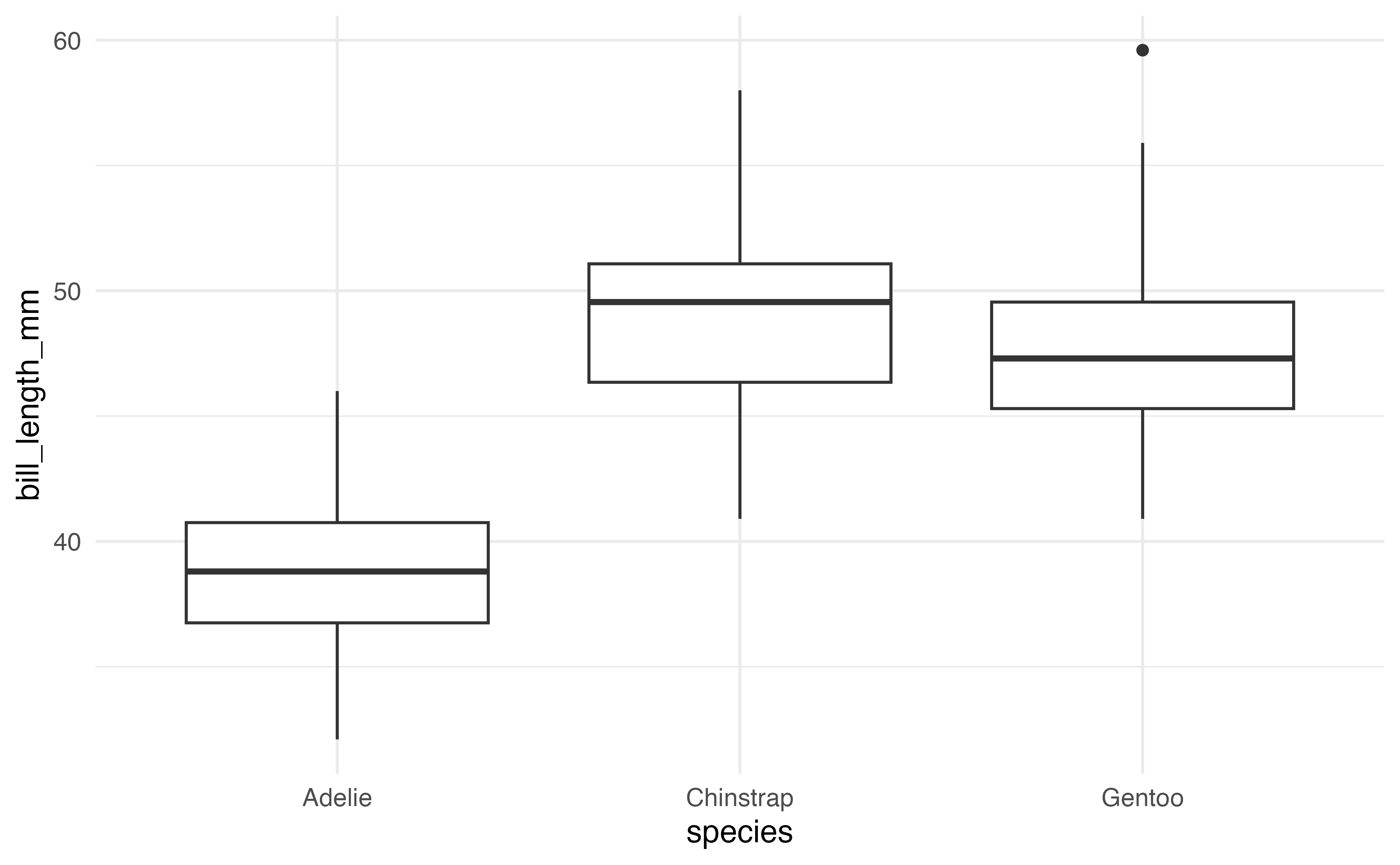
These are a few of the many geoms available in ggplot2. A full list is available at https://ggplot2.tidyverse.org.
2.6.2 Customizing plots
There are a multitude of ways to customize plots in ggplot2. In this section, we will focus on customization that is used in the text and is useful for effective and clear data analysis and communication. These features are illustrated on the scatterplot of bill_length_mm versus flipper_length_mm, but they can be applied to any type of ggplot2 visualization.
Labels
By default, ggplot2 labels the components of the plot using the variable names from aes(). If the variables have clear names, then these default labels are generally sufficient. When we are ready to communicate results (e.g,. through reports or presentations), the plot labels should be clear to the intended audience. This means using full words (or meaningful abbreviations), units when appropriate, and a title or caption.
The labs() function is used to create a new layer on the visualization with updated labels. The code below is used to change the labels on the x- and y-axes and add a title to the scatterplot.
ggplot(data = penguins, aes(x = bill_length_mm, y = flipper_length_mm)) +
  geom_point() +
  labs(x = "Bill length (in millimeters)",
       y = "Flipper length (in millimeters)",
       title = "Bill length versus Flipper length ")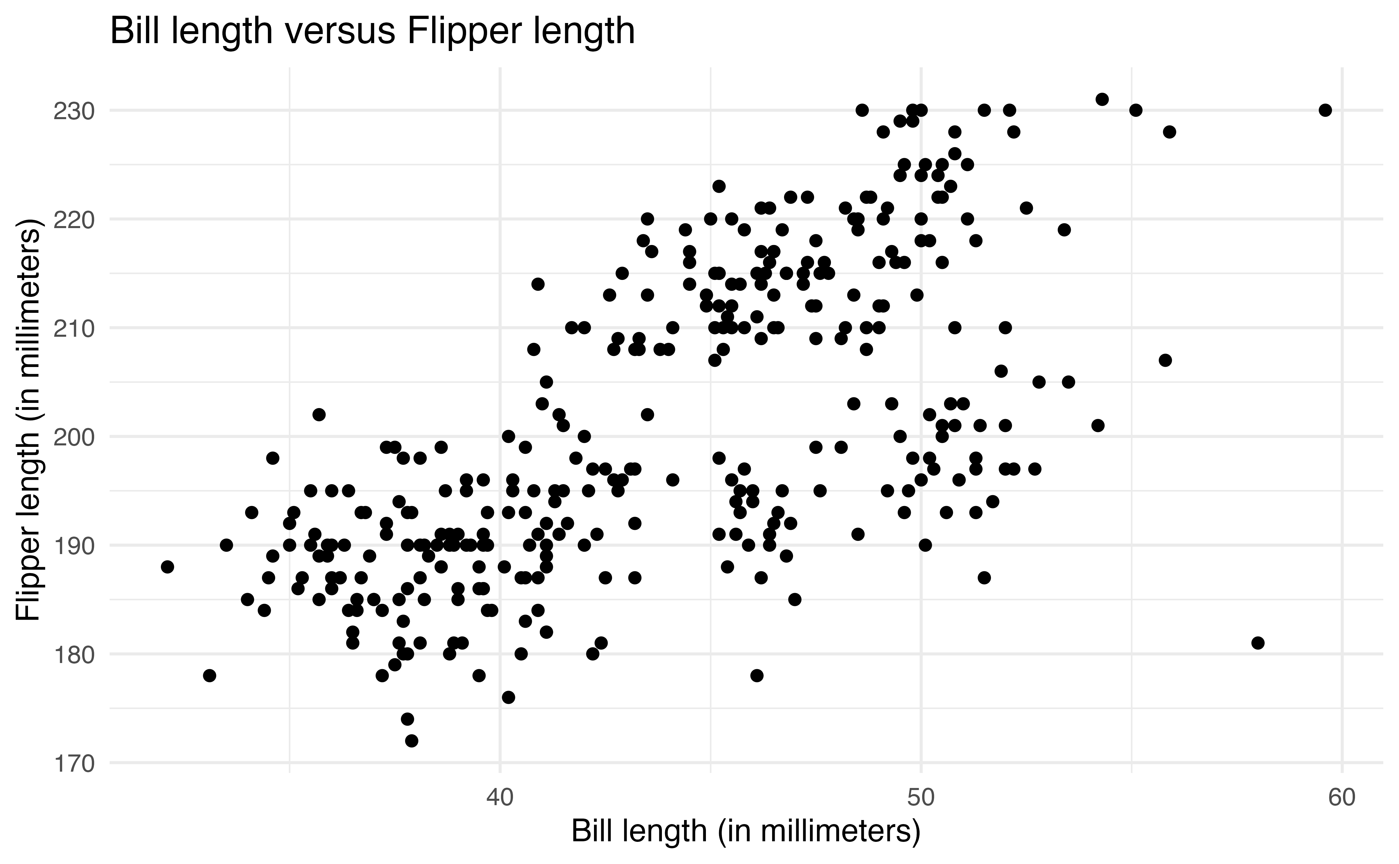
2.6.2.1 Aesthetics
There are a variety of aesthetics, visual features, that can be customized in ggplot2. Some commonly used aesthetics include color, shape, size, alpha (transparency), fill, and linetype. The same aesthetics can be applied across the entire plot, or aesthetics can be applied based on values of a variable.
We often apply the same aesthetic across an entire plot to make it more visually appealing or easier to read. This type of aesthetic change does not add any additional information to the visualization.
For example, the code below changes the color of all points on the plot by adding the color = argument in geom_point(). The colors can be defined based on a list of over 600 colors8 or HTML hex color codes.
ggplot(data = penguins, aes(x = bill_length_mm, y = flipper_length_mm)) +
  geom_point(color = "steelblue") +
  labs(x = "Bill length (in millimeters)",
       y = "Flipper length (in millimeters)",
       title = "Bill length versus Flipper length ")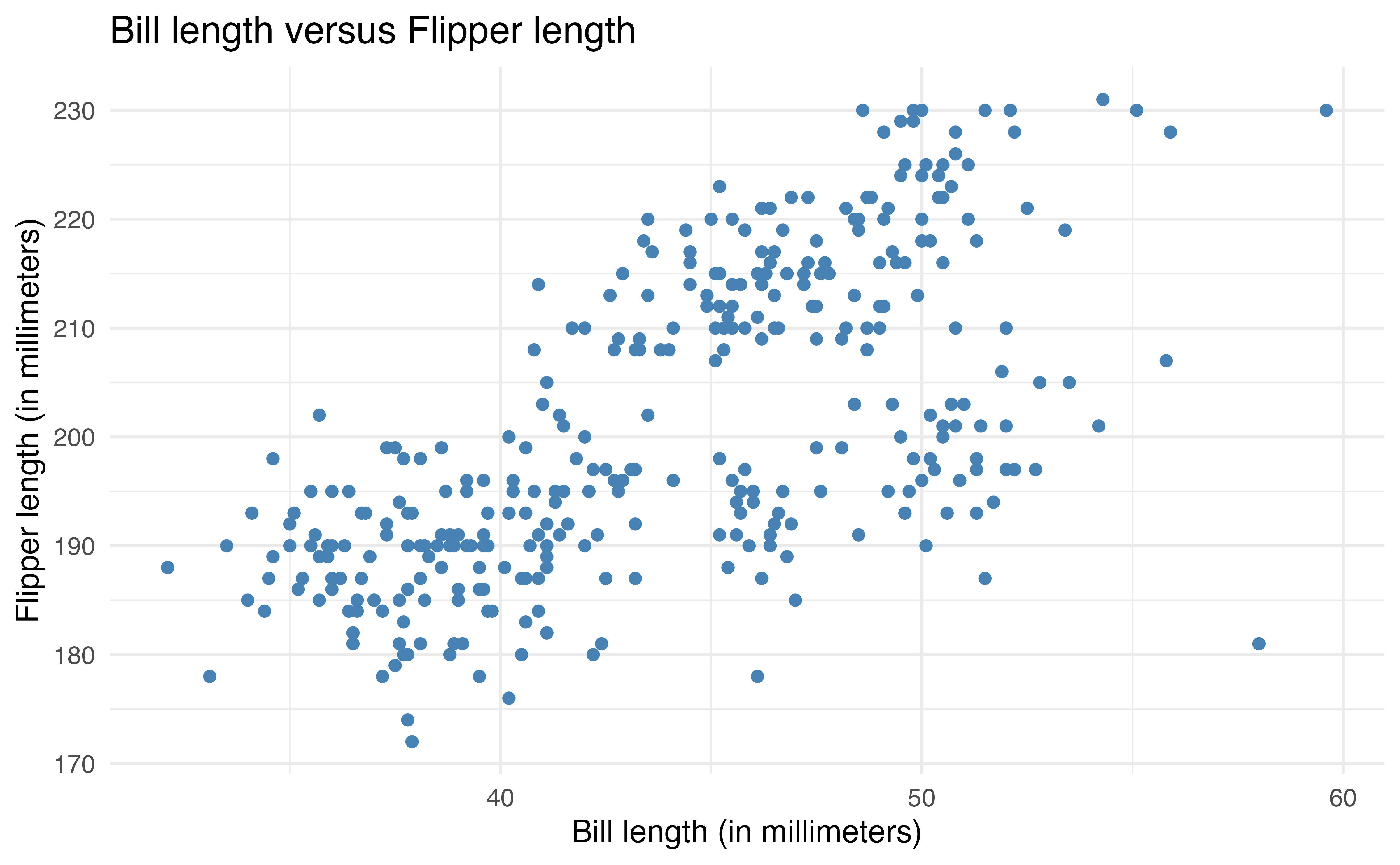
The second way to apply aesthetics is to map them to specific variables. This adds makes the visualization engaging and adds additional information about the data. This is useful in data analysis when we want to make comparisons across subgroups of data.
The aesthetics are defined inside aes() to map them to a particular variable (similar to defining the variables that go on each axis). For example, the code below colors the points based on species. We also add a subtitle and update the color label in labs().
ggplot(data = penguins, aes(x = bill_length_mm, y = flipper_length_mm,
                            color = species)) +
  geom_point() +
  labs(x = "Bill length (in millimeters)",
       y = "Flipper length (in millimeters)",
       title = "Bill length versus Flipper length",
       color = "Species",
       subtitle = "By species")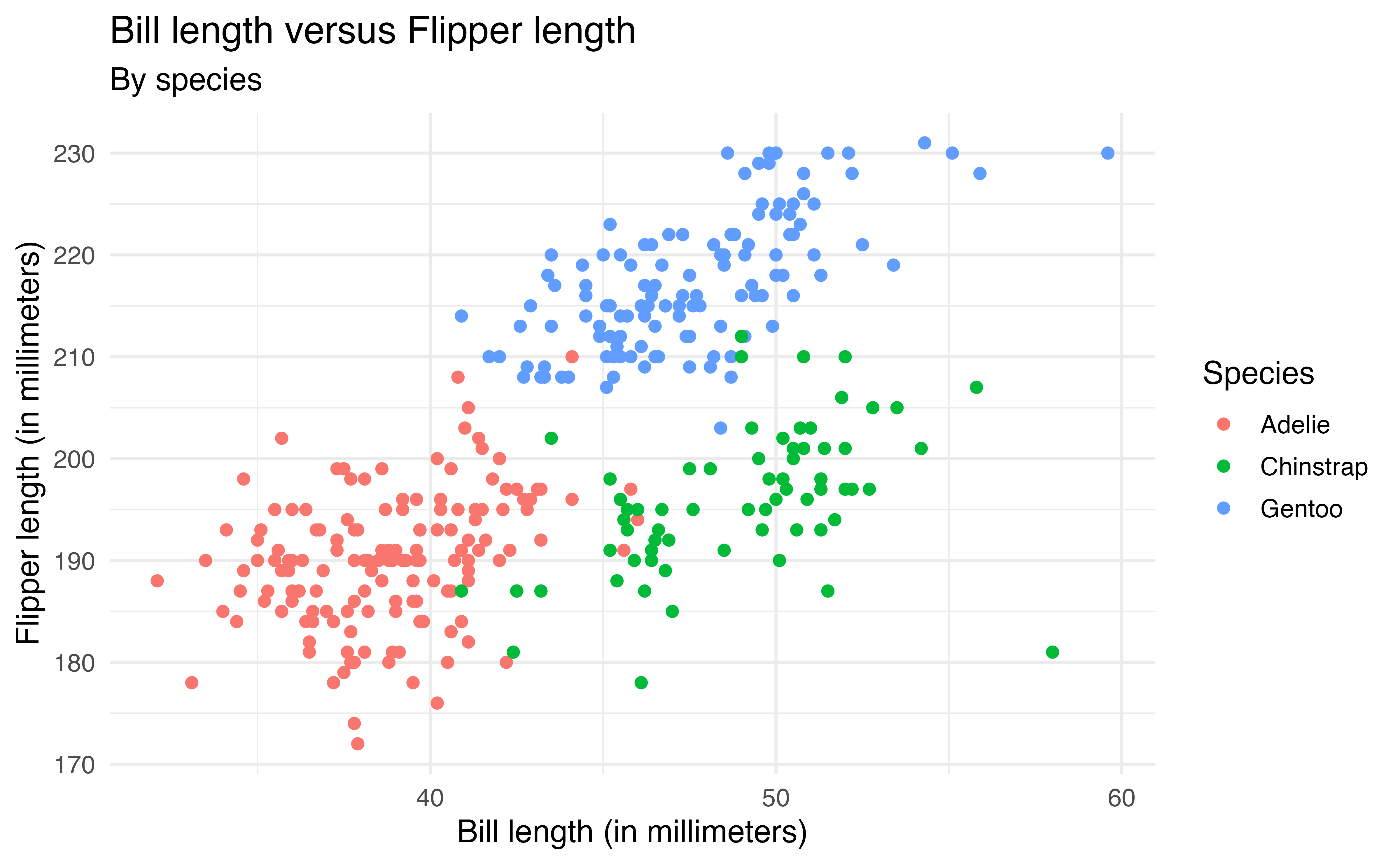
species
Now we are able to see the relationship between bill_length_mm and flipper_length_mm by species and make comparisons between species.
We can also map multiple aesthetics to variables. In the code below, the color of the points is based on species and the shape is based on island.
ggplot(data = penguins, aes(x = bill_length_mm, y = flipper_length_mm,
                            color = species, shape = island)) +
  geom_point() +
  labs(x = "Bill length (in millimeters)",
       y = "Flipper length (in millimeters)",
       title = "Bill length versus Flipper length",
       color = "Species",
       shape = "Island",
       subtitle = "By species and island")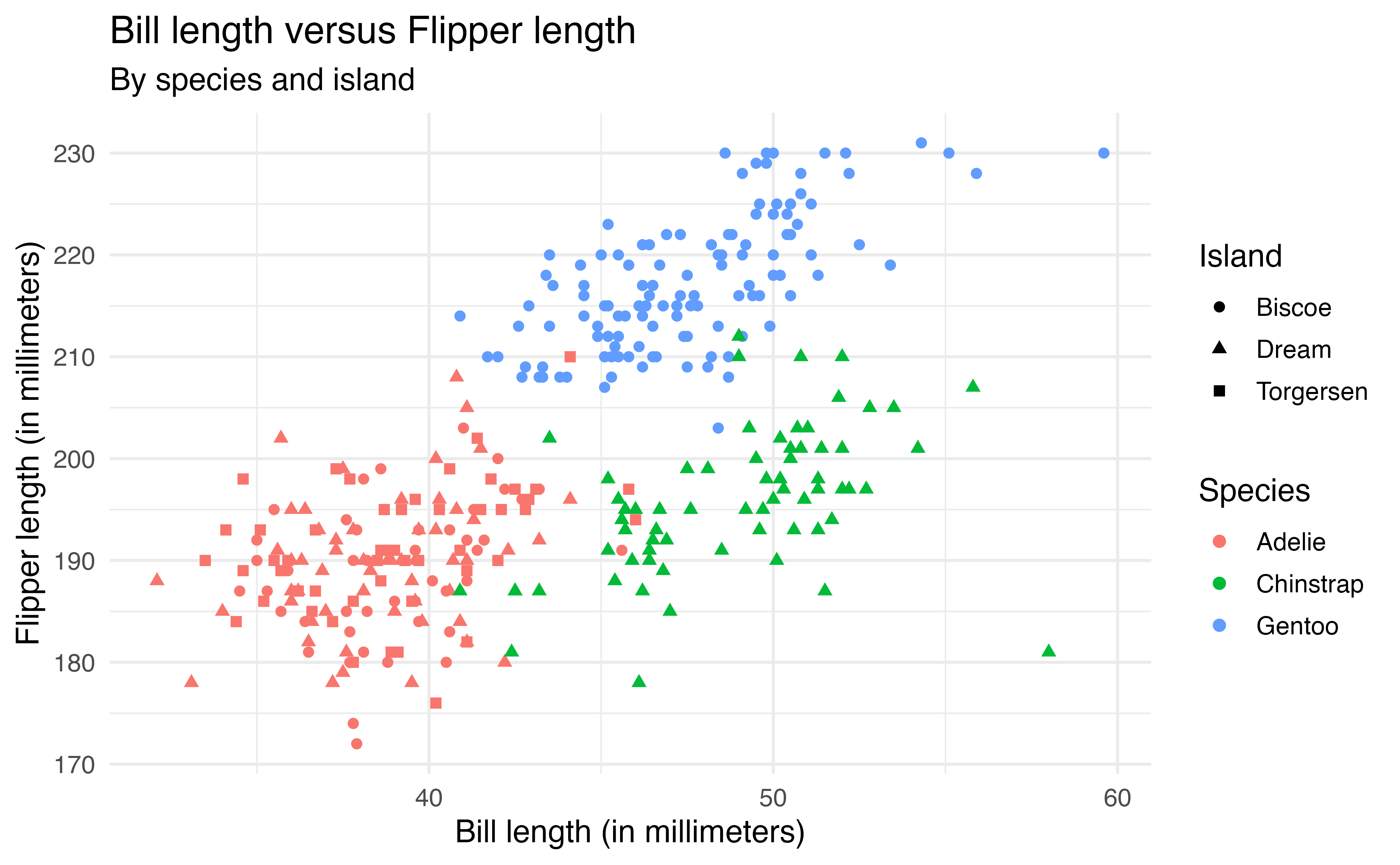
species and shape by island
The code below produces the plot of the bill_length_mm versus species in Figure 2.6.
ggplot(data = penguins, aes(x = species, y = bill_length_mm)) +
  geom_boxplot()
Describe how to update the code such that
all boxes are filled in using the color
cyan.the color of the boxes are filled in based on
species.9
2.6.3 Faceting
Another way to view a visualization by subgroups is by faceting, creating a separate plot for each subgroup. The facet_wrap function is used to facet based on a single variable. In the code below, we modify the previous plot by faceting by island rather than changing the shape based on island.
ggplot(data = penguins, aes(x = bill_length_mm, y = flipper_length_mm,
                            color = species)) +
  geom_point() +
  labs(x = "Bill length (in millimeters)",
       y = "Flipper length (in millimeters)",
       title = "Bill length versus Flipper length",
       color = "Species",
       shape = "Island",
       subtitle = "Faceted by island") +
  facet_wrap(vars(island))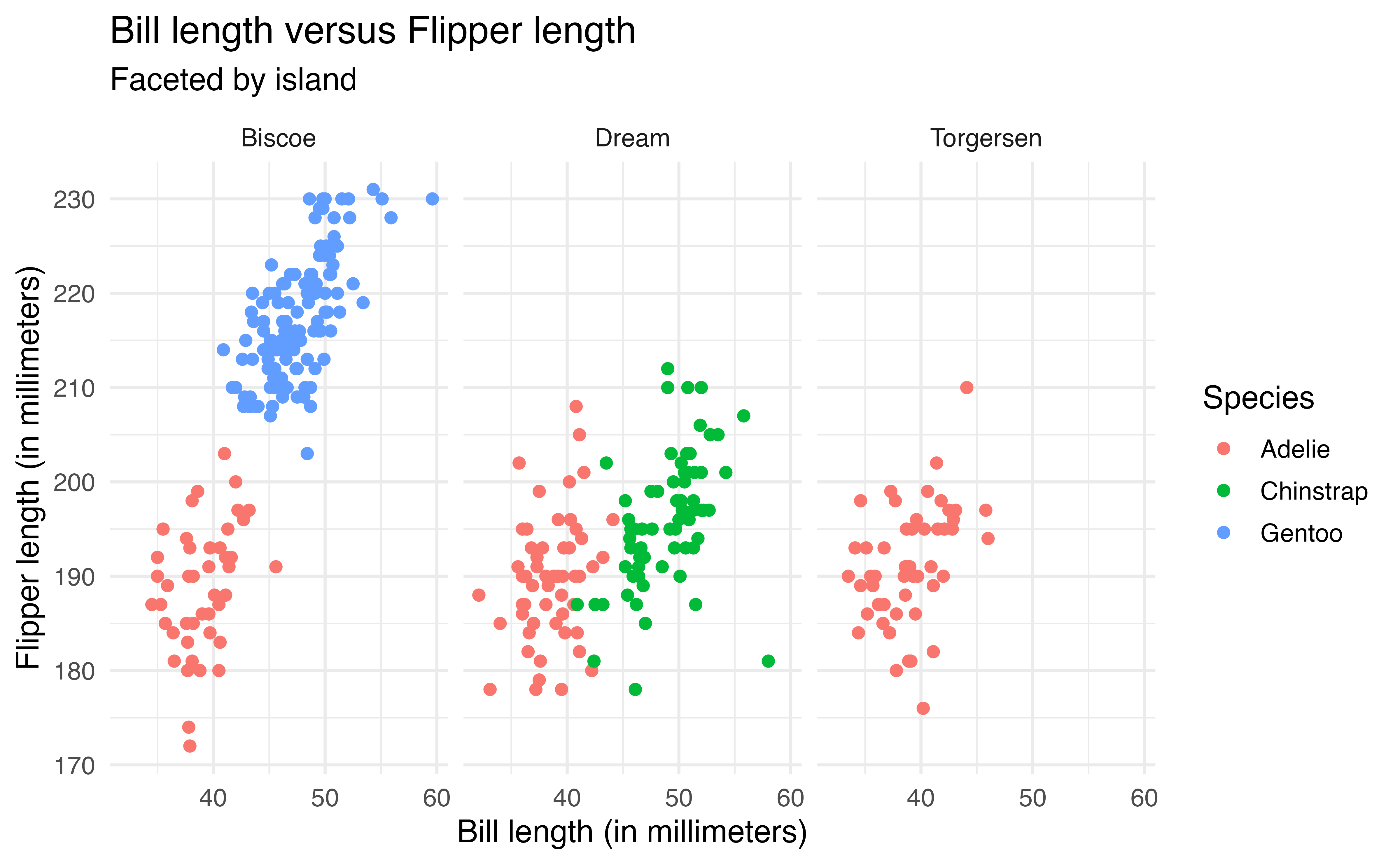
island
Because there is a lot of overlap across islands, the faceted plot makes it easier to see the relationship within each island and identify which species are on each island.
We use facet_grid() to facet based on two variables, such that one variable defines the rows and the other defines the columns. In the code below, we now update the previous plot such that the rows are defined by island the columns are defined by species.
ggplot(data = penguins, aes(x = bill_length_mm, y = flipper_length_mm,
                            color = species)) +
  geom_point() +
  labs(x = "Bill length (in millimeters)",
       y = "Flipper length (in millimeters)",
       title = "Bill length versus Flipper length",
       color = "Species",
       subtitle = "Faceted by island and species") +
  facet_grid(rows = vars(island),
             cols = vars(species))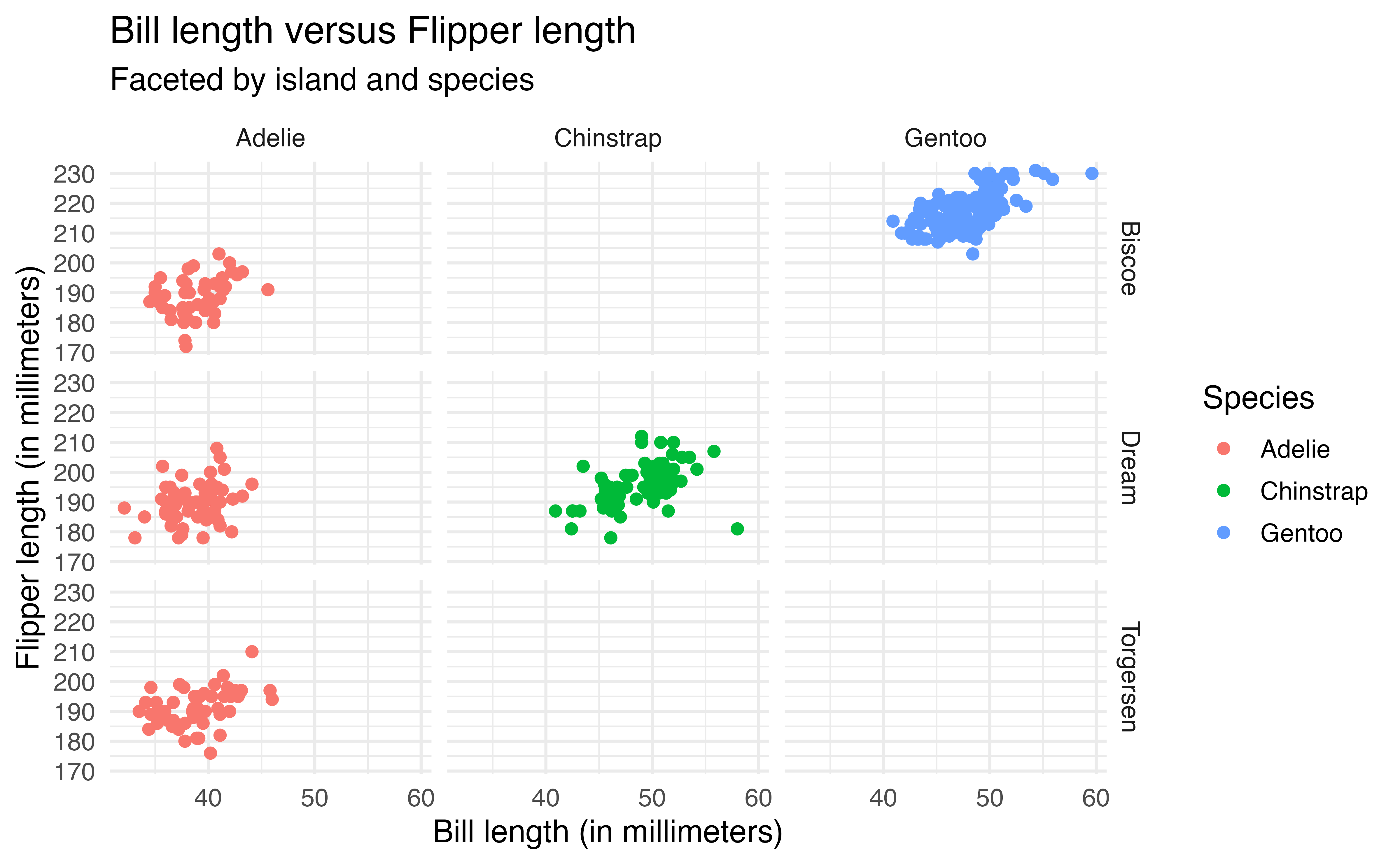
island and species
Note that facet_grid() creates a plot for every possible combination of the variables. The empty plots indicate combinations of island and species that do not exist in the data.
Recreate the plot below of flipper_length_mm versus species faceted by year. 10
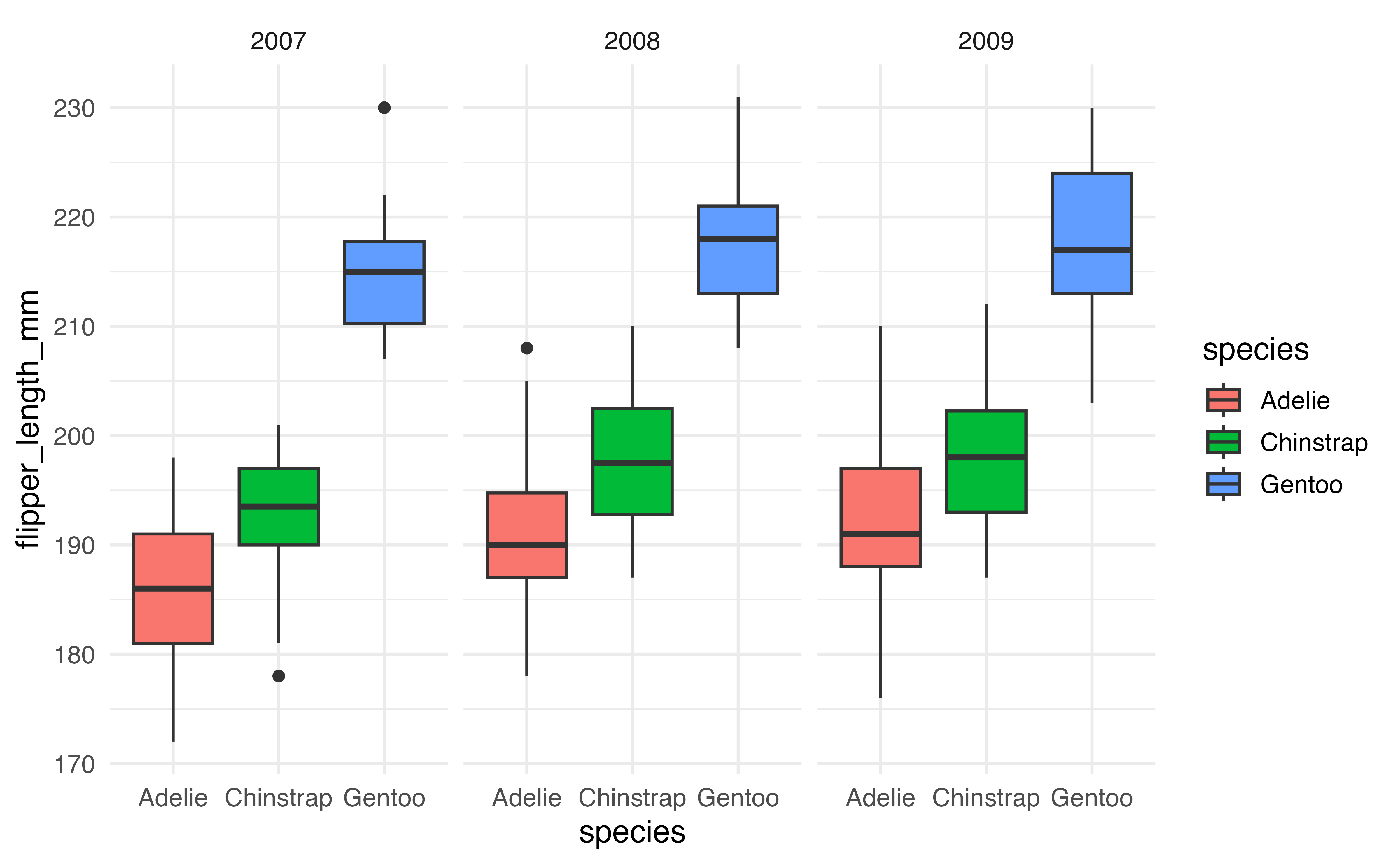
flipper_length_mm versus species faceted by year
2.6.4 Color palettes
Thus far, we have relied on the default color palette in ggplot2 when we’ve mapped an aesthetic to color. We may wish to choose colors to align with a particular color scheme or those that are more accessible. The functions scale_color_manual() and scale_fill_manual() are used to “manually” define color palettes. We use scale_color_manual() to define a color palette that maps onto the color aesthetic and scale_fill_manual() to define a color palette that maps to the fill aesthetic.
Packages such as viridis (Garnier et al. 2024) and PNWColors (Lawlor 2020) have pre-defined color palettes. Both packages are available on CRAN. In the code below, we apply the Bay color palette from the PNWColors package to Figure 2.9, the scatterplot of bill_length_mm versus flipper_length_mm colored by species.
The argument values = pnw_palette("Bay", 3) indicates that the colors are mapped to the Bay color palette using there colors (one for each species).
library(PNWColors)

ggplot(data = penguins, aes(x = bill_length_mm, y = flipper_length_mm,
                            color = species)) +
  geom_point() +
  labs(x = "Bill length (in millimeters)",
       y = "Flipper length (in millimeters)",
       title = "Bill length versus Flipper length",
       subtitle = "By species") +
  scale_color_manual(values = pnw_palette("Bay", 3))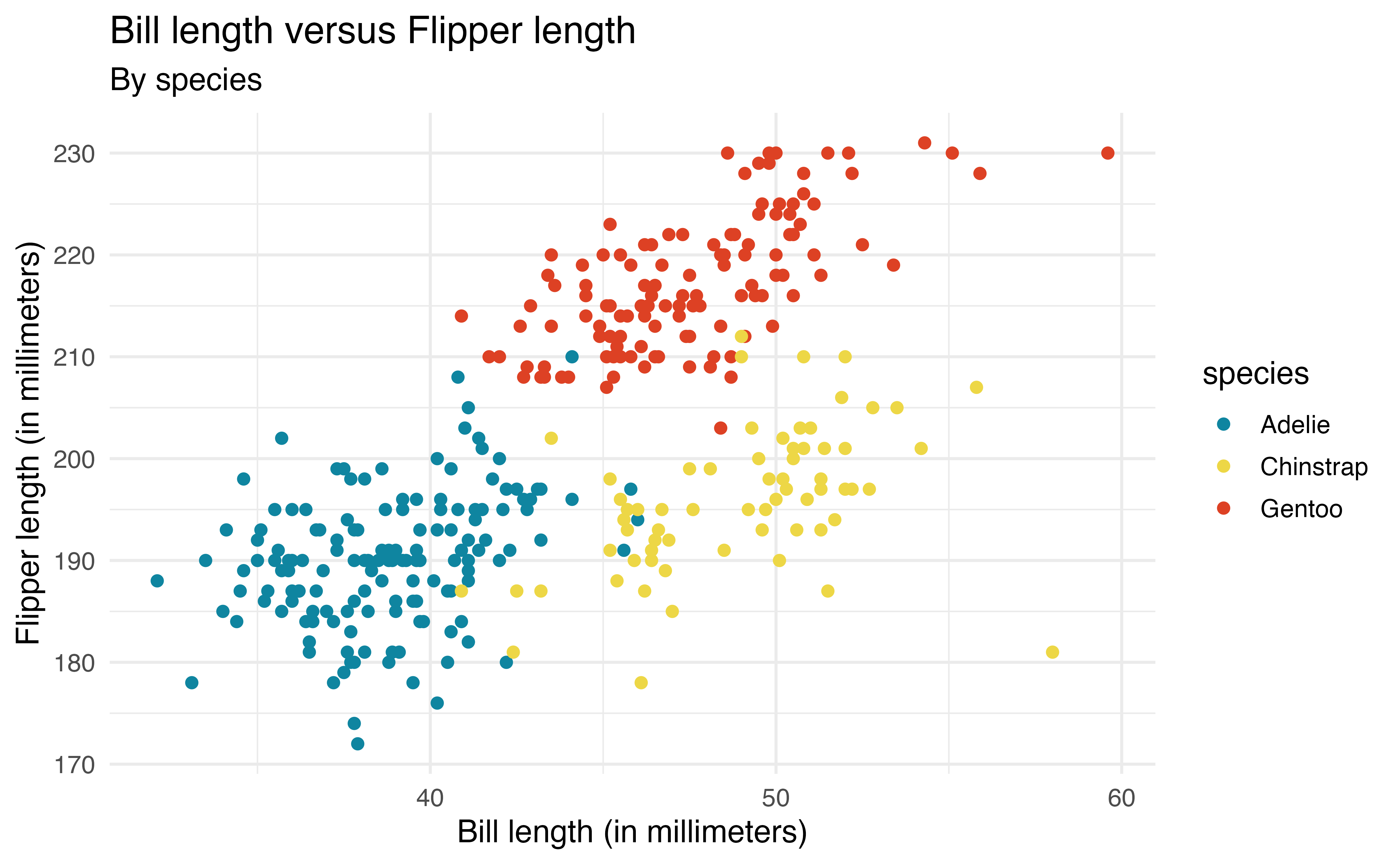
We may also wish to create a color palette. For example, here we apply the palette my_color_palette that is defined using HTML hex codes.
my_color_palette <- c("#993399", "#2B8181", "#CB4F04")

ggplot(data = penguins, aes(x = bill_length_mm, y = flipper_length_mm,
                            color = species)) +
  geom_point() +
  labs(x = "Bill length (in millimeters)",
       y = "Flipper length (in millimeters)",
       title = "Bill length versus Flipper length",
       subtitle = "By species and island") +
  scale_color_manual(values = my_color_palette)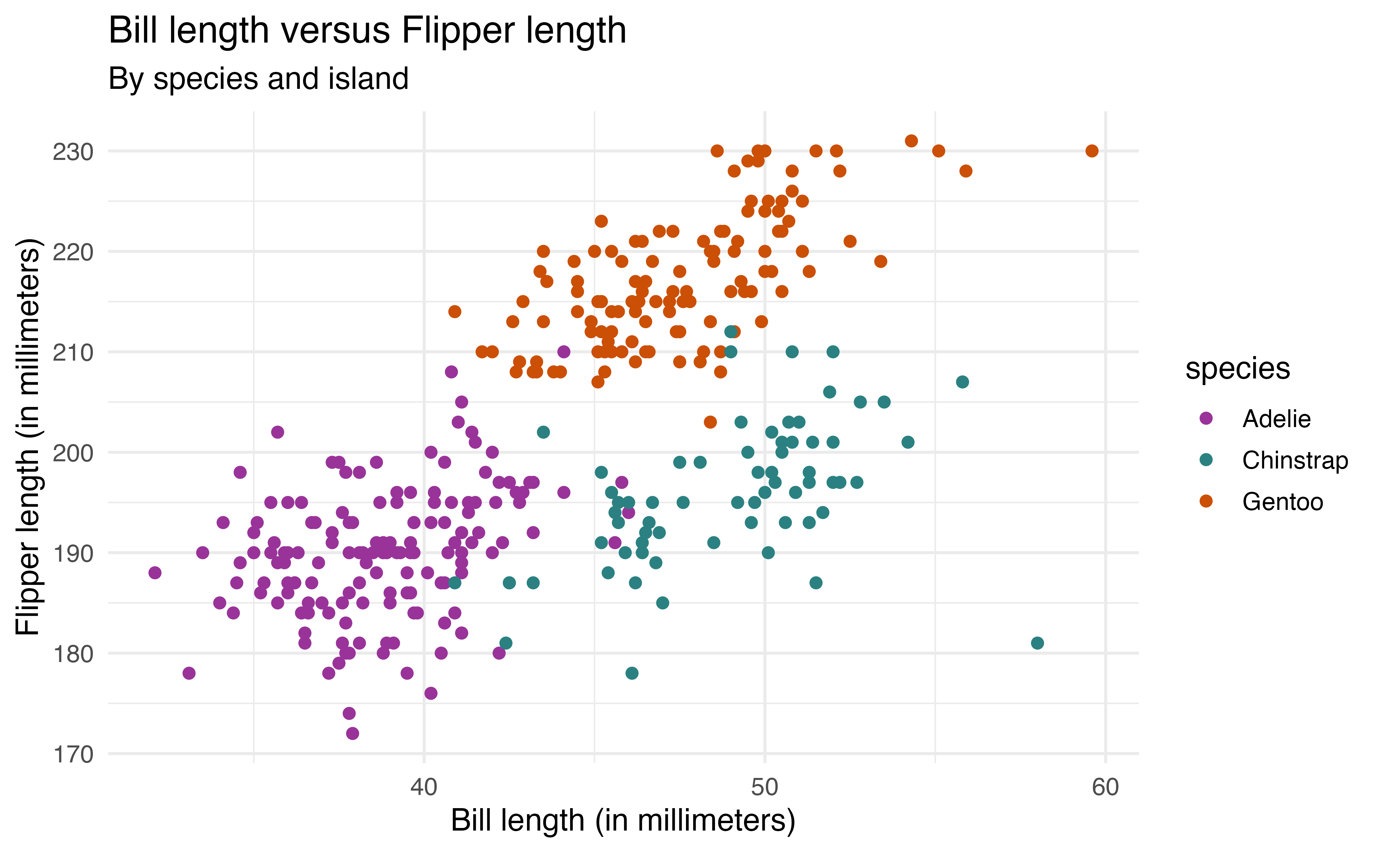
When choosing a color palette, it is important to consider the accessibility of the color choices, how they may be viewed by individuals with color-blindness , and how they appear in gray scale. There are multiple ways to check the accessibility of color palettes. The Color Palette Finder on the R Graph Gallery website (https://r-graph-gallery.com/color-palette-finder) is a tool for checking the accessibility of pre-defined color palettes. The colorblindcheck R package (Nowosad 2019) allows users to check the accessibility of pre-defined or custom color palettes.
2.7 Quarto
In Chapter 1 we introduced reproducibility, a key component of data science in which analysis is conducted in such a way that another person (or ourselves months later) can produce the same results given the same code and data set.
Quarto is “an open-source scientific and technical publishing system” (PBC 2025) developed by Posit for conducting reproducible data science. Quarto documents can produce many different types of formats including PDFs, Word documents, websites, books, and others using a consistent syntax and document structure.11 Quarto is not automatically included in RStudio, so it must be installed. It can be downloaded from https://quarto.org/docs/get-started. It is automatically installed in Positron.
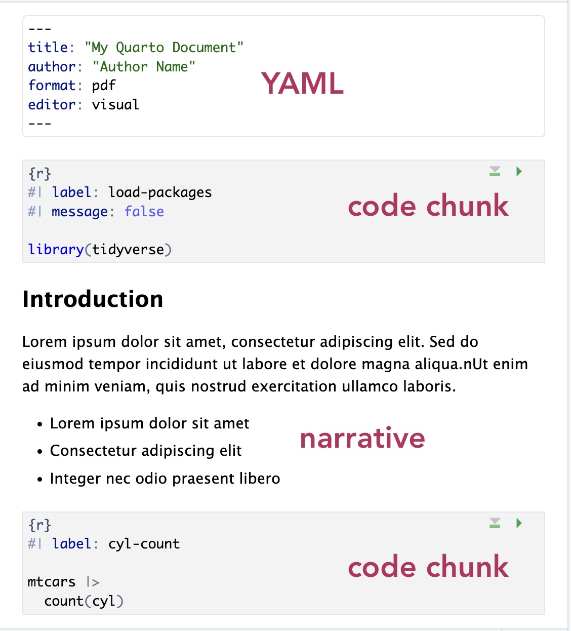
Figure 2.16 is an example of a Quarto (.qmd) document. All code, output, and narrative are in a single document, and the resulting output updates as changes are made to the document. This eliminates the need to copy and paste results from one document to another throughout the analysis, a process that is prone to error. Let’s take a look at the parts of the Quarto document in Figure 2.16.
The YAML (“Yet Another Markup Language” or “YAML Ain’t Markup Language”) is considered the “front matter” of the document. This is where we include content for the heading, such as title, author, and date. This is also where we specify the format type and other global features to be applied for the entire document. The YAML in Figure 2.16 shows global code chunk options applied so that the code is displayed when the document is rendered echo: true , but all additional warnings and messages are suppressed warning: false and message: false
The code chunk is where we put all code that is executed when the document is rendered. R code chunks12 can be added to the document by starting with ```{r} and ending with ```. They can also be added from the Insert menu in the tool bar of the visual editor. A variety of options can be applied to code chunks primarily to customize how they display code and results in the rendered document. Section 28.5 in R for Data Science (Wickham, Çetinkaya-Rundel, and Grolemund 2023) provides an extensive overview of code chunks and the set of options to customize them.
The narrative is written in the white space of the document. The visual editor in RStudio and Positron makes formatting the narrative (e.g, making text bold or adding lists) similar to formatting in word processors such as Google Docs, Apple Pages, or Microsoft Word. The visual editor also makes it easy to add images and tables within the narrative.
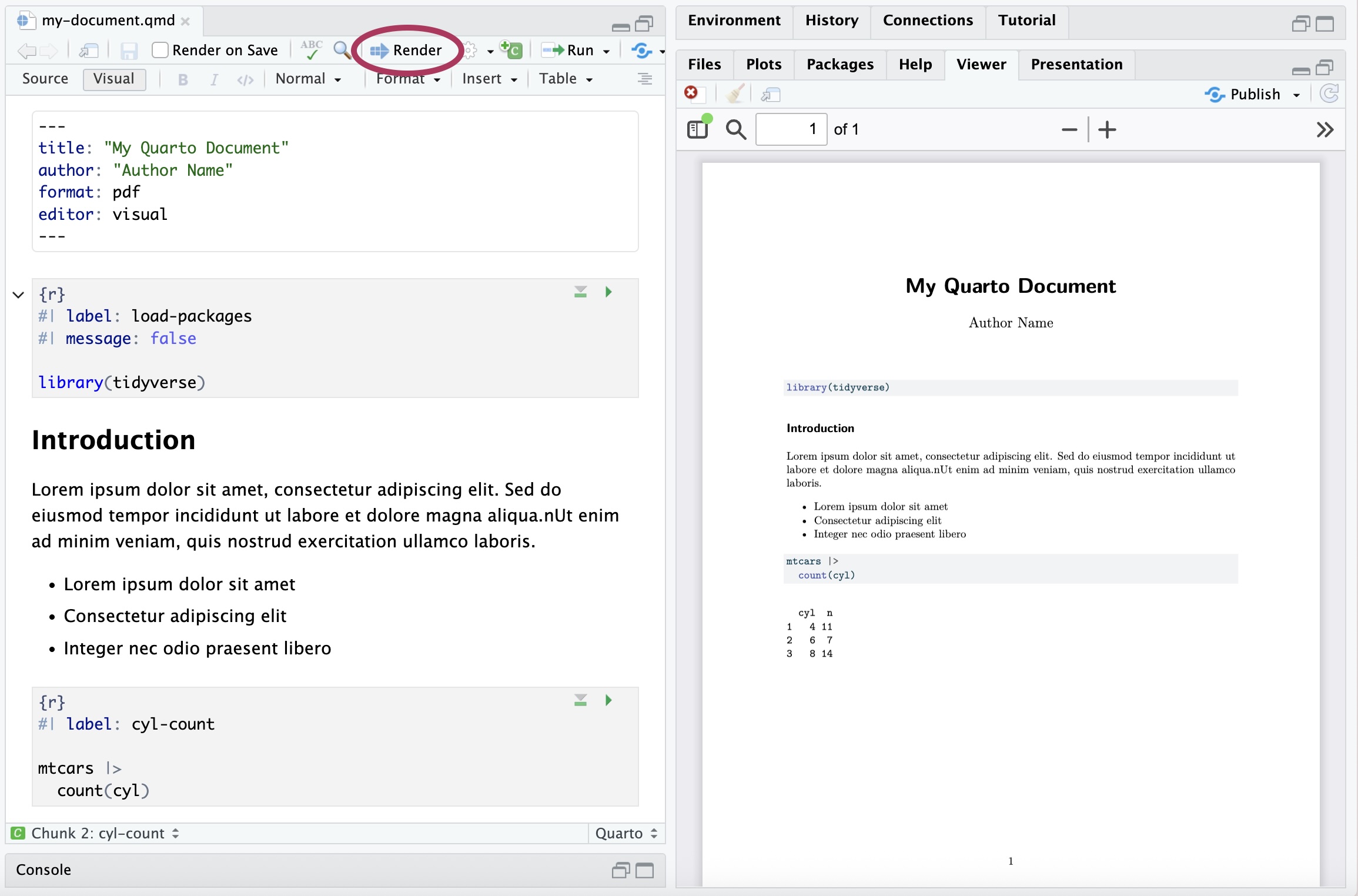
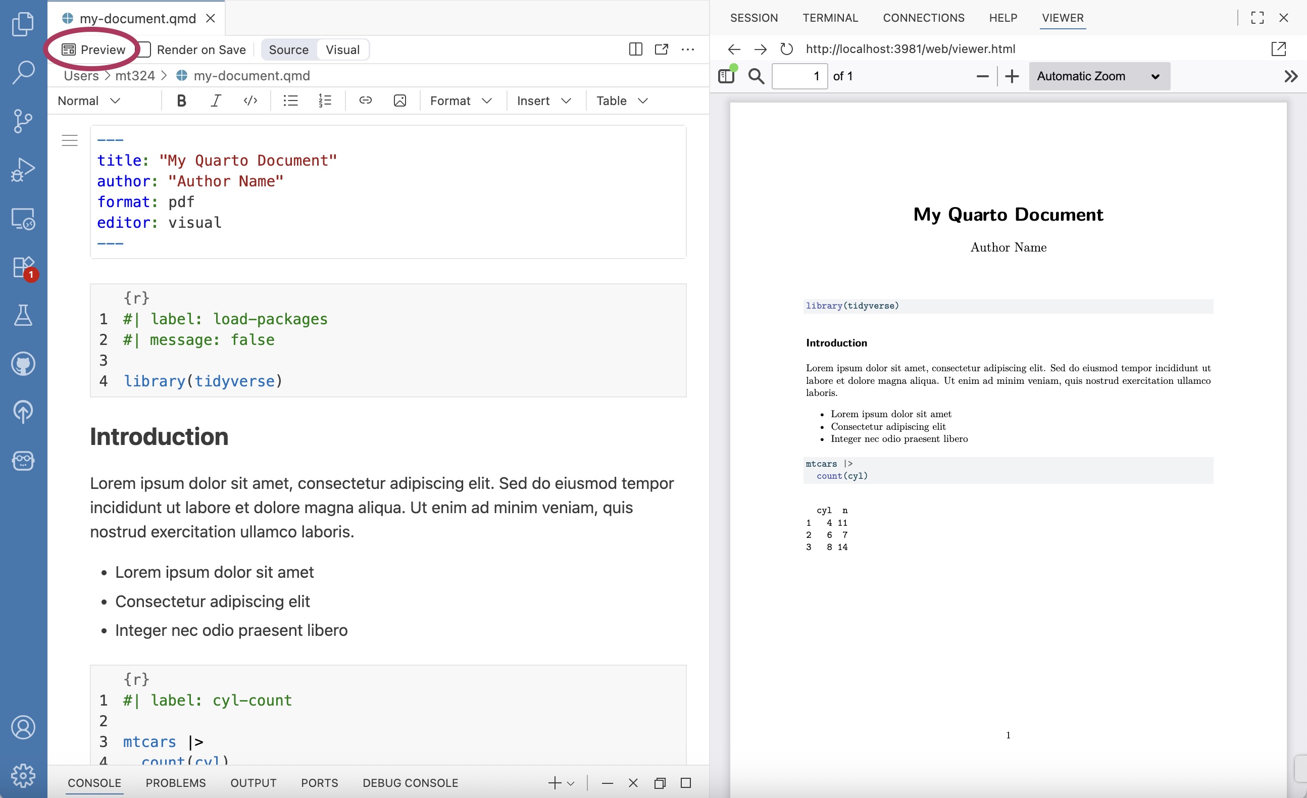
Throughout the analysis workflow, we regularly render the Quarto document to see the updated results and narrative. Documents are rendered by clicking the “Render” button in RStudio (Figure 2.17 (a)) and the “Preview” button in Positron (Figure 2.17 (b)). We also see the resulting PDFs in the Viewer pane of each IDE. When a document is rendered, all code and narrative are executed sequentially from beginning to end. Therefore, all necessary code must be in the Quarto document to render properly; code in the console is not executed when a document is rendered.
The assignments in the supplemental materials for this book are designed to be written in Quarto. See Chapter 28 in R for Data Science (Wickham, Çetinkaya-Rundel, and Grolemund 2023) and quarto.org for further reading and resources on Quarto.
2.8 Summary
In this chapter, we introduced data wrangling and data visualization using the tidyverse (specifically dplyr and ggplot2 packages), focusing on code for the analysis tasks frequently used in this book. We also showed ways to customize plots for effective communication and accessibility, and we introduced Quarto for writing reproducible reports. There are many online resources about the tidyverse and Quarto. A few primary resources for additional reference and practice are the following: R for Data Science (Wickham, Çetinkaya-Rundel, and Grolemund 2023), tidyverse.org, and quarto.org.
In Chapter 3, we utilize the computing from this chapter as we begin analyzing data in the exploratory data analysis.
At this point, Positron is fairly new, so it has not been widely adopted in the classroom. We anticipate that will change over time as more users move to Positron.↩︎
Use
install.packages("remotes")if the remotes package is not installed.↩︎There are 152 penguins in the Adelie species.↩︎
Only the first 10 observations are displayed.↩︎
penguins |> filter(island == "Biscoe") |> arrange(desc(bill_length_mm)) |> select(species, bill_length_mm). The species is Gentoo and the bill length is 59.6 mm.↩︎This function can also be spelled
summarise().↩︎Code to compute median bill length by species and island:
penguins |> group_by(sex, species) |> summarize(median_bill_length = median(bill_length_mm, na.rm = TRUE)). The median bill length for Adelie penguins on Dream island is 38.55 mm.↩︎Type
colors()in R to see the full list of built-in colors.↩︎- Include
fill = "cyan"ingeom_boxplot(). - Include
fill = speciesinaes().
- Include
ggplot(data = penguins, aes(x = species, y = flipper_length_mm, fill = species)) + geom_boxplot() + facet_wrap(vars(year))↩︎In fact, this book was written using Quarto in RStudio!↩︎
Quarto supports other coding languages such as Python and Julia.↩︎