month
Describe the distribution of an individual variable using visualizations and summary statistics
Describe the relationship between two or more variables using visualizations and summary statistics
Identify outliers and other interesting features in the data
Explain how outliers and other unusual features may impact analysis results
Allrecipes (allrecipes.com) is a popular cooking website visited by over 60 million users each month (Allrecipes 2025). The site is most known for providing recipes and tips making it easy to cook a variety of dishes from around in the world at home. The recipes are primarily submitted by non-professional home cooks, and users can rate and review the recipes. Each week, over 200 new recipes are added to the site and over 2000 recipes receive new ratings (Allrecipes 2025).
The analysis in this chapter will focus on 2218 recipes that were posted on Allrecipes between February 2009 and July 2025. In this data, a recipe is “posted” if it is newly published or updated. The data were adapted from the cuisines data frame in the tastyR R package (Mubia 2025a). The data in cuisines were originally scraped from Allrecipes by data scientist Brian Mubia (Mubia 2025b). The tastyR package was featured as part of TidyTuesday (Community 2024), the weekly data visualization challenge, in September 2025.
The data are in recipes.csv. We will use the following variables:
country: The country / region the cuisine is from (Brazilian, Filipino, French, Italian, Other). This is a simplified version of the country variable in the cuisines data frame.
author: User who posted the recipe
chef_john: Indicator of whether recipe was posted by American Chef John Mitzewich (known as Chef John), derived from the variable author. (1: Posted by Chef John, 0: Not posted by Chef John)
month: Month in which the recipe posted, derived from the variable date_published in the cuisines data frame. (1: January, 2: February, 3: March, . . ., 12: December).
season: Season in which the recipe was posted, derived from variable date_published and based on the definition of seasons in National Centers for Environmental Information (NCEI) (2025).)
Spring: Months 3, 4, 5
Summer: Months 6, 7, 8
Fall: Months 9, 10, 11
Winter: Months 12, 1, 2
calories: Number of calories per serving
protein: Amount of protein per serving (in grams)
avg_rating: Average rating (1: worst to 5: best)
total_ratings: Number of ratings
reviews: Number of reviews
prep_time: Preparation time (in minutes)
cook_time: Cooking time (in minutes)
total_time: Total time to make dish (in minutes).
prep_time + cook_time but not always. This could include other factors such as marination time or additional waiting periods.servings: Number of servings
See the tastyR documentation (Mubia 2025a) for the full codebook.
Our goal is to use exploratory data analysis to understand the distributions of key variables, the relationships between variables, and other interesting features in the data.
This book is about regression analysis, using statistical models to describe the relationship between a response variable and one or more predictor variables, as well as use predict values of the response variable. This chapter focuses exploratory data analysis, an important step of the workflow that happens before modeling as show Figure 1.3. Exploratory data analysis (EDA) is the process of examining the data to better understand the observations, distributions of variables, relationships between variables, and other interesting features of the data. It helps us identify observations that are far from the majority of the data, instances of missing data, and potential errors in the data . Lastly, it is where we gain initial insights about potential relationships between variables that help inform the decisions we’ll make as we do the regression analysis.
In his 1977 book Exploratory Data Analysis , Statistician John Tukey described EDA as “looking at data to see what it seems to say” (Tukey et al. 1977, 2:v). This short definition emphasizes an important point about EDA. It is only used to glean initial insights from the data (“what it seems to say”) not to draw conclusions. We use statistical inference (Chapter 5 and Chapter 8) to draw conclusions from the data. Though we can’t draw conclusions from EDA, it is still a critical step in th workflow. The insights gleaned from EDA help us more fully understand the implications of our results as we apply them in practice. It also helps us as data scientists better communicate the nuances in the data to collaborators and stakeholders. We typically don’t publish all the results of EDA in a final report or presentation, but the knowledge gained from EDA is infused throughout any report or presentation as we describe the data, interpret results, and share conclusions. Simply put,
“Exploratory and confirmatory [statistical inference] can – and should - proceed side by side.” (Tukey et al. 1977, 2:vii)
Figure 3.1 shows the workflow for exploratory data analysis. We typically start by getting a general sense of the data, then explore more detailed relationships in the data.
In each step of the workflow, we will also make note of outliers, observations that are far from the majority of the data. The remainder of this chapter follows the progression outlined above, but the workflow may not be as linear in practice. In fact, some data cleaning may occur based on what is learned at each subsequent step. The goal is to explore, and thus use judgment and creativity to move around the data and guide the exploration.
After loading the data into software, the first step of the EDA workflow (Figure 3.1) is an initial check to get an overall view of the data and some initial data cleaning. The purpose of this check is to see whether the data loaded into the software as expected, identify what the rows and columns represent, and understand the variable types and their formats. This step is important, because it allows us to begin data cleaning and make necessary changes to the data and variable formats before moving too far into the analysis.
Statistical software typically has functionality to view a summary of the data. For example, the glimpse() function in the tidyverse R package (Wickham et al. 2019) provides a summary (or “glimpse”) of the data, like the one shown in Table 3.1. We can often view data in its original format (e.g., .xlsx or .csv) before loading it into the software; however, we still need to check the data after loading it into the software in case of information loss or other problems.
recipes data
Rows: 2,218
Columns: 22
$ name           <chr> "Saganaki (Flaming Greek Cheese)", "Coney Island Knishe…
$ country        <chr> "Other", "Other", "Other", "Other", "Other", "Other", "…
$ url            <chr> "https://www.allrecipes.com/recipe/263750/flaming-greek…
$ author         <chr> "John Mitzewich", "John Mitzewich", "CHIPPENDALE", "Hei…
$ date_published <date> 2024-02-07, 2024-11-26, 2022-07-14, 2025-01-31, 2025-0…
$ ingredients    <chr> "1 (4 ounce) package kasseri cheese, 1 tablespoon water…
$ calories       <dbl> 391, 301, 64, 106, 449, 958, 378, 90, 157, 322, 4, NA, …
$ fat            <dbl> 25, 17, 3, 9, 23, 24, 10, 5, 6, 16, 0, NA, 21, 2, 66, 8…
$ carbs          <dbl> 15, 31, 9, 7, 58, 144, 59, 10, 25, 39, 1, NA, 16, 63, 7…
$ protein        <dbl> 16, 7, 1, 1, 7, 46, 14, 1, 2, 7, 0, NA, 28, 6, 54, 17, …
$ avg_rating     <dbl> 4.8, 4.6, 4.3, 5.0, 3.8, 4.4, 4.3, NA, 4.6, 5.0, 4.7, 4…
$ total_ratings  <dbl> 25, 10, 126, 1, 13, 40, 3, NA, 65, 2, 182, 2, 19, 16, 9…
$ reviews        <dbl> 22, 9, 104, 1, 11, 32, 3, NA, 55, 2, 138, 2, 15, 16, 84…
$ prep_time      <dbl> 10, 30, 20, 10, 30, 30, 30, 40, 0, 5, 5, 5, 10, 10, 20,…
$ cook_time      <dbl> 5, 75, 15, 0, 15, 165, 75, 30, 0, 5, 0, 25, 10, 50, 16,…
$ total_time     <dbl> 15, 180, 180, 10, 45, 675, 585, 155, 0, 10, 5, 30, 50, …
$ servings       <dbl> 2, 16, 12, 6, 15, 6, 6, 84, 24, 1, 21, 8, 4, 10, 4, 8, …
$ year           <dbl> 2024, 2024, 2022, 2025, 2025, 2022, 2023, 2020, 2025, 2…
$ month          <dbl> 2, 11, 7, 1, 2, 8, 12, 6, 1, 6, 8, 9, 12, 9, 12, 7, 9, …
$ days_on_site   <dbl> 541, 248, 1114, 182, 164, 1085, 598, 1869, 192, 60, 106…
$ chef_john      <dbl> 1, 1, 0, 0, 0, 0, 0, 0, 0, 0, 0, 0, 0, 0, 1, 0, 0, 0, 0…
$ season         <chr> "Winter", "Fall", "Summer", "Winter", "Winter", "Summer…
Table 3.1 shows a summary of the recipes data. The rows contain the observations (also known as cases) in the data and the columns contain the variables that describe each observation. There are 2218 rows (observations) and 22 columns (variables) in the data. Each row represents a recipe posted on Allrecipes and each column is a feature or characteristic of the recipe. At this point, we can ask ourselves if these are the expected number of rows and columns based on the original data source. If not, we need to figure out the discrepancy in the number of rows and/or columns and address it before moving forward.
Once we understand the structure of the data, we look at the individual variables more closely. At this point, the primary focus is on the variable type, but we may also notice if there are any missing values (typically coded as NA) and anything else notable about the variable that we want to explore further.
There are three types of variables: quantitative variables, categorical variables, and identifier variables. We typically assign the variable type based on the description and how the observations appear in the data. For example, we typically think of a variable such as age, an individual’s age in years, as quantitative. This is the case if the values are numeric values such as 18, 24, 35,.... However, age is a categorical variable if is defined as age ranges, such as 18-25, 26-30, 31-35,.... It is important to know the variable type, because that informs how the variable is handled in the regression analysis.
What type of variable is month?
What is the more reliable identifier variable - name or url?1
In addition to knowing the variable type, we also need to know how it is stored in the software. When the data set is loaded into the software, the software stores each column (the variables) as a specific format. Typically, this column format aligns with the variable type (this is what we want!), but occasionally the format does not align with the variable type. Therefore, the next step of the initial data check is to make sure the column formats are as we expect and address any mismatches.
In general, quantitative variables are stored in columns with double / floating point number formats, which are formats for columns that contain real numbers with decimals. In the output above, this is coded by the software as dbl, but you may also see this denoted by float64 or similar codes. The software treats columns with this format as numeric data. Examples of these columns in the recipes data set are avg_rating and prep_time. These are both quantitative variables and are being stored in the double/floating point number format in the software. Therefore, the column format aligns with the variable type and will be treated as we expect by the software as we do the analysis.
Columns that contain categorical data are typically stored as character or factor formats. The software treats both of these formats as text rather than numeric data. The primary difference between character and factor types is that the data stored as factors also have an ordering applied. Let’s take a look at some categorical variables in the recipe data . The variables country and and author are two categorical variables that are correctly stored in the software as character (<chr>) data formats.
One of the most common mismatches between the variable’s type and how it is stored occurs when categorical variables are stored in the software under numeric formats. From Table 3.1, we see this has occurred with the variables month and chef_john. This often happens when the categories are represented by numbers (e.g., “1” instead of “January”). Though we know they are categorical from Section 3.1, they are currently stored as double column types by the software. This means the the software thinks we can do calculations, such as find the average or standard deviation; however, these types of operations would not make sense in the context of month, for example. This mismatch can become particularly troublesome in the regression models. As we’ll see in Chapter 7, quantitative and categorical variables are handled differently in regression models.
We address these mismatches before moving forward with the EDA by changing the format in which such variables are stored. Once we have made changes to the data, we examine the summary of the data again to check the changes we’ve made and address any remaining issues. In Table 3.2, we see that chef_john and month are now correctly stored as factors, a format suitable for categorical variables. We are now ready to move on to the next step and explore the distributions of individual variables.
recipes data with correct formats for chef_john and month
Rows: 2,218
Columns: 22
$ name           <chr> "Saganaki (Flaming Greek Cheese)", "Coney Island Knishe…
$ country        <chr> "Other", "Other", "Other", "Other", "Other", "Other", "…
$ url            <chr> "https://www.allrecipes.com/recipe/263750/flaming-greek…
$ author         <chr> "John Mitzewich", "John Mitzewich", "CHIPPENDALE", "Hei…
$ date_published <date> 2024-02-07, 2024-11-26, 2022-07-14, 2025-01-31, 2025-0…
$ ingredients    <chr> "1 (4 ounce) package kasseri cheese, 1 tablespoon water…
$ calories       <dbl> 391, 301, 64, 106, 449, 958, 378, 90, 157, 322, 4, NA, …
$ fat            <dbl> 25, 17, 3, 9, 23, 24, 10, 5, 6, 16, 0, NA, 21, 2, 66, 8…
$ carbs          <dbl> 15, 31, 9, 7, 58, 144, 59, 10, 25, 39, 1, NA, 16, 63, 7…
$ protein        <dbl> 16, 7, 1, 1, 7, 46, 14, 1, 2, 7, 0, NA, 28, 6, 54, 17, …
$ avg_rating     <dbl> 4.8, 4.6, 4.3, 5.0, 3.8, 4.4, 4.3, NA, 4.6, 5.0, 4.7, 4…
$ total_ratings  <dbl> 25, 10, 126, 1, 13, 40, 3, NA, 65, 2, 182, 2, 19, 16, 9…
$ reviews        <dbl> 22, 9, 104, 1, 11, 32, 3, NA, 55, 2, 138, 2, 15, 16, 84…
$ prep_time      <dbl> 10, 30, 20, 10, 30, 30, 30, 40, 0, 5, 5, 5, 10, 10, 20,…
$ cook_time      <dbl> 5, 75, 15, 0, 15, 165, 75, 30, 0, 5, 0, 25, 10, 50, 16,…
$ total_time     <dbl> 15, 180, 180, 10, 45, 675, 585, 155, 0, 10, 5, 30, 50, …
$ servings       <dbl> 2, 16, 12, 6, 15, 6, 6, 84, 24, 1, 21, 8, 4, 10, 4, 8, …
$ year           <dbl> 2024, 2024, 2022, 2025, 2025, 2022, 2023, 2020, 2025, 2…
$ month          <fct> 2, 11, 7, 1, 2, 8, 12, 6, 1, 6, 8, 9, 12, 9, 12, 7, 9, …
$ days_on_site   <dbl> 541, 248, 1114, 182, 164, 1085, 598, 1869, 192, 60, 106…
$ chef_john      <fct> 1, 1, 0, 0, 0, 0, 0, 0, 0, 0, 0, 0, 0, 0, 1, 0, 0, 0, 0…
$ season <fct> Winter, Fall, Summer, Winter, Winter, Summer, Winter, S…Univariate exploratory data analysis is the exploration of individual variables. The goal is to better understand the variables in the data before exploring at relationships between variables. This is also where we begin to see how the observations in our sample data compare to the population of interest by identifying ways in which the sample data are representative of the population and ways it differs. This helps us understand the scope of inferential conclusions we can draw and potential limitations of the analysis. Univariate EDA is also where we can more clearly see outliers and missing data, and continue cleaning data, as needed.
The univariate distribution for a categorical variable includes the levels (or categories) of the variable and the number of observations or proportion of observations at each level. We examine distributions of categorical variables using visualizations and frequency tables.
Let’s examine the distribution of month, the month a recipe was posted, and get some initial insight into the times of year people generally post recipes to the website.
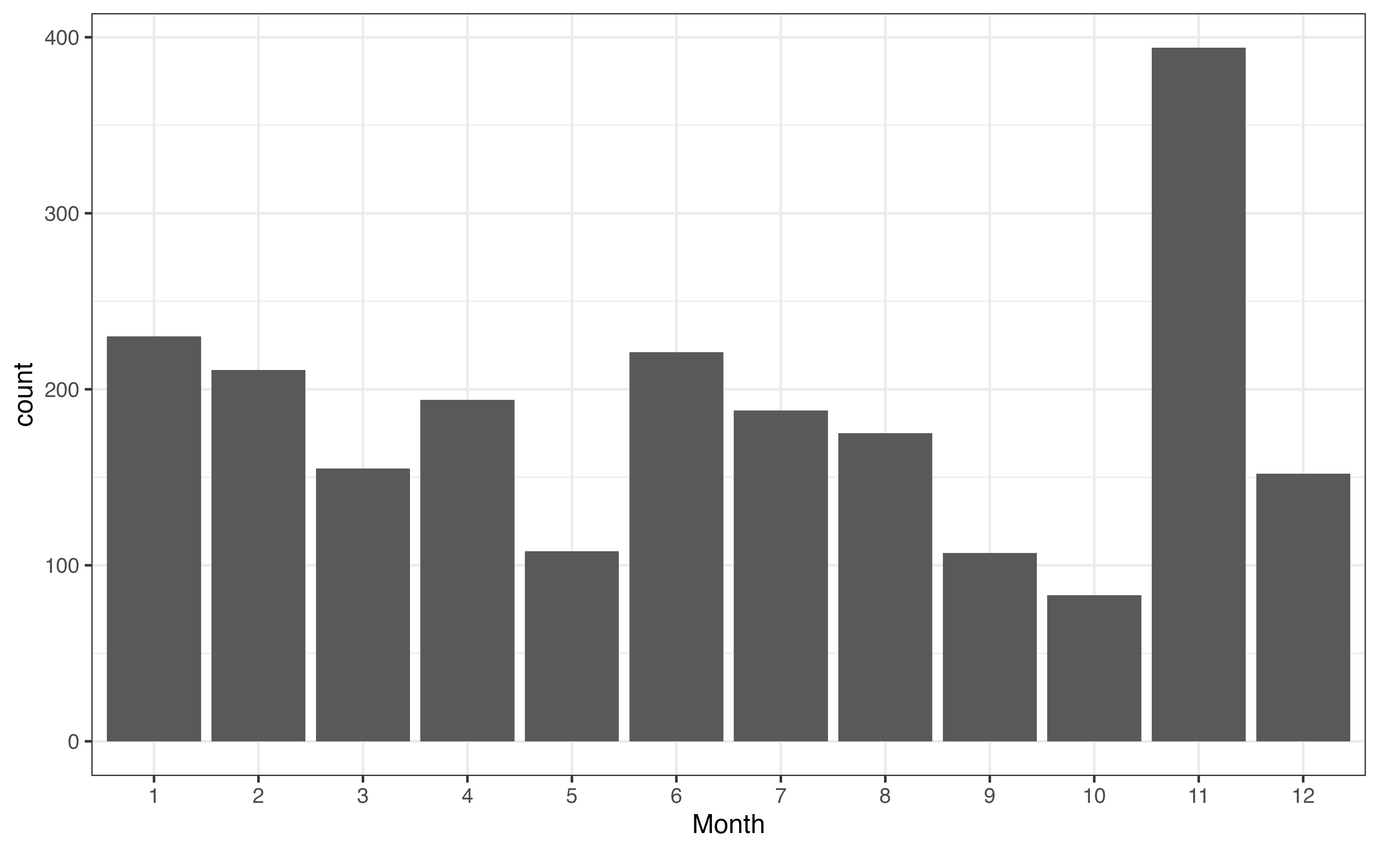
A bar chart is a commonly used visualization for univariate categorical distributions. A bar chart has one bar for each level, such that the height of the bar represents the frequency, the number of observations at that level. Figure 3.2 is the bar chart for month. There is a bar for each month, and the height of the bar represents the number of recipes posted that month.
month
As we look at Figure 3.2, one thing that immediately stands out is the large number of recipes in November. We are unable to determine the reason for this large spike from the plot alone, but we may have some hypotheses about why this is the case based on our understanding the site’s users and our collaborators’ subject-matter expertise. One hypothesis is that there is a large uptick in recipes during the holiday season in the United States, Thanksgiving in particular, because it is a United States holiday in November that traditionally includes a large meal.
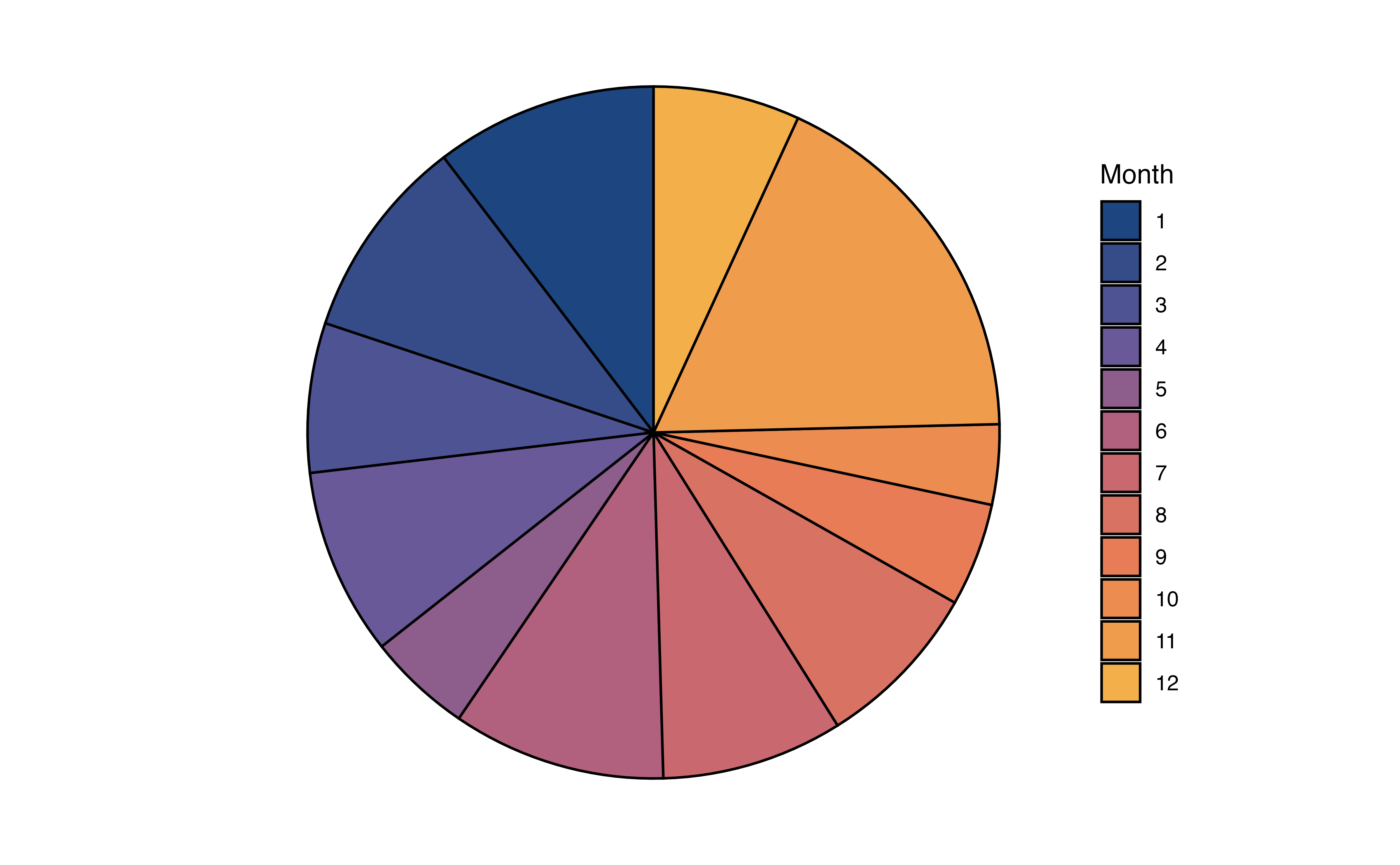
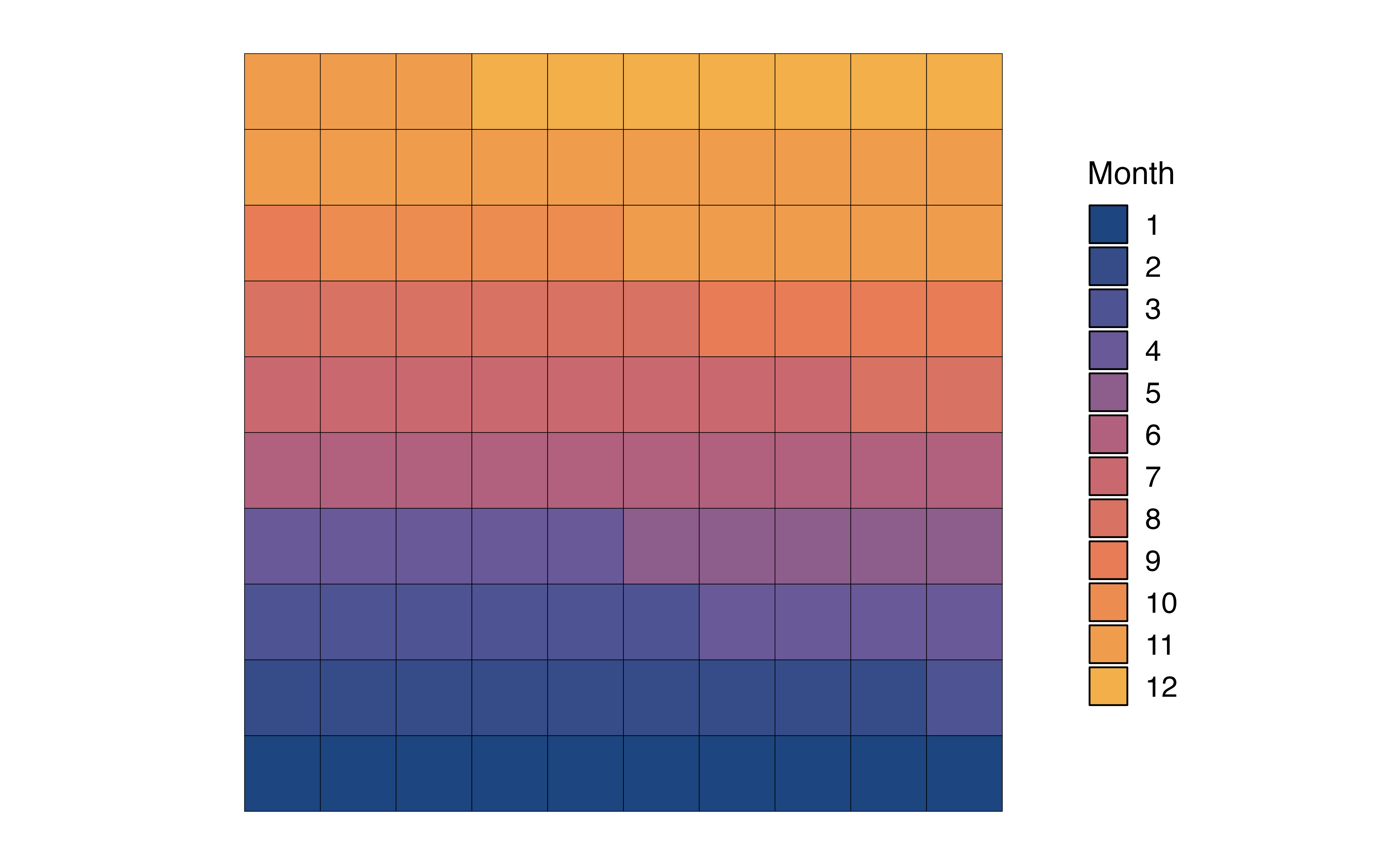
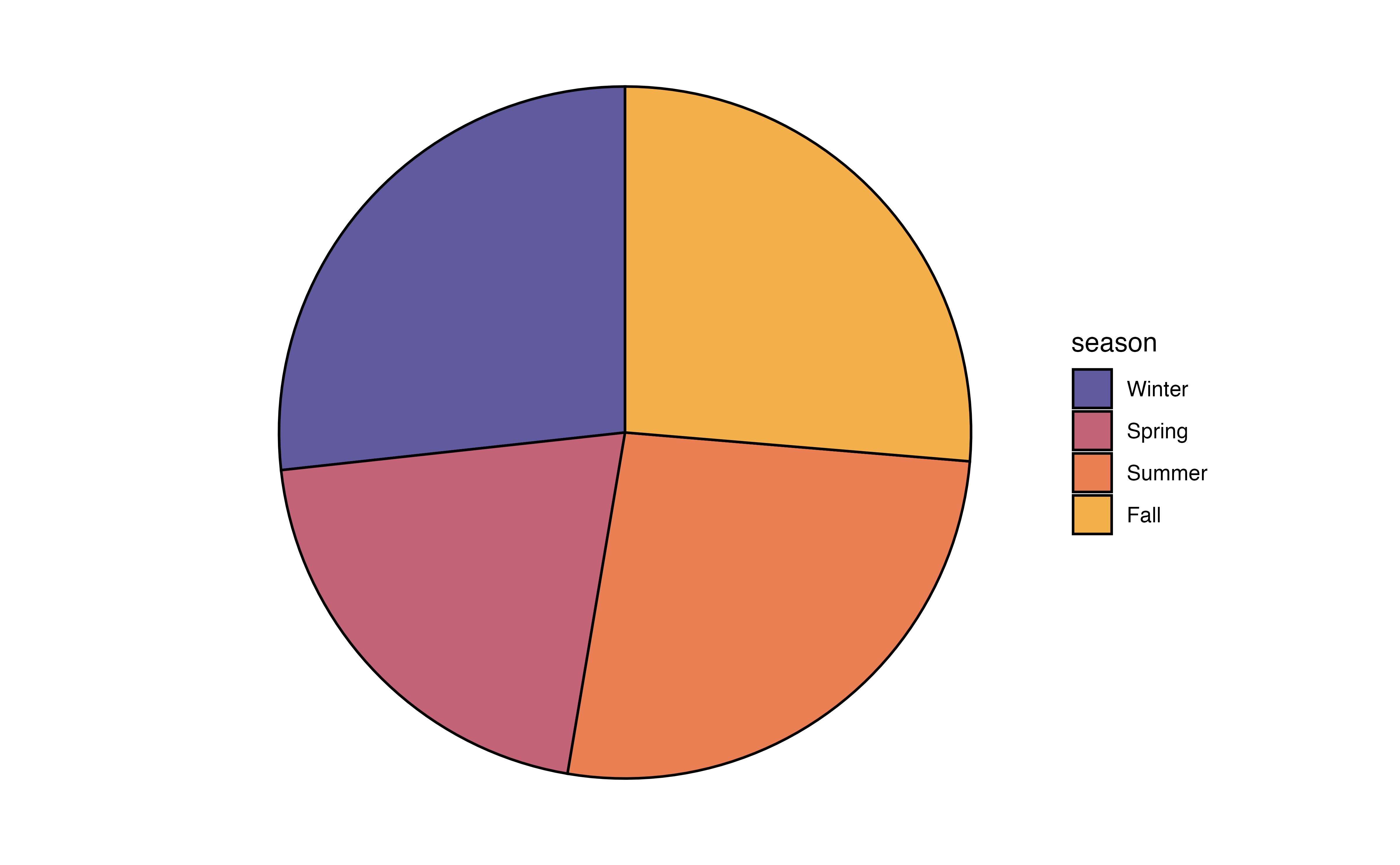
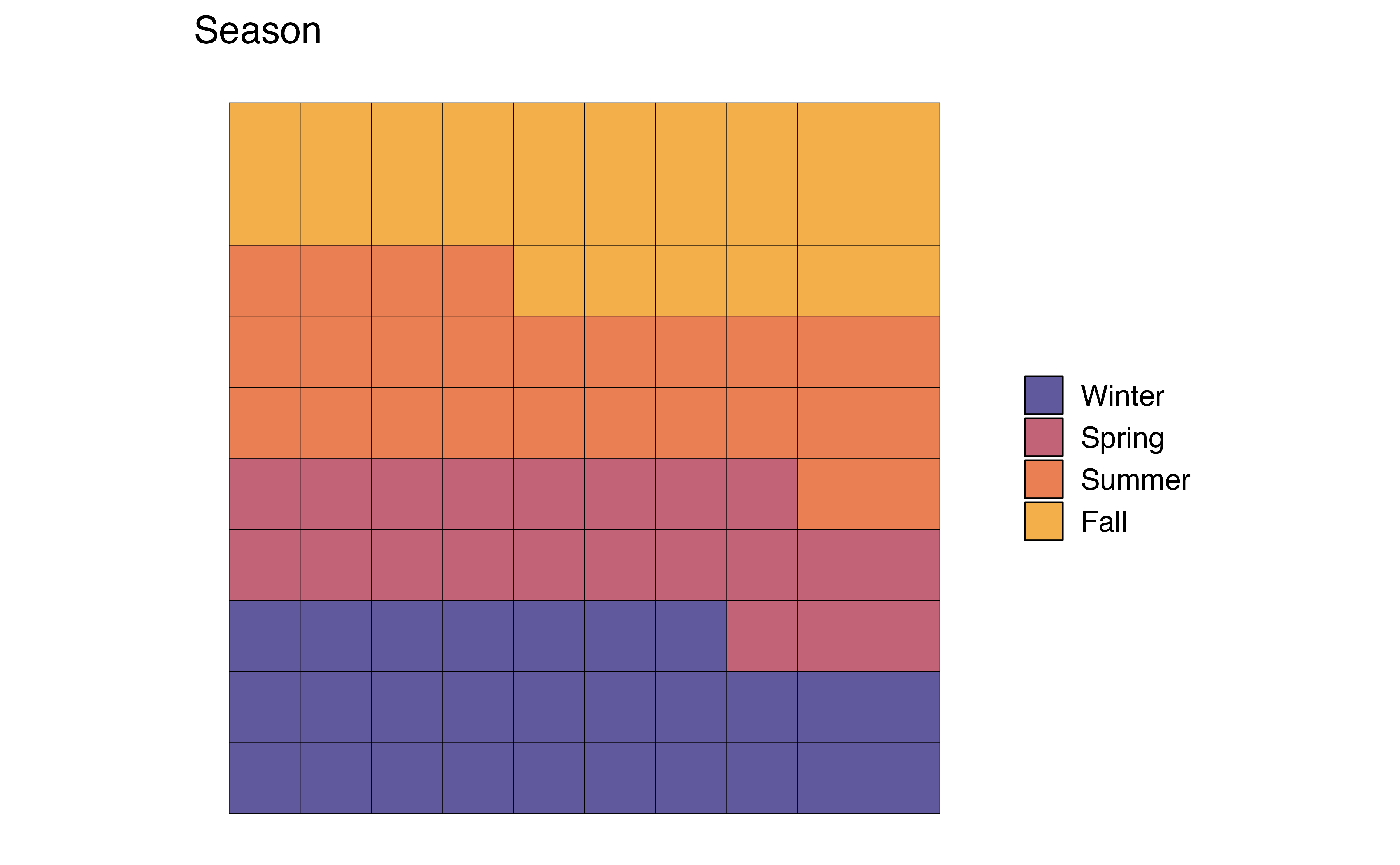
The bar chart in Figure 3.2 displays the frequencies, but perhaps we are more interested in visualizing the proportions, also called relative frequencies. In that case we can (1) remake the bar plot such that that height of the bars represent the proportions rather than frequencies (Figure 3.3 (a)), (2) make a pie chart, or (3) make a waffle chart.

month with proportions
In Figure 3.3 (b), the distribution of month is visualized using a pie chart. In a pie chart, each slice represents the proportion of observations at a given level. As we observed from the bar chart, the slice for Month 11 (November) is the largest, indicating the large proportion of recipes in the data were published that month.
In Figure 3.3 (c), the distribution of month is visualized using a waffle chart. In a waffle chart, the number of squares for each level represents the proportion of observations at that level. It is similar to a pie chart in that is shows how the parts (levels) make up the whole (variable). In fact, it is sometimes referred to as a “square pie chart”. A nice feature of the waffle chart is that we can count the squares to approximate the proportion of observations at each level.
In general, we can use any of these charts to visualize a univariate distribution of a categorical variable. As we see in Figure 3.3, the pie chart and waffle chart can be challenging to read when there are many levels. It can be hard to compare the size of the slices in the pie chart, and distinguish between the many colors on both charts. Therefore, it is preferable to reserve these for categorical variables with fewer levels.
In addition to visualizations, we can make a frequency table, a table of the number and proportion of observations at each level.
month
| month | n | prop |
|---|---|---|
| 1 | 230 | 0.104 |
| 2 | 211 | 0.095 |
| 3 | 155 | 0.070 |
| 4 | 194 | 0.087 |
| 5 | 108 | 0.049 |
| 6 | 221 | 0.100 |
| 7 | 188 | 0.085 |
| 8 | 175 | 0.079 |
| 9 | 107 | 0.048 |
| 10 | 83 | 0.037 |
| 11 | 394 | 0.178 |
| 12 | 152 | 0.069 |
From Table 3.3, we not only see that Month 11 (November) is the most popular month for posting recipes, but we see more specifically that about 17.8% of the recipes in the data were posted that month. We can also more easily identify the least common month to post recipes, Month 10 (October). Only about 3.7% of the recipes in the data were posted that month.
seasonLet’s use the visualizations and summaries introduced in this section to describe the distribution of the season in which a recipe was posted.
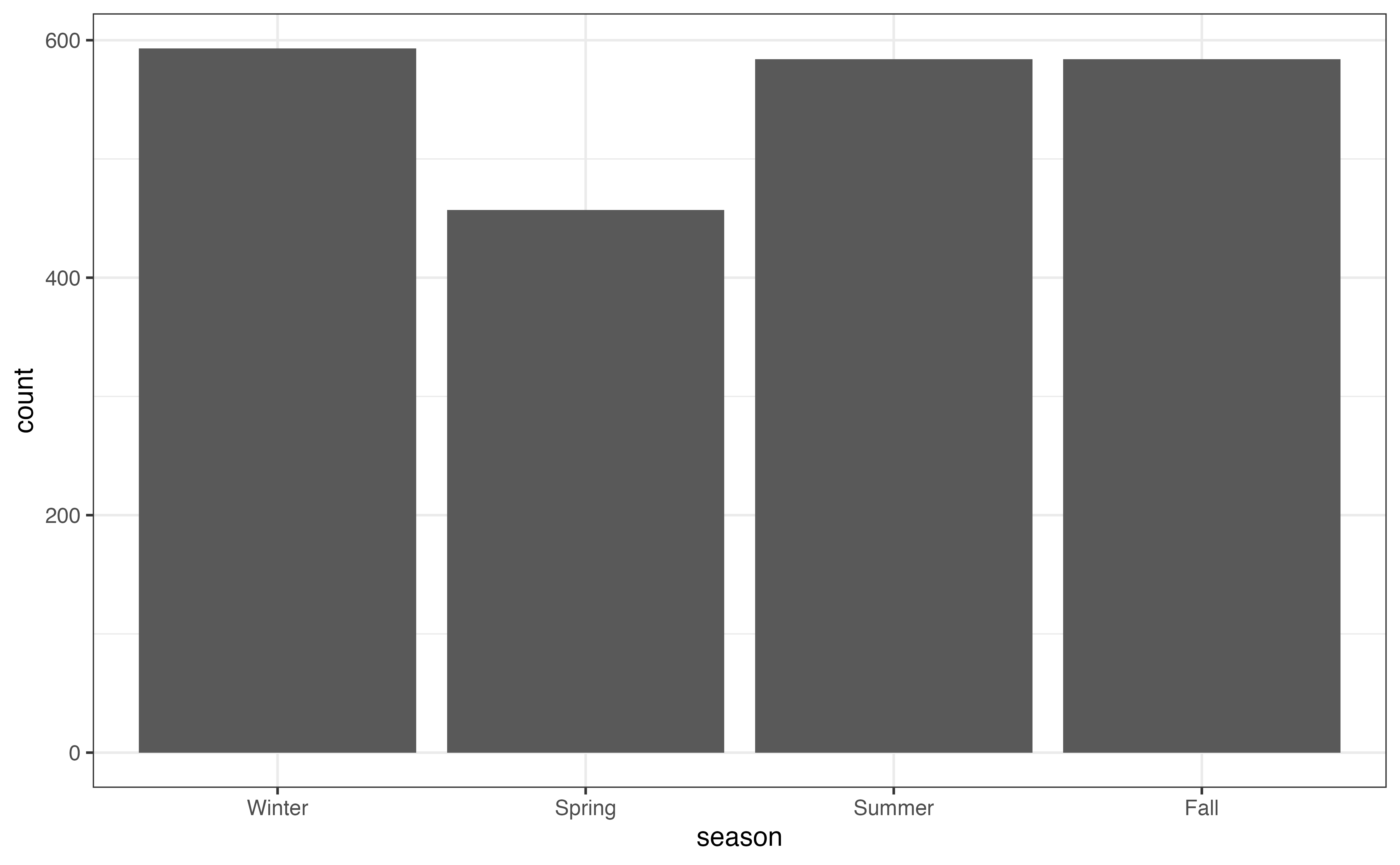
season
season
| season | n | prop |
|---|---|---|
| Winter | 593 | 0.267 |
| Spring | 457 | 0.206 |
| Summer | 584 | 0.263 |
| Fall | 584 | 0.263 |
Use Figure 3.4 and Table 3.4 to describe the distribution of season.2
Both month and season provide information about when individuals post recipes to the site, so we wouldn’t necessarily need both variables in later stages of the analysis. An advantage to season is that it has fewer levels, so visualizations are easier to interpret, particularly the pie chart and waffle chart, compared to month (Figure 3.3). It will also be easier to interpret as we look at relationships between variables. An advantage to month is that we get the more specific detail, such as the large number of recipes posted in November. In practice, we could refer back to the analysis objective to determine which variable to use in later steps.
As with categorical variables, we examine the univariate distributions of quantitative variables using visualizations and summary statistics. The description of the distribution of a quantitative variable includes the following components: shape, center, spread, and the presence of notable features such as outliers. Let’s examine the distribution of avg_rating, a recipe’s average user rating. The ratings range from 1 to 5, with 1 being the worst and 5 being the best.
A histogram is commonly used to visualize the distribution of a quantitative variable. In a histogram, the values of the variable are divided into ranges of equal width (called bins), and there is one bar on the graph for each bin. The height of the bar represents the number of observations that have values within the bin. It is similar to a bar chart, but the bars represent a range of values instead of individual levels.
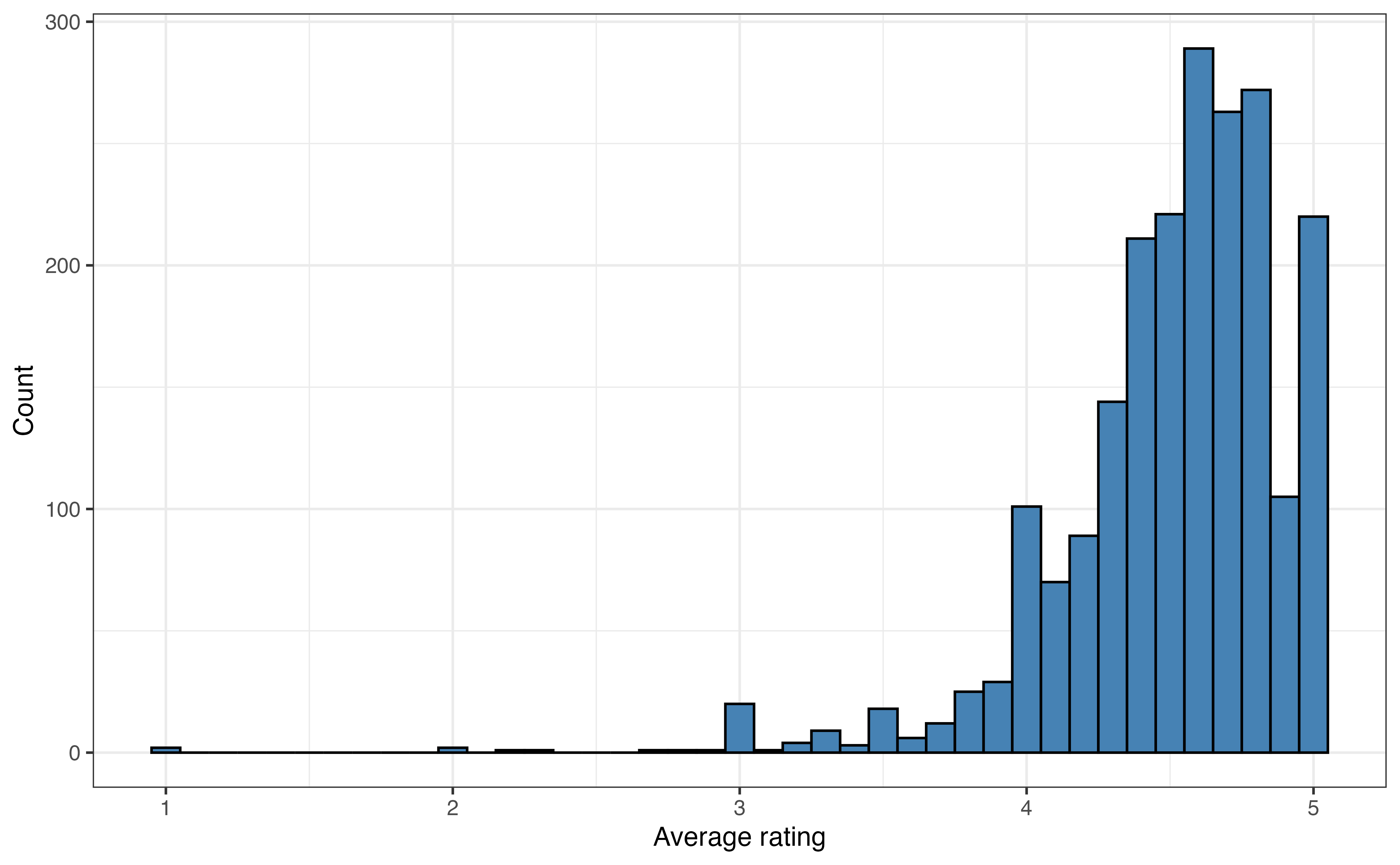
avg_rating
Figure 3.5 is the histogram of avg_rating. We now clearly see that a vast majority of the recipes have average ratings between 4 and 5. There are very few recipes with ratings less that 3, and at least one outlier with a an average rating around 1.
The width of the bins on a histogram can make it easier or harder to see the features of the distribution. In general, the default bin width set by the statistical software is a good choice. In some cases, however, we may wish to change the width to illuminate more detail in the distribution (decrease bin width) or smooth out the distribution (increase bin width).
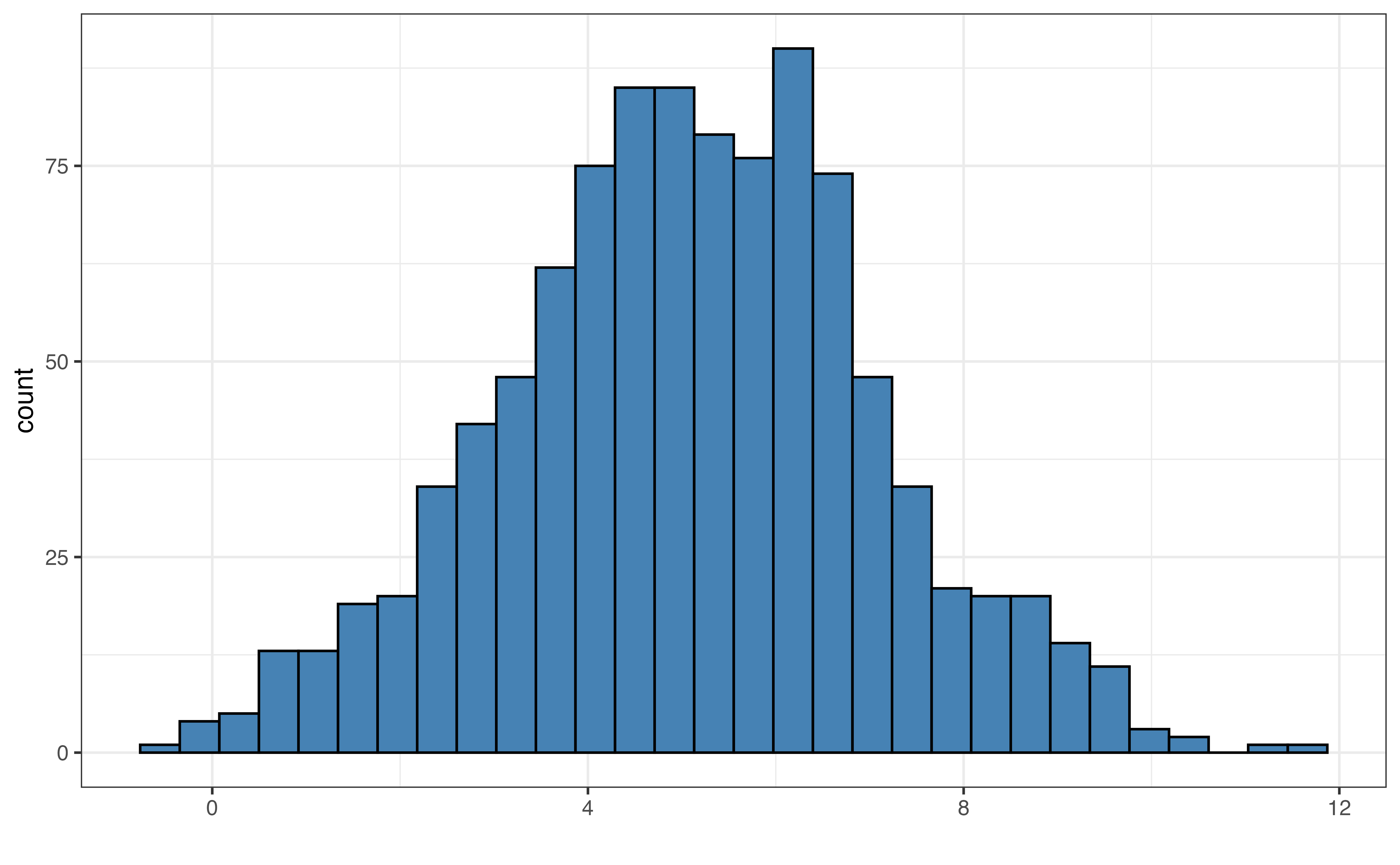
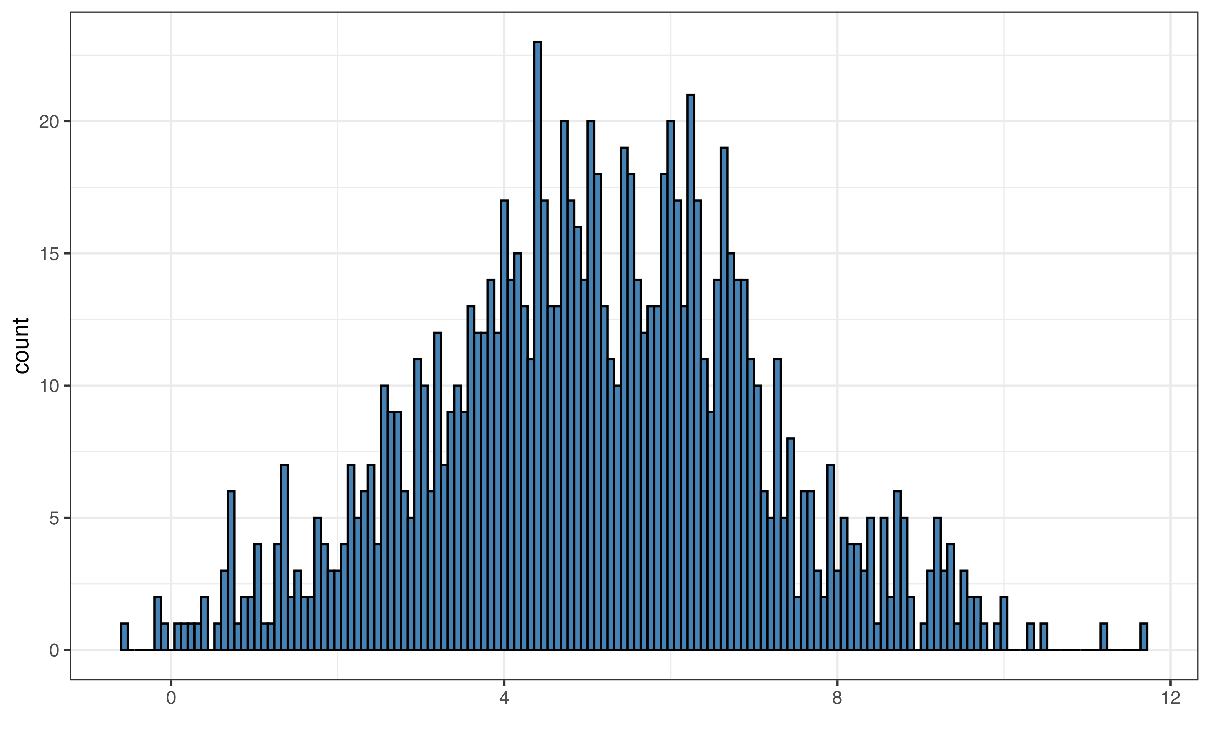
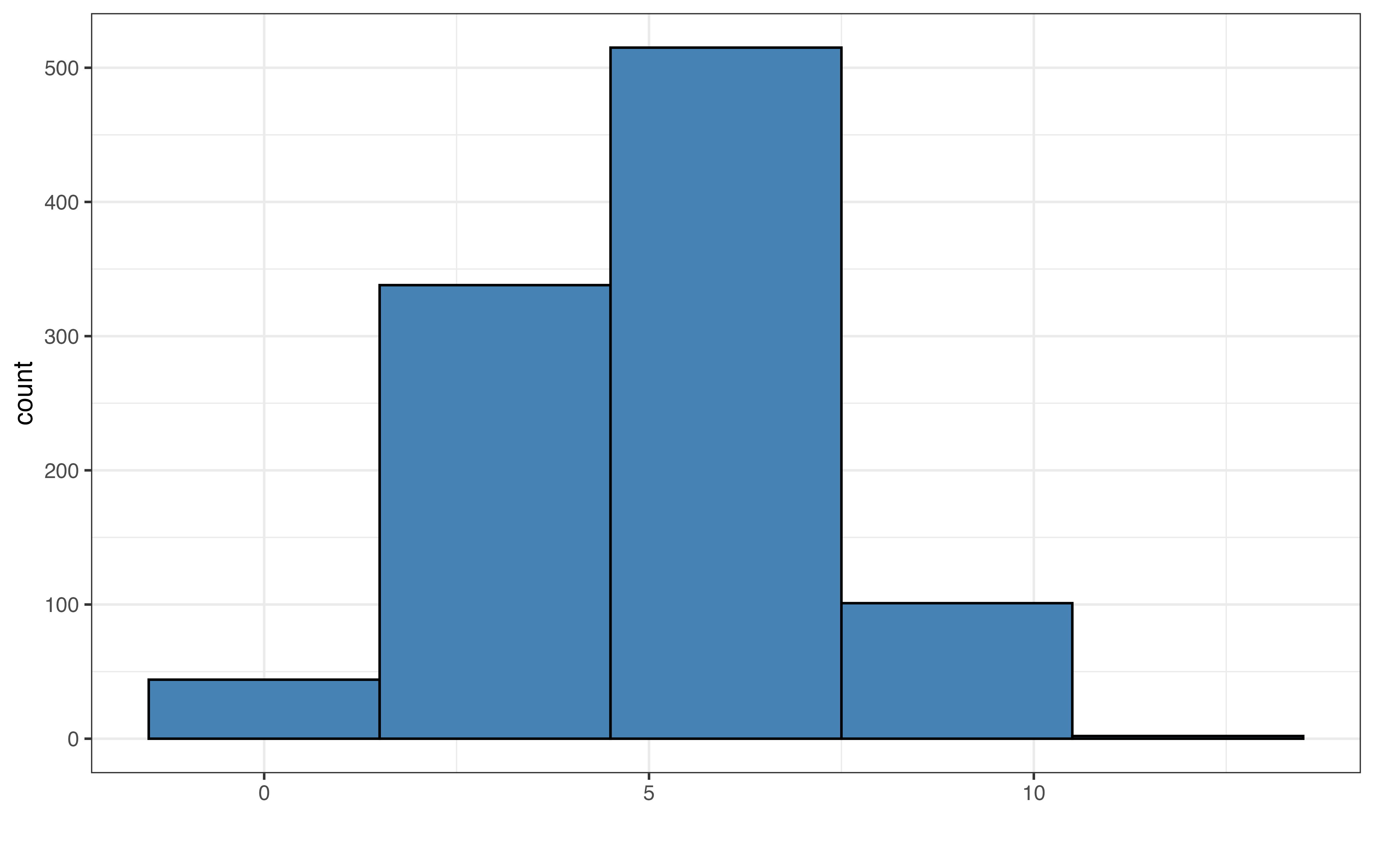
Figure 3.6 shows examples of the default bin width, very small bin widths, and very large bin widths. Small bin widths adds more detail the histogram. This can make the histogram more challenging to read without adding much useful information for the analysis. In contrast, large bin widths can aggregate the data so much that we lose key information about the distribution.
In general, it is good practice to start with the default bins set by software and make small adjustments, if needed.
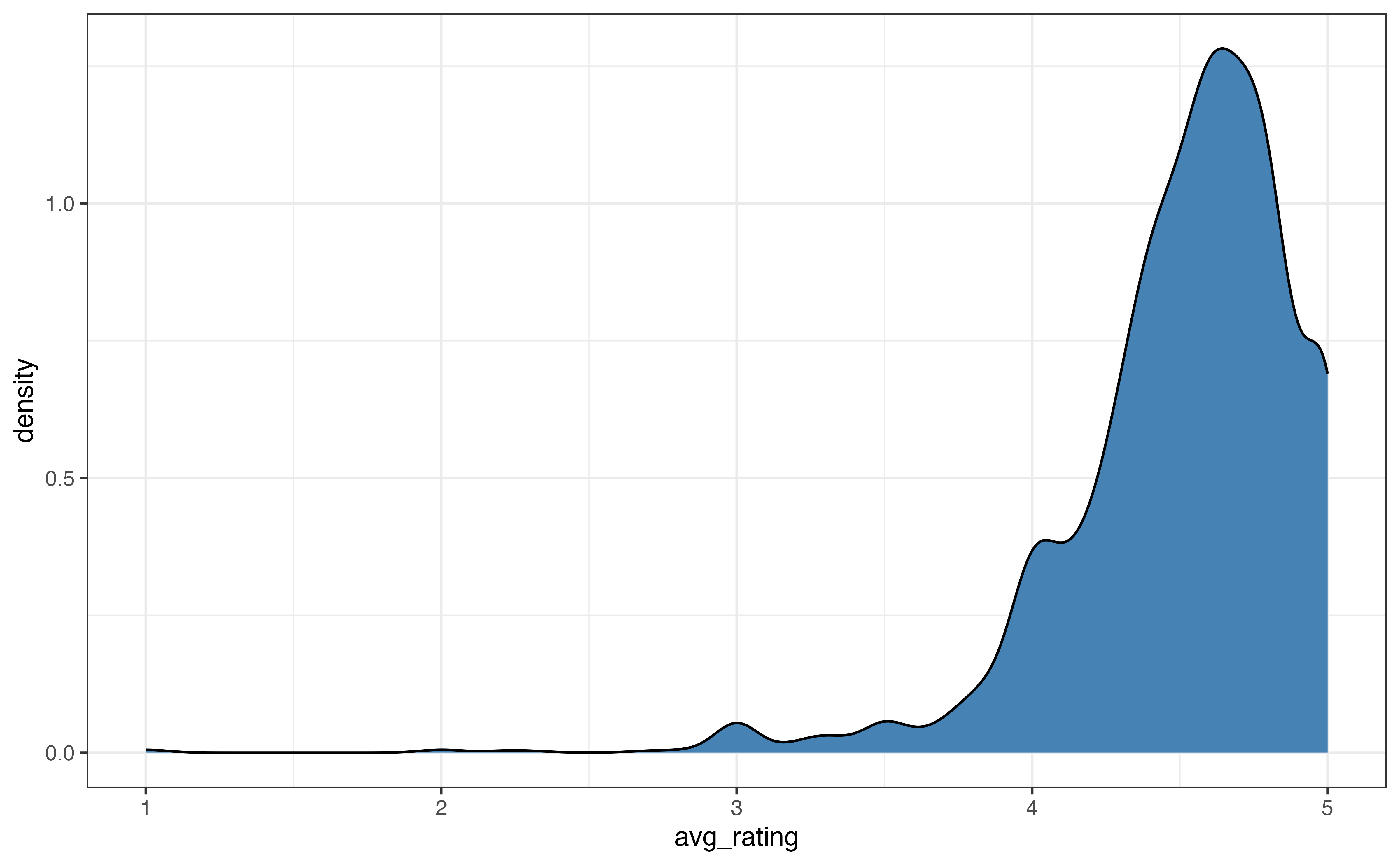
Figure 3.7 shows two commonly used alternatives to histograms, density plots and boxplots. A density plot (Figure 3.7 (a)) is often thought of as a “smoothed out histogram”. Similar to a histogram, portions of the distribution with larger heights indicate the parts of the distribution where more observations occur. In general, we are not concerned with the exact values from the density plot, but rather we use the plot for a summary view of the distribution.
A boxplot (Figure 3.7 (b)) is a visualization that highlights the quartiles and outliers of a distribution. The left line of the box is the first quartile, \(Q_1\), which marks the \(25^{th}\) percentile. The middle line in the box is the median, \(Q_2\), which marks the \(50^{th}\) percentile. The right line of the box is the third quartile, \(Q_3\), which marks the \(75^{th}\) percentile. The points on the graph represent outliers.
These visualizations are most useful for describing the shape of a distribution and for identifying outliers. Some features are more apparent on one type of visualization compared to others, so we use the goals of the EDA to help choose which visualization(s) to use.
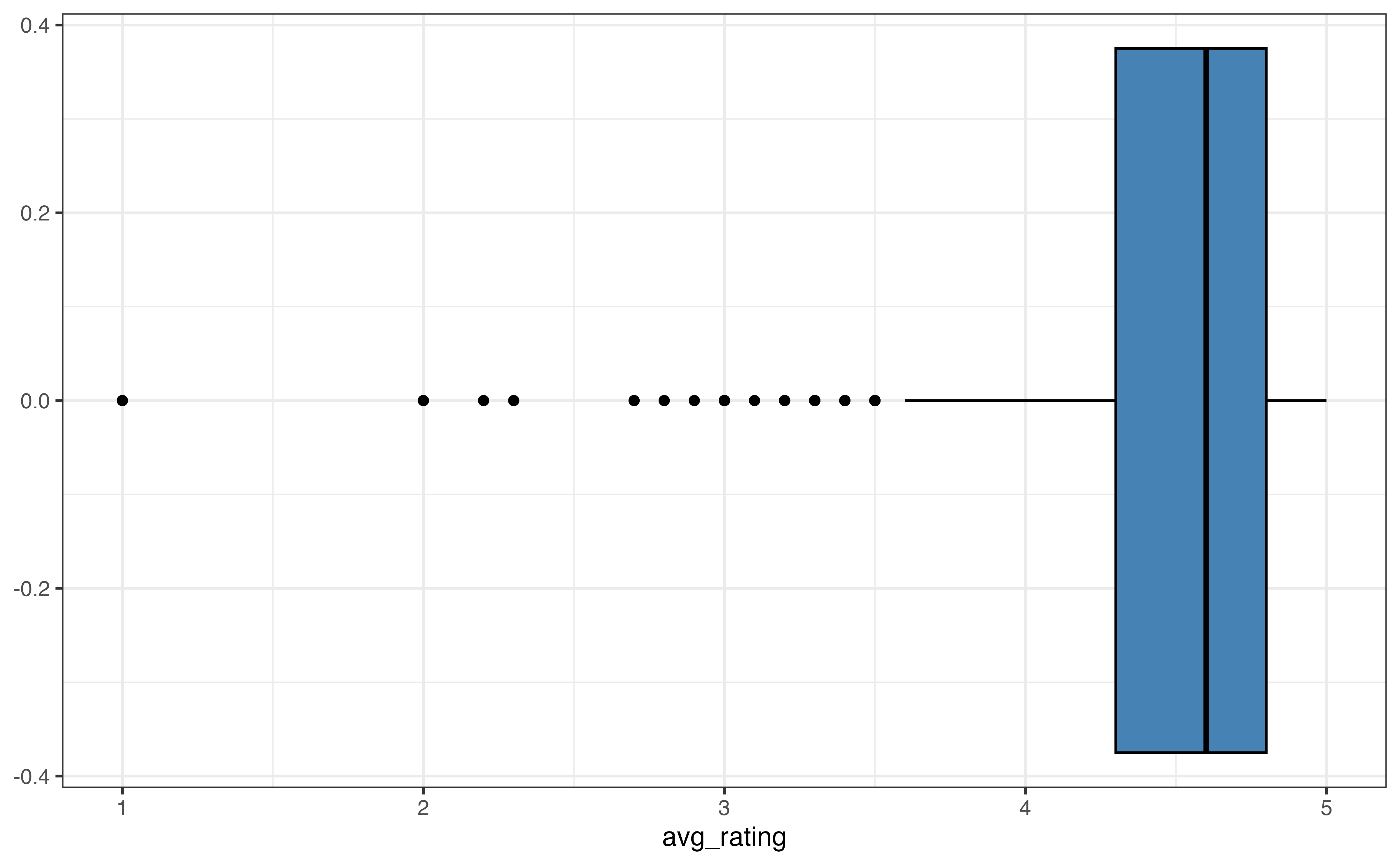
avg_rating
The description of shape includes the skewness and number of modes.
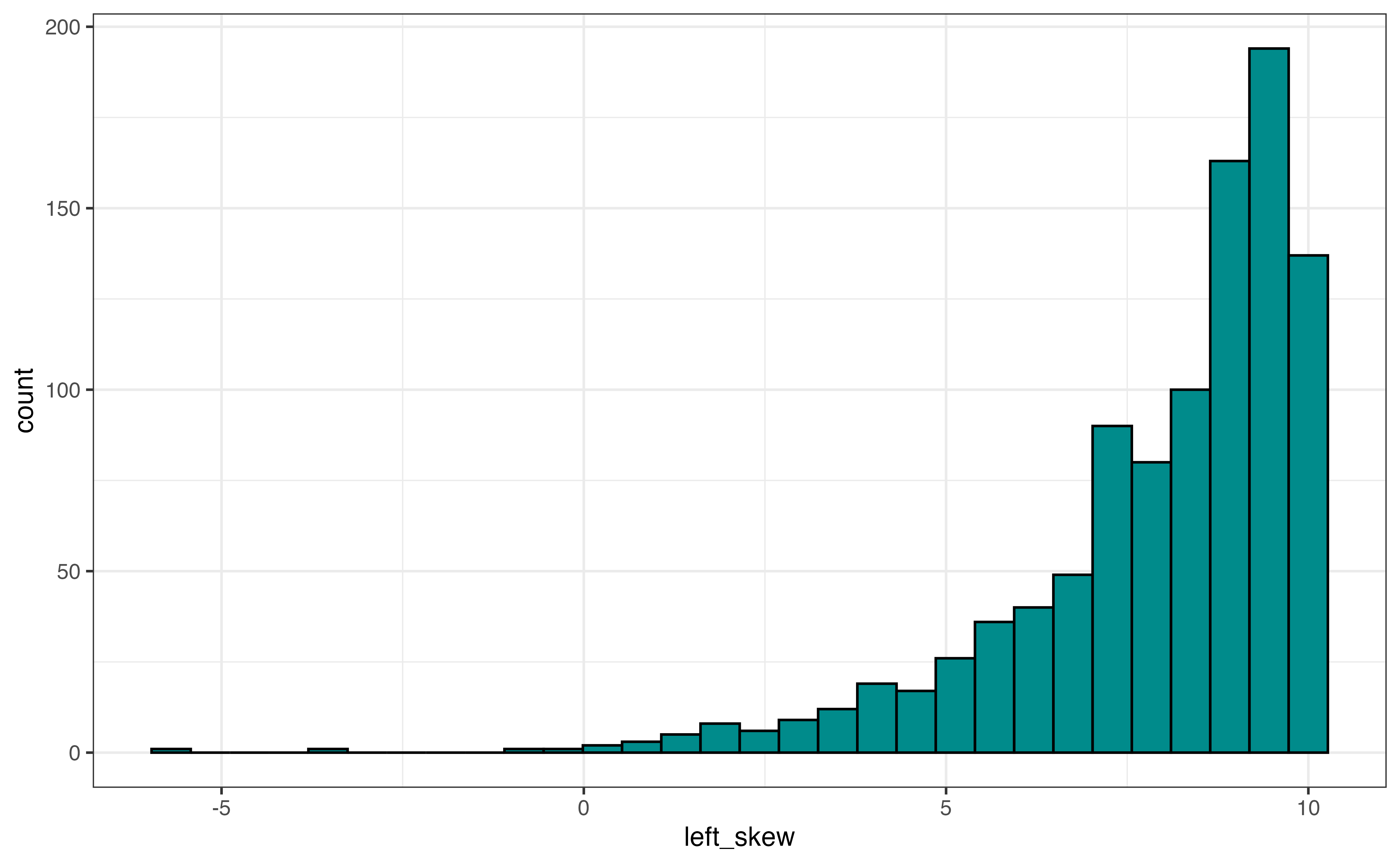
The skewness is described as left-skewed, right-skewed, or symmetric. Figure 3.8 shows examples of a distribution with each type of skewness. If a distribution has a tail, a portion of the distribution that covers a wide range of values with very few observations, then the direction of the skewness is determined by the direction of the tail. Figure 3.8 (a) shows a left-skewed distribution (also called negatively-skewed). The majority of the observations take values at the higher end of the range, and the tail extends out to the lower values (the left side) of the distribution. An example of a left-skewed distribution is a typical distribution of online ratings for a product. Most online ratings tend to be very high, with few people giving low ratings, as we have observed with avg_rating.
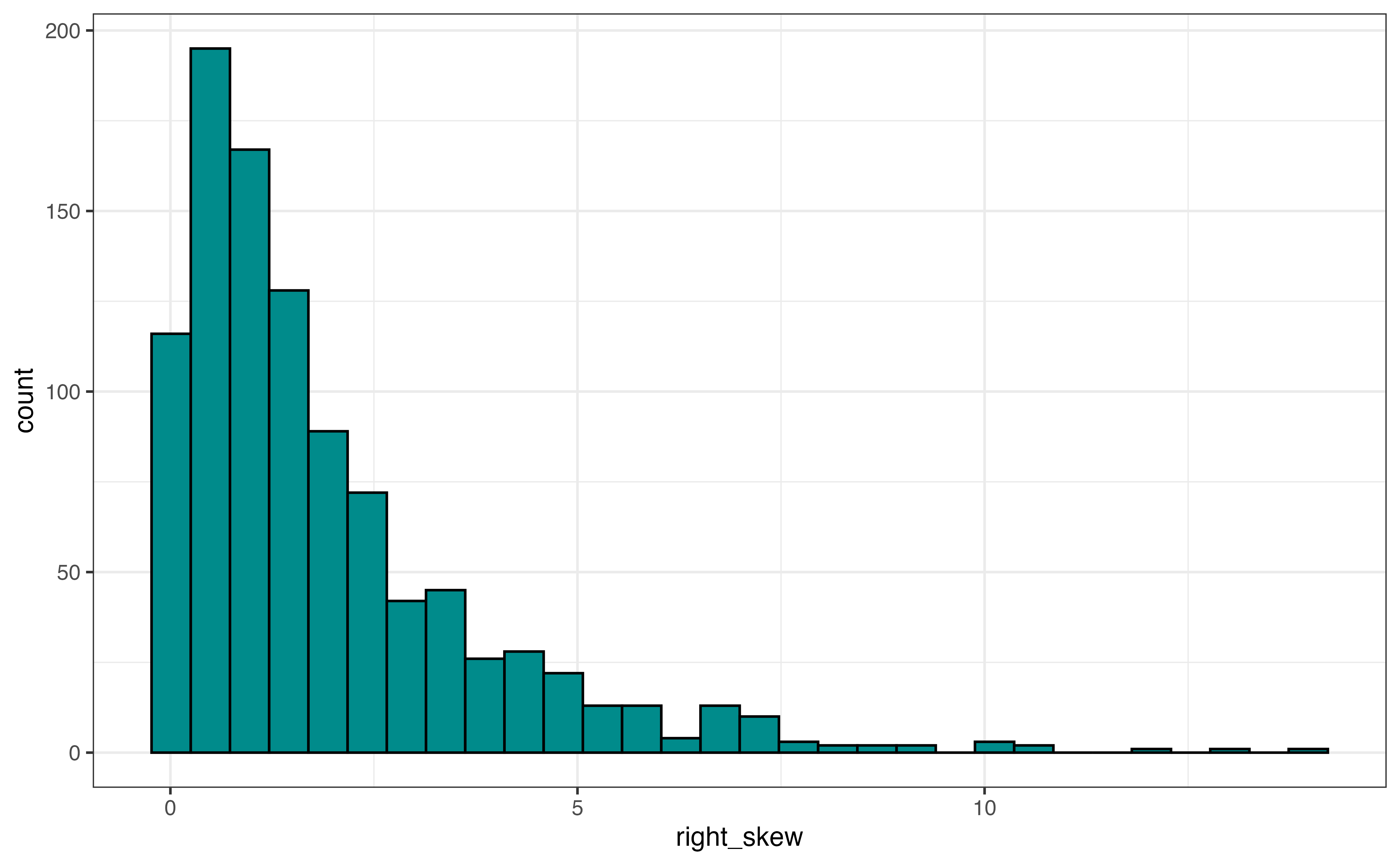
Figure 3.8 (b) is an example of a right-skewed distribution (also called positively-skewed). The majority of the observations take values at the lower end of the range, and the tail extends out to the higher values (the right side) of the distribution. An example of a right-skewed distribution is a distribution of annual income among adults in the United States. The income for most adults lie within a particular range, and a few adults have annual incomes far greater than the majority of the population (e.g., professional athletes, celebrities, etc.)
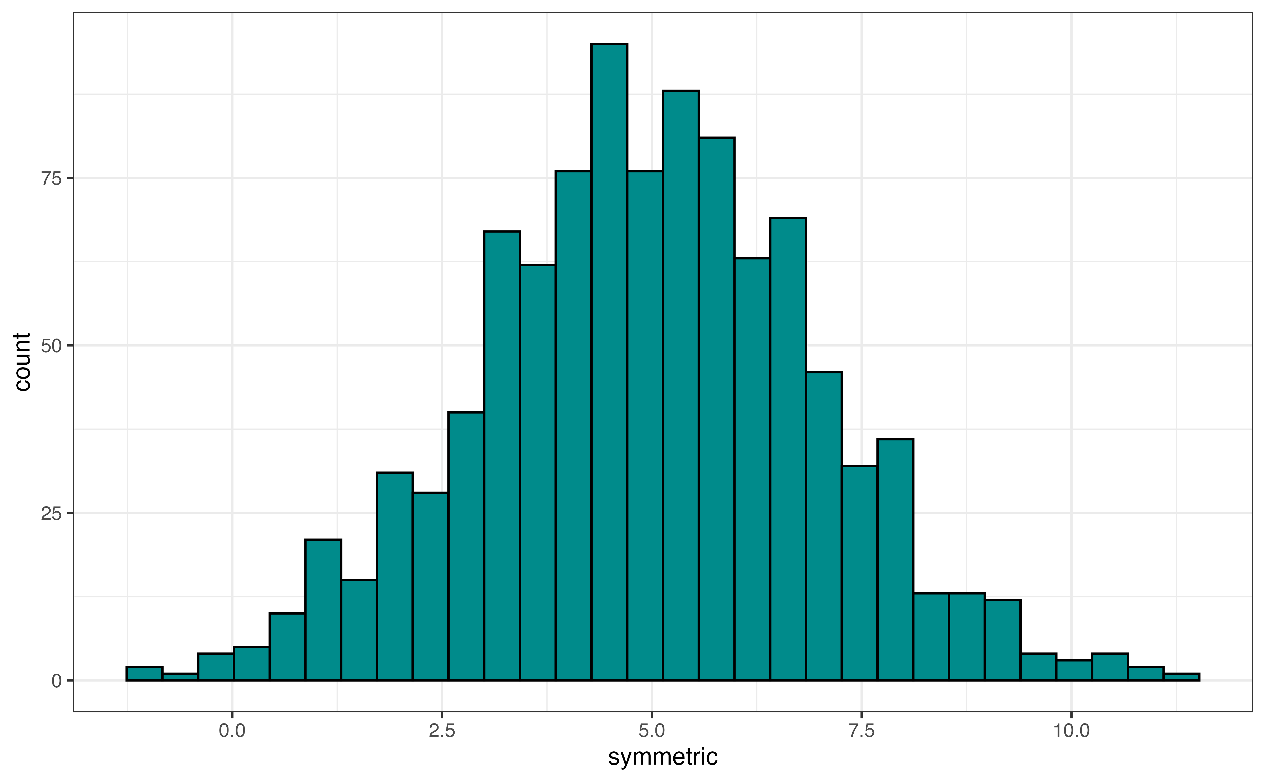
Figure 3.8 (c) is an example of a symmetric distribution. If we divide the distribution down the middle, both sides of the distribution are approximately the same. Another way to think about it is if we fold the distribution along the center, the left side would fit almost perfectly on the right side. An example of a symmetric distribution is the distribution of shoe size among adults. A majority of individuals have a shoe size around the center of the distribution, and a small number of individuals have very small or very large shoe sizes.
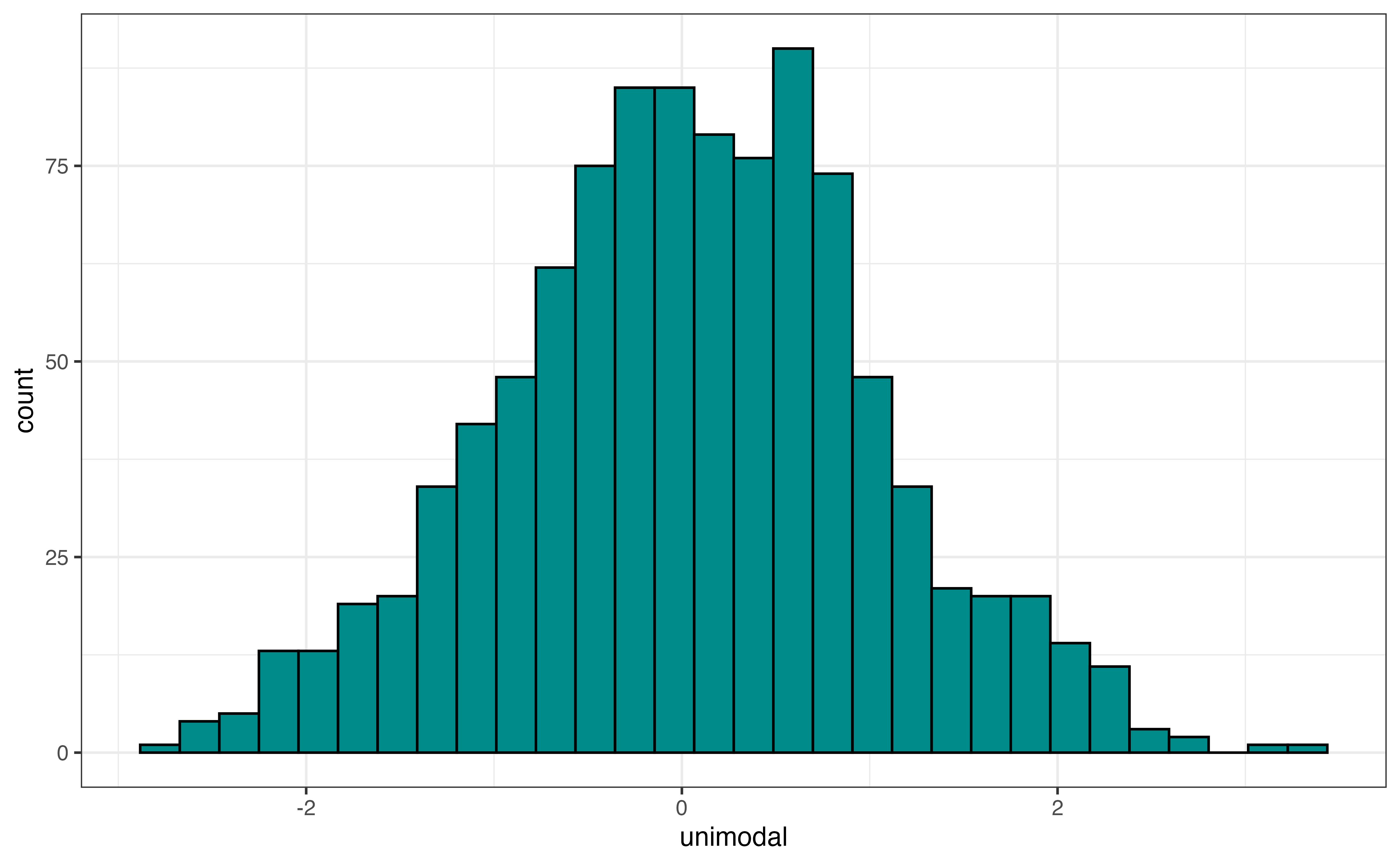
In addition to the skewness, the shape of the distribution includes the modality, number of peaks. Figure 3.9 shows examples of distributions with three different modalities: unimodal, bimodal, and multimodal. Figure 3.9 (a) is an example of a unimodal distribution, a distribution with a single peak. The distribution of annual incomes for adults in the United States is an example of a unimodal distribution.
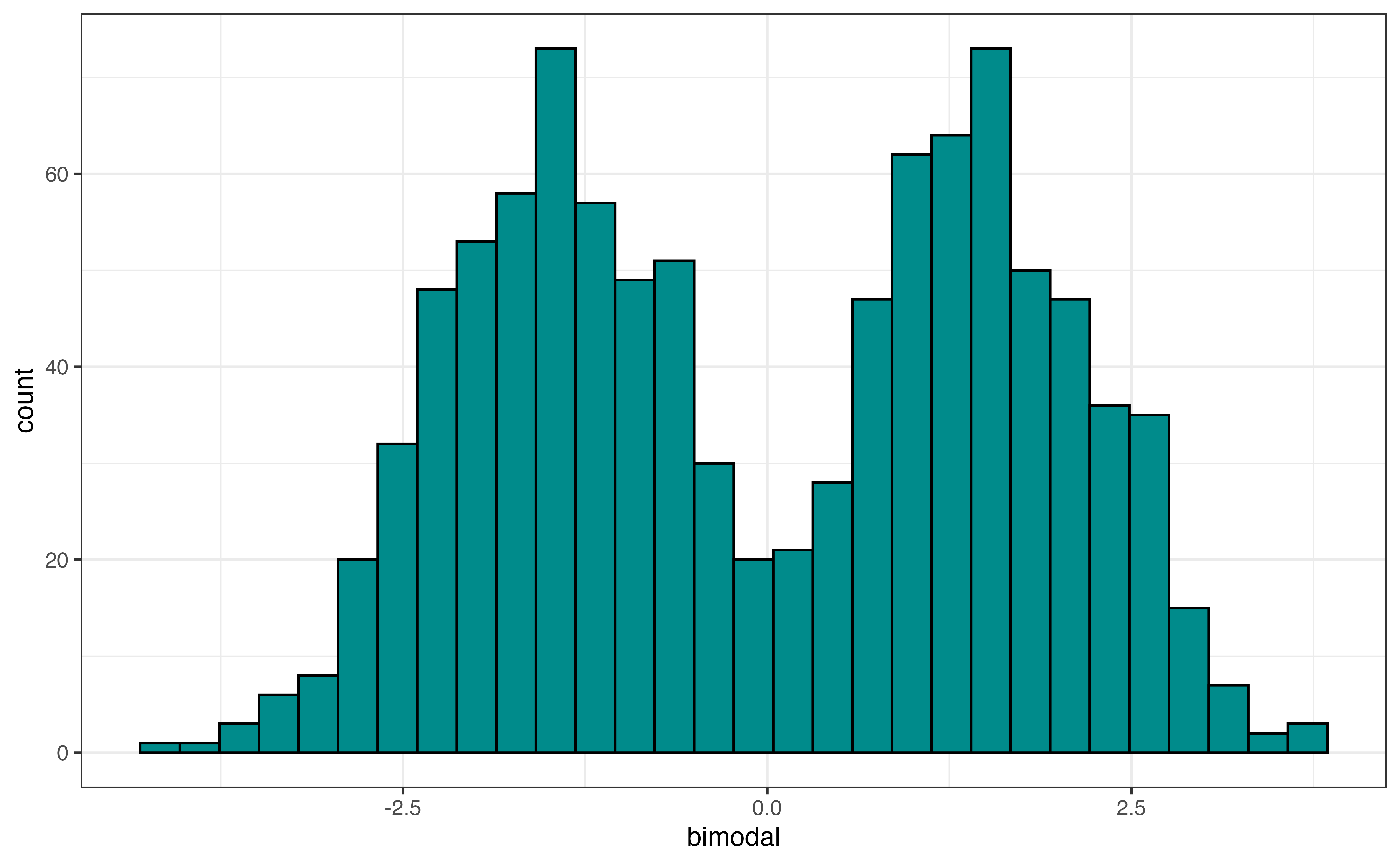
Figure 3.9 (b) is an example of a bimodal distribution, a distribution with two peaks. Bimodal distributions generally indicate there are at least two subgroups represented in the data that we may want to take into account in the analysis. An example of a bimodal distribution is a city’s average daily temperatures in a city across a year. If the city has four distinct seasons, there will typically be a peak around the mean temperature in the fall and winter (low temperatures) and a peak around the mean temperature for spring and summer (high temperatures).
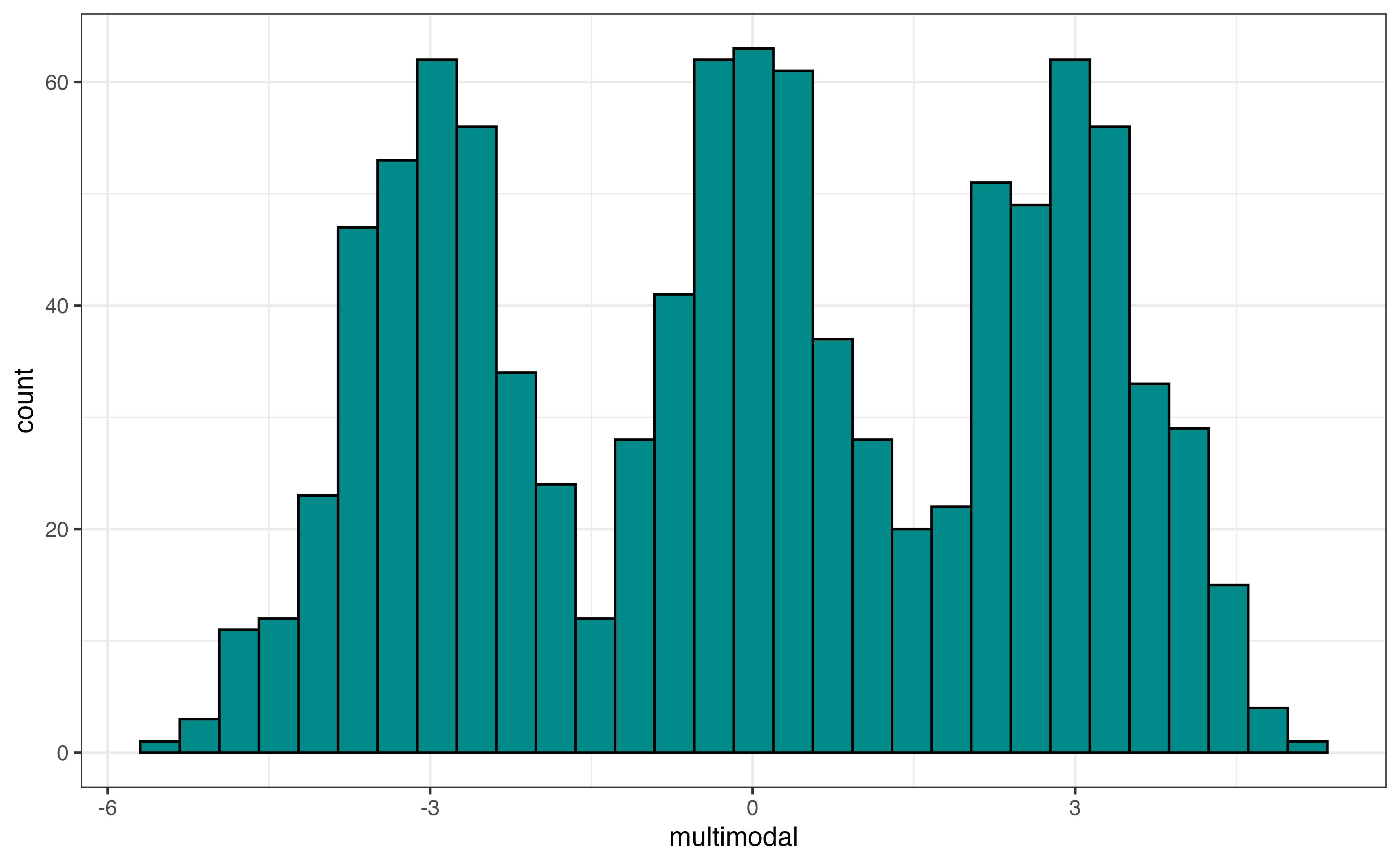
Figure 3.9 (c) is an example of a multimodal distribution, a distribution with three or more peaks. Similar to bimodal distributions, multimodal distributions generally indicate there are multiple subgroups in the data we want to take into account i the analysis. An example of a multimodal distribution is the distribution of heights for school-aged children across a large age range, about 5 - 18 years old. There will be a peak around the mean height for elementary school children (around ages 5 - 9), a peak around the mean height middle school children (around ages 10 - 14), and a peak around the mean height for high school children (around ages 14 - 18).
To determine the modality of a plot, think about using a pencil or finger to trace along the top of the distribution. The modality, then, is the number of peaks in the traced outline.
As we trace the distribution, we don’t need to hit every small dip in the distribution, because these small dips are often noise in the data. Rather, we are concerned about large peaks and valleys in the distribution.
Use Figure 3.5 and Figure 3.7 to describe the shape of the distribution of avg_rating.3
In addition to visualizations, we compute summary statistics to more precisely describe aspects of the distribution. The summary statistics for avg_rating are in Table 3.5.
avg_rating
| Prop Complete | Mean | SD | Min | Q1 | Median | Q3 | Max |
|---|---|---|---|---|---|---|---|
| 0.956 | 4.51 | 0.401 | 1 | 4.3 | 4.6 | 4.8 | 5 |
We will primarily use these summary statistics to describe the center and spread of the quantitative distribution. We have also computed the statistic Prop Complete that is the proportion of observations that have a reported value for the variable. If the proportion is less than 1, then there are observations with missing values for the variable. We need to address the missingness before moving forward with the analysis. Strategies for dealing with missing data are in Chapter 13.
Let’s use the summary statistics to describe the center and spread of the distribution.
We use the mean (also called average) or median (also called \(Q_2\), the \(2^{nd}\) quartile, \(50^{th}\) percentile) to describe the center of a distribution. To determine which measure is the better representation of the center, consider the shape of the distribution and whether there are outliers. If the distribution is approximately symmetric with no (or few) outliers, then the mean is the preferred measure of center. The mean is impacted by skewness and outliers, so the median is preferred if skewness or outliers are present.
We prefer the mean over the median to describe the center of the distribution when the criteria mentioned above are met. This is because the mean is computed using all the observations in the data set. In contrast, the median is determined based on the one or two observations in the middle to the distribution. In general, we prefer statistics that use all the data if they will be representative of the distribution and not skewed by a few extreme observations.
From Table 3.5, the mean value of avg_rating in the data is about 4.509 and the median is 4.6. The distribution of avg_rating is left-skewed and has outliers (see Figure 3.5), so the median is the more representative measure of the center of the distribution.
The standard deviation, interquartile range (IQR), and range are measures used to describe the spread of a distribution. If shape of the distribution is approximately symmetric with no (or few) outliers, the standard deviation, a measure of the average distance between each observation and the mean, is the preferred measure of the spread. Because the mean is used to to compute the standard deviation, it is impacted by skewness and outliers. When the distribution is skewed or there are outliers, the interquartile range (IQR) is the more representative measure of spread. The IQR is the difference between the \(75^{th}\) and \(25^{th}\) percentiles, \(Q_3 - Q_1\).
The range \((\text{max} - \text{min})\) should be used with caution and not reported as the only measure of spread. Because it only takes into account the minimum and maximum values, it only gives describes the spread of the extreme ends of the distribution, which is not typically the spread of the majority of the data. Additionally, it is impacted by skewness and outliers, and thus can make the spread of a distribution appear larger than what is true for the vast majority of the data.
To describe the center and spread of a distribution, use
the mean and standard deviation if there is no extreme skewness or outliers, or
the median and IQR if skewness or outliers are present
From Table 3.5, the standard deviation of avg_rating is 0.401, so the average rating for each recipe is about 0.401 points from the mean rating of 4.509, on average. The IQR is 0.5. This means the spread of the middle 50% of the distribution, \(Q_3 - Q_1\) is about 0.5 points. Lastly, the range, the distance between the minimum and maximum values, is 4 .
Because the distribution of avg_rating is skewed with outliers, the IQR 0.5 is the most representative measure of spread.
The last part of describing the distribution of a quantitative variable is the presence of outliers. Outliers can be valid observations that are very different from the rest of the data (e.g,. a professional athlete’s annual salary in the distribution of annual salaries for 1000 randomly sampled adults in the United States). Sometimes, however, they indicate errors in the data (e.g., a person’s age is recorded as 150 years old).
Outliers are most visible in histograms (Figure 3.5) and boxplots (Figure 3.7 (b)). It is more challenging to differentiate between outliers and skewness in a density plot. From the histogram, we visually assess outliers by looking for observations that are set apart on the graph, typically very high or very low. For example, in Figure 3.5, there appears to be at least a few outliers that have low average ratings around 1 and 2.
On a boxplot, the outliers are marked as points on the plot. An observation is considered an outlier if it is less than \(Q_1 - 1.5 \times IQR\) or greater than \(Q_3 + 1.5 \times IQR\). Based on the boxplot in Figure 3.7, observations with average ratings about 3.5 or less have been identified as outliers. Based on this plot, there are no outliers on the high end of the distribution of average rating.
If there are outliers due to data entry errors, we need to input the correct values, if possible, or remove the observations from the analysis data. If there are a lot of data entry errors for an individual variable, we may consider removing that variable from the analysis and thus retaining more observations for the analysis. If outliers are unusual yet valid observations, there are options on how to handle them based on the analysis goals and their impact on the regression analysis results. We discuss these options further in ?sec-handle-outliers.
The description of the distribution of a quantitative variable includes the following:
Shape: Skewness and modality of distribution
Center: Middle of the distribution (measured by mean or median)
Spread: How far apart the observations are (measured by standard deviation or IQR)
Outliers: Observations that are far from the rest of the data
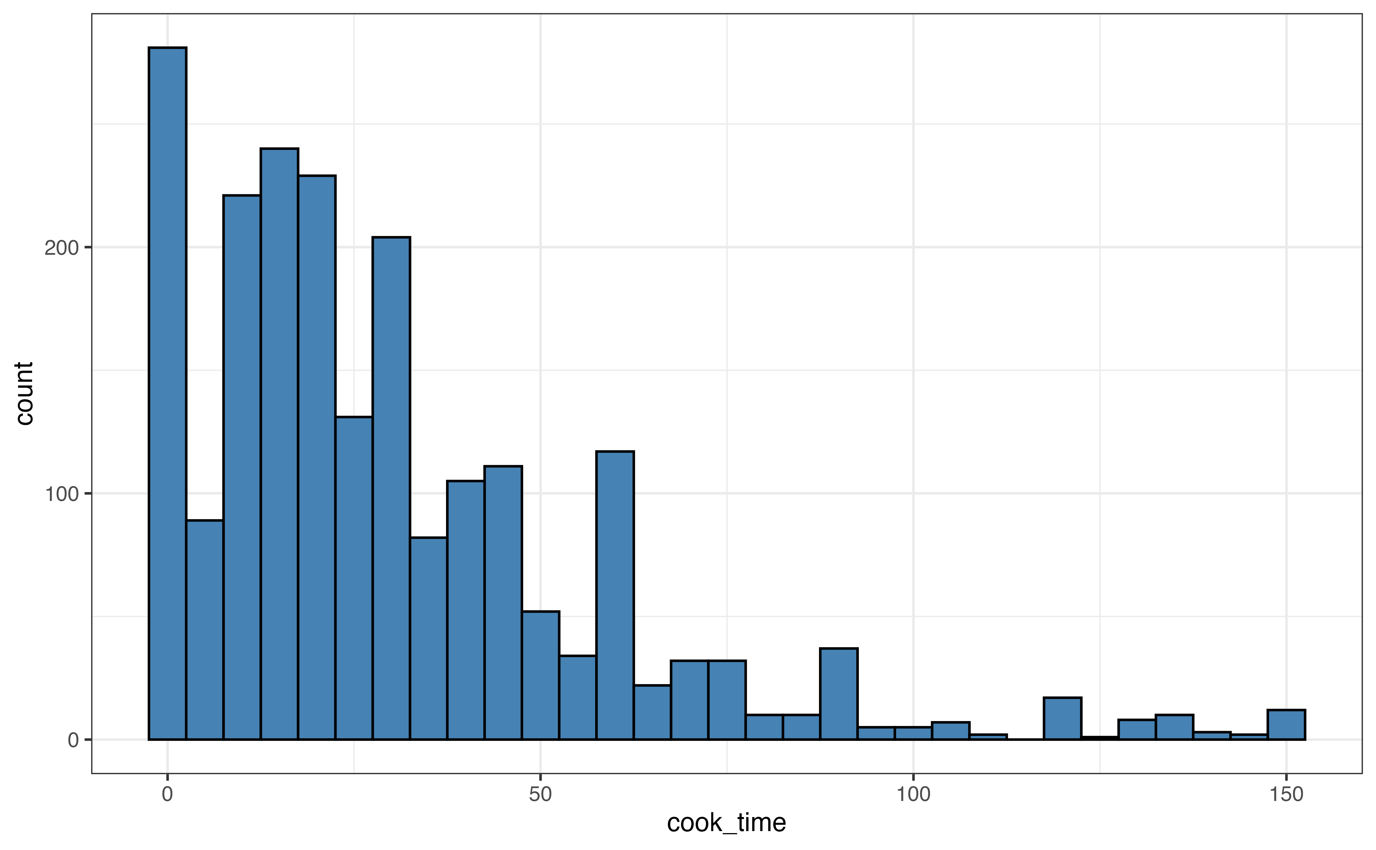
cook_timeLet’s use the visualizations and summary statistics introduced in the previous section to describe the distribution of cook_time, the amount of time (in minutes) it takes to cook a dish.
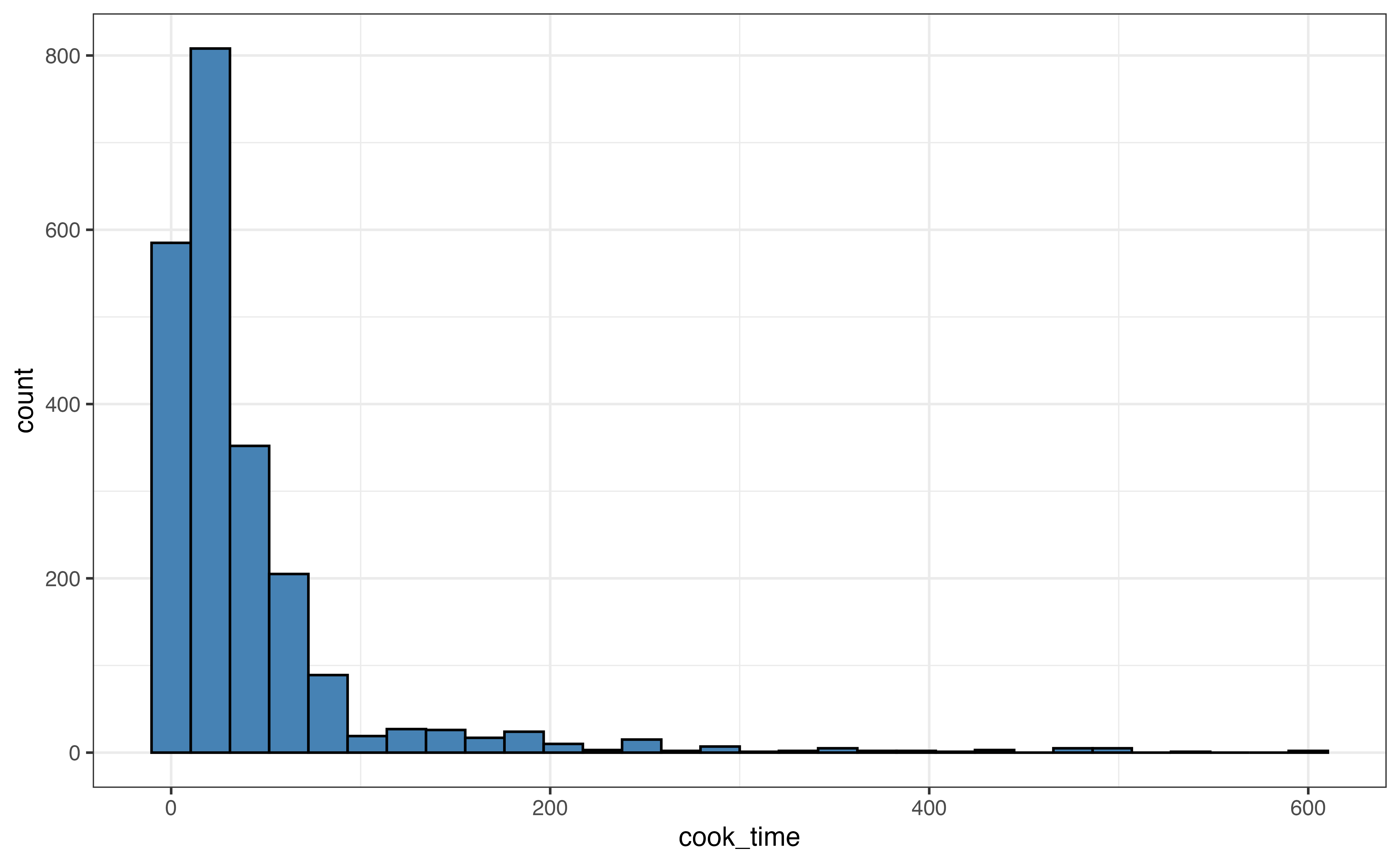
cook_time
cook_time
| Prop Complete | Mean | SD | Min | Q1 | Median | Q3 | Max |
|---|---|---|---|---|---|---|---|
| 1 | 41.8 | 63.2 | 0 | 10 | 25 | 45 | 600 |
Use the visualizations in Figure 3.10 and summary statistics in Table 3.6 to describe the distribution of cook_time. Include the shape, center, spread, and potential outliers in the description.4
When a distribution has extreme outliers, such as the distribution of cook_time, the outliers can compress the majority of the observations on the graph, making it difficult to get a detailed view of the majority of the distribution. In this case, we can also make a visualization without the outliers to get a better view.
About 95% of the observations have cook times of 150 minutes or less, so we create a new histogram that only includes those observations.

cook_time
In Figure 3.11, we compare a visualization of the full distribution with one that only includes recipes with cook time 150 minutes or less. For example, in Figure 3.11 (b), we get a lot of detail about the distribution of recipes with cook time 50 minutes or less. In contrast, all these recipes are contained in the first three bars of the histogram in Figure 3.11 (a).
After we have explored the distributions of individual variables in the univariate EDA, we explore the relationships between variables. We begin with bivariate EDA, the exploration of the relationship between two variables. In Section 3.6, we extend this to the relationship between three or more variables. There are three types of bivariate relationships: relationship between two quantitative variables, relationship between one quantitative and one categorical variable, and the relationship between two categorical variables.
Similar to univariate EDA, we use visualizations and summary statistics to explore the relationship between two variables. The components to describe the relationship between two quantitative variables include the shape, direction, and potential outliers. We use a scatterplot to visualize the relationship and the correlation to quantify it.
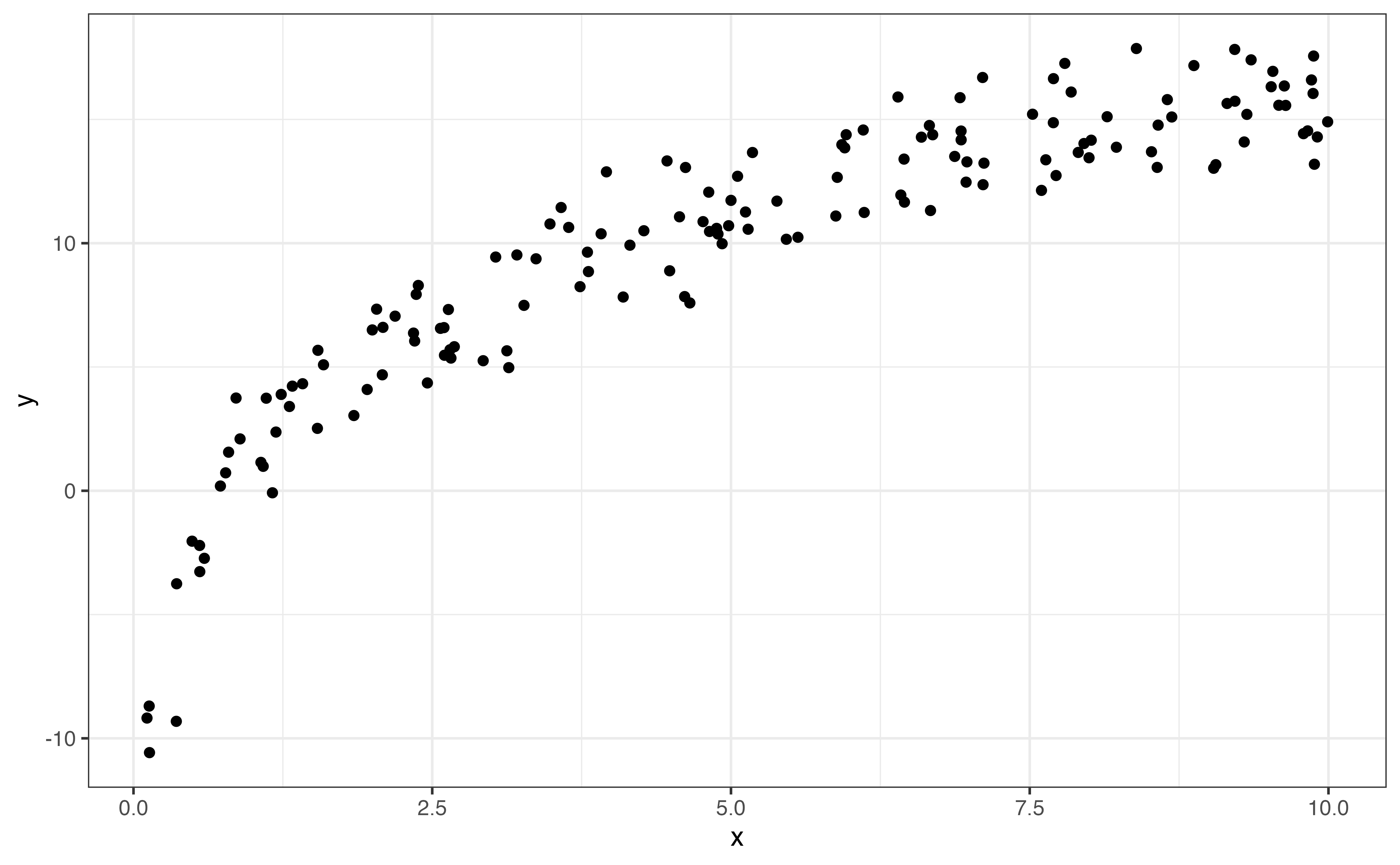
A scatterplot is a plot for two quantitative variables, such that one variable is on the x-axis (horizontal axis), one variable is on the y-axis (vertical axis), and each observation is represented by a point. Let’s take a look at the relationship between the number of calories per serving (calories) and the total grams of protein per serving (protein).
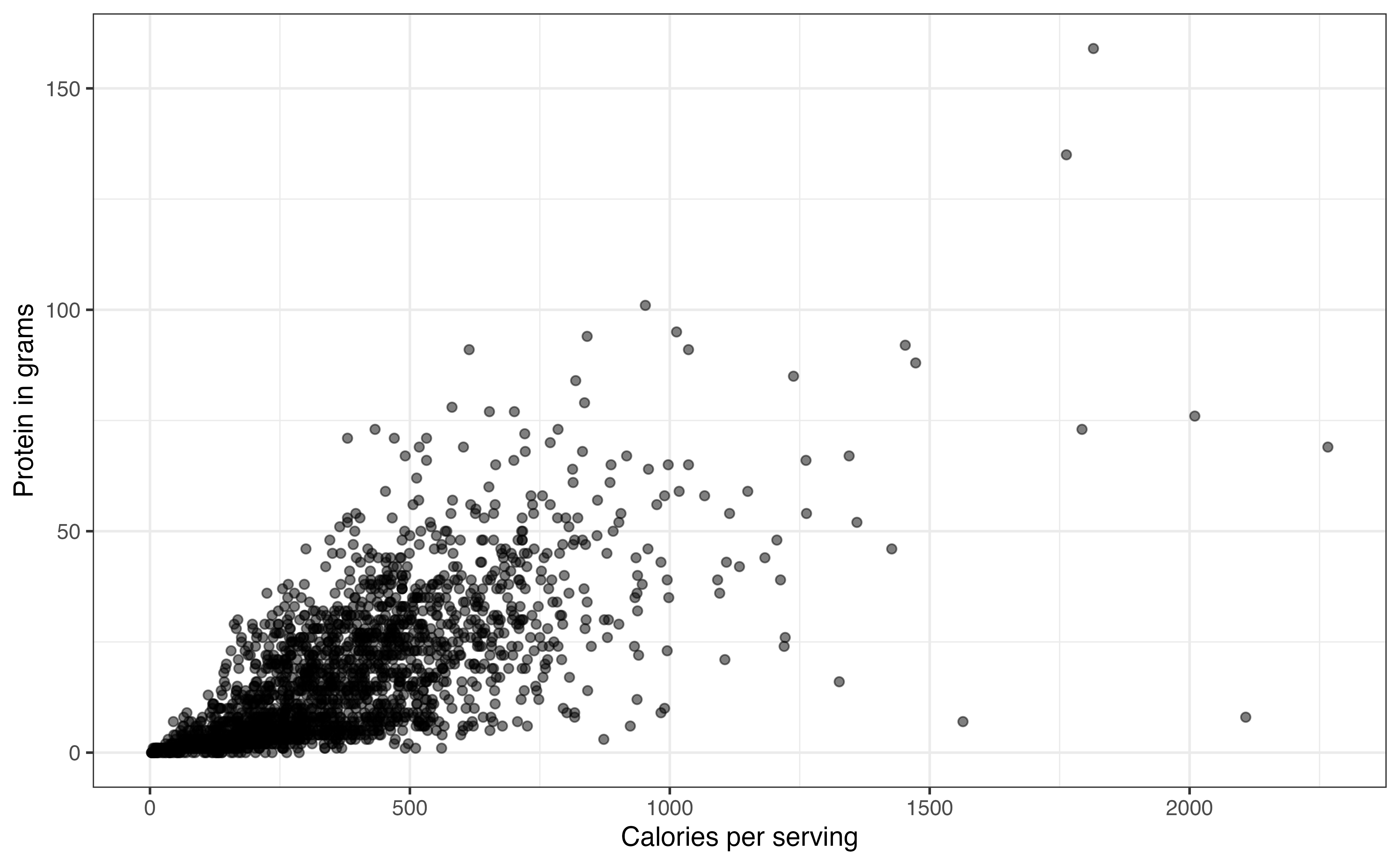
calories and protein
Figure 3.12 is the scatterplot with calories on the x-axis and protein on the y-axis. From the visualization, we can see the shape and direction of the relationship, along with outliers. We also get an indication of the strength of the relationship that we will quantify using summary statistics.
In bivariate EDA, the shape is a description of the overall trend of the points in the scatterplot. Common shapes we are linear, quadratic, and logarithmic. There may also be no clear trend. These are shown in Figure 3.13. Figure 3.13 shows examples of the commonly observed shapes. When we do linear regression, we generally assume that the relationship between the response variable and the predictor variable(s) is linear as in Figure 3.13 (a). Additionally, there are methods to account for quadratic (Figure 3.13 (b)) and logarithmic (Figure 3.13 (c)) relationships in the model. A scatterplot with no clear trend as in Figure 3.13 (d) indicates there is little to no relationship between the two variables.
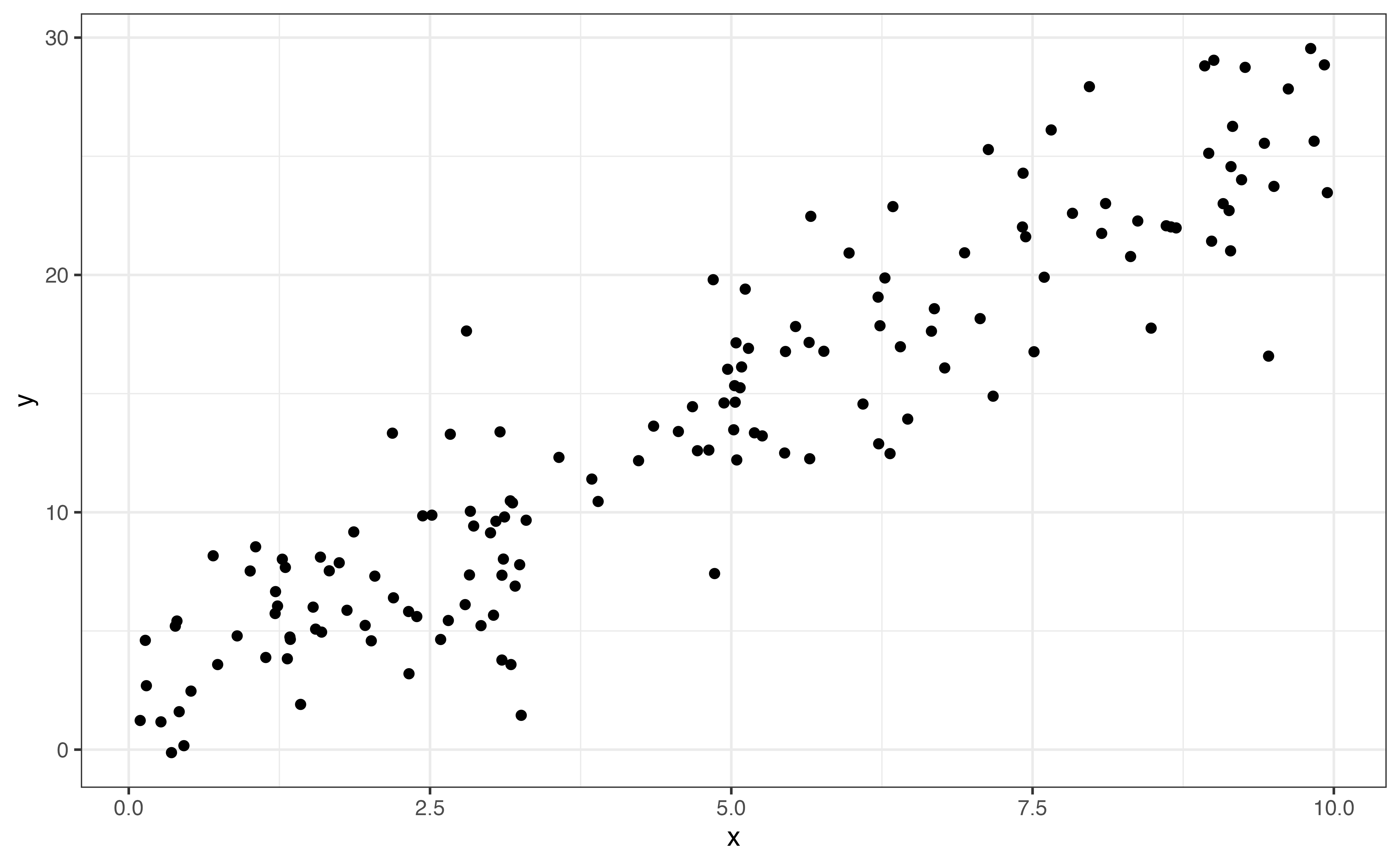
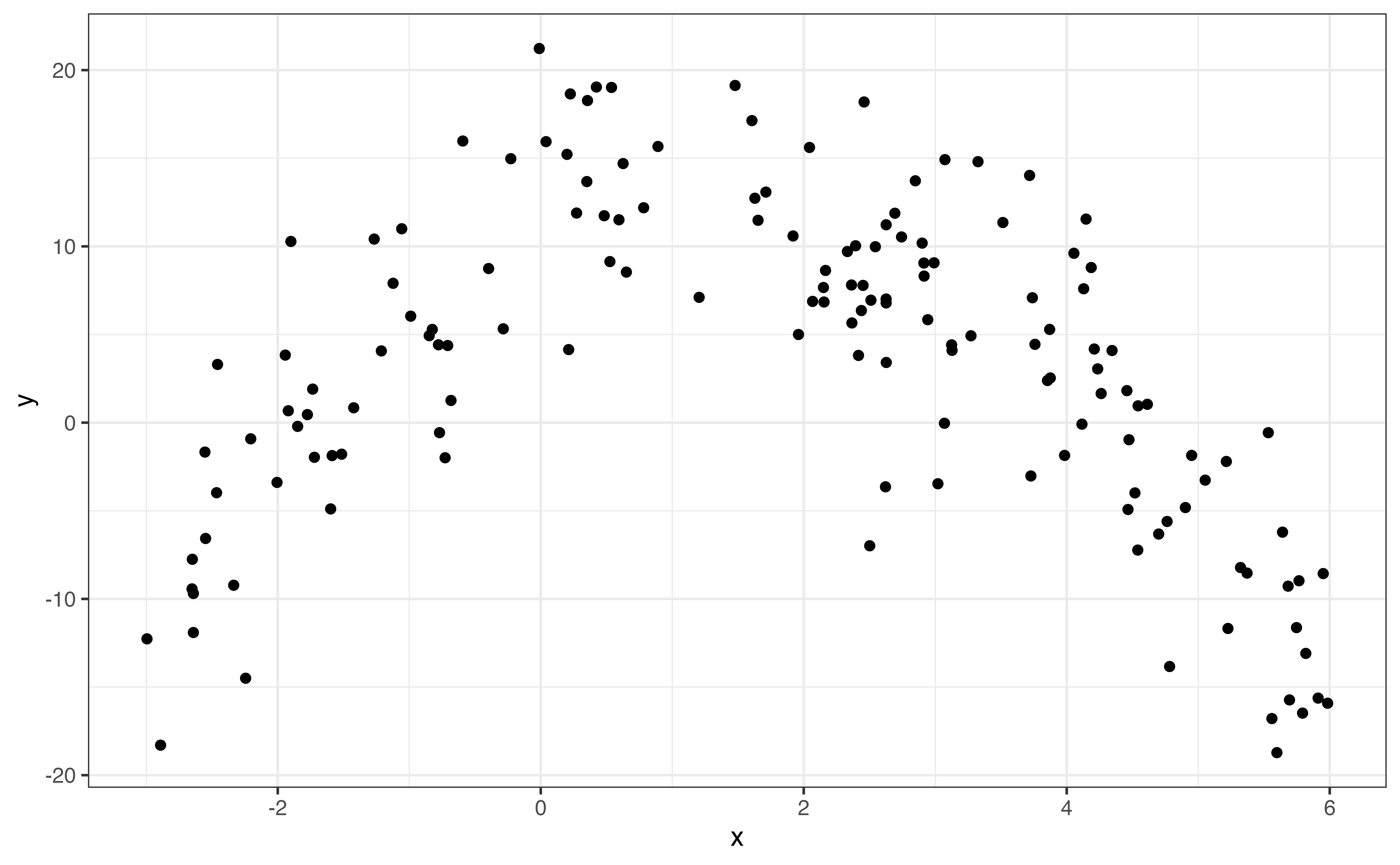
If the shape of the relationship is monotonic, always increasing or always decreasing, then we describe the direction of the relationship in addition to the shape. Linear (Figure 3.13 (a)) and logarithmic (Figure 3.13 (c)) trends are examples of monotonic relationships. There are three potential directions: positive, negative, and no direction. These are illustrated in Figure 3.14.
The direction is positive Figure 3.14 (a) if one variable tends to increase as the other increases. The direction is negative Figure 3.14 (b) if one variable tends to decrease as the other increases. Lastly, there no direction Figure 3.14 (c) if there is no clear pattern in how one variable changes as the other changes.
From Figure 3.12, relationship between calories and protein is positive and linear. In general, recipes with more calories per serving tend to also have more grams of protein per serving.
The strength of the relationship between two variables is a measure how closely the observations follow the overall pattern or shape. Points that are tightly clustered together indicate a stronger relationship than points that are more dispersed. Figure 3.15 shows examples of linear relationships with different strengths.
When the shape between two variables is linear, we use the correlation to quantify the strength of the relationship. The correlation, denoted \(r\), is a measure of the strength and direction of the linear relationship between two variables. The correlation ranges from -1 to 1, with \(r \approx -1\) indicating a nearly perfect negative linear relationship, \(r \approx 1\) indicating a nearly perfect positive relationship, and \(r \approx 0\) indicating a very weak to no linear relationship.
The direction of the linear relationship between two variable is indicated by the sign of the correlation. The strength is indicated by the magnitude of the correlation, \(|r|\).
Let’s use the correlation to describe the strength of the linear relationship between calories and protein. The correlation between the two variables is 0.705. Based on the scatterplot in Figure 3.12 and the correlation, there is a strong, positive linear relationship between the two variables.
Correlation measures the strength of the linear relationship, so values of correlation close to 0 do not necessarily mean there is no relationship between the two variables. In the graphs below, both relationships have correlation with magnitudes around \(|r| = 0.12\) (0.12 and -0.12 to be exact). From the scatterplots, however, we see a clear relationship between the two variables. The relationship is quadratic and not well described by a line, so the correlation is low.
It is important to use visualizations alongside summary statistics to provide additional context and reveal features that may be hidden by the summary statistic alone.
When looking at the relationship between two variables, outliers are observations fall outside the general trend of the data. Outliers may have out-sized influence when building a regression model. Therefore, it is important to identify outliers in the EDA, so we can take them into account when evaluating the results from the regression analysis. We discuss how the impact of outliers on regression modeling in Section 6.4.5.
There are outliers in the relationship between calories and protein in Figure 3.12. In particular, there are two observations with over 1500 calories per serving and protein close to 0 grams. These are far outside the general trend of the data, as the amount of protein is lower than expected based on the other observations with high calories per serving.
In addition to identifying outliers, we want to make note of other interesting features in the relationship. These features are most often observed from visualizations. For example, the variability (spread) in the values of one variable may increase as the values of the other increases. We see this in the relationship between protein and calories in Figure 3.12, as the variability in protein (as seen by the vertical spread of the points) increases as the calories increase. Patterns like this are important to identify, because they directly relate to the assumptions we make when doing linear regression (Section 5.3). Recognizing these potential issues in the EDA can help us make decisions to address potential issues in the analysis.
The description of the relationship between two quantitative variables includes the following:
Shape: Overall pattern or trend in the data (e.g., linear, quadratic, etc.)
Direction: For a monotonic relationship, description of whether variables move together (positive), move opposite of one another (negative), or have no clear direction (none)
Strength: How clustered or spread out the observations are
Outliers: Observations that do not follow general trend of the data
Interesting features: Other interesting features, such as increased variability in one variable as the other increases
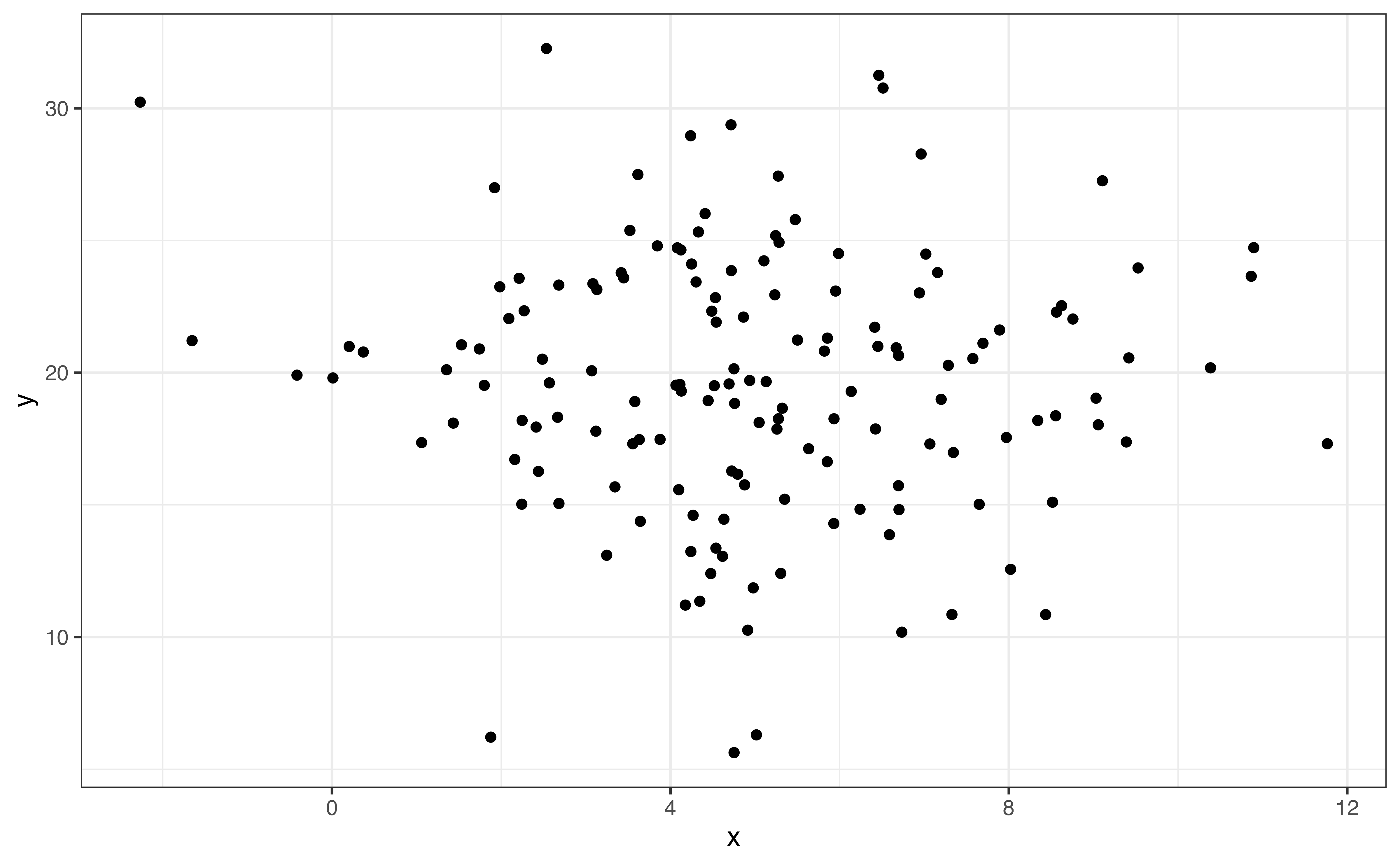
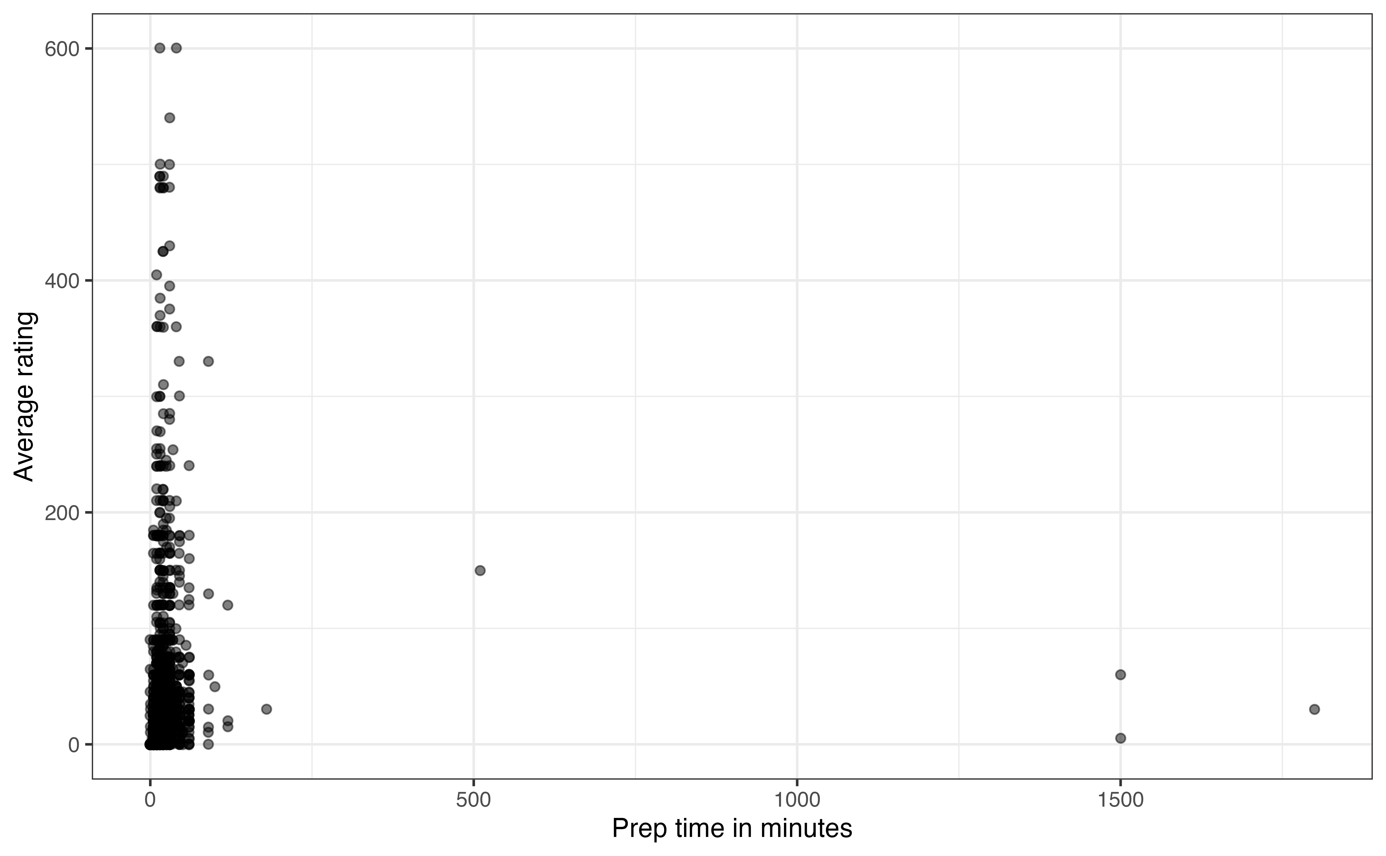
prep_time and avg_ratingIs the amount of time it takes to prepare a dish associated with users’ opinions about the recipe? To answer this, let’s look at the relationship between prep_time and avg_rating.
prep_time and avg_rating
In Figure 3.17, we see there are a few recipes with very long preparation times. Based on the descriptions in the data, these outlier recipes are those that require foods to marinate before cooking. They are making it difficult to see whether there is an association between the two variables for the vast majority of the data. The \(95^{th}\) percentile for prep_time is 45 minutes, so we will narrow the scope of data and evaluate the relationship for those recipes that have preparation time of 45 minutes or less.
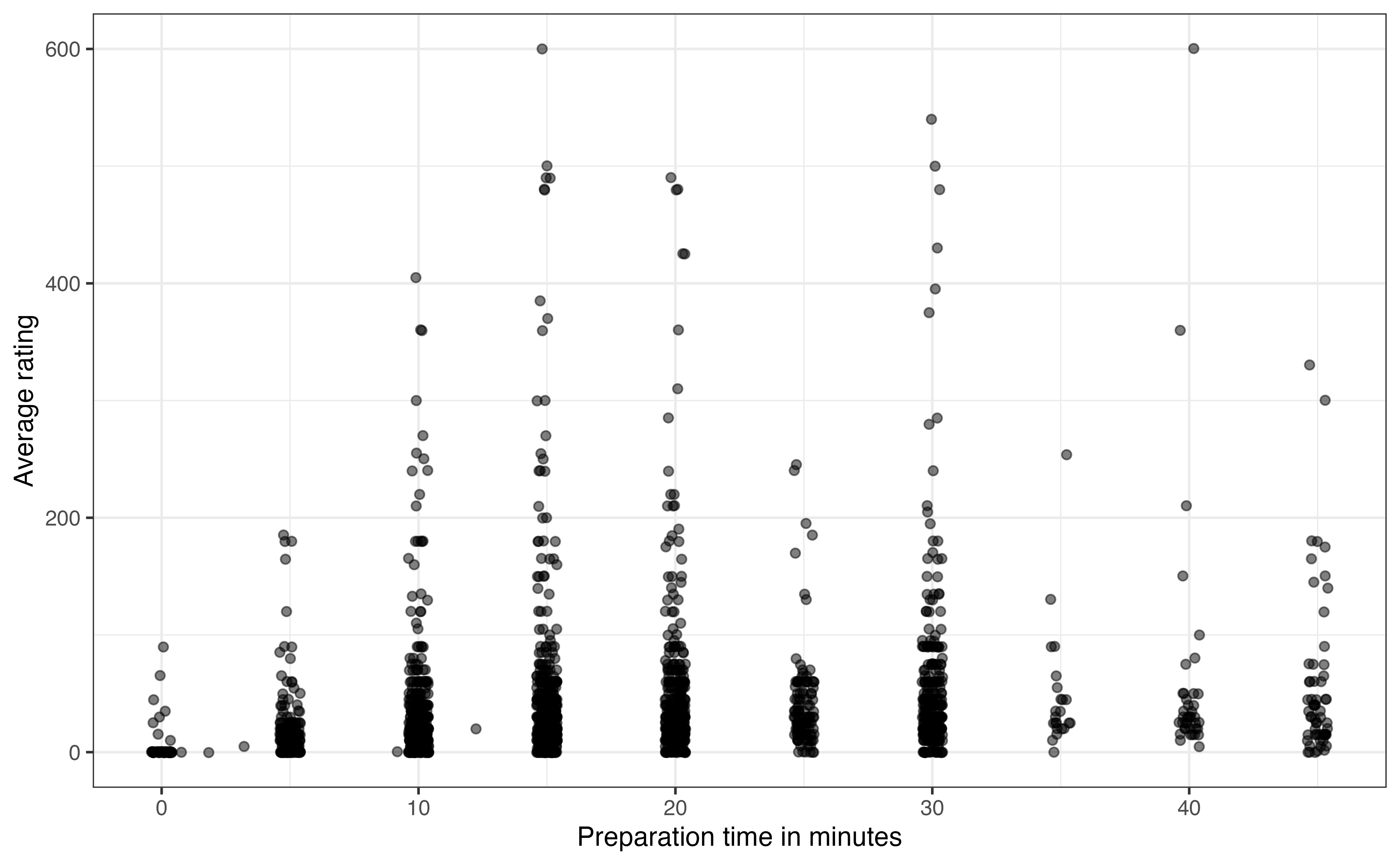
prep_time and avg_rating for recipes with prep_time <= 45
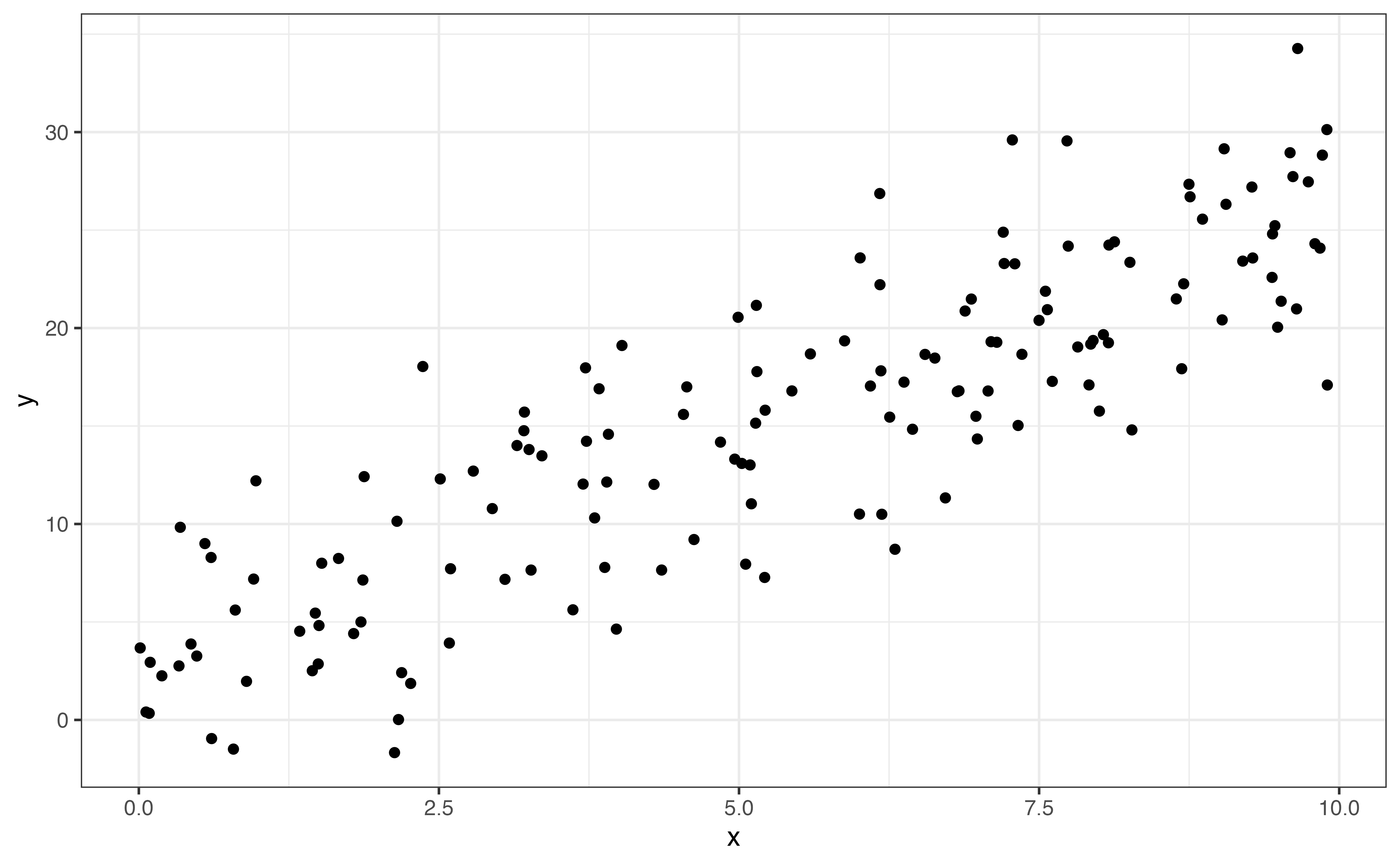
Figure 3.18 is the updated scatterplot for recipes with preparation time 45 minutes or less. Based on Figure 3.18, does there appear to be a relationship between prep_time and avg_rating? Explain.5
Something that may stand out on this plot is that the data appear to be organized in columns. This is not an error in the data, but rather reveals something about the way prep_time appears on the website. The preparation times are recorded in 5-minute increments for recipes with preparation time of five minutes or greater. The exact time is recorded for the few recipes with preparation time less than five minutes.
The next thing that stands out on Figure 3.18 is the recipes with preparation times equal to 0. This seems unusual, as we would expect some preparation for any recipe. So what is happening here? The recipes with 0 minutes for the preparation times are those that show no preparation time on the website. In other words, these are examples of missing data. We don’t know why exactly these values are missing but some possible explanations are (1) the recipe author included the preparation time in the value for cook_time, (2) the recipe author just did not include preparation time in the materials posted on the site. In practice, we need to deal with these types of observations before moving too far into the analysis and modeling.
Next, we examine the relationship between a quantitative variable and a categorical variable. In general, we are interested in how the distribution of the quantitative variable differs based on levels of the categorical variable. Here we discuss three plots commonly used to visualize the relationship between a quantitative and categorical variable: side-by-side boxplots, ridgeline plots, and violin plots. These are all extensions of the plots for univariate quantitative distributions, so we can rely on the observations from Section 3.4.2 as we examine these plots.
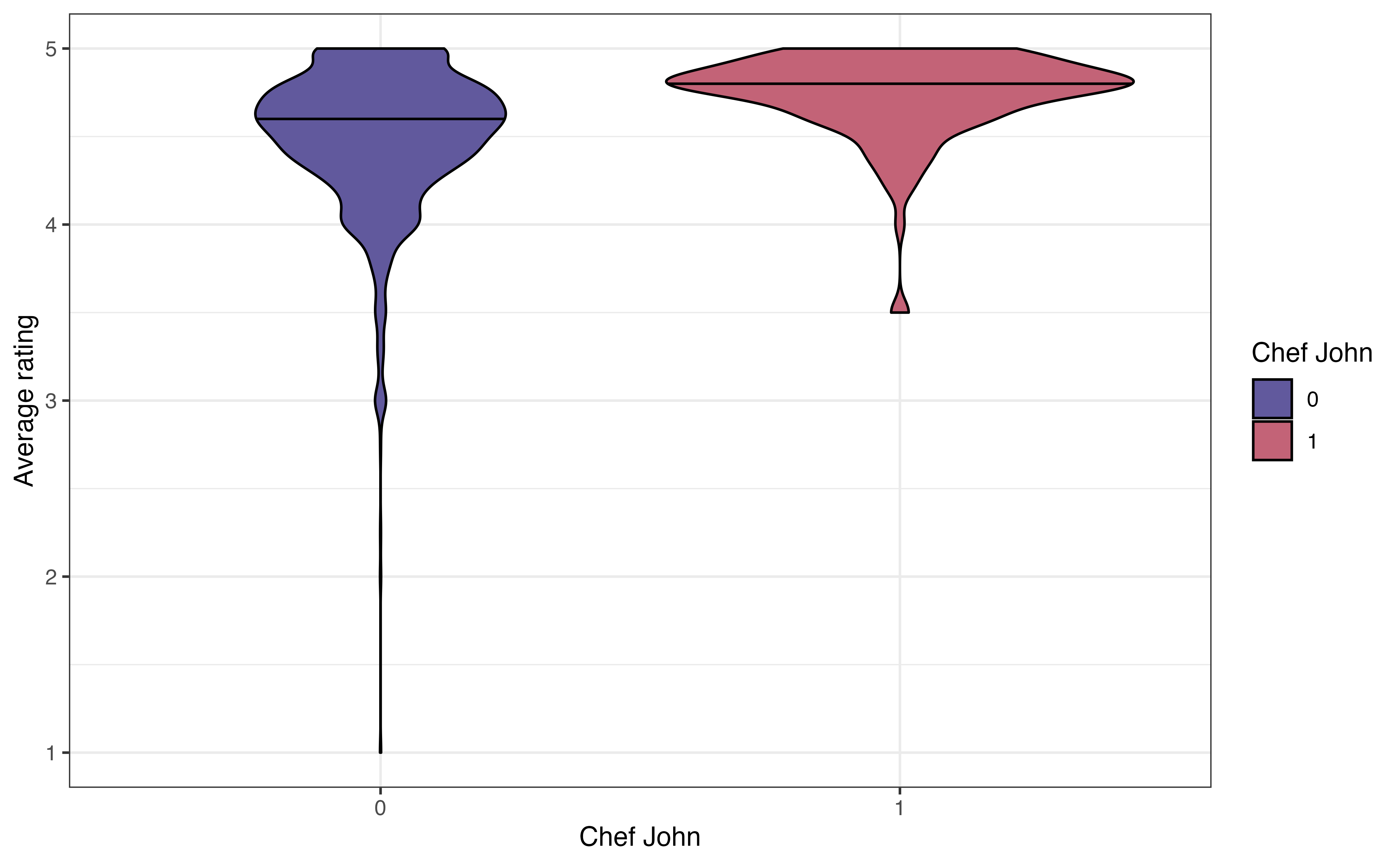
John Mitzewich, more commonly known as Chef John, is an American chef who posts online content about cooking and has posted a lot of recipes on allrecipes.com. He is the author of 130 recipes on the site; the second most common author (besides anonymous authors) has 22 recipes. The variable chef_john is an indicator of whether a recipe is posted by Chef John. Let’s look at the relationship between chef_john and avg_rating to see how users’ ratings of Chef John’s recipes compare to the ratings for other authors. Figure 3.19 shows three visualizations to explore the relationship between these two variables.
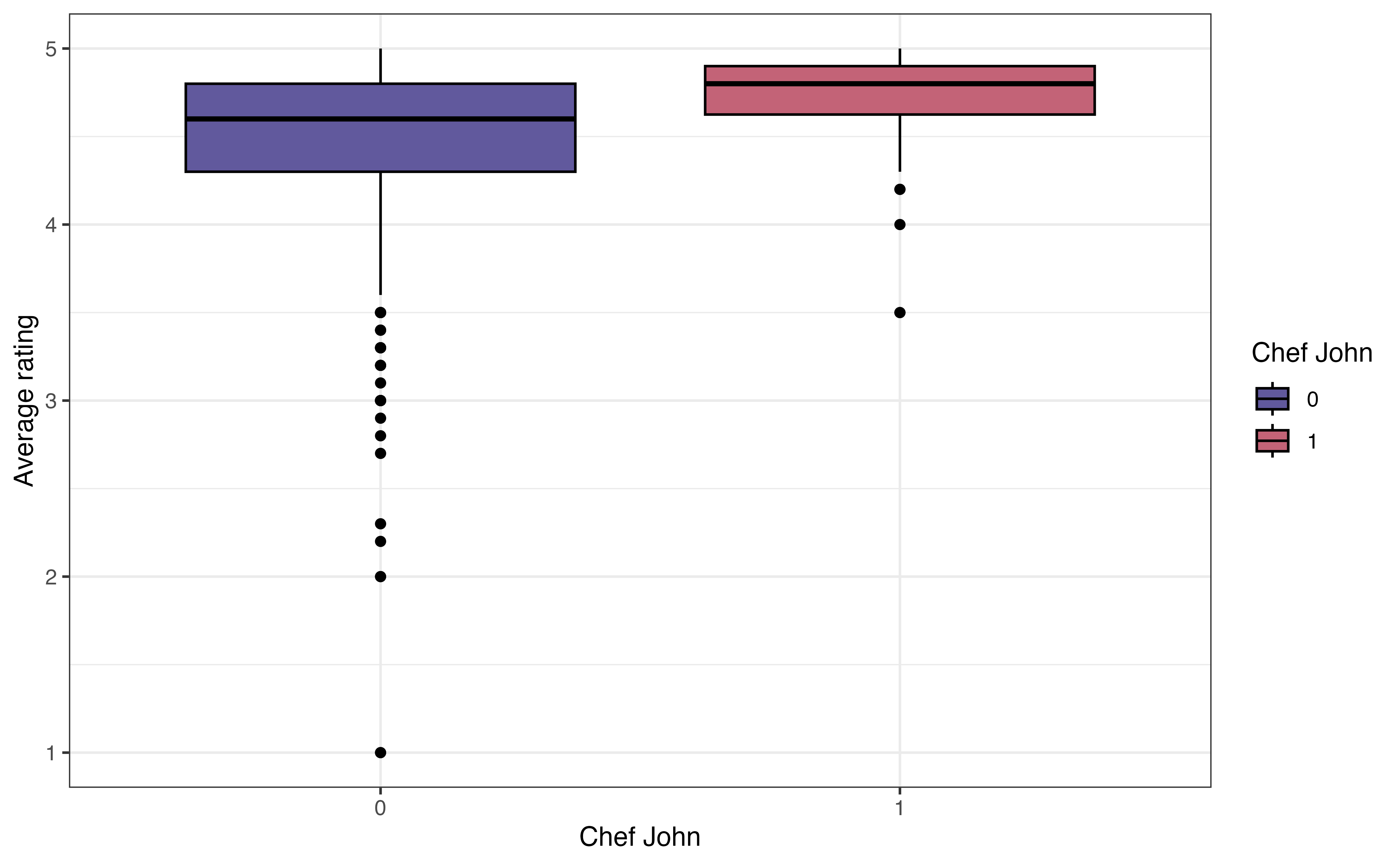

chef_john and avg_rating
The side-by-side boxplot in Figure 3.19 (a) shows a boxplot of the distribution of avg_rating for each level of chef_john. When evaluating whether there appears to be a relationship between the two variables, we want to see if the boxplots are relatively similar for the recipes posted by Chef John (chef_john = 1) and those posted by all other authors (chef_john = 0). In this plot, the median for Chef John’s recipes is slightly higher than the median for all other posters, though there is overlap in the middle 50% of both distributions, as shown by the overlapping boxes. There is less variability in the average ratings among Chef John’s recipes compared to the variability in the average ratings for all others. We also note that there are more extreme low outliers in the distribution of recipes posted by all other authors.
The ridgeline plot in Figure 3.19 (b) shows the density plot of the distribution of avg_rating for each level of chef_john. These plots are useful for comparing the center and shape of the distribution at each level. They also show how the spreads of the distributions compare. As with the side-by-side boxplots, we see there is more spread (variability) in the average ratings for recipes posted by others compared to those posted by Chef John. The number of outliers is less apparent, however, compared to side-by-side boxplot.
Lastly, the violin plot in Figure 3.19 (c) is like a combination of the boxplot and ridgeline plot. The plots show the density of avg_rating for each level of chef_john with the median marked by a horizontal line. This makes it easier to compare the center of the distributions. We can also easily compare the spreads of the distributions. As with the ridgeline plots, it is less clear which observations are outliers.
One thing that is not clear from the visualizations is the number of observations in each subgroup. Knowing the number of observations in each subgroup provides useful context to better understand the differences in the distributions. Therefore, in addition to visualizations, we compute the number of observations and other summary statistics introduced in Section 3.4.2 to describe the distribution of the quantitative variable at each level of the categorical variable. The summary statistics for avg_rating for each level of chef_john is shown in Table 3.7.
avg_rating for each level of chef_john
| chef_john | n | Prop Complete | Mean | SD | Min | Q1 | Median | Q3 | Max |
|---|---|---|---|---|---|---|---|---|---|
| 0 | 2088 | 0.955 | 4.50 | 0.405 | 1.0 | 4.30 | 4.6 | 4.8 | 5 |
| 1 | 130 | 0.969 | 4.74 | 0.251 | 3.5 | 4.62 | 4.8 | 4.9 | 5 |
When evaluating a potential relationship, we are primarily concerned with how the centers of the distribution for the quantitative variable compare for each level of the categorical variable. If there are large differences between the centers, then there is indication of a potential relationship between the two variables. Otherwise, if the centers are equal or relatively close, there is little to no indication of a relationship between the variables. It is worth noting again that we are only making observations about the data, not drawing conclusions at this point.
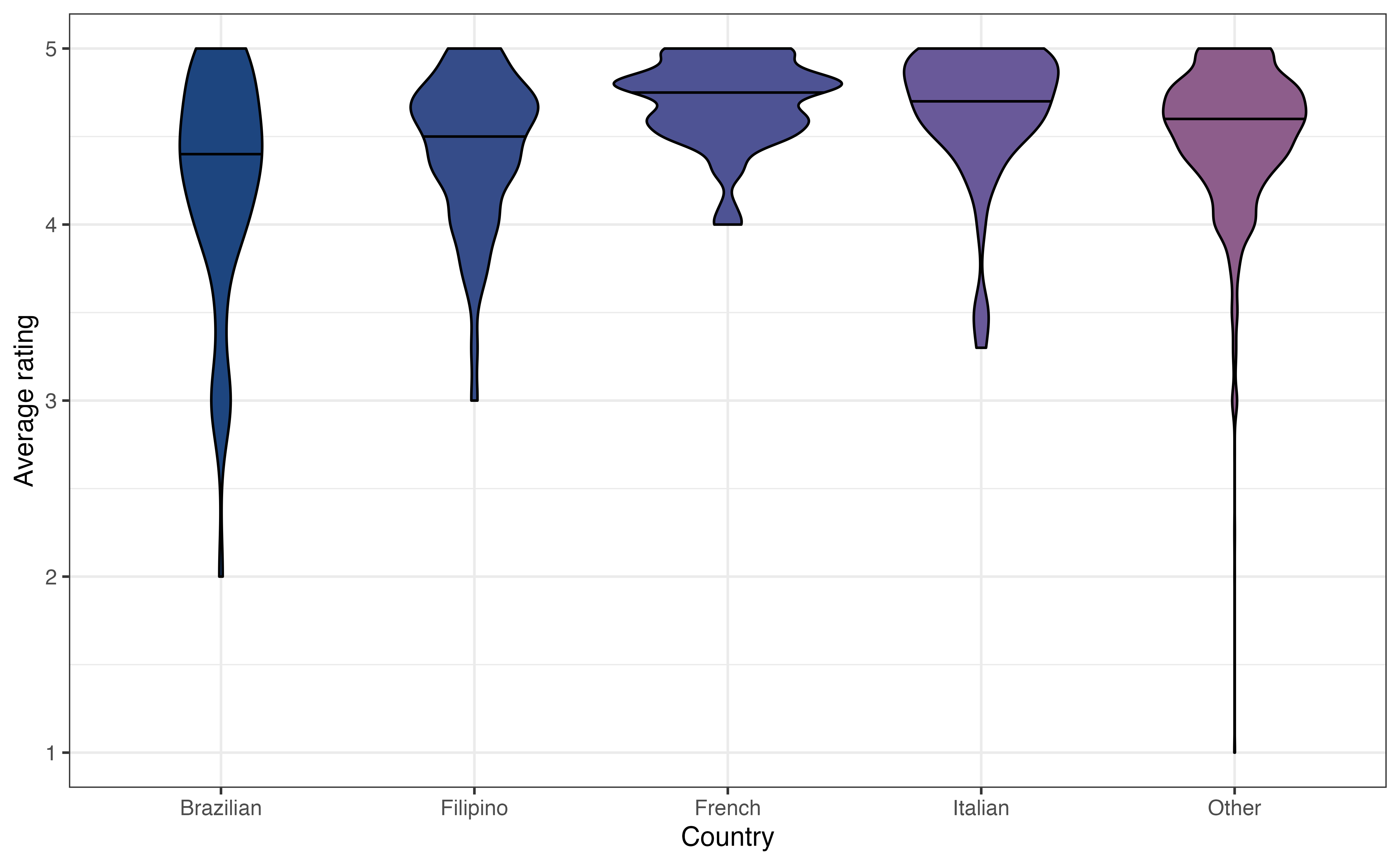
country and avg_ratingHow do users rate recipes from different countries? Figure 3.20 shows the relationship between country and avg_rating.
country and avg_rating
Write two observations from Figure 3.20. Does there appear to be a relationship between country and avg_rating?6
The last type of bivariate relationship is the relationship between two categorical variables. We will be particularly interested in these relationships in Chapter 11, as we fit models with categorical response variables. We use visualizations along with tables of frequencies and relative frequencies to examine these relationships. There are three commonly used visualizations for the relationship between two categorical variables: grouped bar plot, segmented bar plot, and mosaic plot.
When looking at the relationship between a quantitative and categorical variable, we naturally looked at the distribution of the quantitative variable by levels of the categorical variable. When we have two categorical variables, the software does not have a natural way in which to arrange the data. Therefore, we rely on the analysis objective to determine how to most effectively visualize and summarize the relationship.
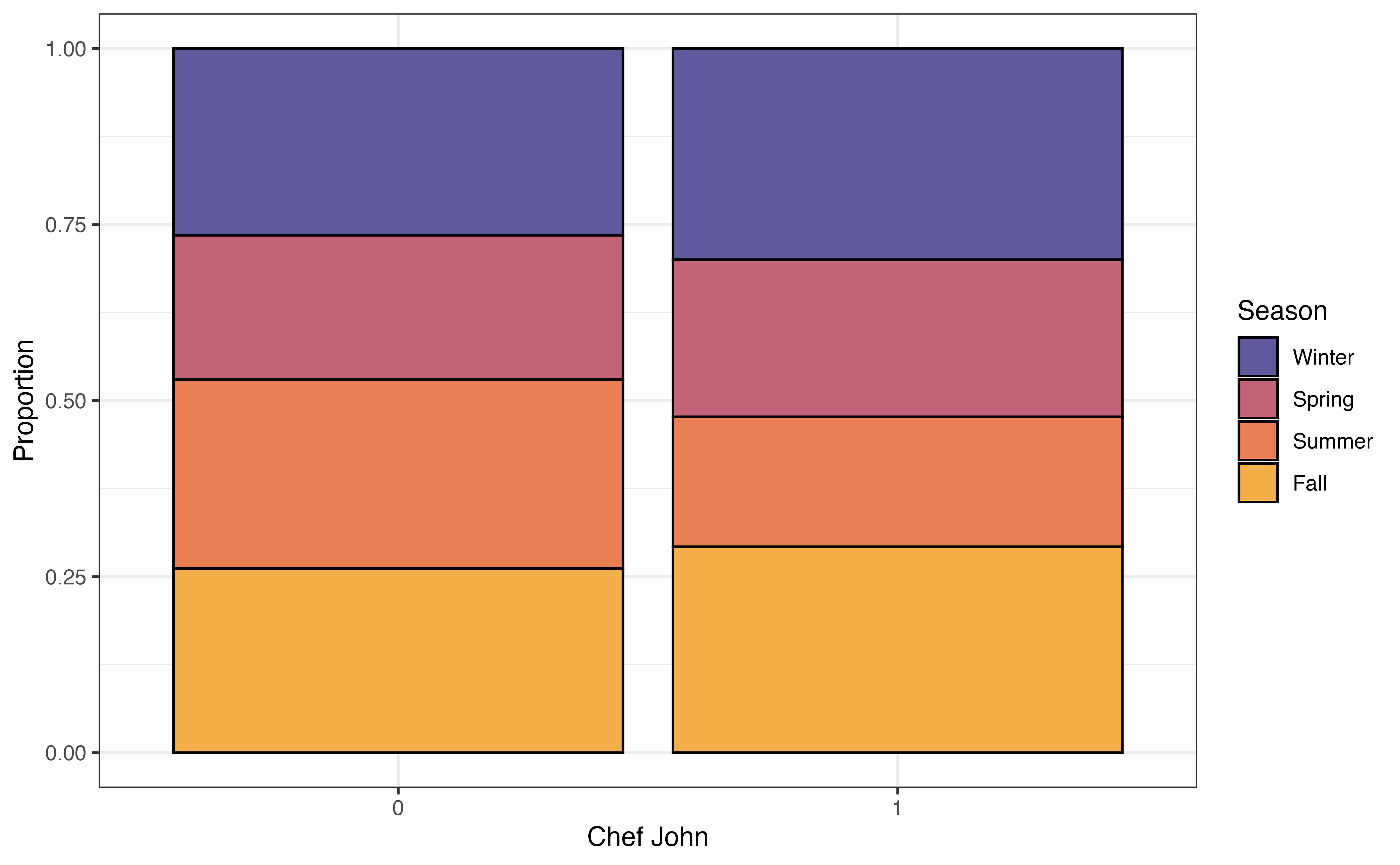
In Section 3.1 we introduced Chef John, the most prolific poster on allrecipes.com based on the observations in our data. We’d like to explore whether he tends to post recipes at similar times of the year compared to other authors. Therefore, we will explore the relationship between season and chef_john, by looking at the distribution of season for Chef John compared to the distribution for all other authors.
Figure 3.21 shows three different visualizations of the relationship between chef_john and season.
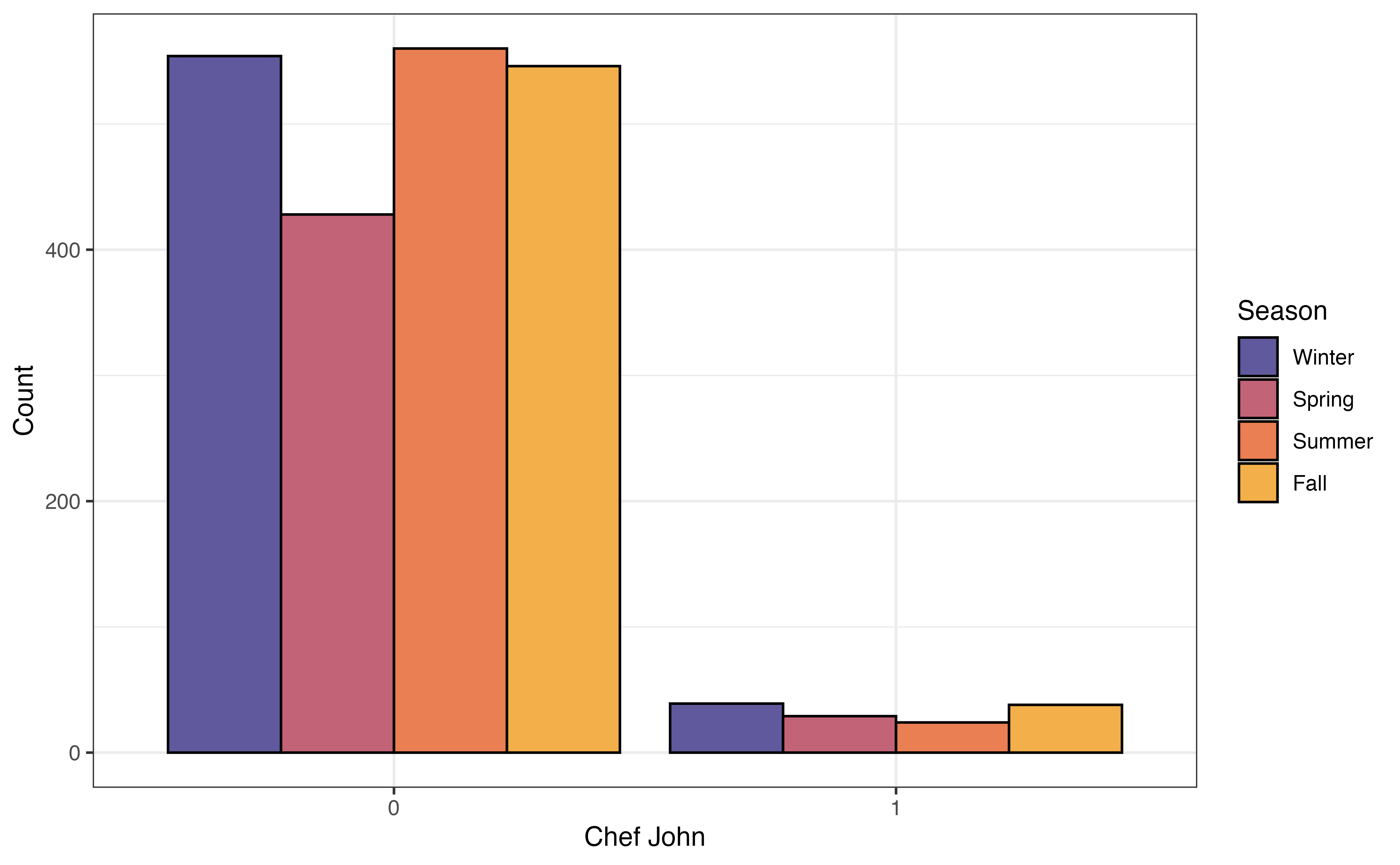
chef_john and season
The grouped bar plot in Figure 3.21 (a) shows a bar chart of season based on the levels of chef_john. The height of the bars represent the number of observations that take a given level of season and given level of chef_john. As we evaluate whether there is a relationship between the two variables, we look to see whether the relative bar heights across seasons is the same for recipes posted by Chef John compared to the relative bar heights for other authors. The data give some indication of a relationship between the variables if the distribution of season differs based on values of chef_john.
Figure 3.21 (a) shows a limitation of the grouped bar chart. Because the heights of the bars represent the number of observations, these plots can be difficult to interpret when the data have a large imbalance. That is the case here, as there are 130 recipes were posted by Chef John and 2088 were posted by all other authors.
In a segmented bar chart (also called stacked bar chart), the bars for one variable are filled in based on the distribution of another variable. In the segmented bar chart in Figure 3.21 (b), there is a bar for each level of chef_john, and each bar is filled in based on the distribution of season. Because we are now working with proportions, we can more easily make comparisons across groups even when the data are imbalanced. If the distributions are approximately the same within each bar, then it is a indication of no relationship between the two variables. Otherwise, differences in the distributions within the bars indicate a potential relationship between the variables.
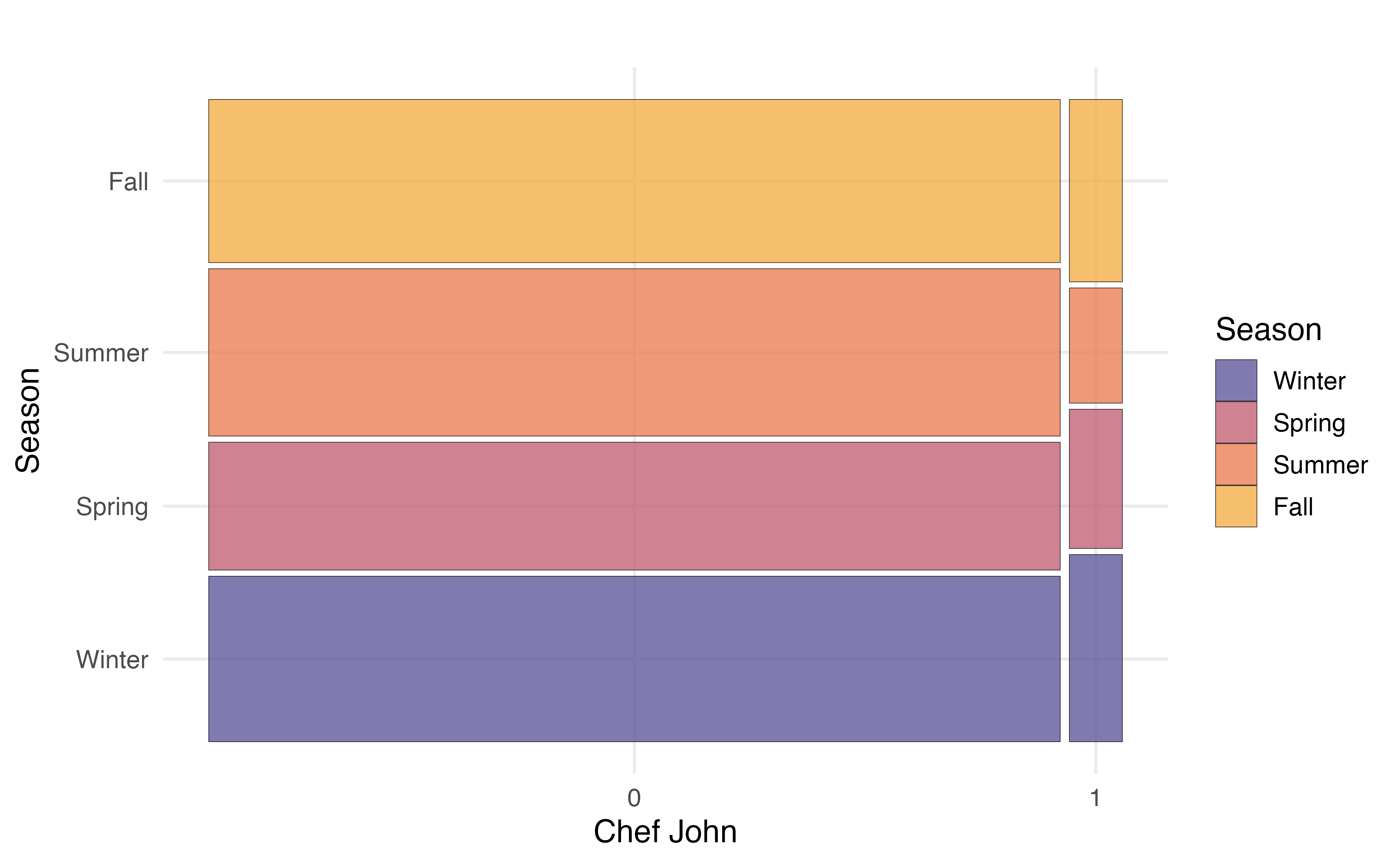
A mosaic plot has some of the advantages of both grouped bar plots and segmented bar plots. In a mosaic plots, the bars for grouping variable are filled in based on the distribution of the other variable, and the width of the bars are based on the number of observations at each level of the grouping variable. Figure 3.21 (b) shows the mosaic plot of season versus chef_john. Now we can not only see the distribution of season for recipes posted by Chef John and for recipes posted by all other authors, but we also see there are far fewer observations that take values chef_john = 1 compared to chef_john = 0.
From the plots in Figure 3.21, we see that a larger proportion of recipes were posted by Chef John in the fall and winter seasons, compared to all other authors. The other authors posted a higher proportion of recipes in the summer compared to Chef John. These figures indicate a potential relationship between whether the recipe was posted by Chef John and the season in which it was posted.
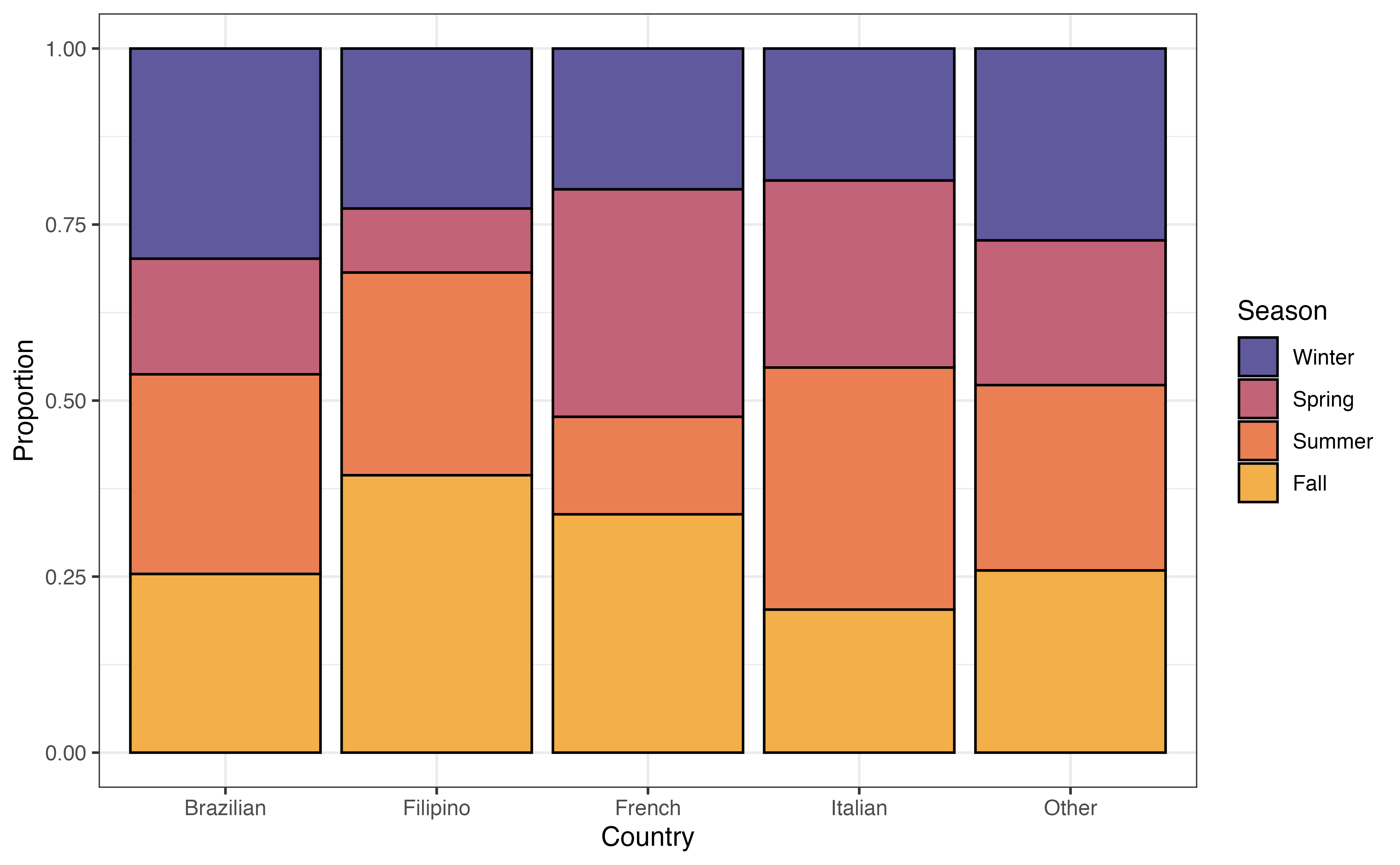
country and seasonIs there a relationship between the country a recipe is from and the time of year it is posted? Figure 3.22 is a segmented bar chart showing the relationship between country and season.
country versus season
Write two observations from Figure 3.22. Does there appear to be a relationship between country and season?7
The next step is multivariate EDA, exploring the relationship between three or more variables. We typically limit this to the exploration of three variables, because it can become challenging to interpret and glean meaningful insights from the relationship between a large number of variables. We often use multivariate EDA when we want to explore potential interaction terms for the regression model (Section 7.7). We generally rely on visualizations for multivariate EDA. We can start with one of the bivariate visualizations introduced in Section 3.5 and further explore them based on subgroups of a third variable.
In Section 3.5.2, we looked at the relationship between the average rating and whether a recipe was posted by Chef John or another author. Now let’s expand on that and consider whether this relationship differs between seasons. Figure 3.23 shows side-by-side boxplots of avg_rating versus chef_john faceted (split up) by season.
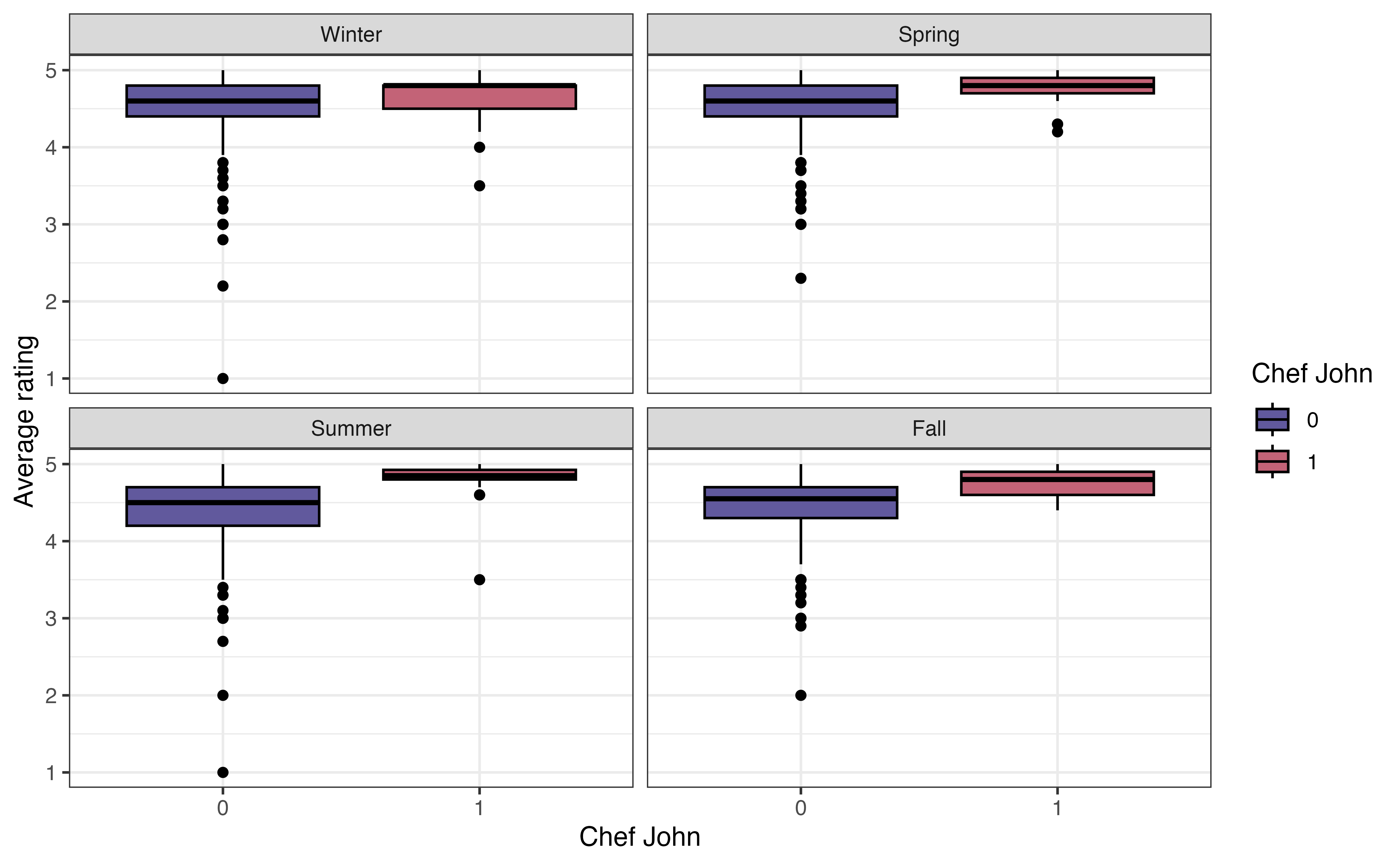
avg_rating versus chef_john faceted by season
As we look at the visualization, the primary question to ask is whether the relationship between avg_rating and chef_john looks similar or different across the levels of season. In other words, are the boxplots the same relative to one another for each level of season. Note that we are not necessarily interested in the absolute position of the boxplots (it’s OK if some seasons generally have higher or lower ratings compared to others) but rather we are interested in the relative positioning of the boxplots within a season.
From Figure 3.23, the relationship between avg_rating and chef_john is approximately the same in each season. Within each season, the median avg_rating for recipes posted by Chef John is higher compared to those posted by other authors. Additionally, there is generally a lot of overlap in the boxes within each season. The exception is the summer, but we keep in mind the very small variability (and small sample size) of recipes posted by Chef John. Based on this EDA, the relationship between avg_rating and chef_john does not appear to differ by season.
Much of the exploratory data analysis in this chapter is done using functions from the dplyr and ggplot2 packages. We refer the reader to Chapter 2 for a more detailed introduction to those packages. Here we will focus on the new functions that were used in this chapter: skim() in Section 3.4.2, waffle() in Section 3.4.1, geom_ridges() in Section 3.5.2, and geom_mosaic() in Section 3.5.3.
The skim() function in the skimr R package (Waring et al. 2022) provides a summary of all the columns in a data frame or tibble. This function is particularly useful for initially checking the data Section 3.3 and univariate data analysis (Section 3.4). The code below produces a summary for each column recipes. Different types of summary output is produced based on the column’s data format.
recipes |>
skim()skim() output for recipes
| Name | recipes |
| Number of rows | 2218 |
| Number of columns | 22 |
| _______________________ | |
| Column type frequency: | |
| character | 5 |
| Date | 1 |
| factor | 3 |
| numeric | 13 |
| ________________________ | |
| Group variables | None |
Variable type: character
| skim_variable | n_missing | complete_rate | min | max | empty | n_unique | whitespace |
|---|---|---|---|---|---|---|---|
| name | 0 | 1 | 4 | 87 | 0 | 2216 | 0 |
| country | 0 | 1 | 5 | 9 | 0 | 5 | 0 |
| url | 0 | 1 | 45 | 120 | 0 | 2218 | 0 |
| author | 0 | 1 | 1 | 35 | 0 | 1635 | 0 |
| ingredients | 1 | 1 | 29 | 1109 | 0 | 2217 | 0 |
Variable type: Date
| skim_variable | n_missing | complete_rate | min | max | median | n_unique |
|---|---|---|---|---|---|---|
| date_published | 0 | 1 | 2009-02-09 | 2025-07-29 | 2024-07-14 | 751 |
Variable type: factor
| skim_variable | n_missing | complete_rate | ordered | n_unique | top_counts |
|---|---|---|---|---|---|
| month | 0 | 1 | FALSE | 12 | 11: 394, 1: 230, 6: 221, 2: 211 |
| chef_john | 0 | 1 | FALSE | 2 | 0: 2088, 1: 130 |
| season | 0 | 1 | FALSE | 4 | Win: 593, Sum: 584, Fal: 584, Spr: 457 |
Variable type: numeric
| skim_variable | n_missing | complete_rate | mean | sd | p0 | p25 | p50 | p75 | p100 | hist |
|---|---|---|---|---|---|---|---|---|---|---|
| calories | 32 | 0.99 | 358.41 | 240.04 | 3 | 190.0 | 319.5 | 477.0 | 2266 | ▇▃▁▁▁ |
| fat | 55 | 0.98 | 18.76 | 16.96 | 0 | 7.0 | 15.0 | 26.0 | 225 | ▇▁▁▁▁ |
| carbs | 35 | 0.98 | 31.96 | 26.06 | 1 | 13.0 | 26.0 | 45.0 | 264 | ▇▂▁▁▁ |
| protein | 39 | 0.98 | 16.61 | 16.30 | 0 | 4.0 | 11.0 | 25.0 | 159 | ▇▁▁▁▁ |
| avg_rating | 97 | 0.96 | 4.51 | 0.40 | 1 | 4.3 | 4.6 | 4.8 | 5 | ▁▁▁▂▇ |
| total_ratings | 97 | 0.96 | 85.25 | 148.24 | 1 | 6.0 | 24.0 | 87.0 | 997 | ▇▁▁▁▁ |
| reviews | 108 | 0.95 | 76.93 | 142.07 | 1 | 6.0 | 21.0 | 74.0 | 975 | ▇▁▁▁▁ |
| prep_time | 0 | 1.00 | 21.50 | 60.72 | 0 | 10.0 | 15.0 | 25.0 | 1800 | ▇▁▁▁▁ |
| cook_time | 0 | 1.00 | 41.75 | 63.18 | 0 | 10.0 | 25.0 | 45.0 | 600 | ▇▁▁▁▁ |
| total_time | 0 | 1.00 | 170.98 | 641.73 | 0 | 35.0 | 60.0 | 120.0 | 14440 | ▇▁▁▁▁ |
| servings | 2 | 1.00 | 10.48 | 13.42 | 1 | 4.0 | 8.0 | 12.0 | 240 | ▇▁▁▁▁ |
| year | 0 | 1.00 | 2023.32 | 1.75 | 2009 | 2022.0 | 2024.0 | 2025.0 | 2025 | ▁▁▁▁▇ |
| days_on_site | 0 | 1.00 | 643.15 | 637.64 | 3 | 207.0 | 382.5 | 1002.8 | 6017 | ▇▁▁▁▁ |
If we are only interested in the summary for particular variables, we specify them in the skim() function. The code below produces the summaries for avg_rating and season.
recipes |>
skim(avg_rating, season)skim() output for avg_rating and season
| Name | recipes |
| Number of rows | 2218 |
| Number of columns | 22 |
| _______________________ | |
| Column type frequency: | |
| factor | 1 |
| numeric | 1 |
| ________________________ | |
| Group variables | None |
Variable type: factor
| skim_variable | n_missing | complete_rate | ordered | n_unique | top_counts |
|---|---|---|---|---|---|
| season | 0 | 1 | FALSE | 4 | Win: 593, Sum: 584, Fal: 584, Spr: 457 |
Variable type: numeric
| skim_variable | n_missing | complete_rate | mean | sd | p0 | p25 | p50 | p75 | p100 | hist |
|---|---|---|---|---|---|---|---|---|---|---|
| avg_rating | 97 | 0.96 | 4.51 | 0.4 | 1 | 4.3 | 4.6 | 4.8 | 5 | ▁▁▁▂▇ |
The output from skim() is a tibble, so we can apply the usual dplyr functions to the results. For example, we may not be interested in all the summary output, so we can use select() to choose certain columns. The code below shows the mean and standard deviation for avg_rating. The column names from the skim() output differ slightly from what is displayed, so use glimpse() or names() to see the underlying column names.
recipes |>
  skim(avg_rating) |>
  select(numeric.mean, numeric.sd)
# A tibble: 1 × 2
numeric.mean numeric.sd
<dbl> <dbl>
1 4.51 0.401We introduced waffle charts in Section 3.4.1 to explore the univariate distribution of a categorical variable. Waffle charts are produced using geom_waffle() in the waffle R package (Rudis and Gandy 2023). The functions in this package are developed to work within the ggplot2 framework, so we can use all the ggplot functions from Section 2.6.2 to customize the charts.
The code to create a waffle chart for the season is below. We begin by using count() to compute the number of observations at each level. Inside geom_waffle(), the argument flip = TRUE arranges the level of season by rows, rather than the default arrangement by columns. The argument make_proportional = TRUE produces a chart such that the number of squares is approximately equal to the proportion of observations at each level, rather than the raw number of observations. Lastly, theme_enhance_waffle() removes unnecessary axis labels.
recipes |>
  count(season) |>
  ggplot(aes(fill = season, values = n)) +
  geom_waffle(flip = TRUE, make_proportional = TRUE) +
  theme_enhance_waffle() +
  scale_fill_manual(values = sunset4)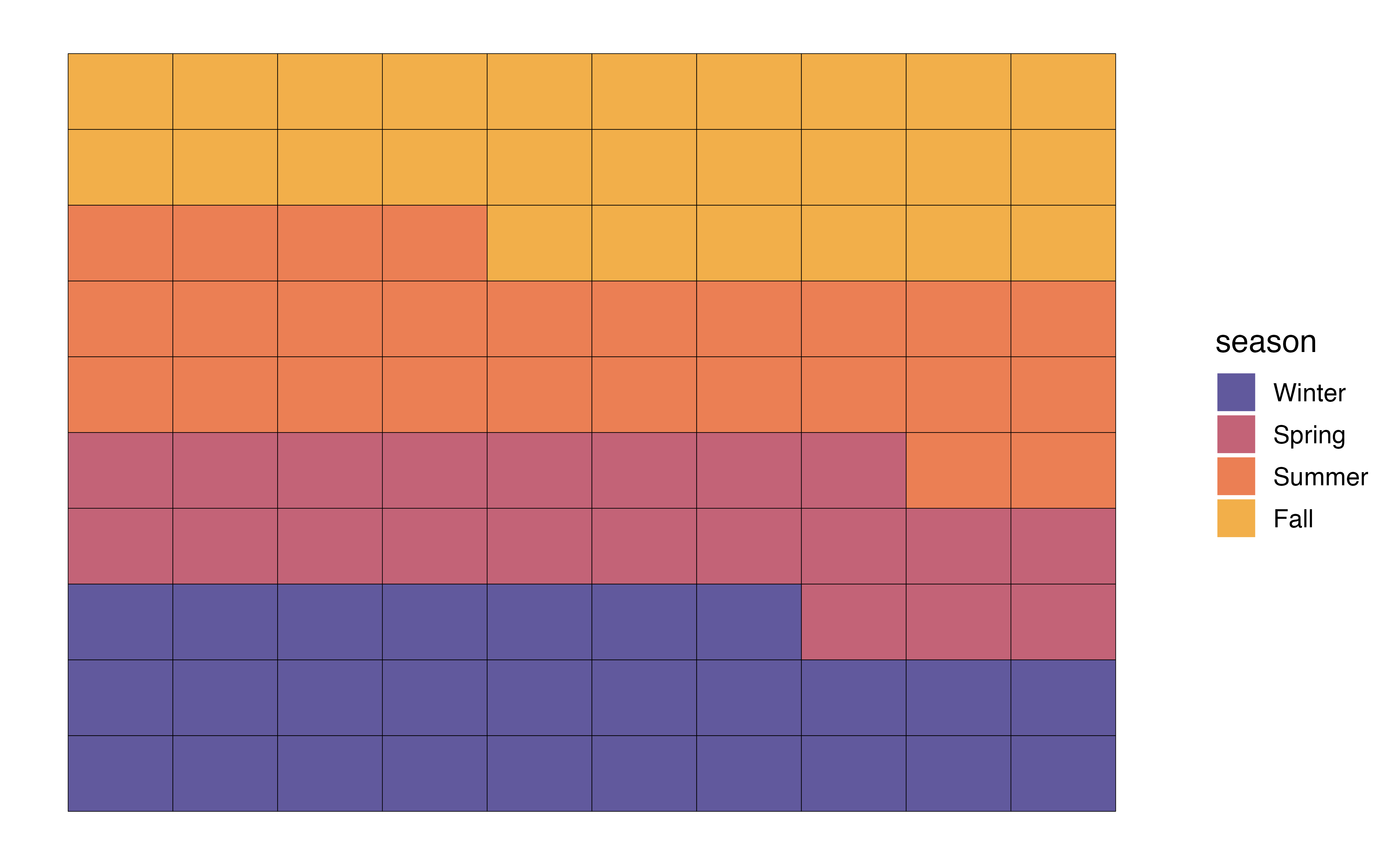
In Section 3.5.2, we introduced ridgeline plots to explore the relationship between a quantitative and categorical variable. We use geom_density_ridges() in the ggridges R package (Wilke 2025) to create the plots. Similar to ggwaffle, the functions in this package are developed to work within the ggplot2 framework, so we can utilize the functions from Section 2.6.2 to customize the plots.
The code for the ridgeline plot of the relationship between avg_rating and chef_john is below.
ggplot(data = recipes, aes(x = avg_rating, y = chef_john)) +
geom_density_ridges() 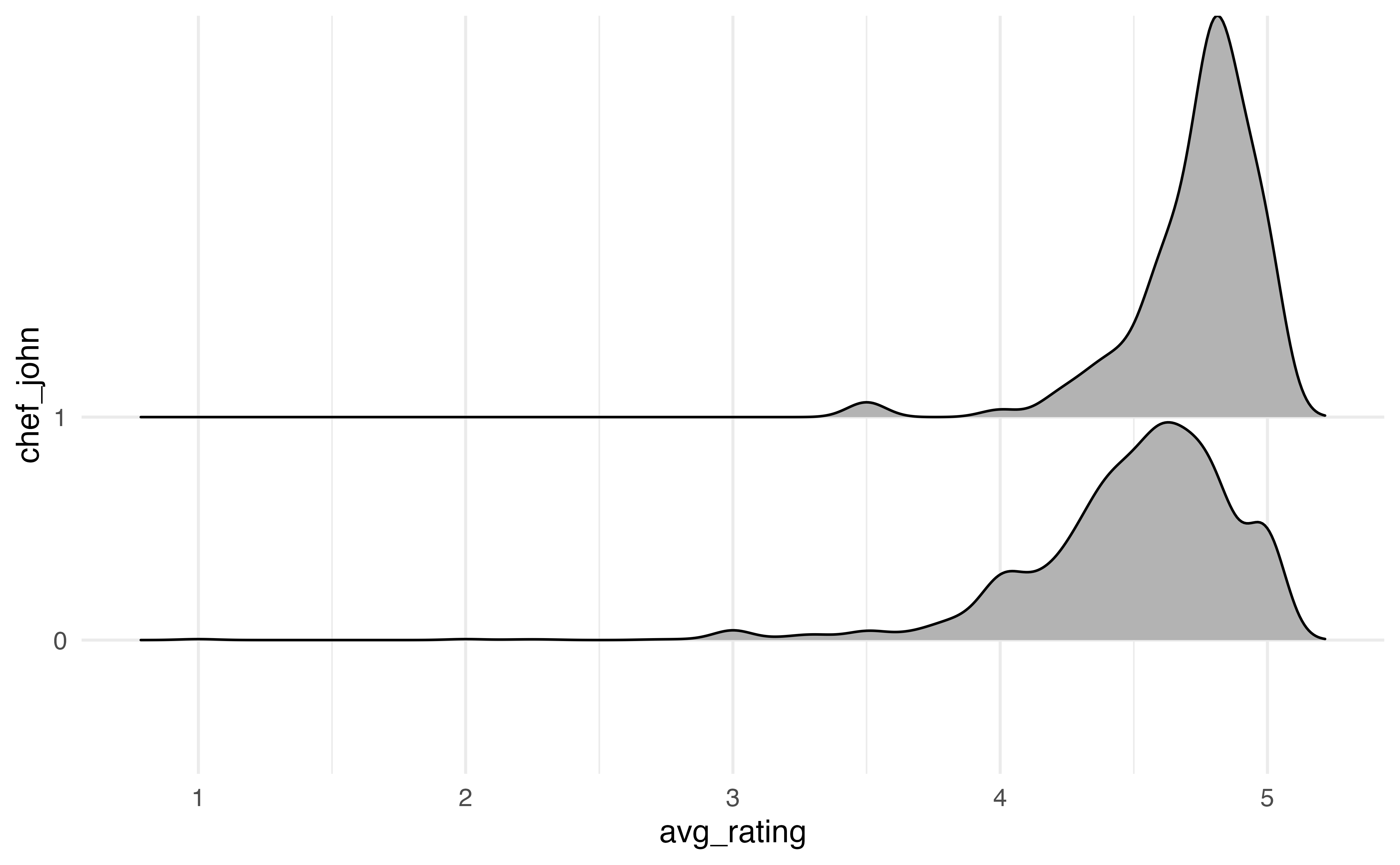
We customize the ridgeline plot by filling in the color of the densities based on chef_john, updating the labels, and applying a new theme to the visualization.
ggplot(data = recipes, aes(x = avg_rating, y = chef_john, fill = chef_john)) +
  geom_density_ridges() +
  labs(x = "Average rating",
       y = "Chef John",
       fill = "Chef John") +
  theme_bw() +
  scale_fill_manual(values = sunset2)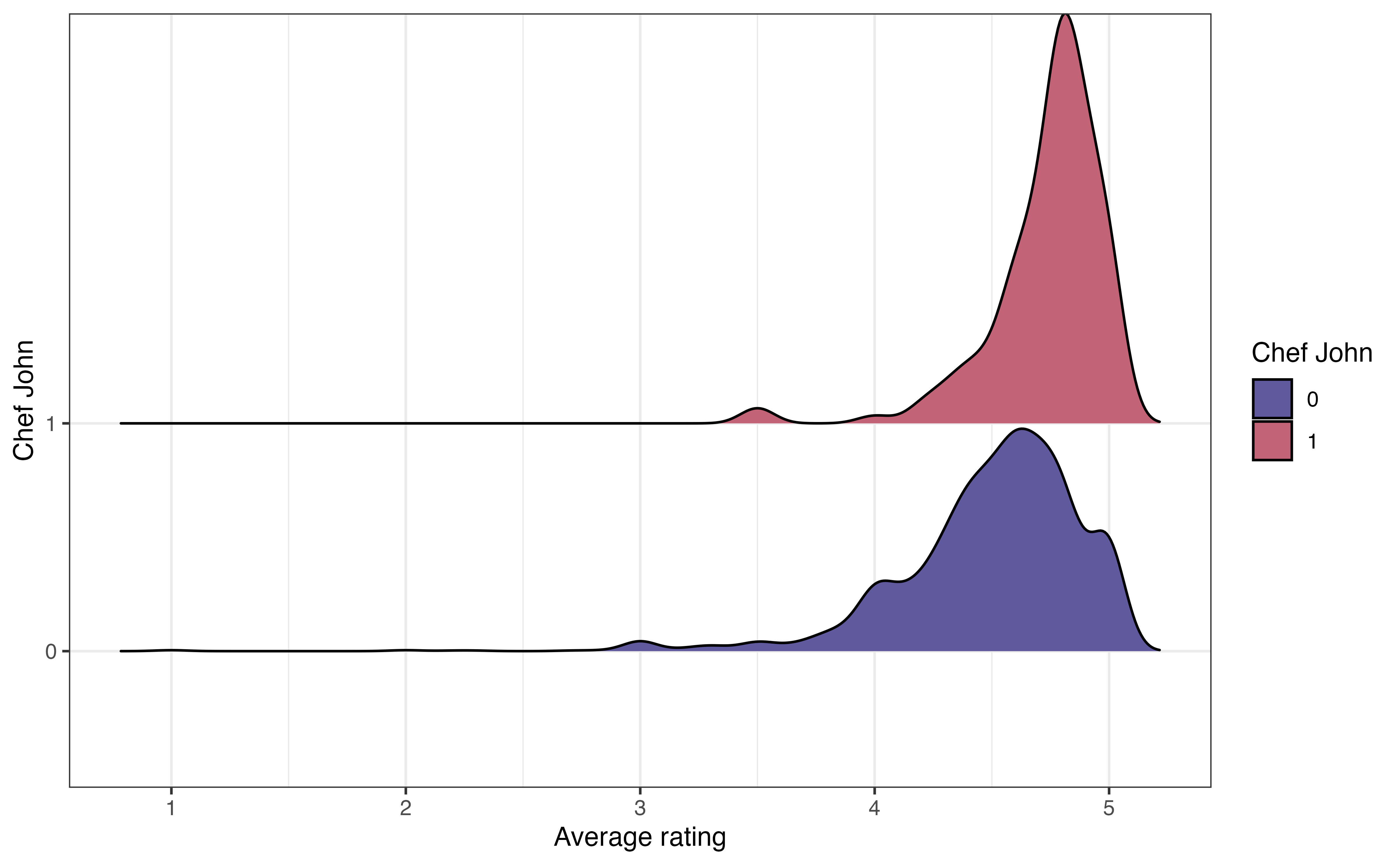
We introduced the mosaic plot for examining the relationship between two categorical variables in Section 3.5.3. Mosaic plots are created using geom_mosaic() in the ggmosaic R package (Jeppson, Hofmann, and Cook 2021).
Below is a mosaic plot of chef_john versus season. The aes() function to define the aesthetics must be an argument of geom_mosaic(). Additionally, the x aesthetic is defined as the product of the two categorical variables of interest.
ggplot(data = recipes) +
  geom_mosaic(aes(x = product(season, chef_john), fill = season))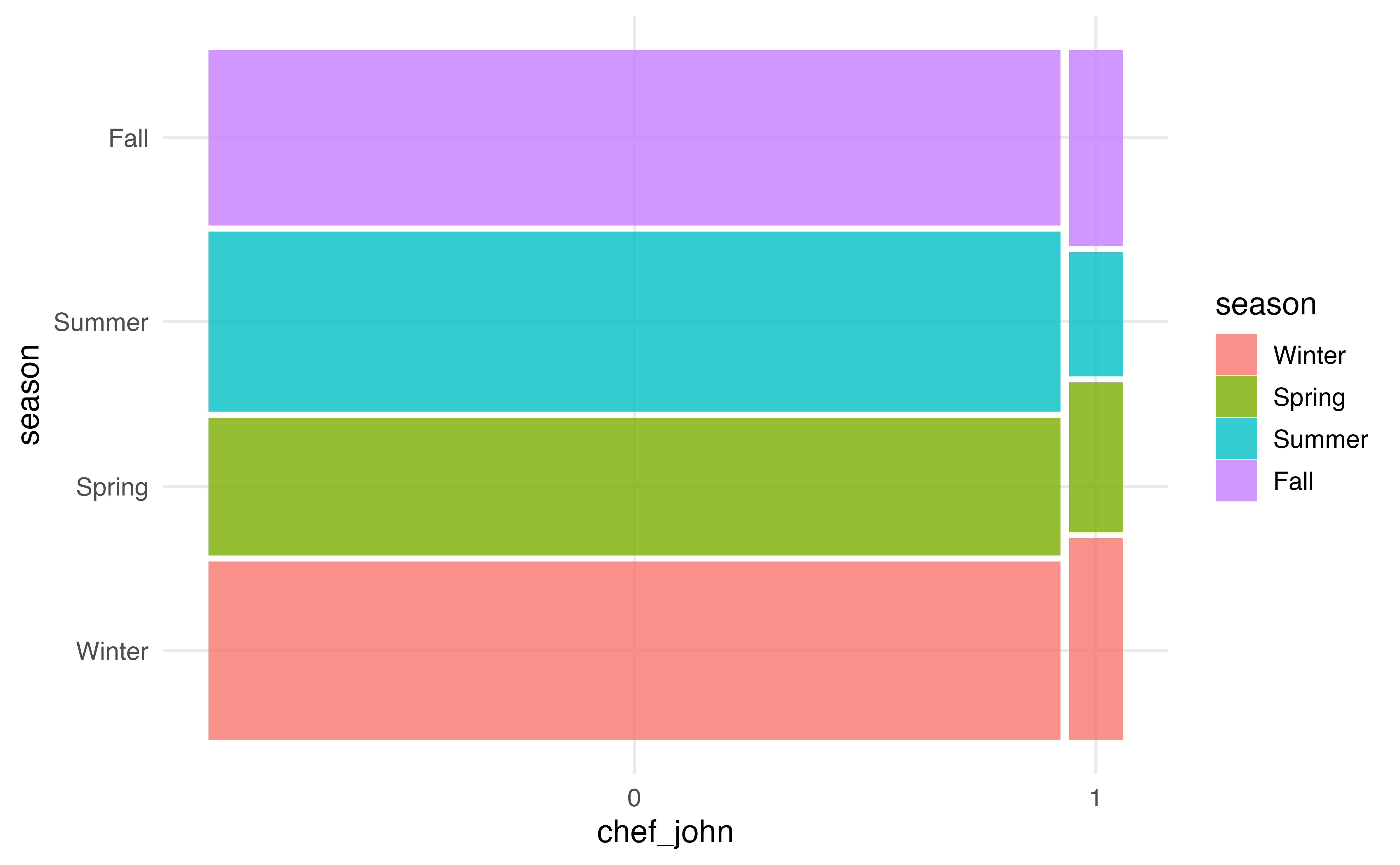
Similar to the packages for waffle plots and ridgeline plots, we can customize mosaic plots using the functions in Section 2.6.2. In the code below, we update the colors using a palette from the viridis R package (Garnier et al. 2024).
library(viridis)

ggplot(data = recipes) +
  geom_mosaic(aes(x = product(season, chef_john), fill = season)) +
  scale_fill_viridis_d()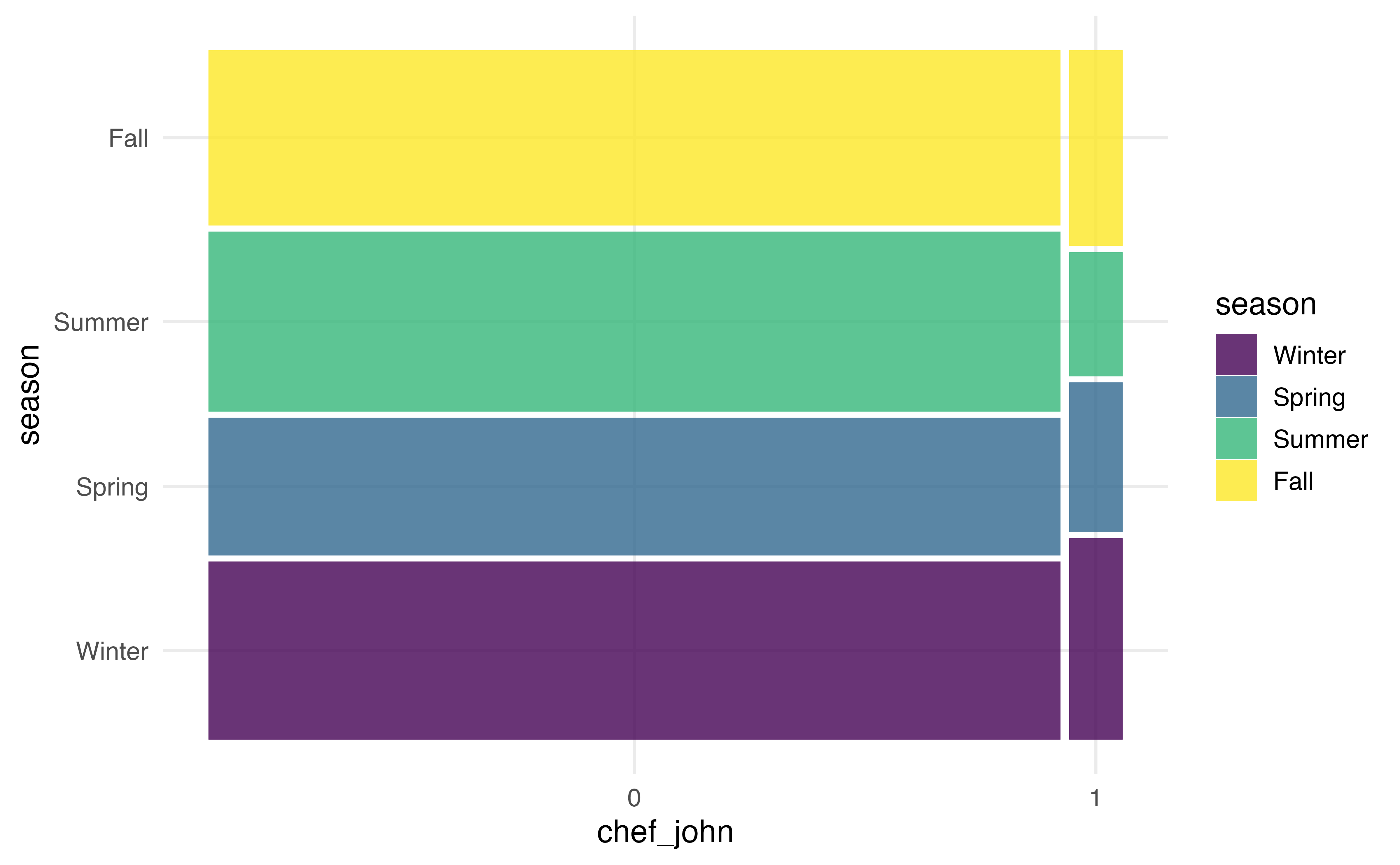
Exploratory data analysis workflow:
In this chapter we introduced the exploratory data analysis, the step in the data science workflow when we begin to clean and explore the data. This is an important step in a regression analysis, because having a clear understanding of the data helps inform the decisions we make throughout the analysis process. It is also the point at which we may identify errors or missing values in the data. We conduct EDA by using visualizations and summary statistics to get an overview of the data, explore the distributions of individual variables, explore the relationships between two variables, and explore the relationships between three or more variables.
The remainder of the text focuses on regression analysis, methods for modeling the relationship between a response variable and one or more predictor variables. Given the importance of EDA in every analysis, each chapter will begin with a short exploration of key variables and relationships in the analysis. The EDA in these sections are is meant to provide context about the data, equipping us to more fully interpret and draw conclusions from the regression analysis results. Because the focus of each chapter is the regression analysis method, the EDA will be brief and focused, similar to what might be presented in a final presentation or report. In practice, the EDA is more in-depth, particularly when working with data sets that have a large number of variables.
We begin with simple linear regression in Chapter 4, using regression analysis to model the relationship between the response variable and one predictor variable. This will provide the foundation for the more complex models introduced in Chapter 7.
Month is a categorical variable, because each number represents a specific month. The more reliable identifier variable is url. There is one recipe per page, and multiple pages cannot have the same URL. Therefore, the URL uniquely identifies the recipe. Though unlikely, it is possible for multiple recipes to have the same name. This actually occurs for two names in the data “Cajun Chicken and Sausage Gumbo” and “Chicharrones de Pollo”.↩︎
In general, there number of recipes posted is approximately equal across the winter, summer, and fall seasons. The smallest proportion of recipes are posted during the spring season.↩︎
The shape of the distribution of avg_rating is skewed left and unimodal.↩︎
The distribution of cook_time is unimodal and right-skewed. The center is best represented by the median, of 25 minutes. The spread is best represented by the IQR, of 35 minutes (45 - 10). There are some clear outliers with cook times of about 350 minutes and greater (the max is 600).↩︎
There does not appear to be a relationship between the average rating and the preparation time. There is not a clear trend on the plot.↩︎
Example observations: (1) There is the least variability in the avg_rating for French recipes. (2) The median avg_rating seems to be similar for all countries.
There does not appear to be a relationship between country and avg_rating. The median avg_ratingis similar across countries, and there is a lot of overlap in the distributions of avg_rating↩︎
Example observations: (1) A larger proportion of Filipino and French recipes are posted in the fall compared to recipes from other countries. (2) A much smaller proportion of Filipino recipes are posted in the spring compared to other countries.
There does appear to be a relationship between season and country . There are differences in the distribution of season across countries.↩︎